
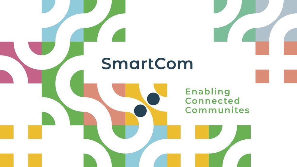
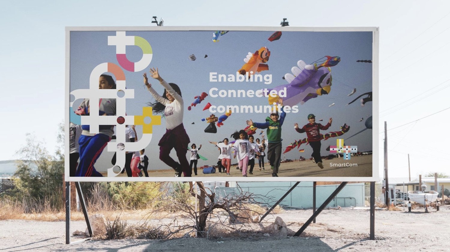
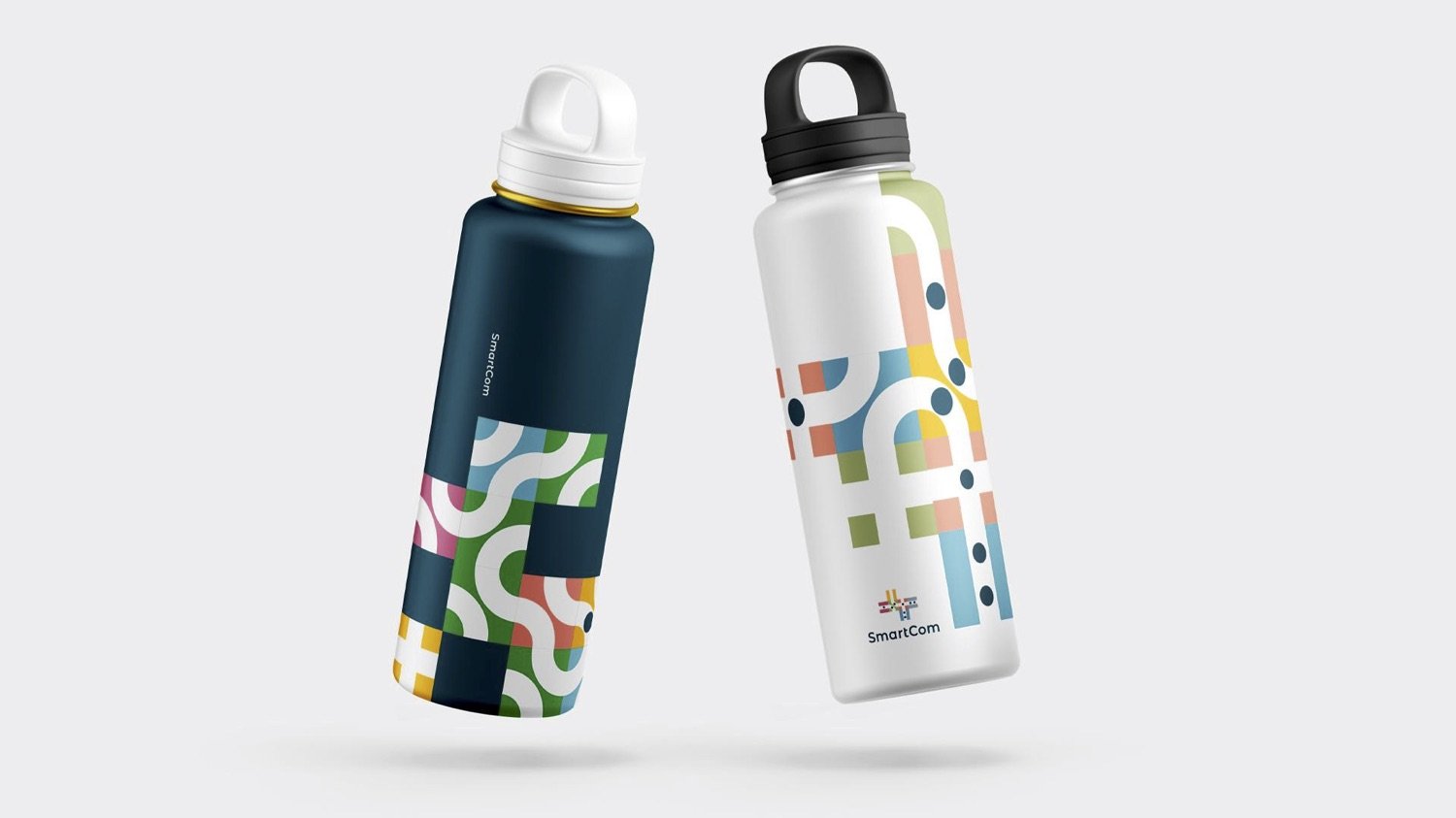
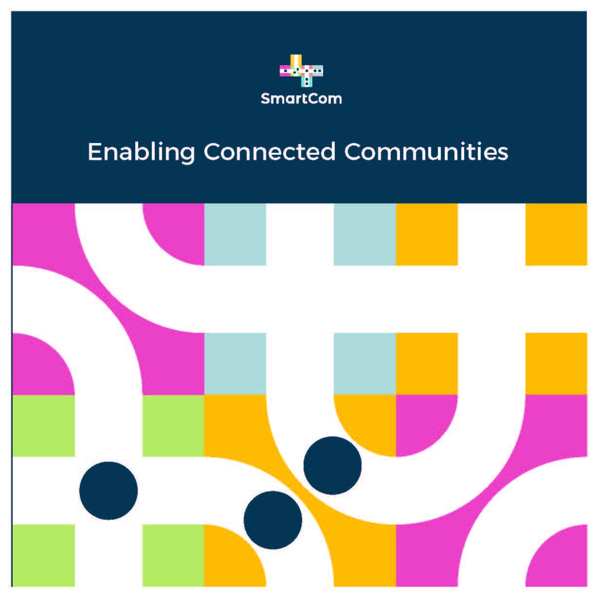
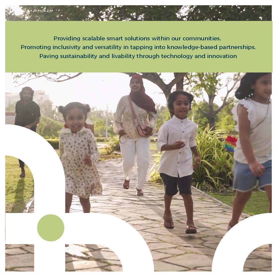
“SmartCom is an easily accessible, high-speed connected network that forms a city-wide community where youth, adults, and corporations can find sustainable solutions while also having the ability to develop and pursue innovative, scalable, and limitless solutions to challenges.”
I was tasked with creating the brand development for a smart city network service provider based in the Maldives. My responsibilities included conducting research, segmenting the audience, and leading a remote team to develop the final artwork.
My Role: Branding, Strategy & Creative Directing
Key Designer: Ashward
Designer: Sithna
Motiongraphics: Imad (Dami)
Agency: Marcomms
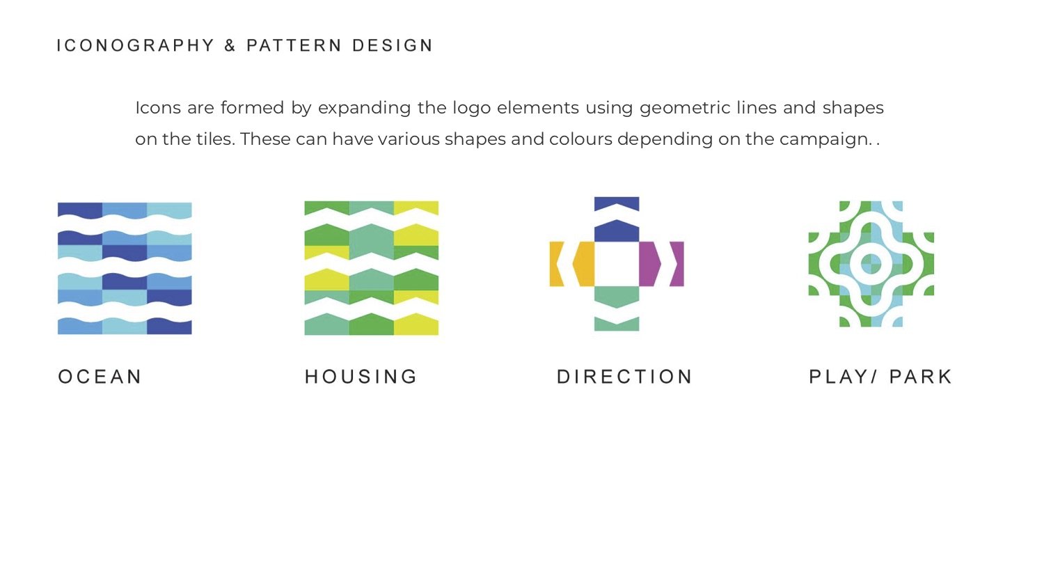
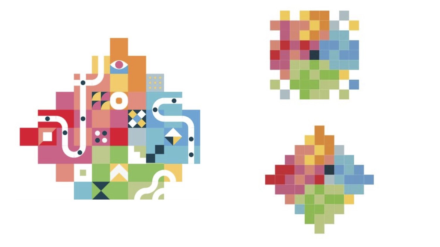
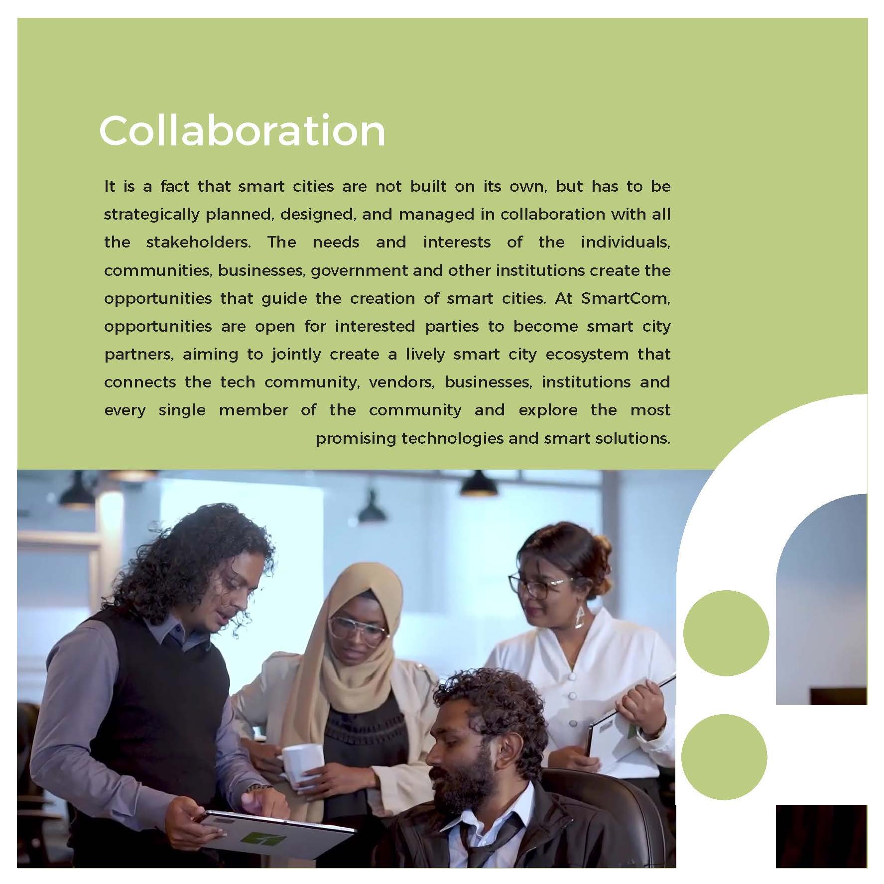
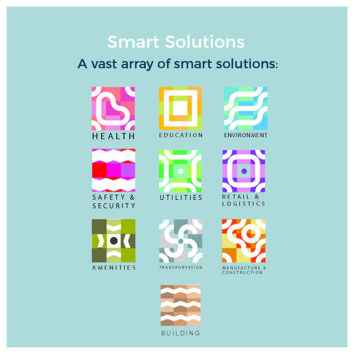
Excerpts from the brand development document
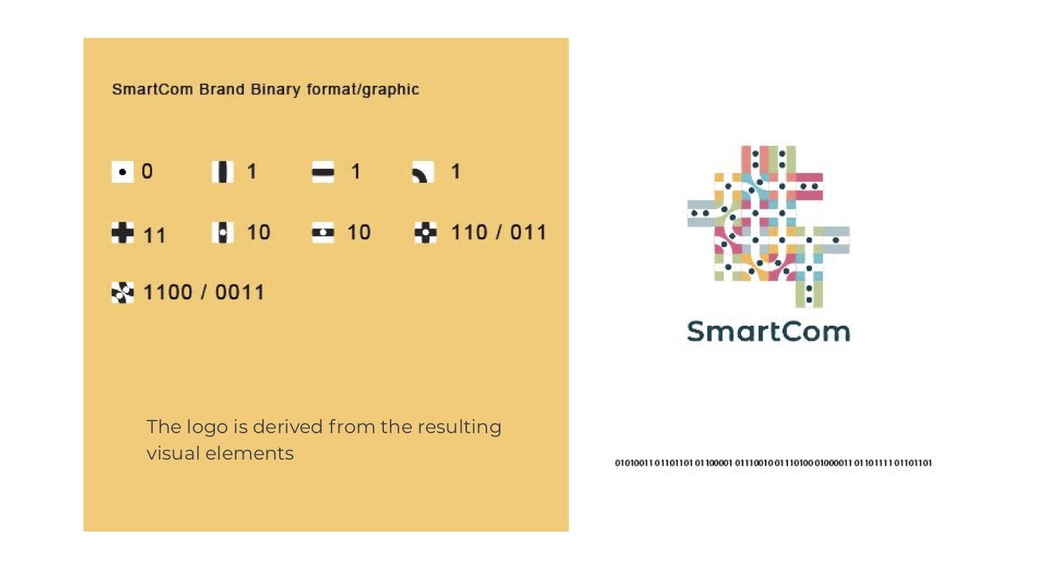
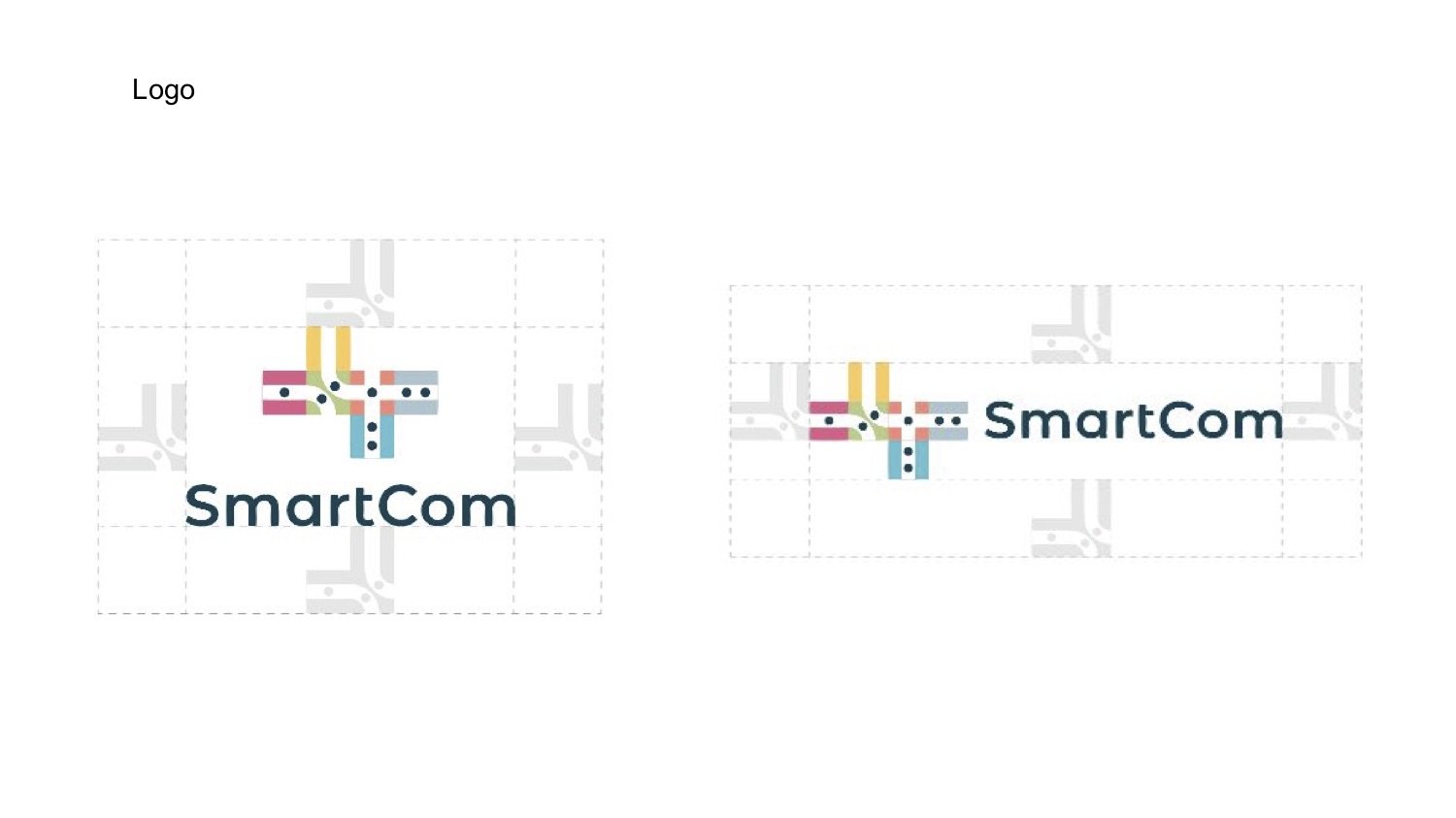
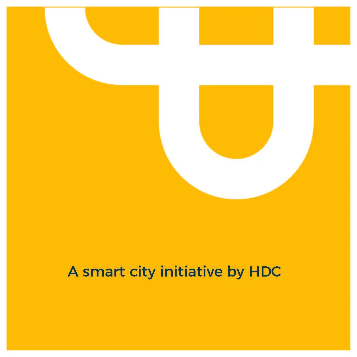
LOGO DERIVATION
I wanted to highlight the connections; between the inhabitants of a place and their larger communities. I derived the logo by converting the name “SmartCom” to binary format and using the resulting 1’s and 0’s as a starting point. These 1’s and 0’s are represented by dots and pathways. Materials viewed from a distance are intended to give a sense of a city.
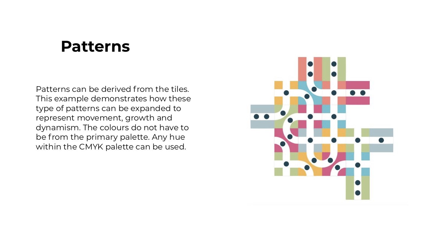
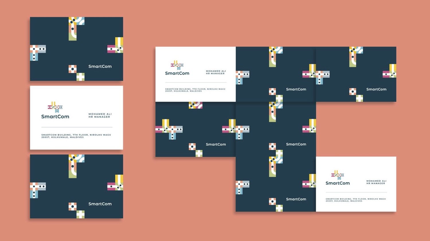
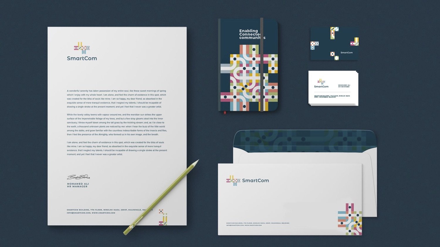
Excerpts from the brand guide.
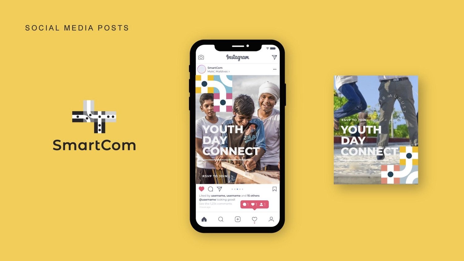
NEWSLETTER


motion graphics: Ahmed Imad (Dami)