The Maldives Stock Exchange has been operating since 2008, making it a relatively recent concept compared to its counterparts in other developing nations.
My Role: Co-Brand Development & Creative Director
Designer and Art Directing: Ashward
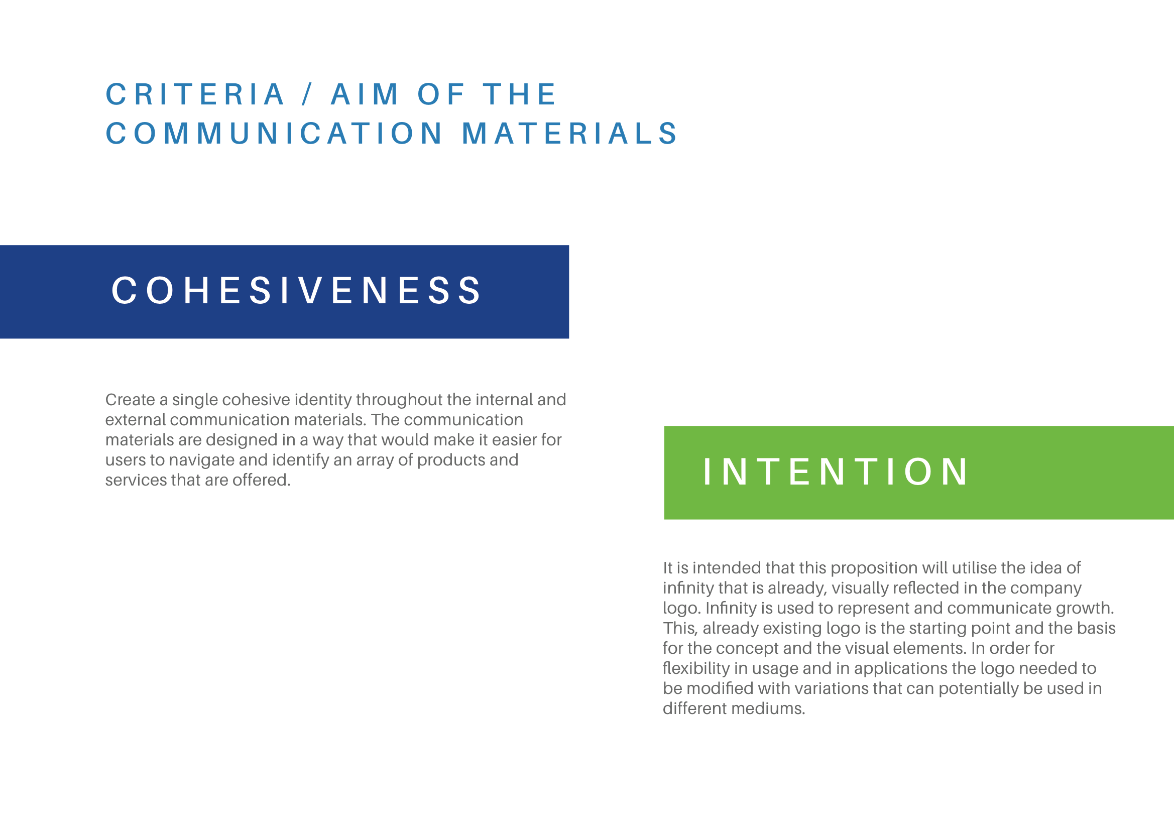
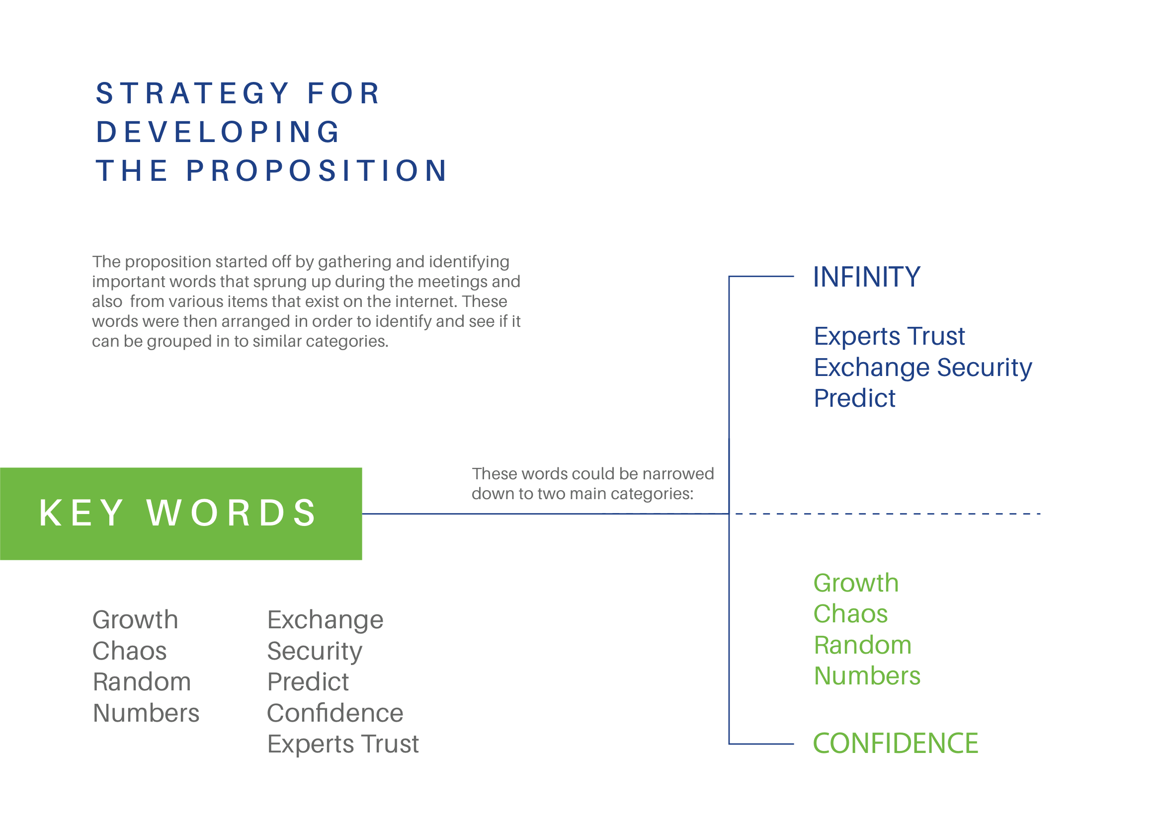
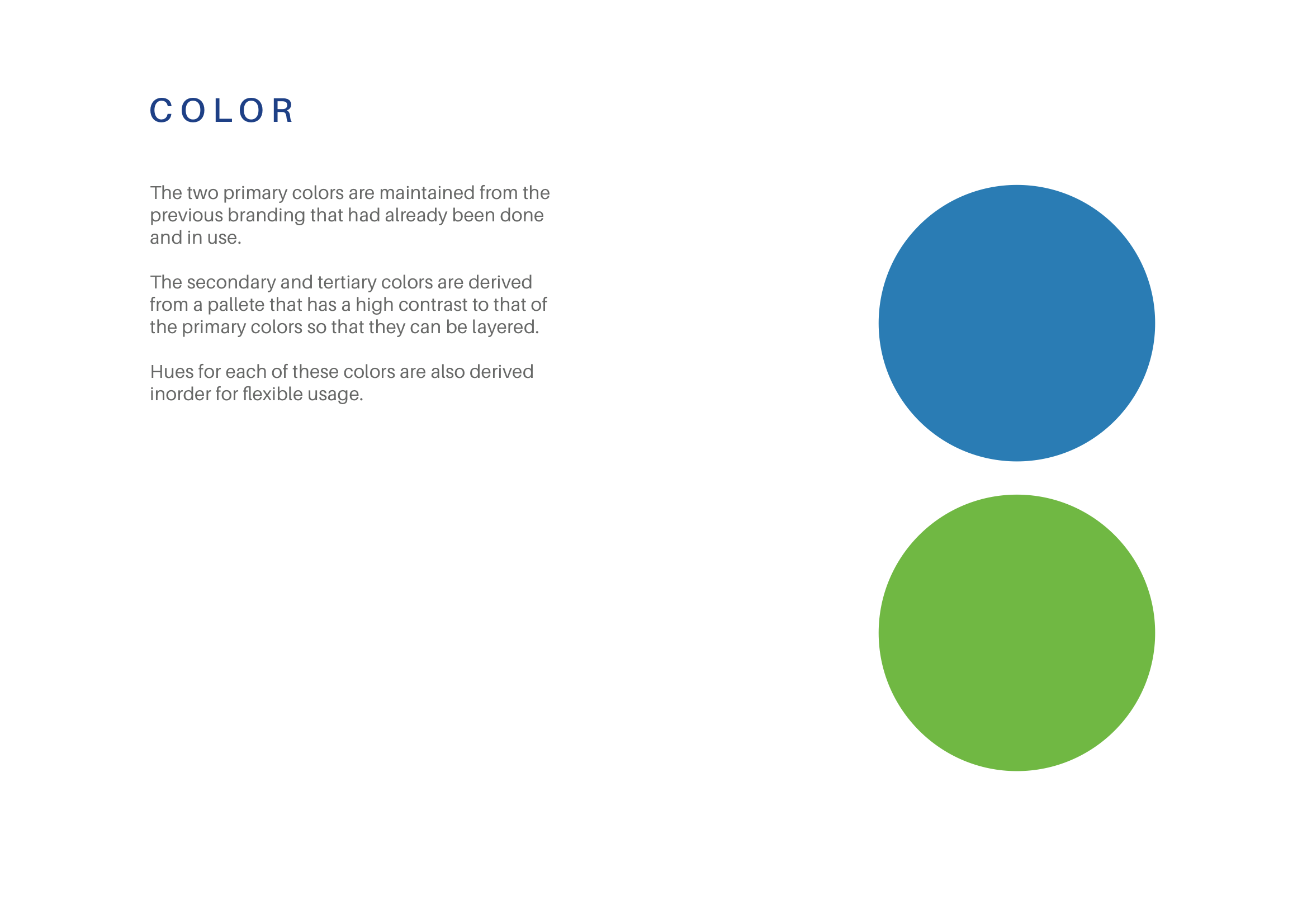
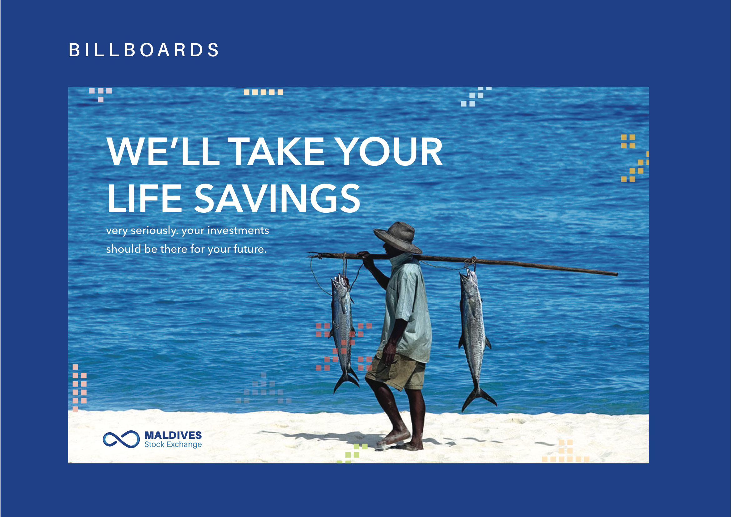
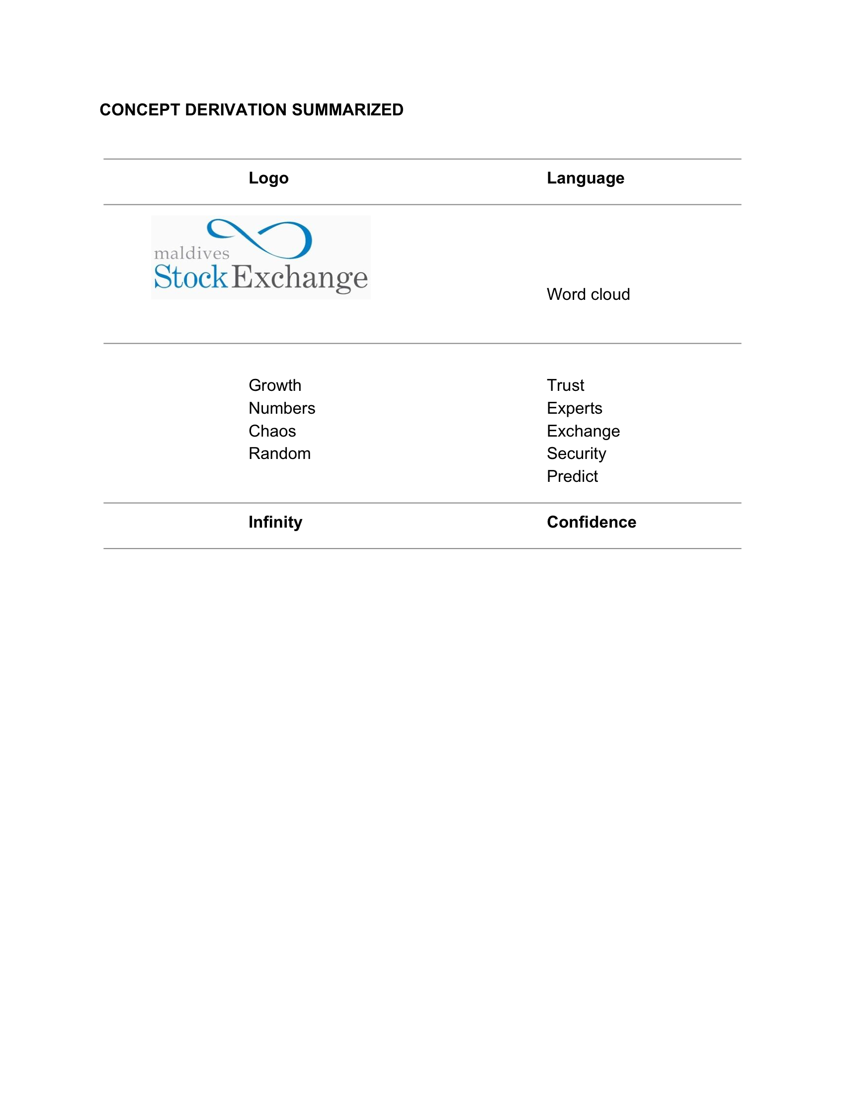
The client sought to rebrand with a focus on positioning themselves as a friendly and approachable institution. They also wanted their new branding to embody the core values of “Trust” and “Growth.”
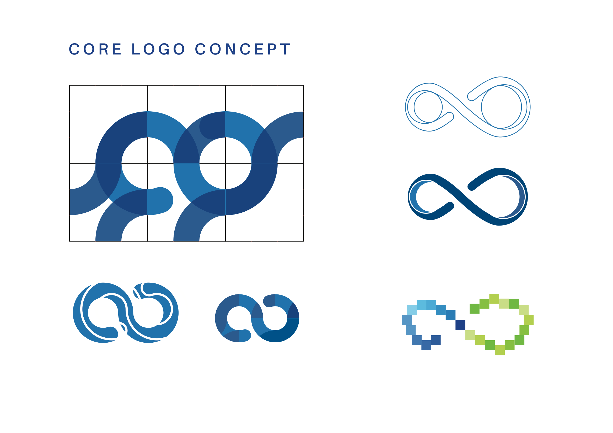
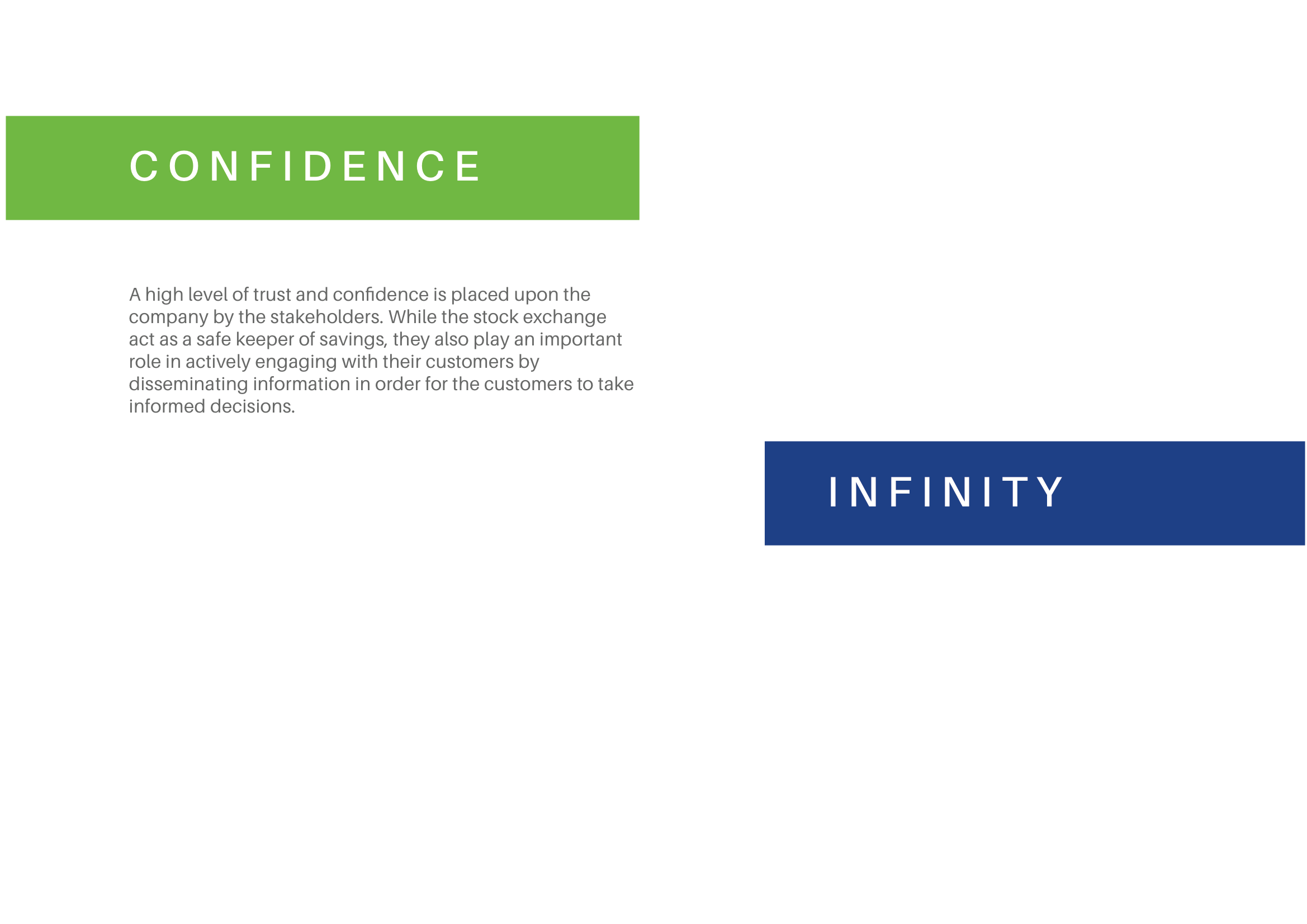
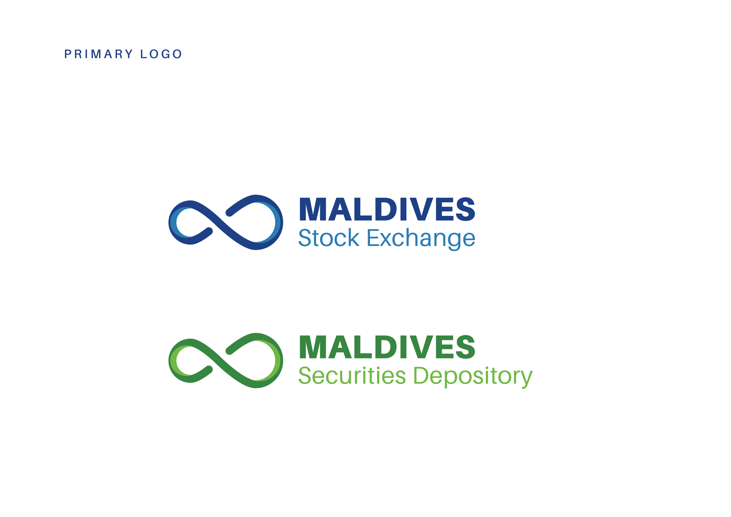
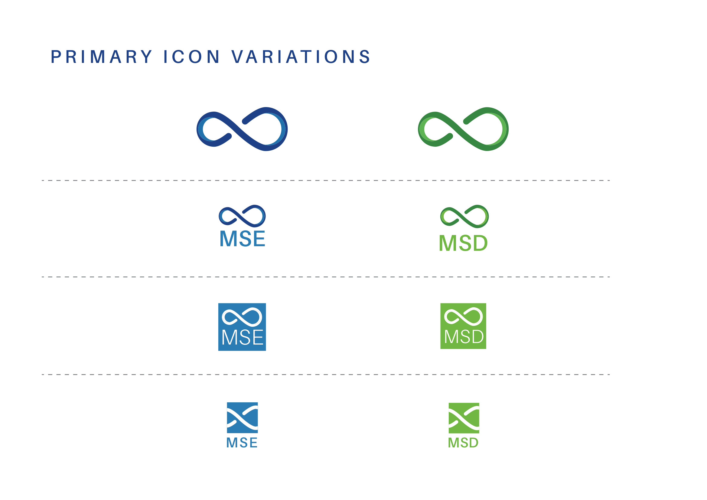
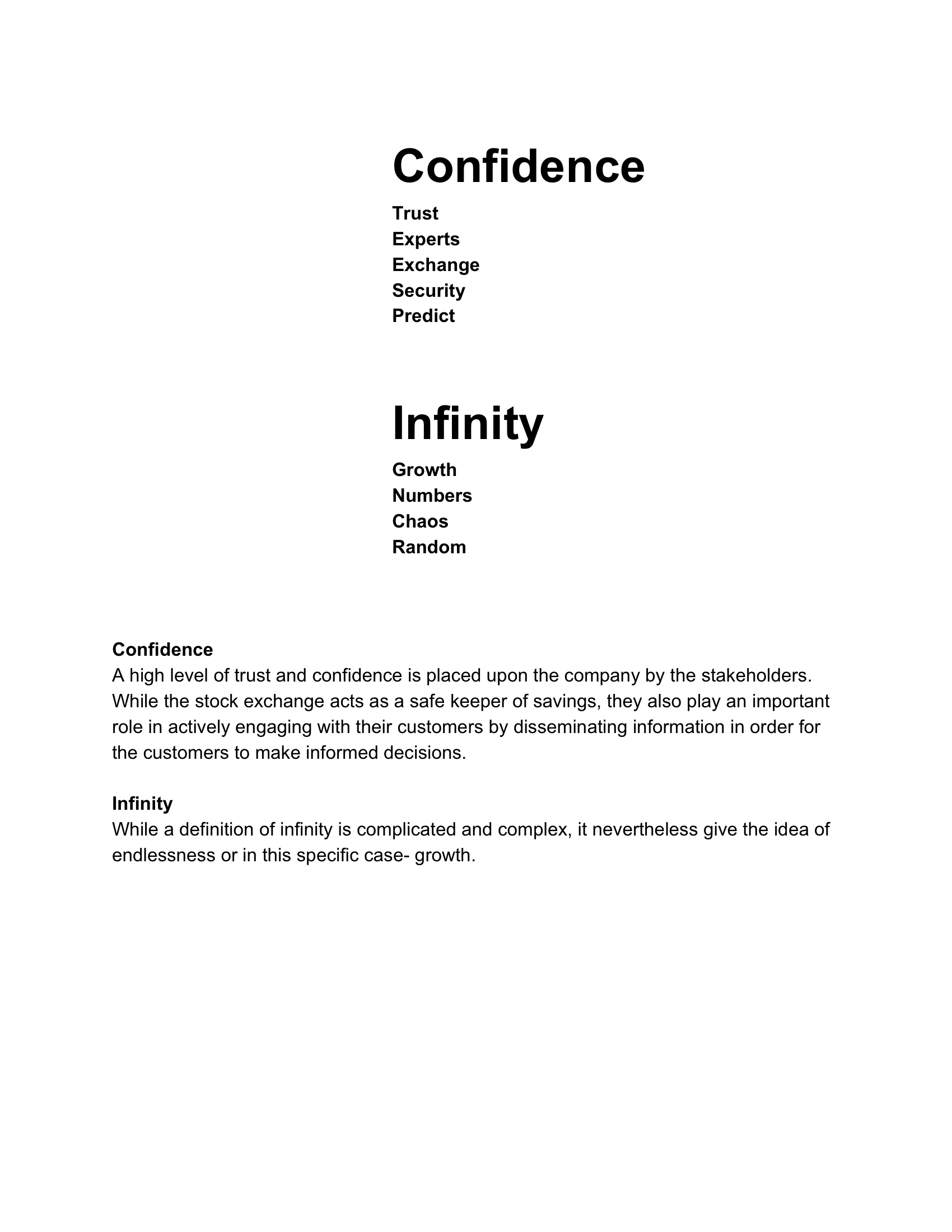
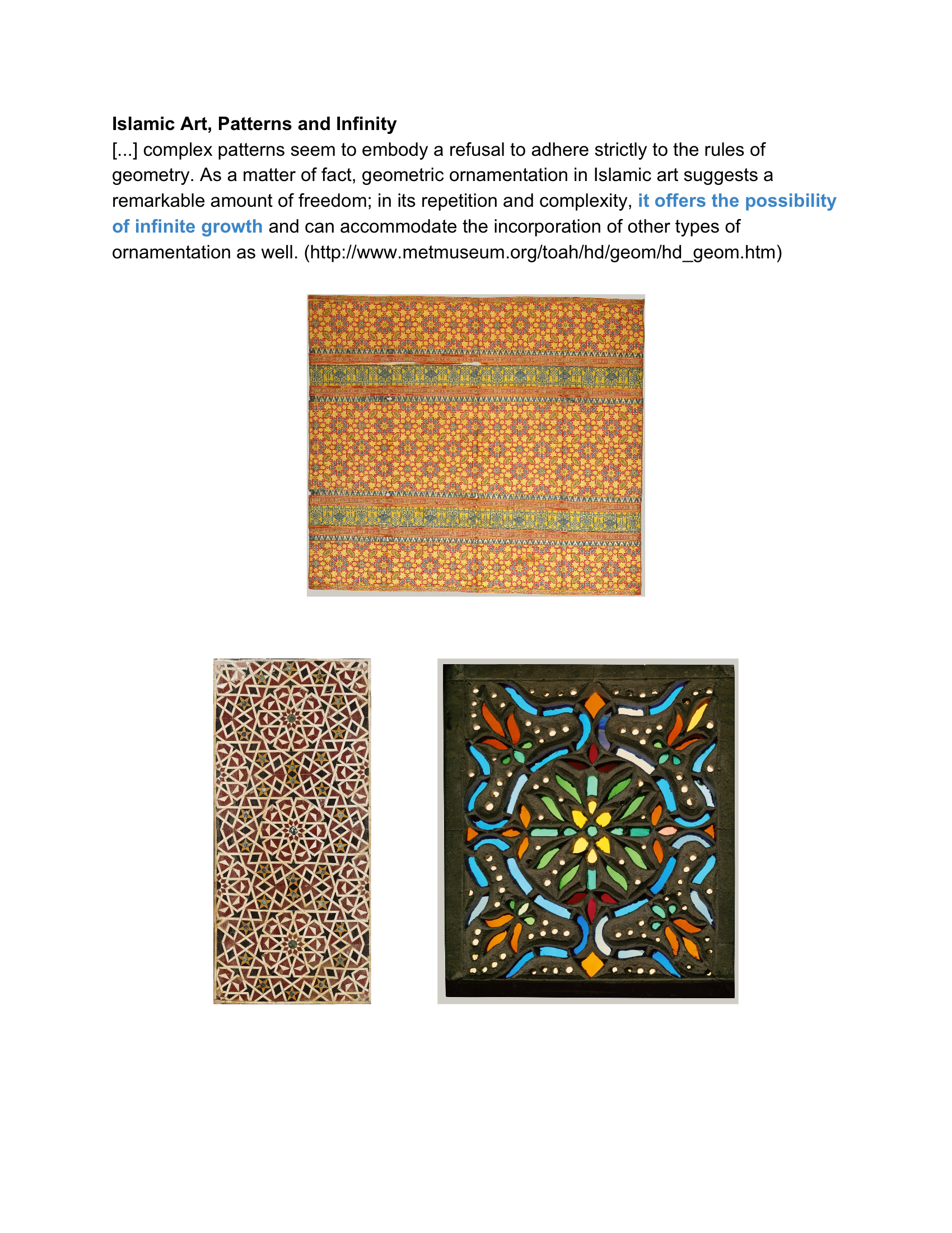
The existing logo featured a stylized infinity symbol, which the client wished to preserve as the foundation of the rebrand. Building on this, we developed a concept inspired by the themes of Confidence and Infinity—confidence in delivering positive returns and fostering the continuous growth of wealth. This approach allowed us to retain the essence of the original logo while aligning it with the client’s vision for a fresh and meaningful identity.
Research & Sketces

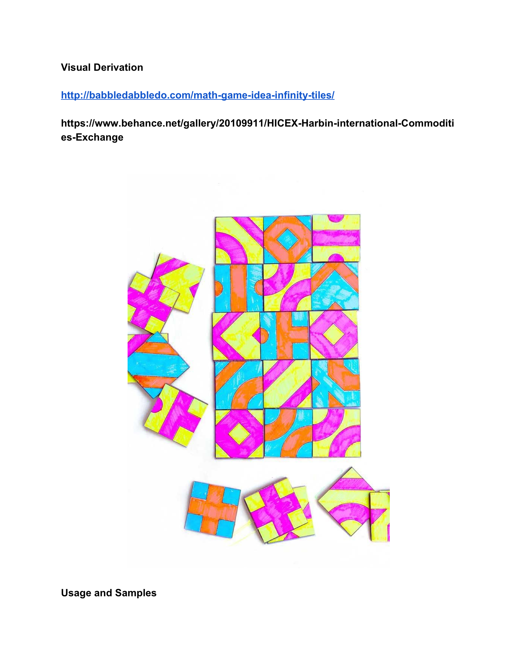
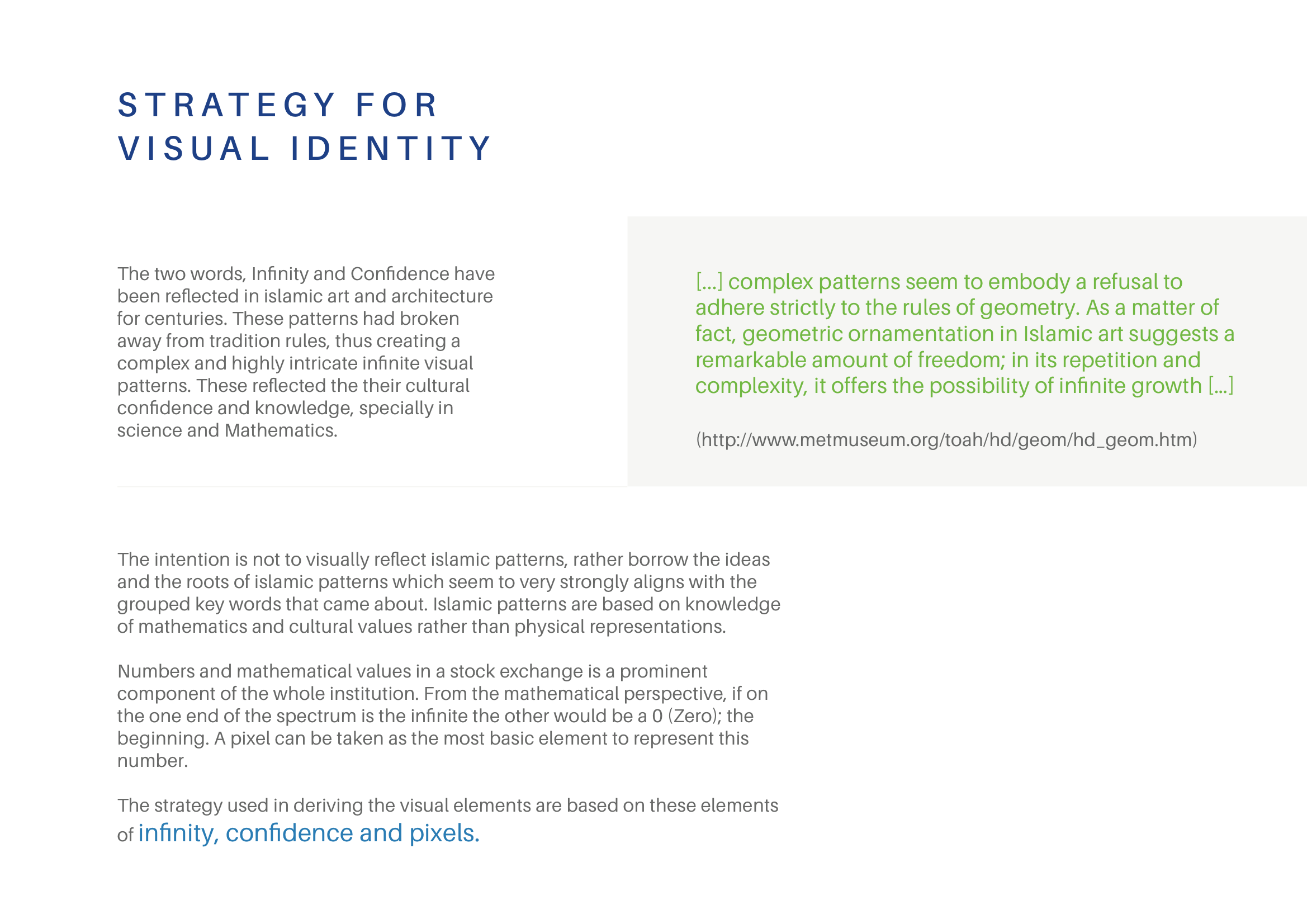
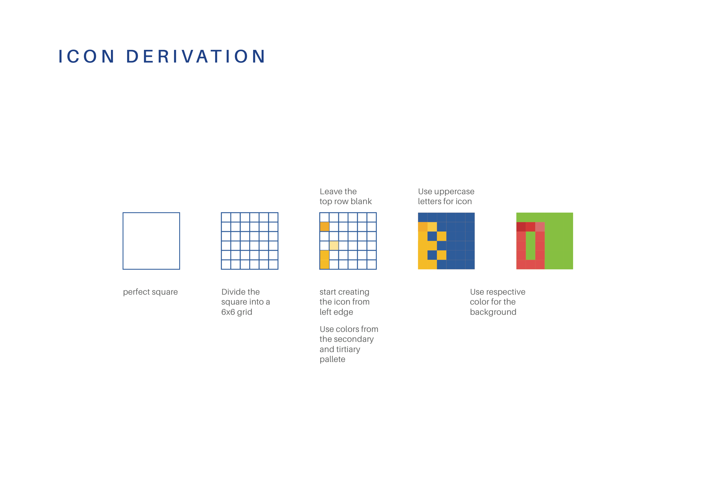
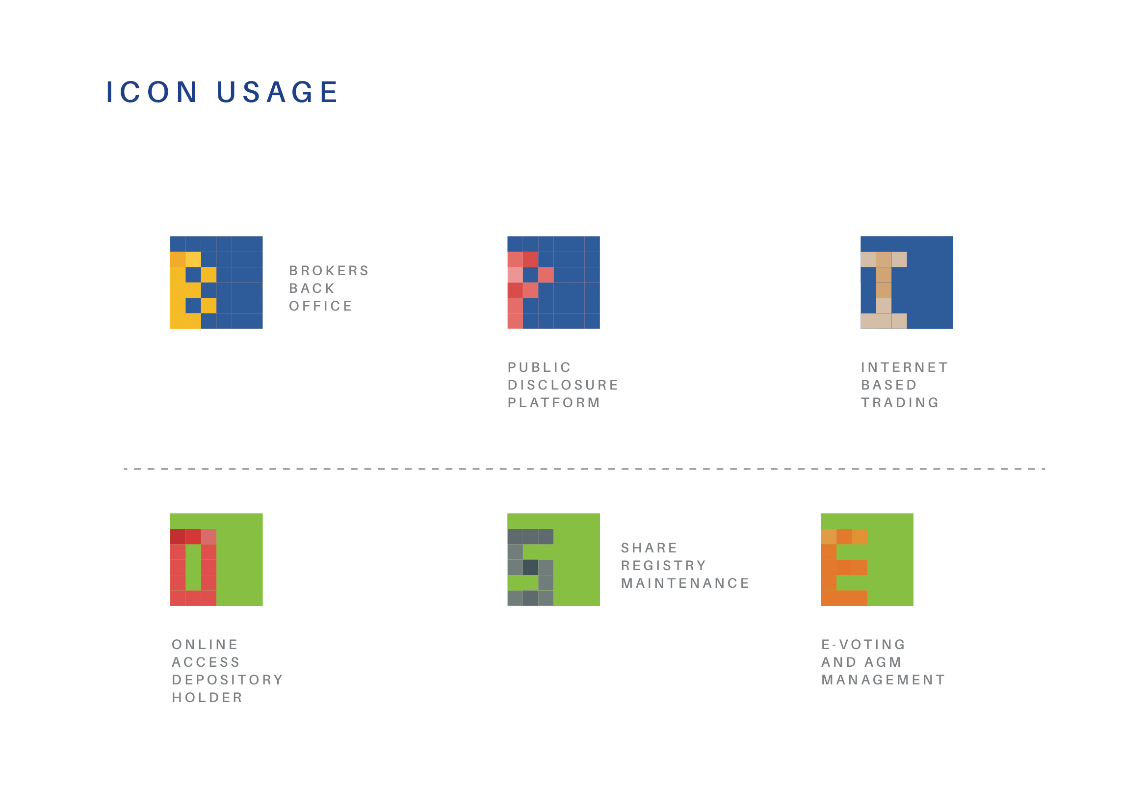
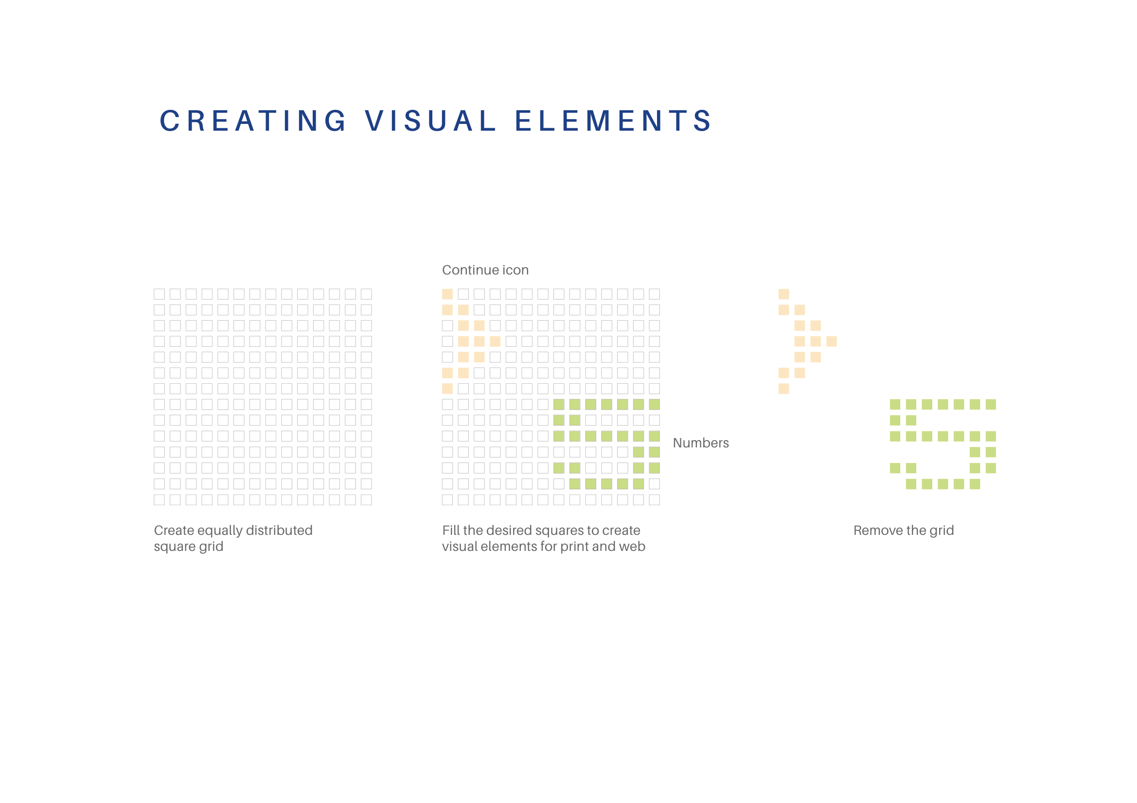
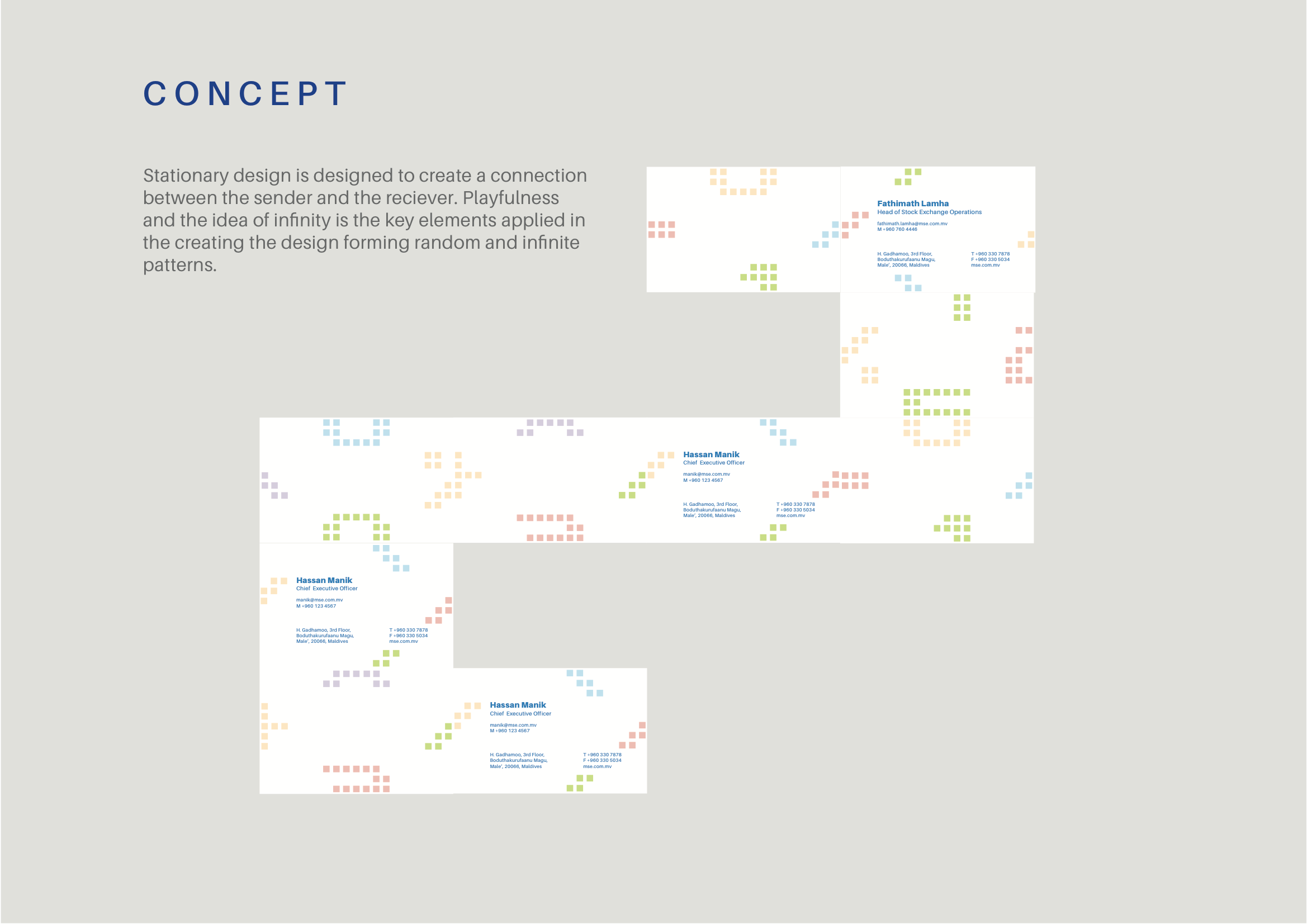
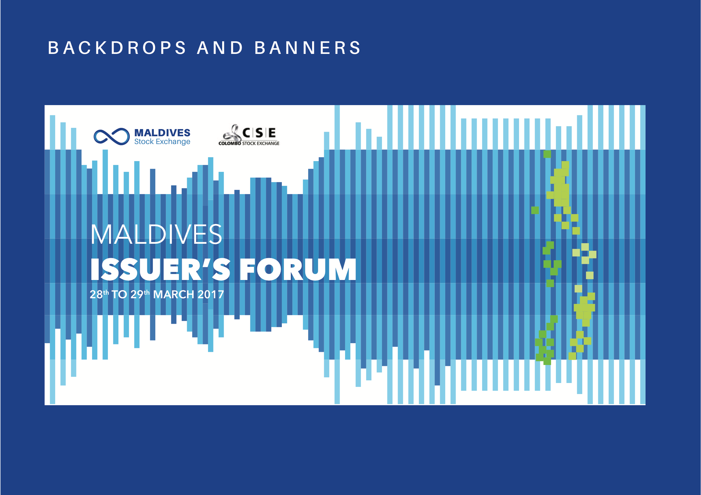
The root of the visual elements is a square, a representation of a digital pixel. This was inspired by the large digital screens we see in stock exchanges. This form of “led display element” is synonymous with much of the imagery that we see portrayed in financial institutions.
A pixel also represents a start of a larger image, synonymous with the initial investment and the idea of growth.
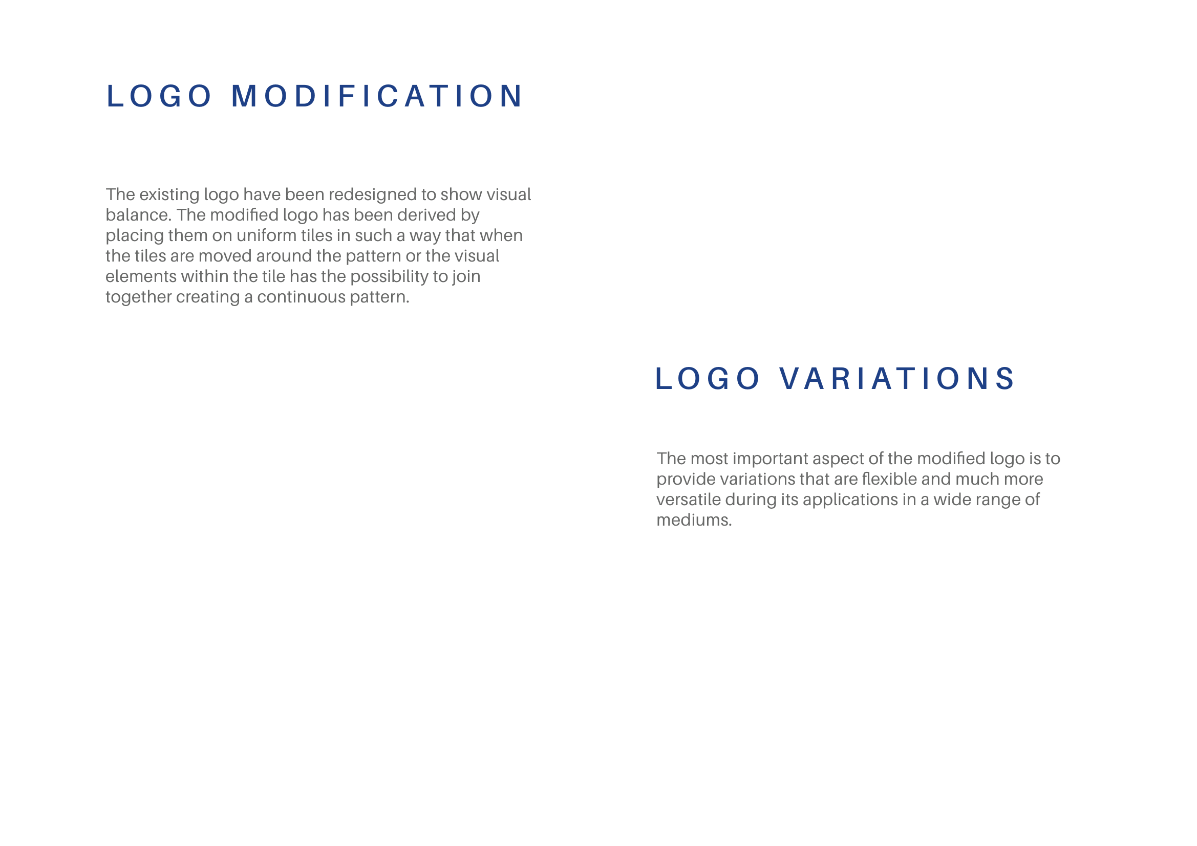
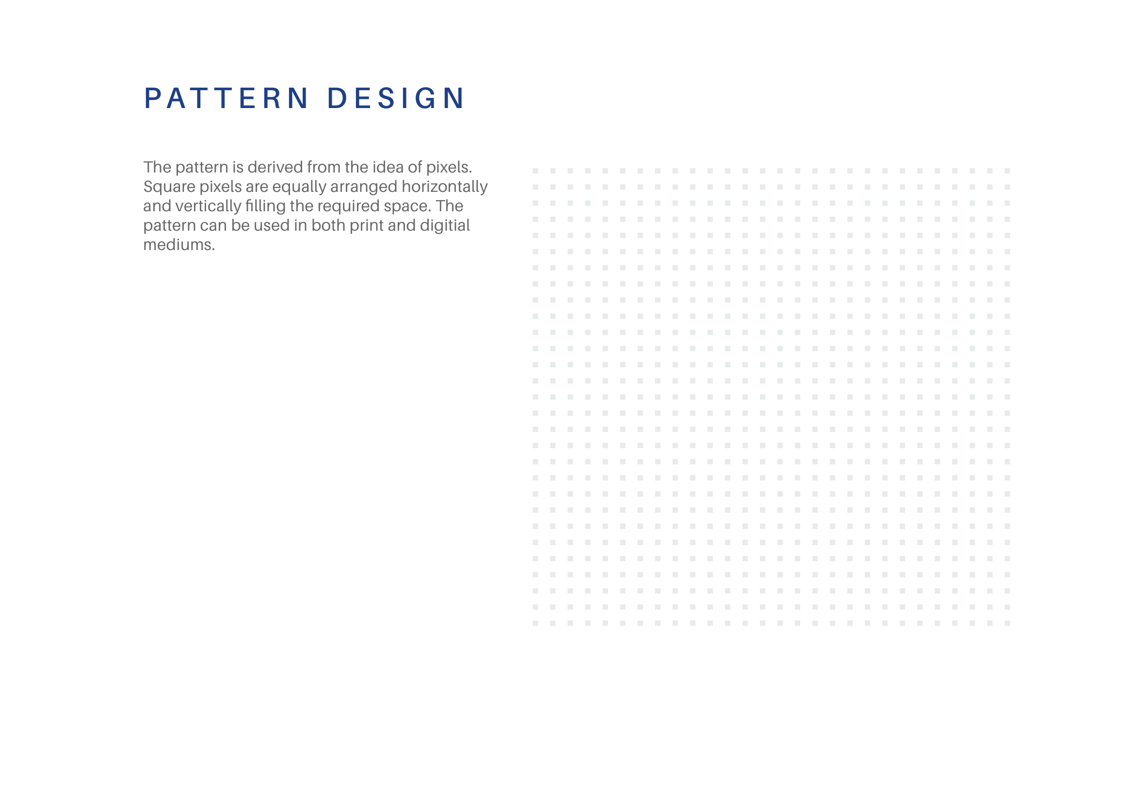
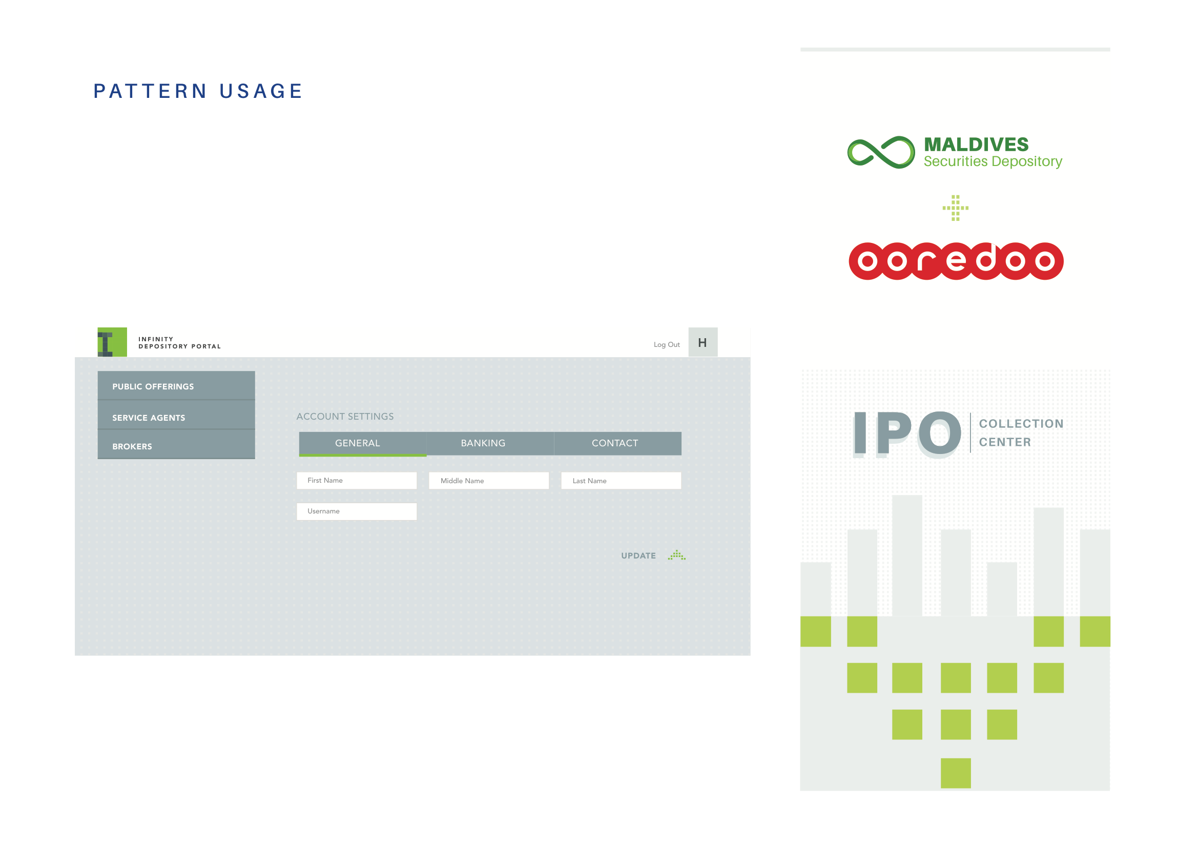
In addition, we designed the placement of the visuals in such a way that the patterns can potentially run seamlessly when they are placed adjacent to each other in whatever direction.
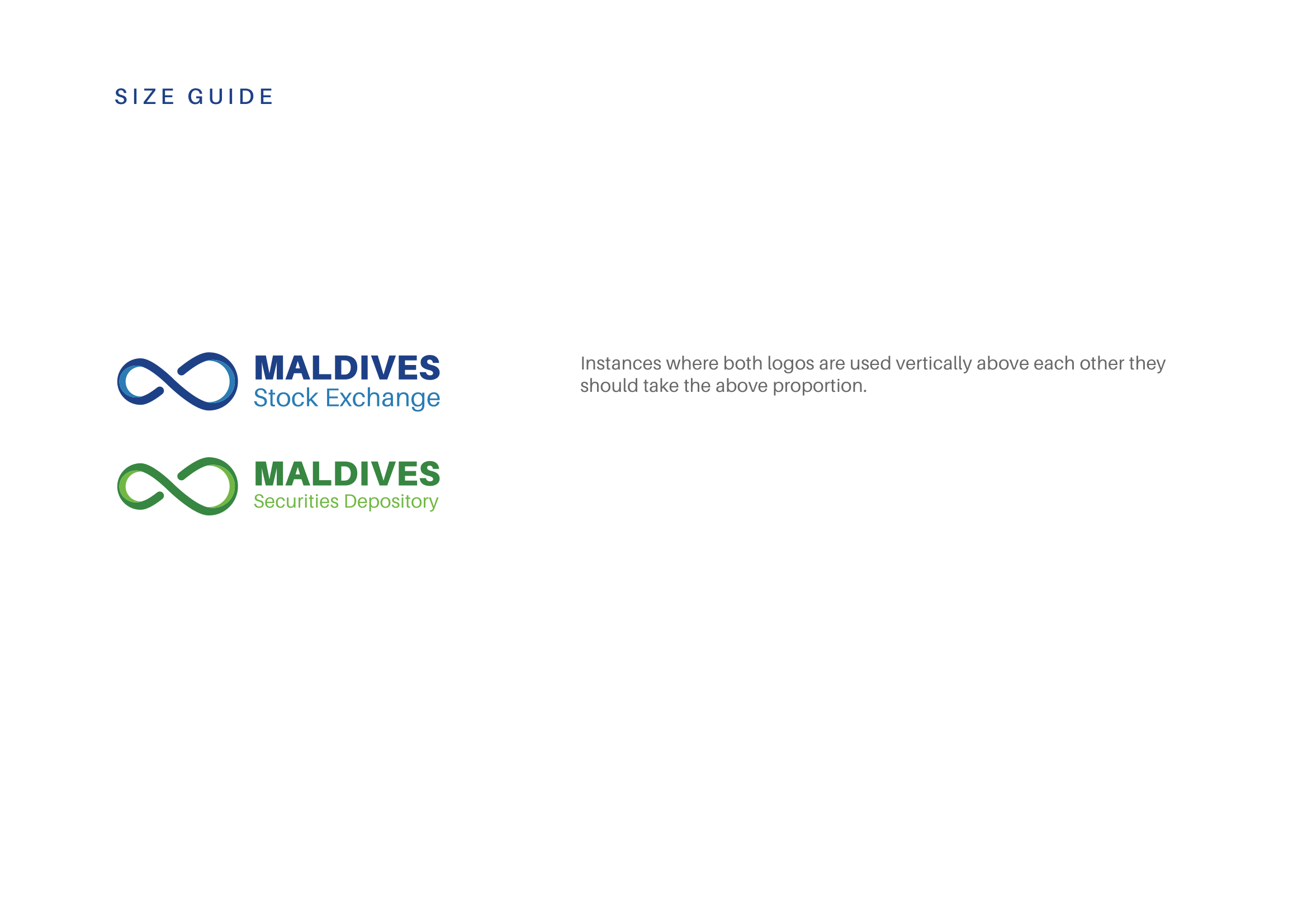
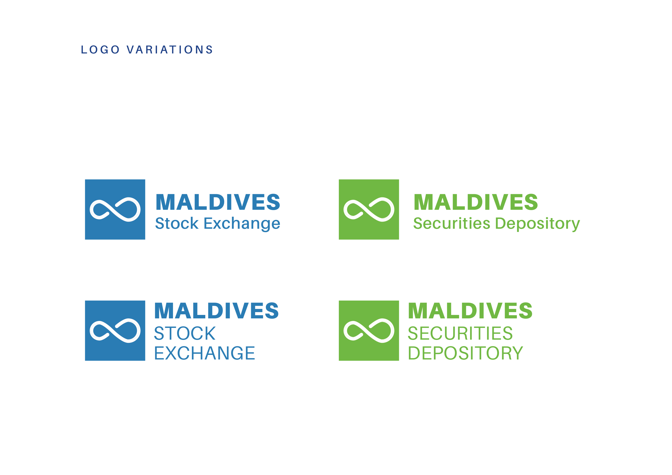
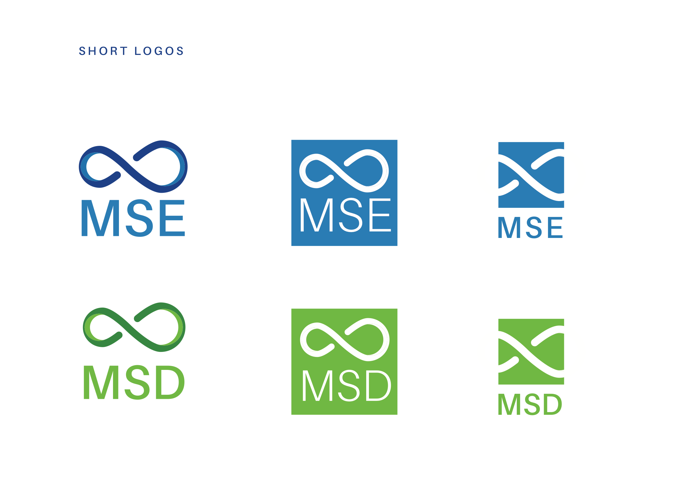
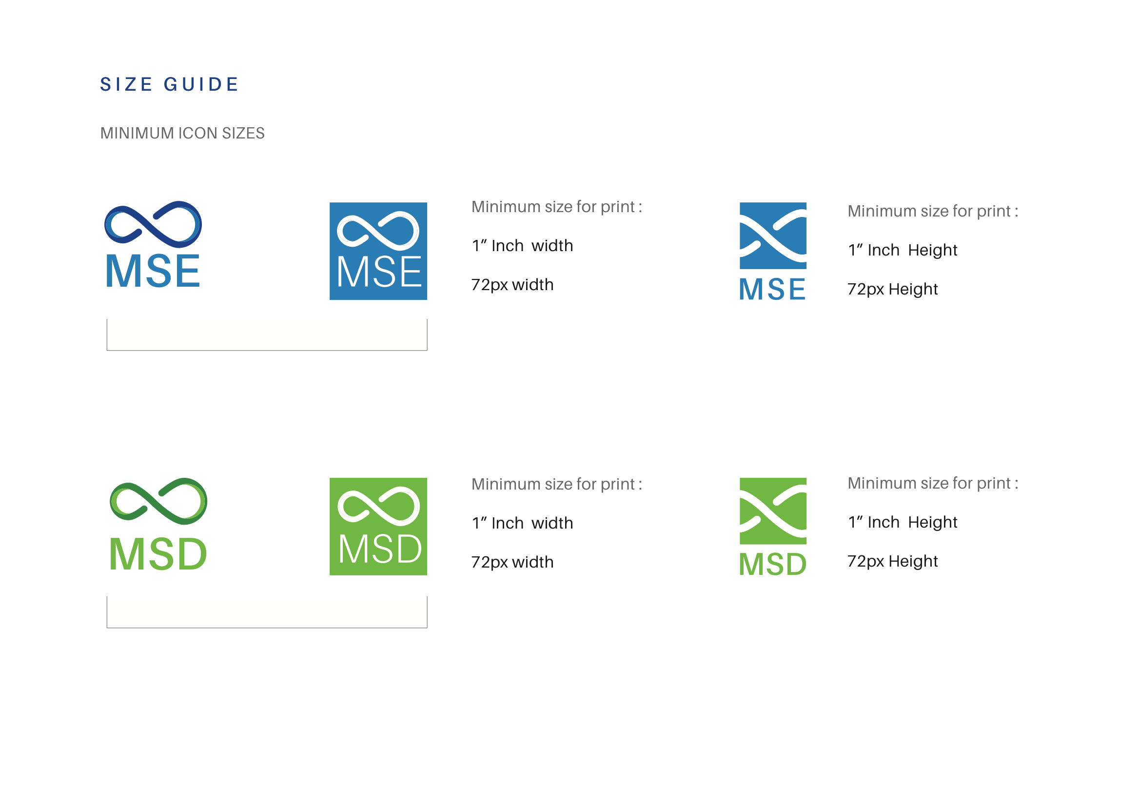
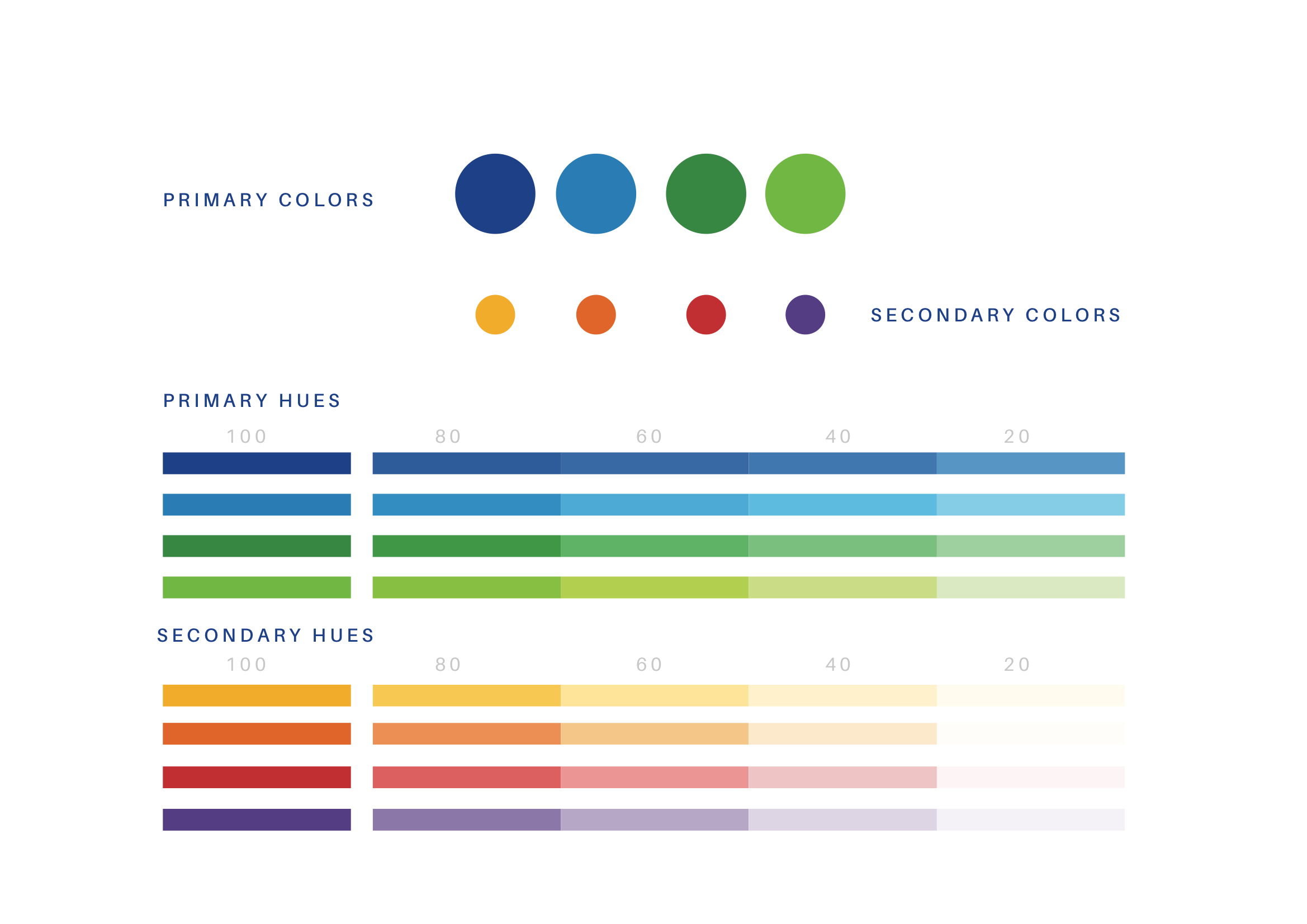
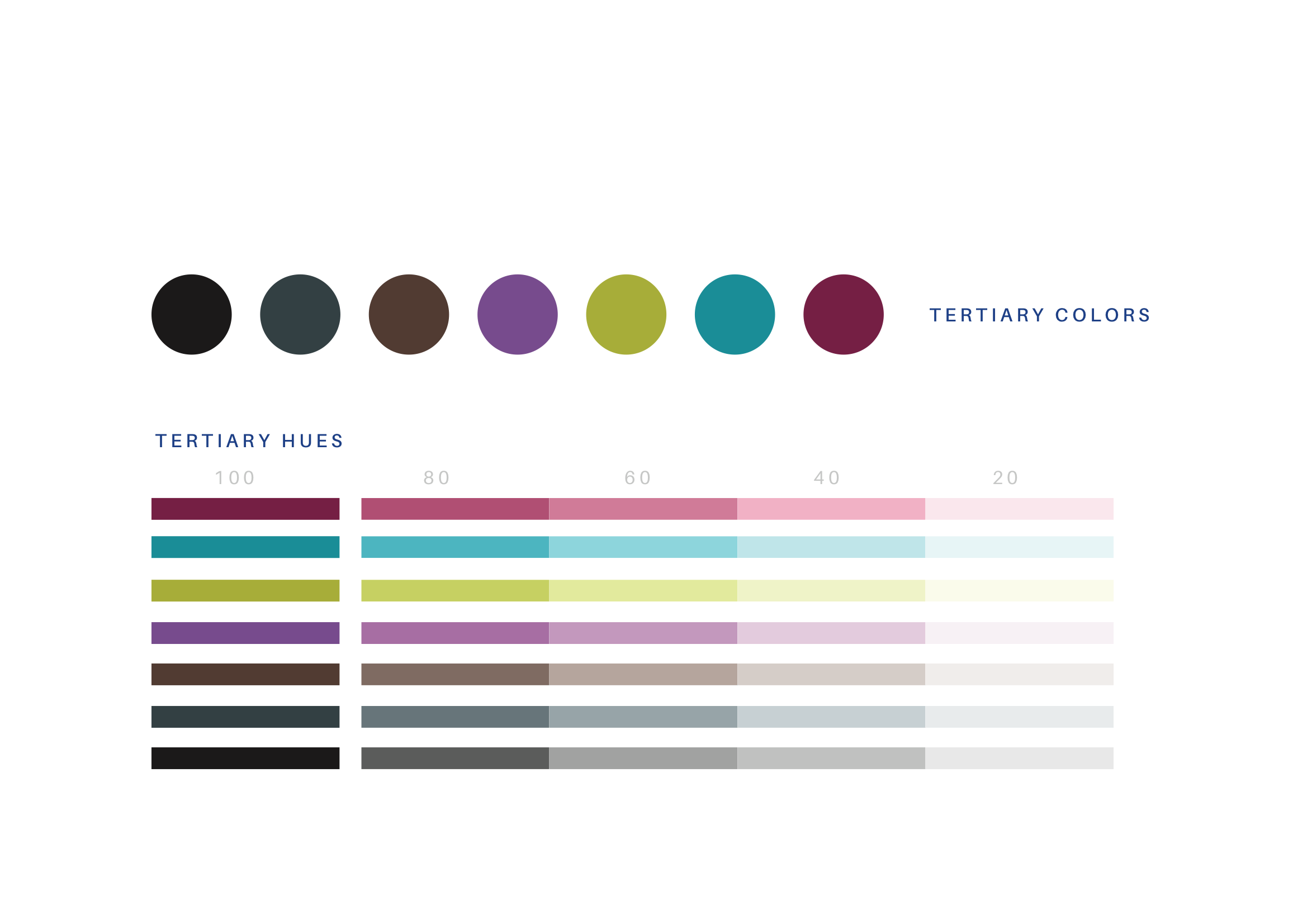
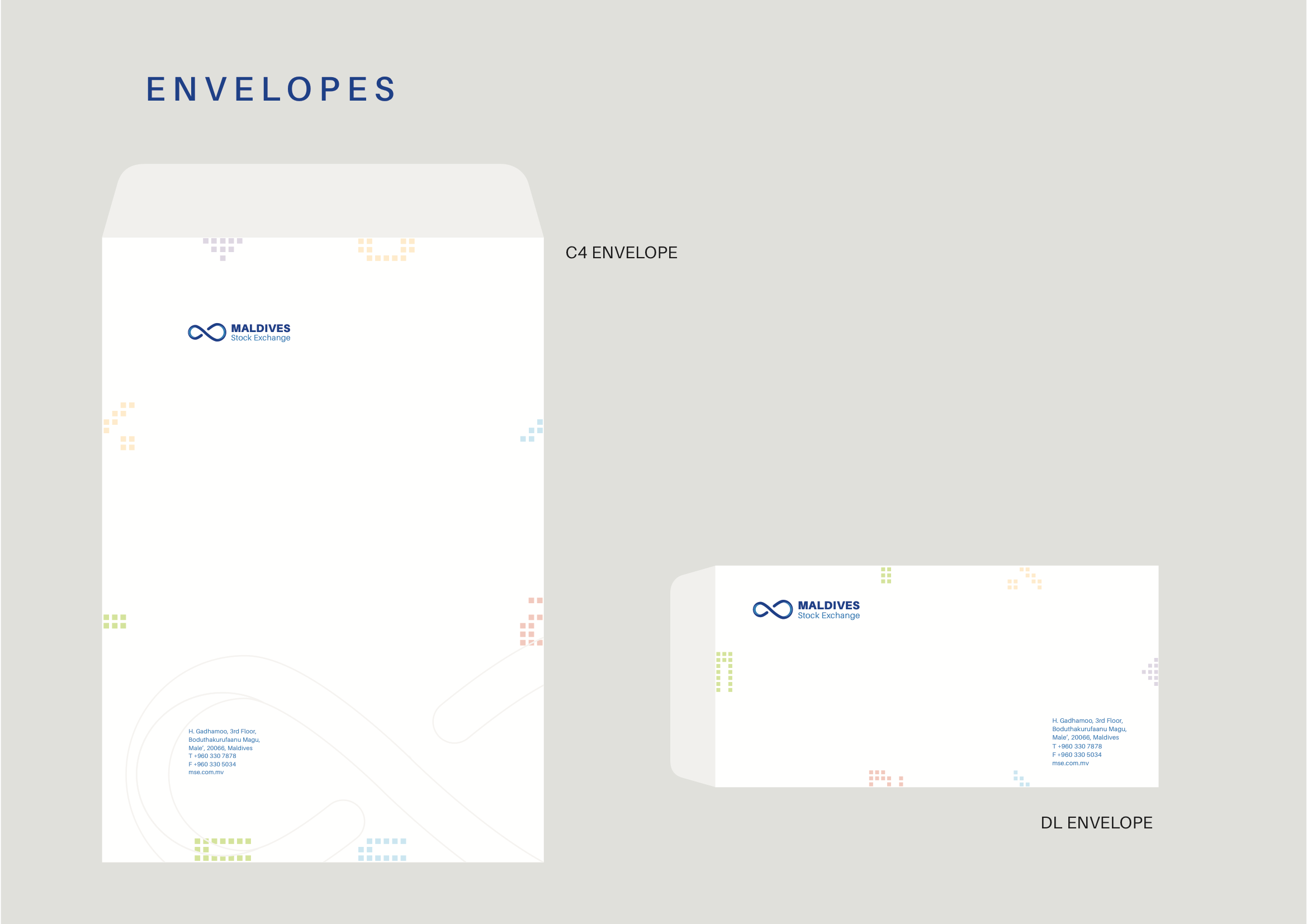
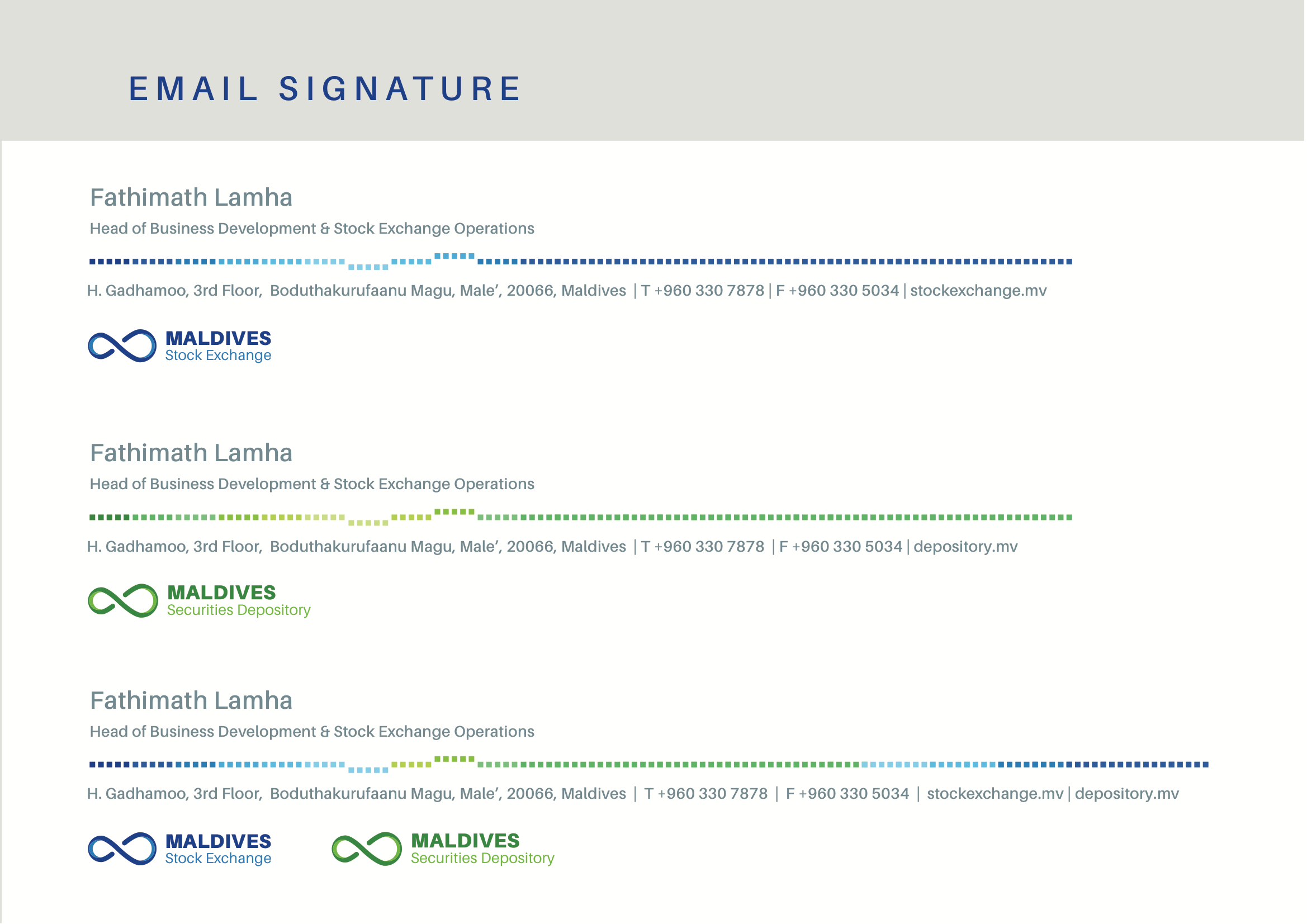
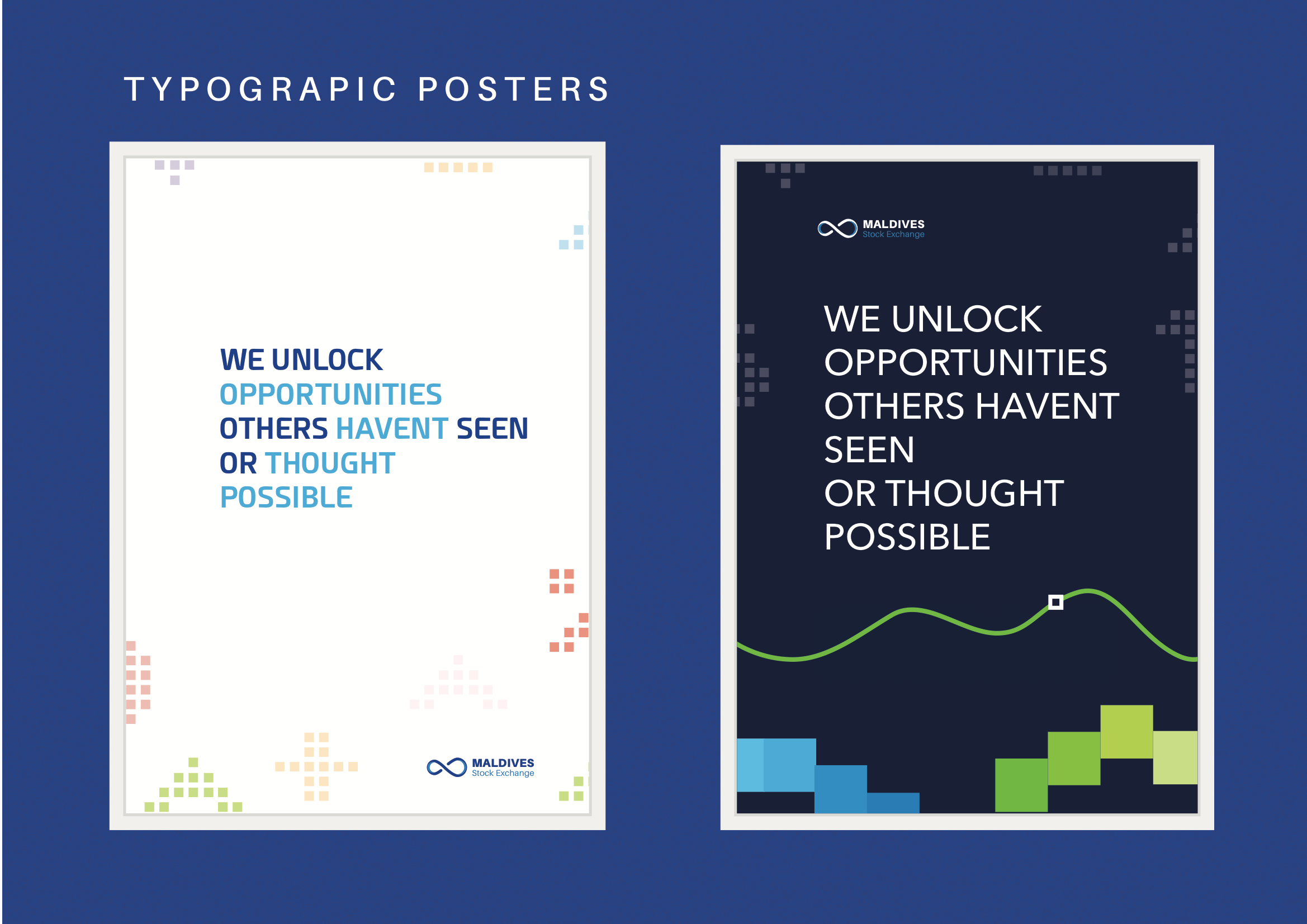
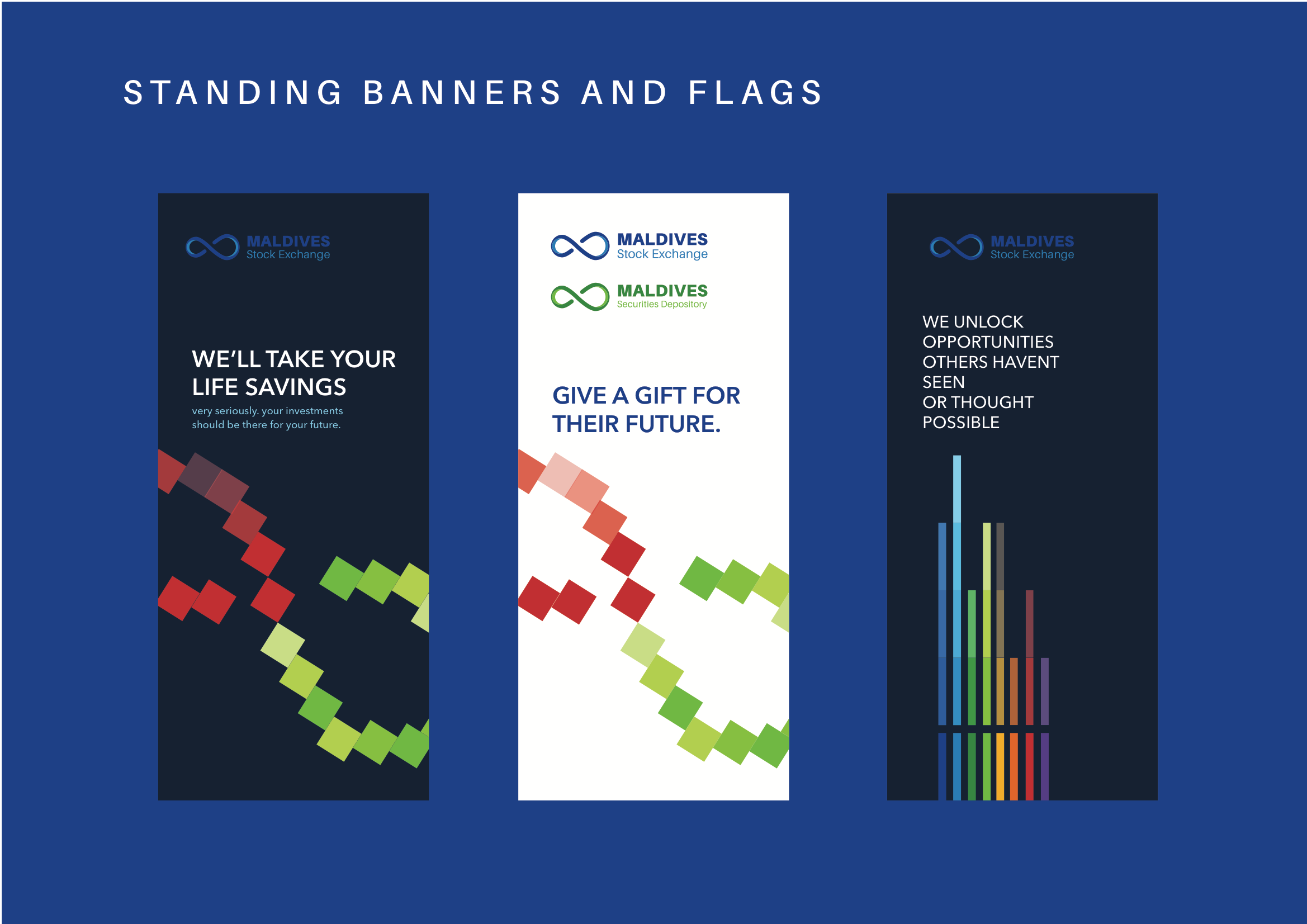
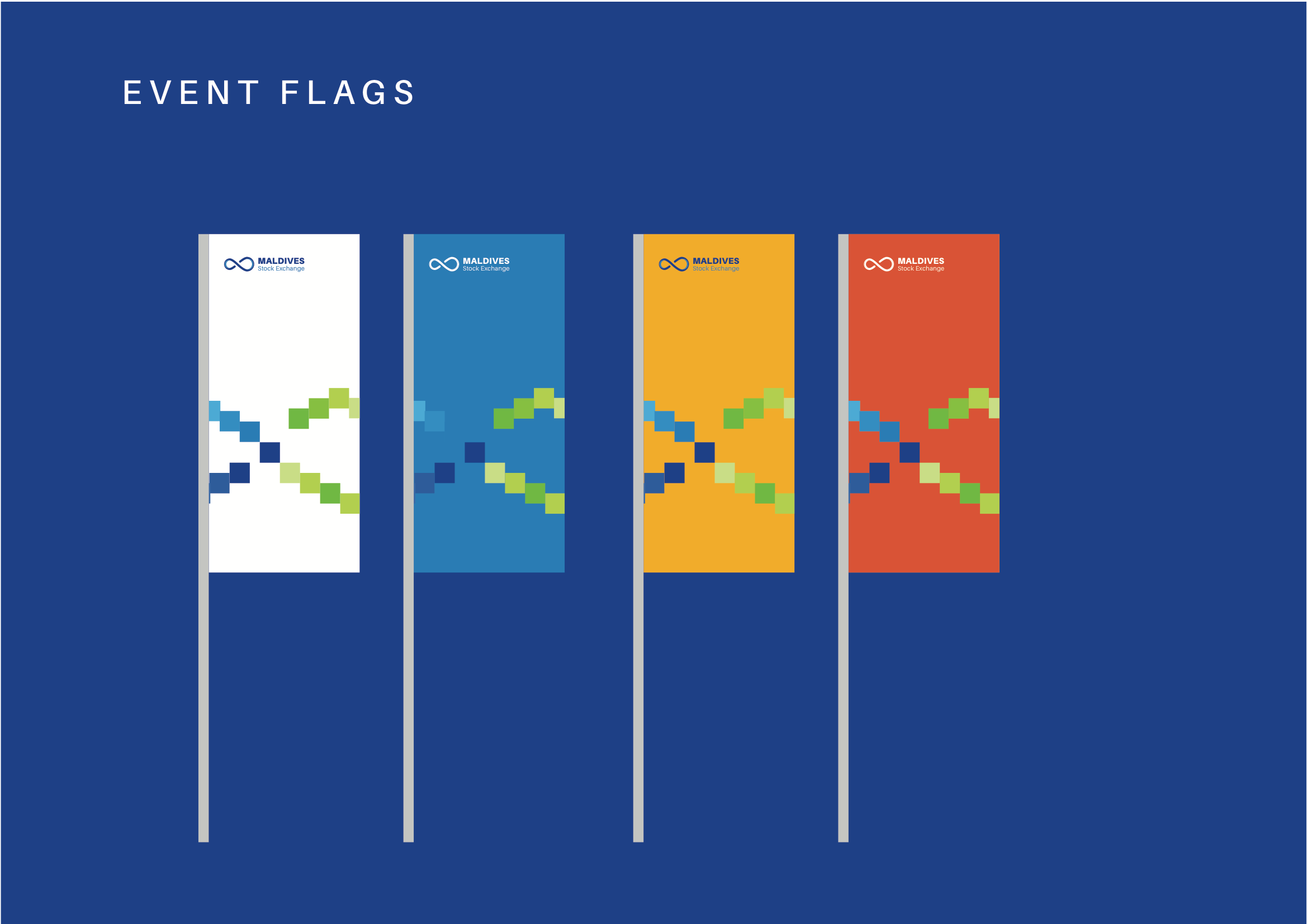
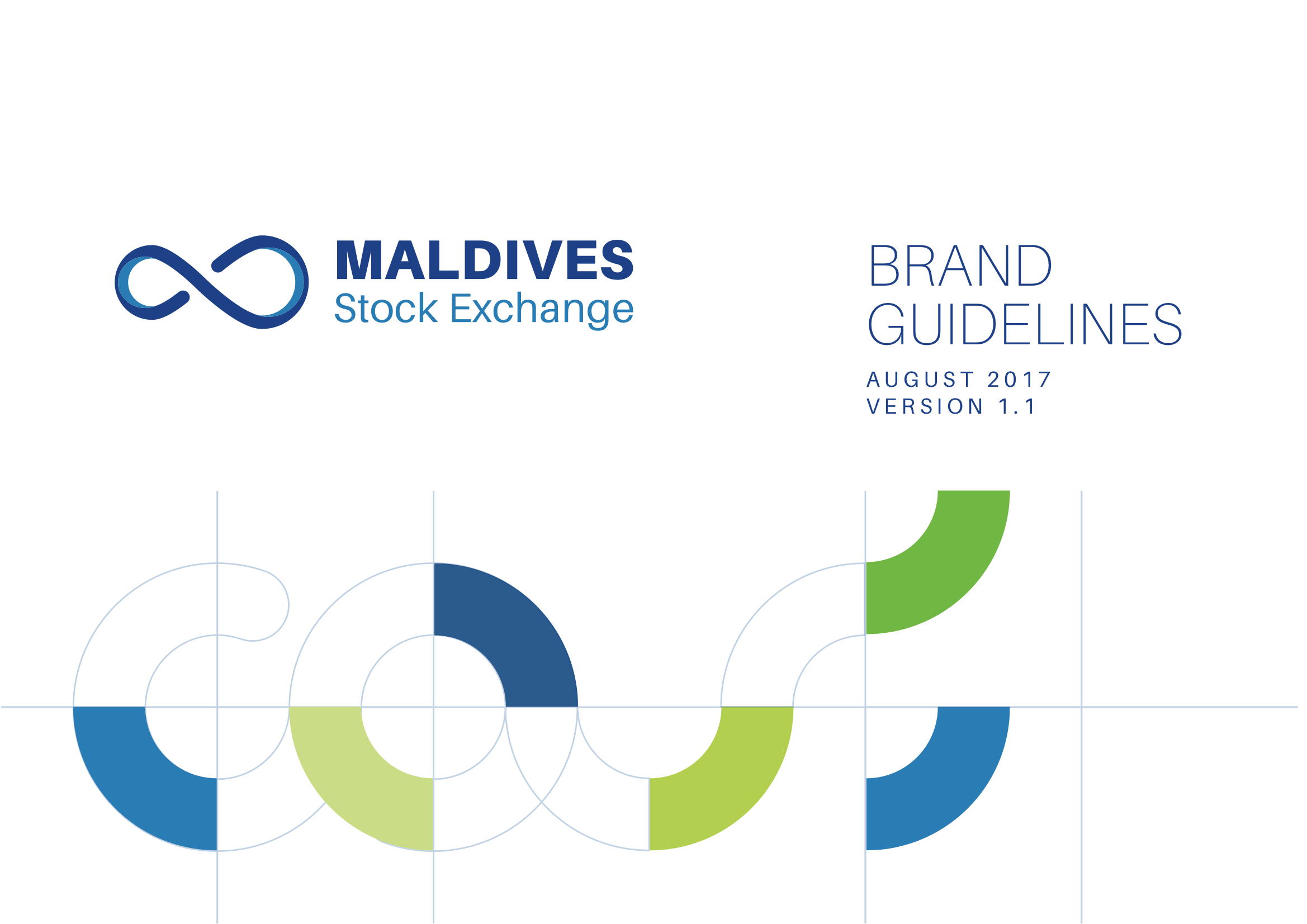
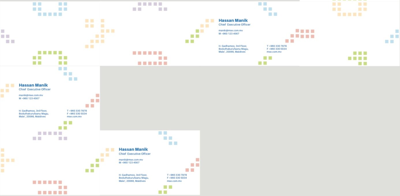
Excerpts from the brand guide