Artist, Story maker & Content Creator
Thank you for being here.
Quick Links: Branding & Strategy | Design & Motiongraphics | Film & Video
Thank you for being here.
Quick Links: Branding & Strategy | Design & Motiongraphics | Film & Video
EyeCare is expanding and they wanted to rebrand their business completely. Their business has grown and new products and services have been added. I am creating branding and new identity elements that reflect the diversity of their business.

+ IN DEVELOPMENT +
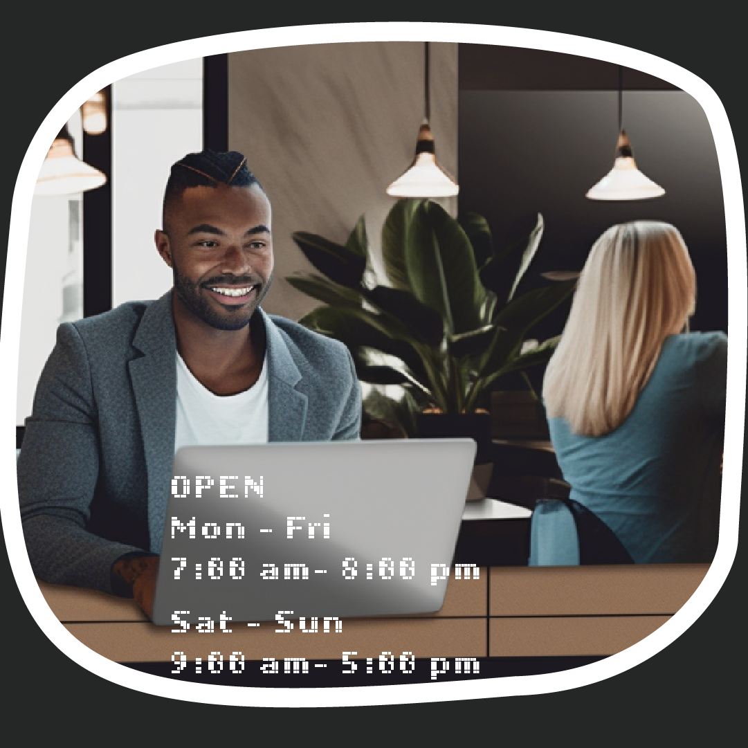
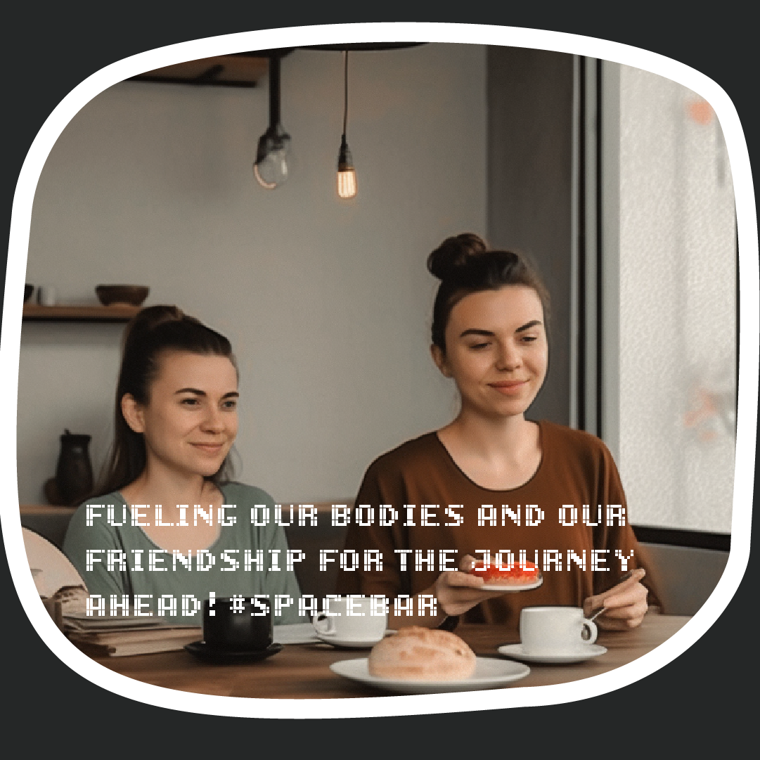
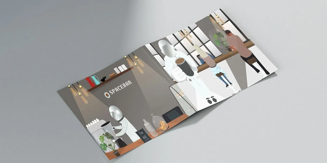
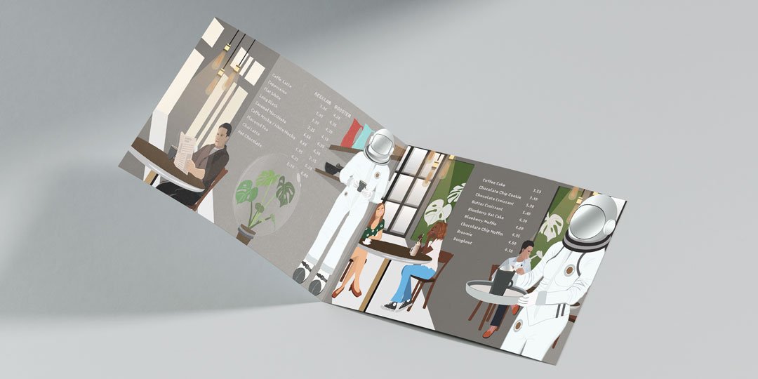
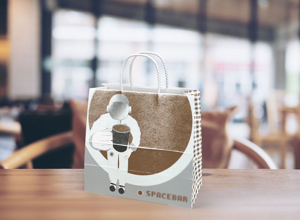
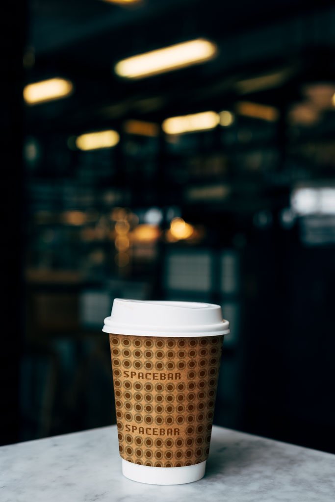
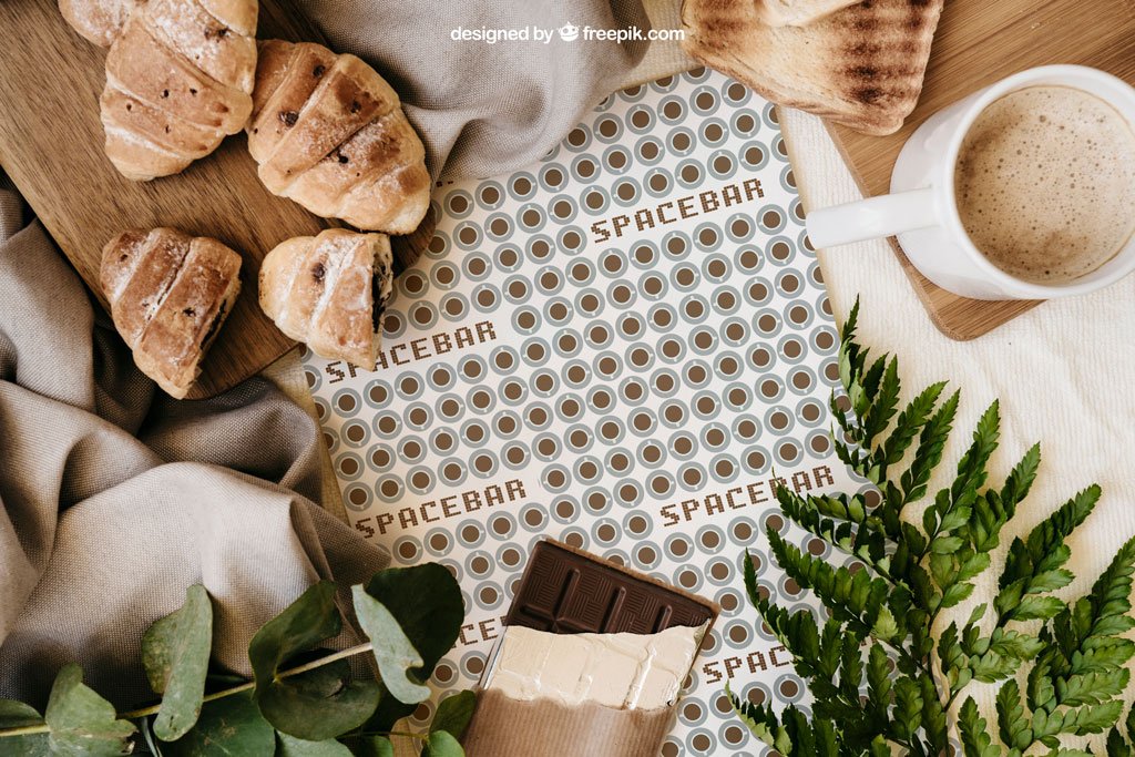
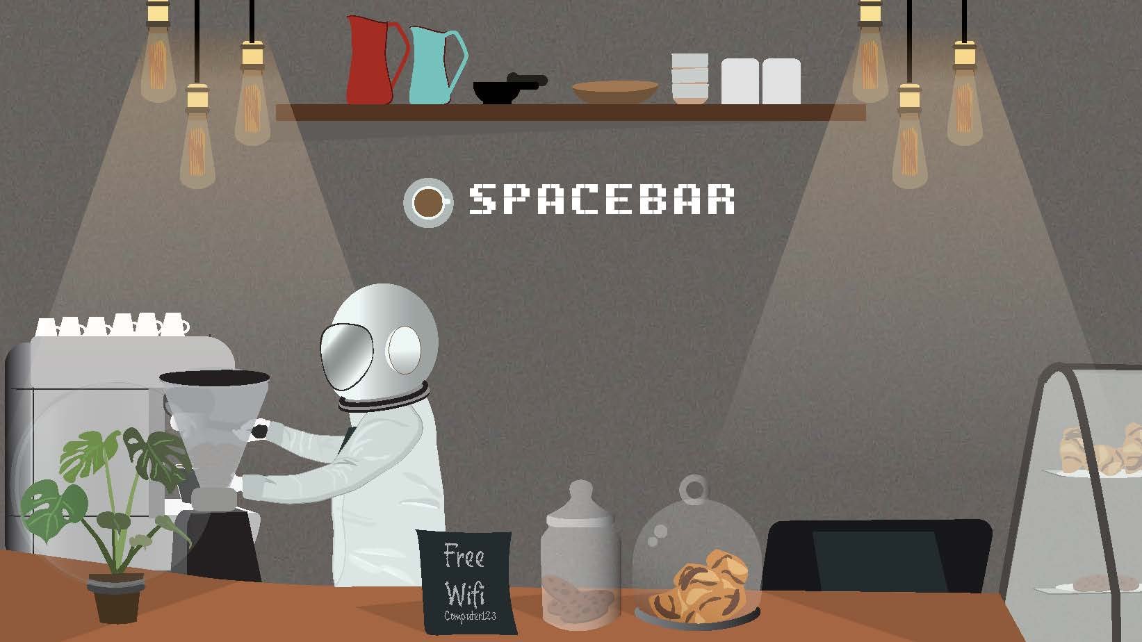
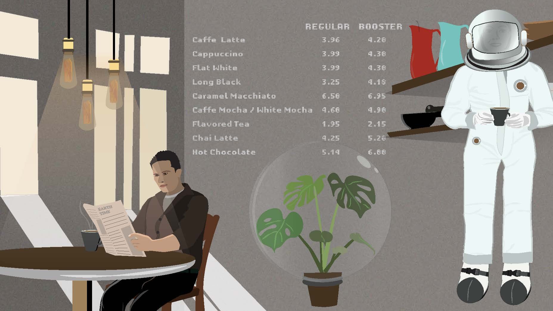
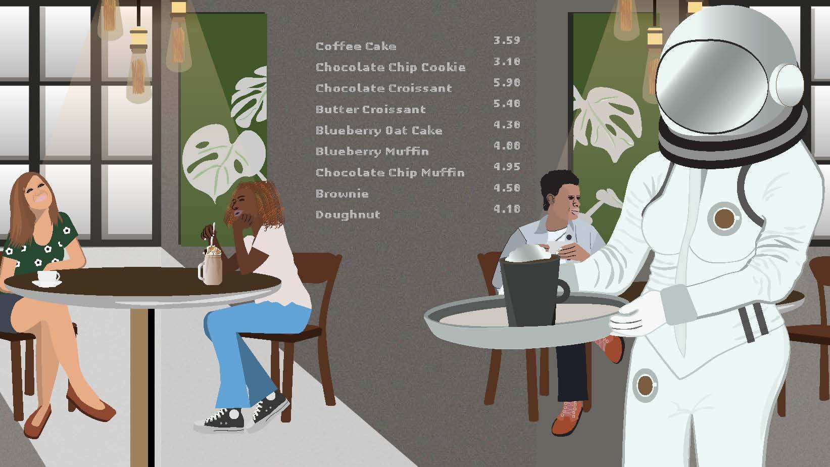
Spacebar is a place very popular amongst Artists and Musicians. I wanted to explore the idea of “space” in its literal sense; out of this world. I also wanted to play on the ideas of spaces between written words; a space of possibilities. Spaces are places that create new opportunities for interaction, innovation, and growth. I wanted the visuals to reflect this in-between place. A place that is real but fantastical at the same time.
Role:
Brand Development
Design and Illustrations
LOGO FORMATION
COLOUR PALETTE

SOME ILLUSTRATED ASSETS
MENU
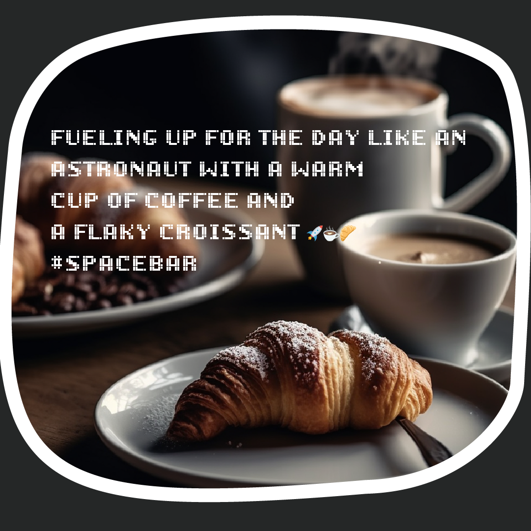
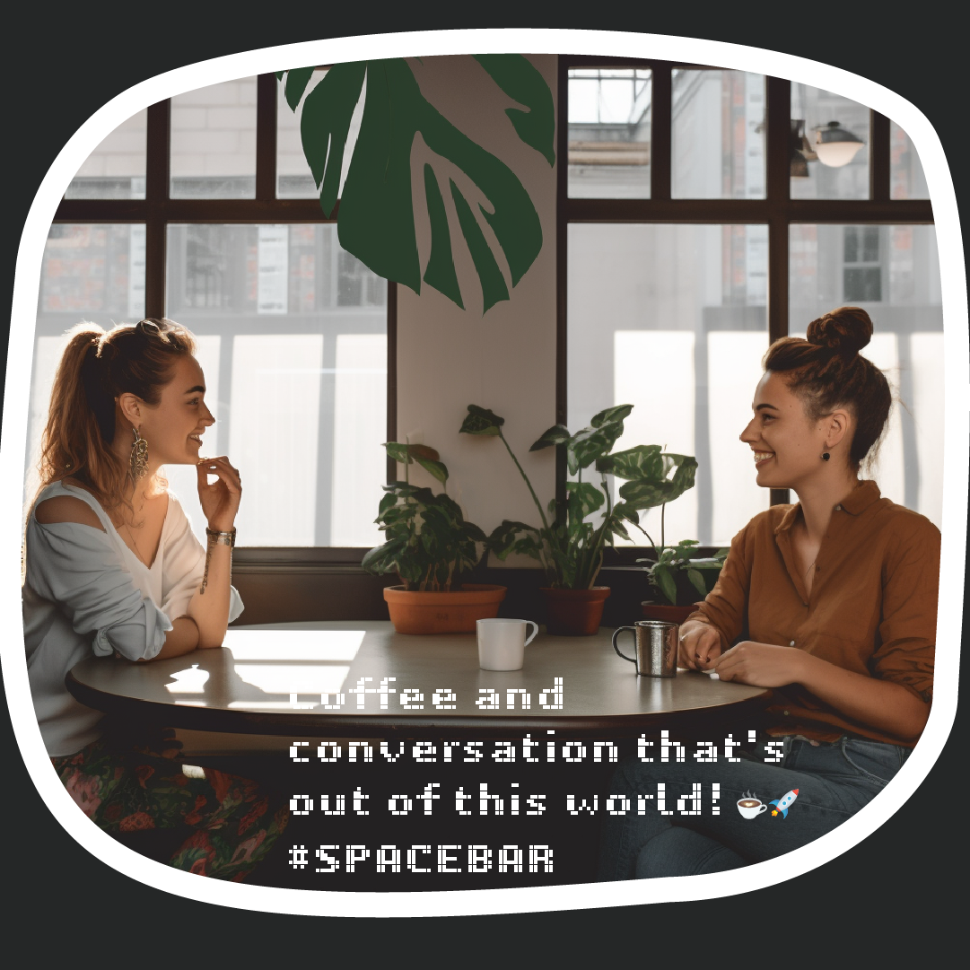
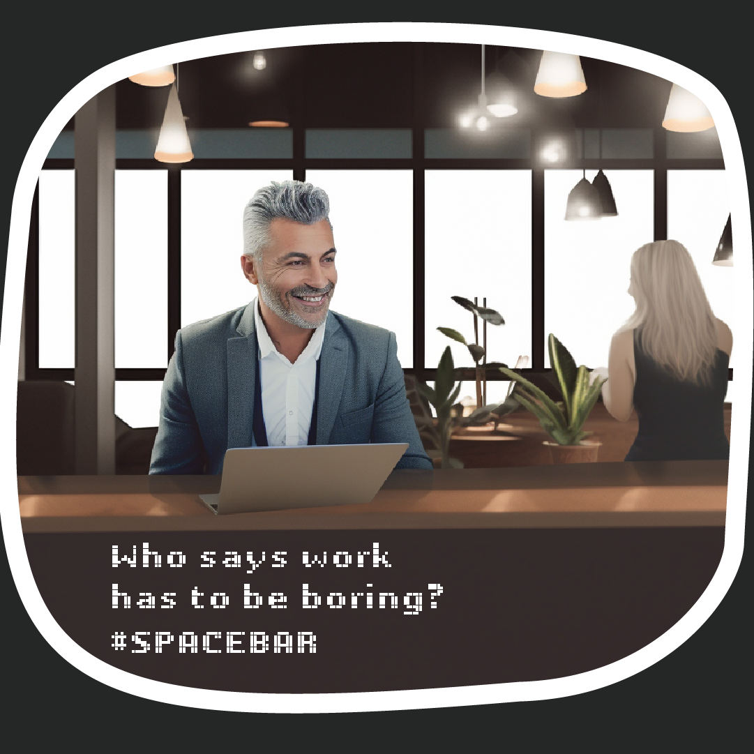
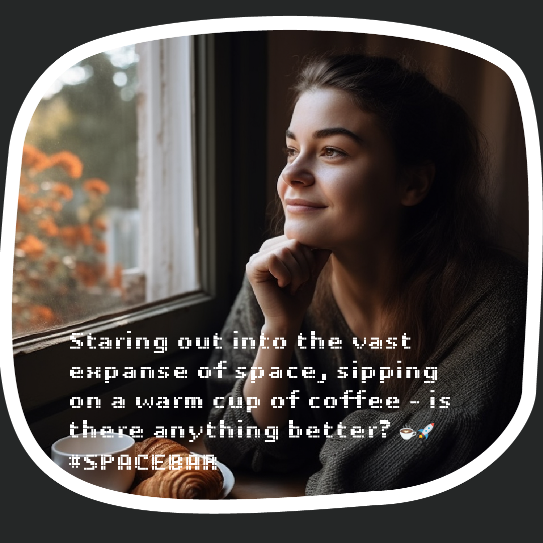
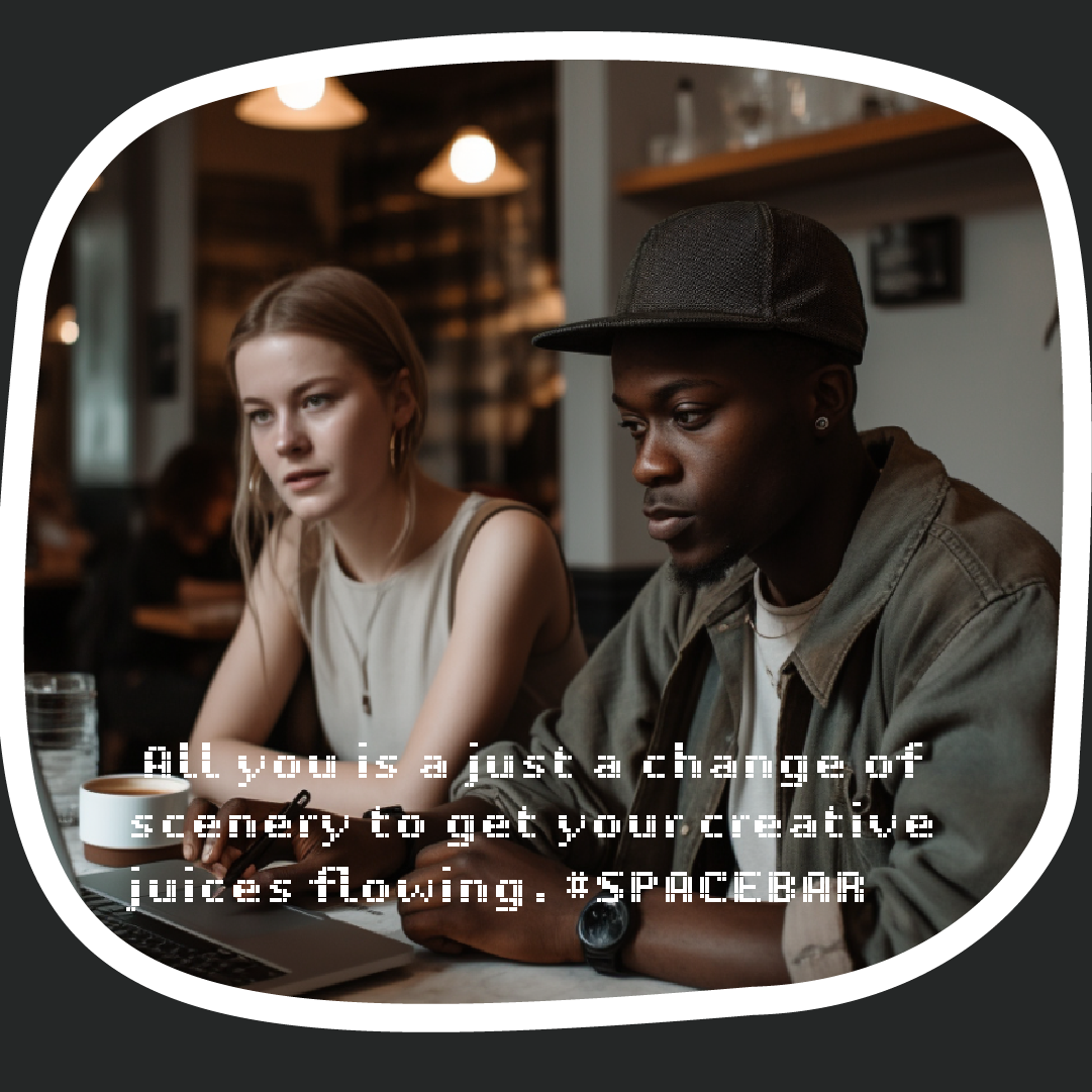
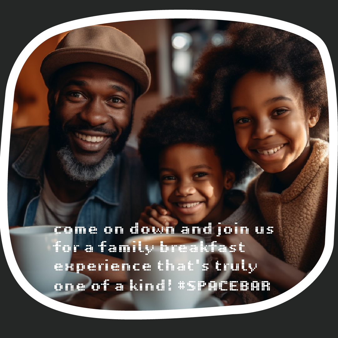
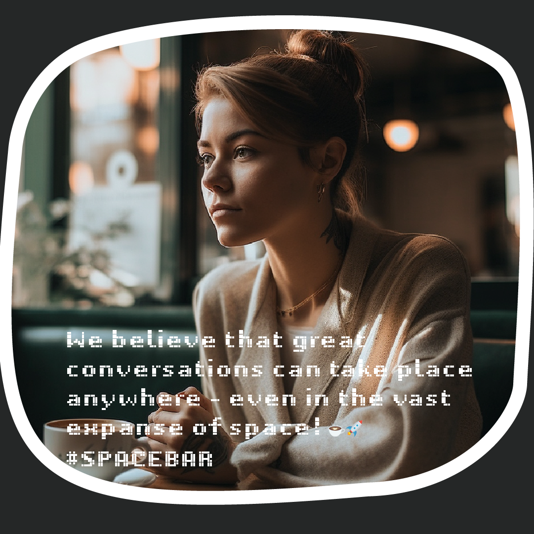
Social Media imagery and captions will be AI generated to align and reinforce the idea of technology and science of the brand. The imagery was generated through Midjourney with the illustrations fed as reference. The captions were generated with ChatGPT

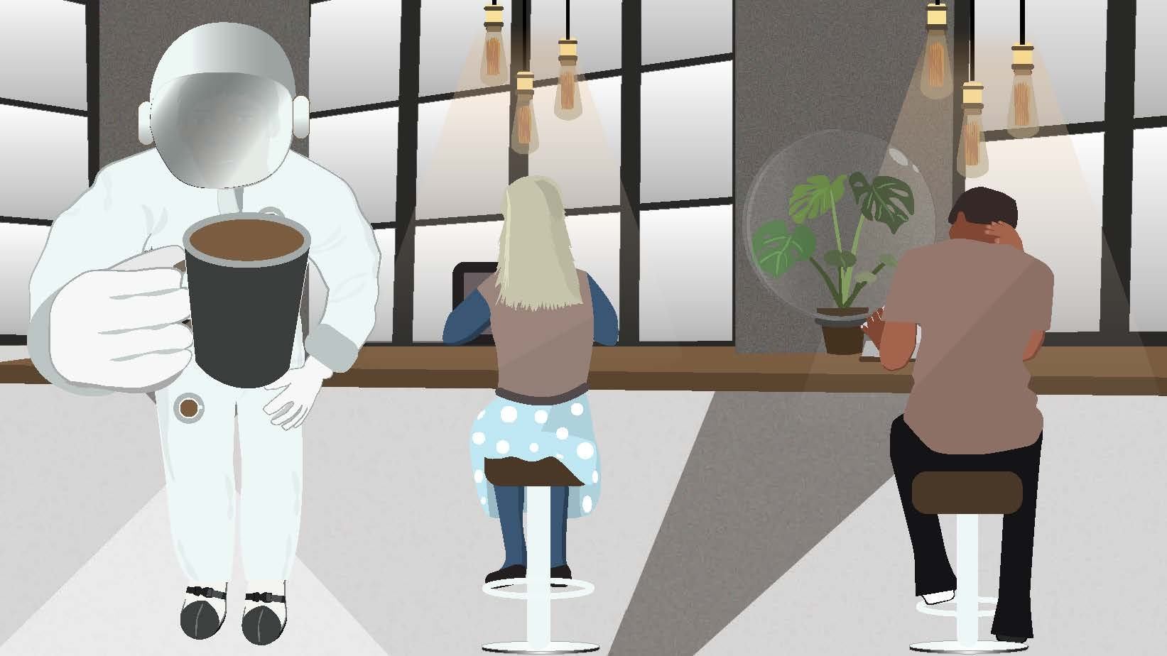
Spacebar is a place very popular amongst Artists and Musicians. I wanted to explore the idea of “space” in its literal sense; out of this world. I also wanted to play on the ideas of spaces between written words; a space of possibilities. Spaces are places that create new opportunities for interaction, innovation, and growth. I wanted the visuals to reflect this in-between place. A place that is real but fantastical as well. I wanted the visuals to convey a feeling of being suspended in between.
I am currently working on a new visual direction. The client wanted to release the assets as we developed the materials.
Role: Design and Illustrations
SOME OF THE ILLUSTRATED ASSETS
PAGES
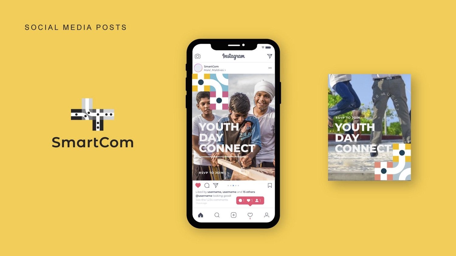
AI-generated imagery of social media posts
All the posts are AI-generated which conceptually aligns with the brand very much. The generated images are prompted to use the illustration to match the colour and feel. The captions are generated through ChatGPT.

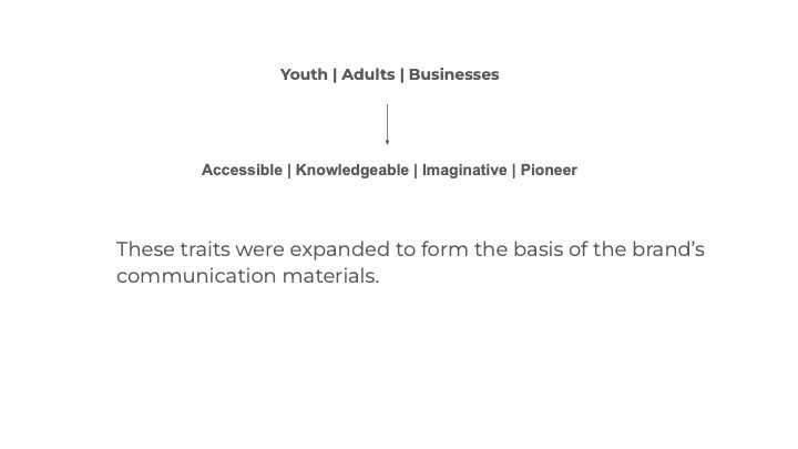
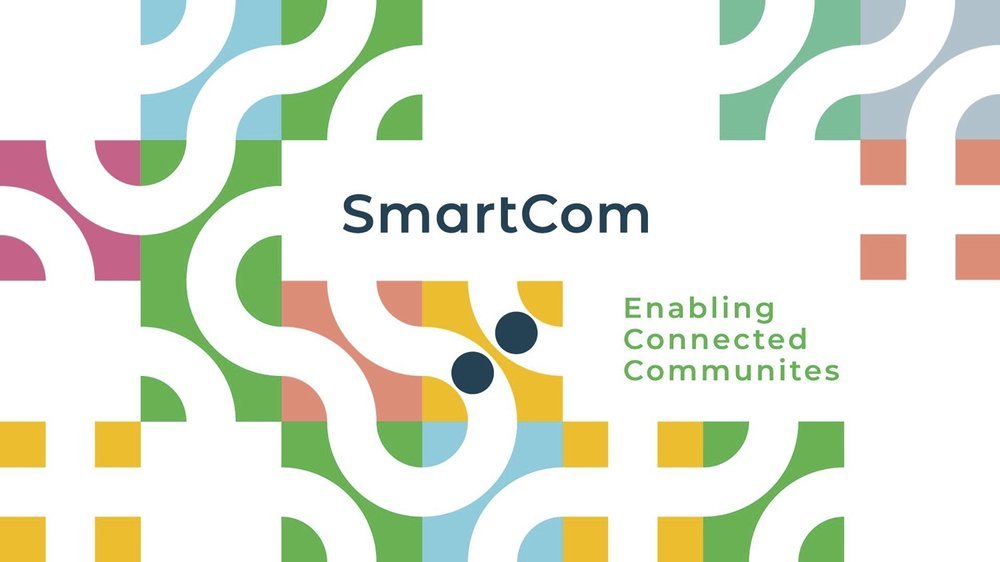
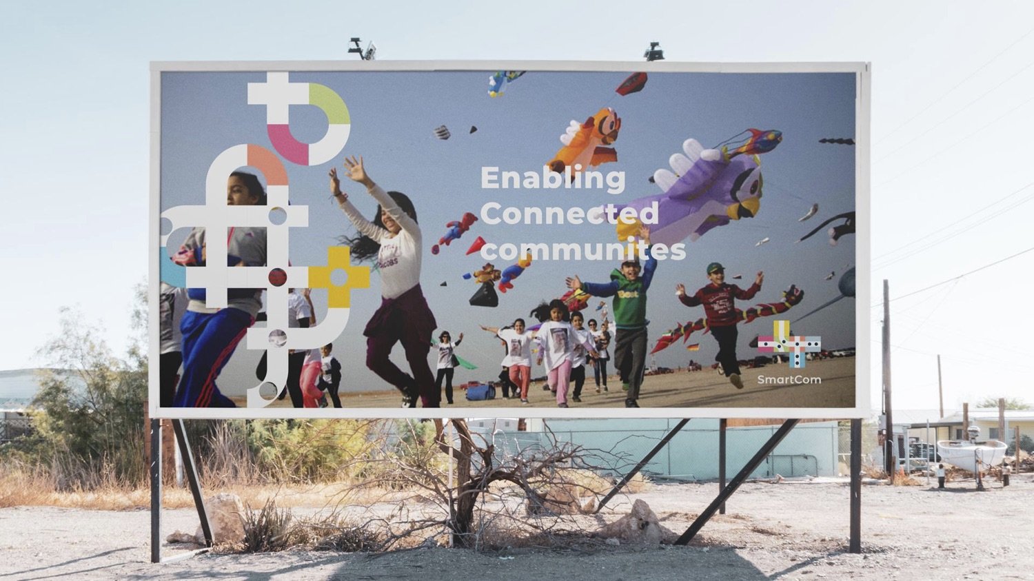
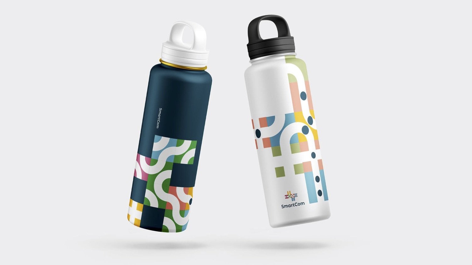
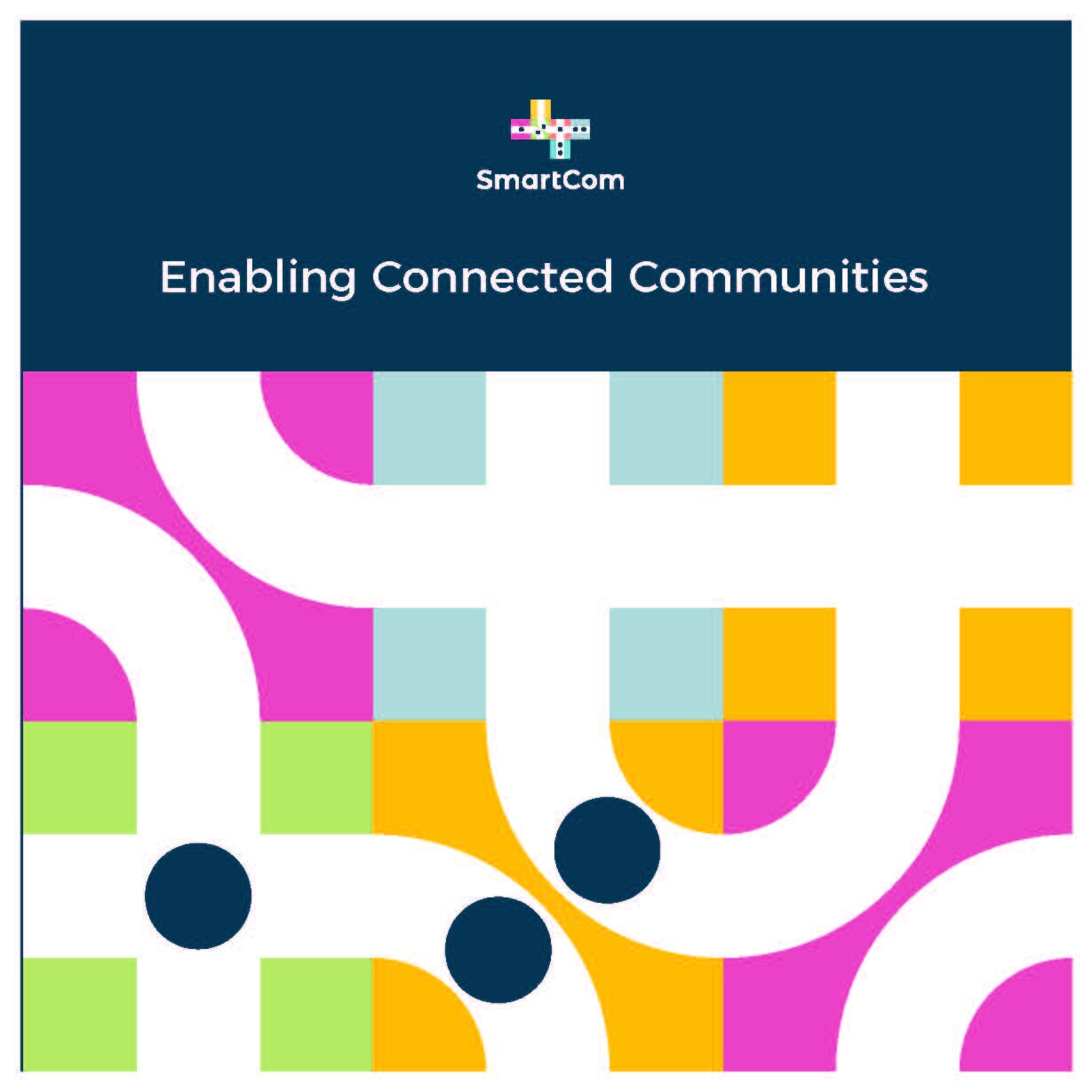
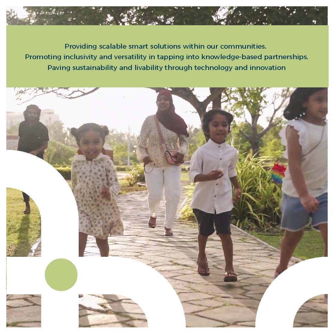
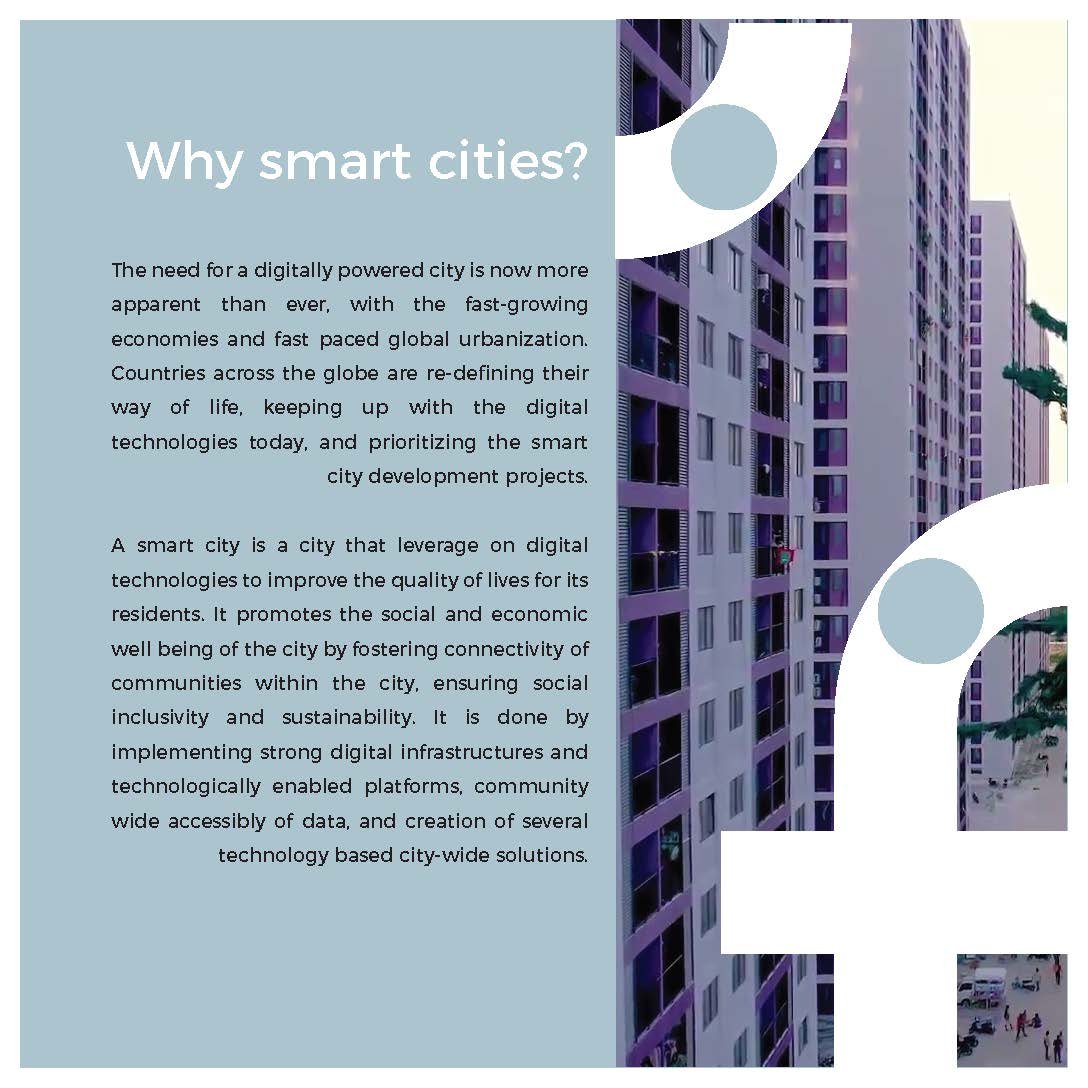
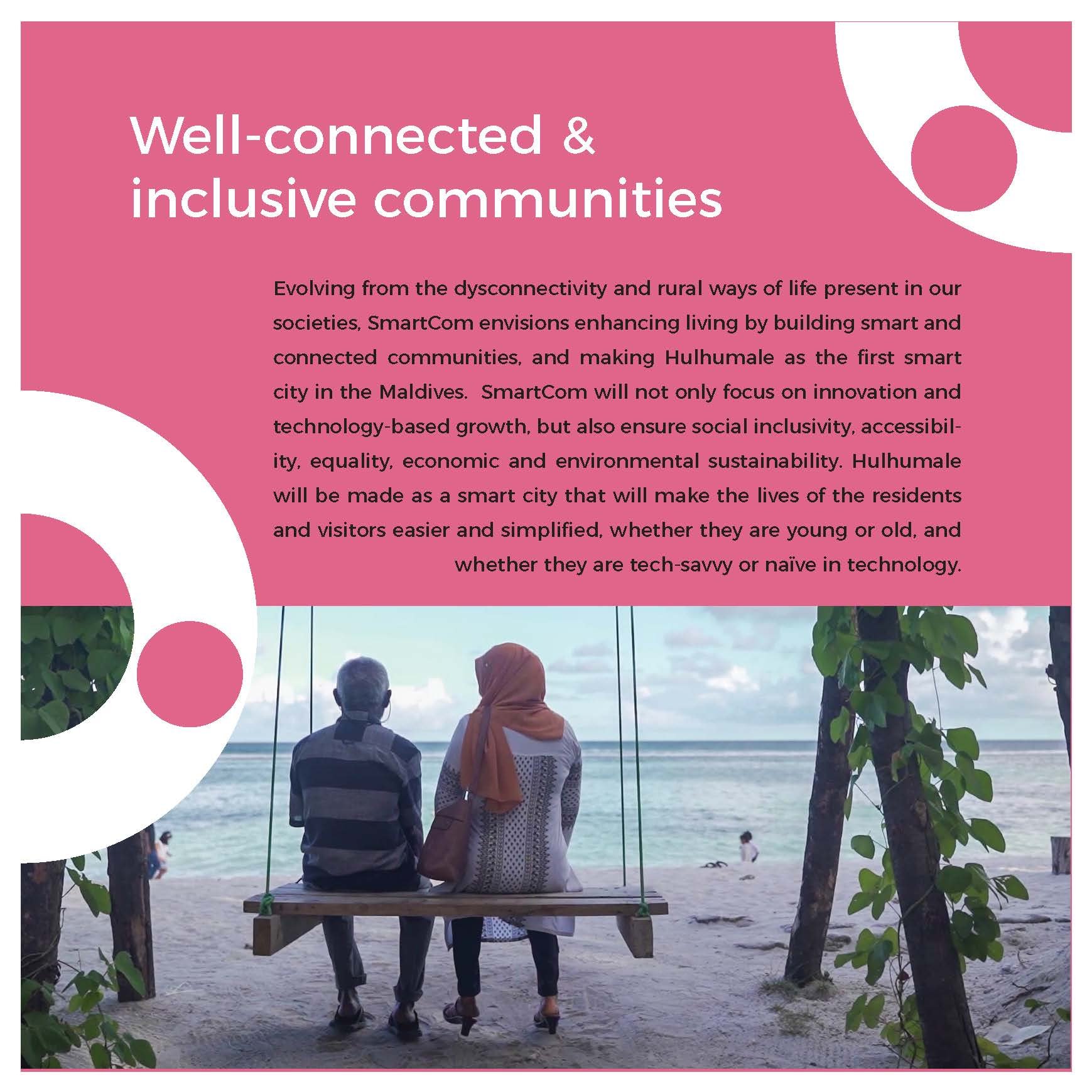
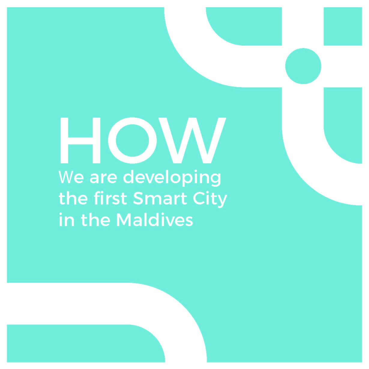
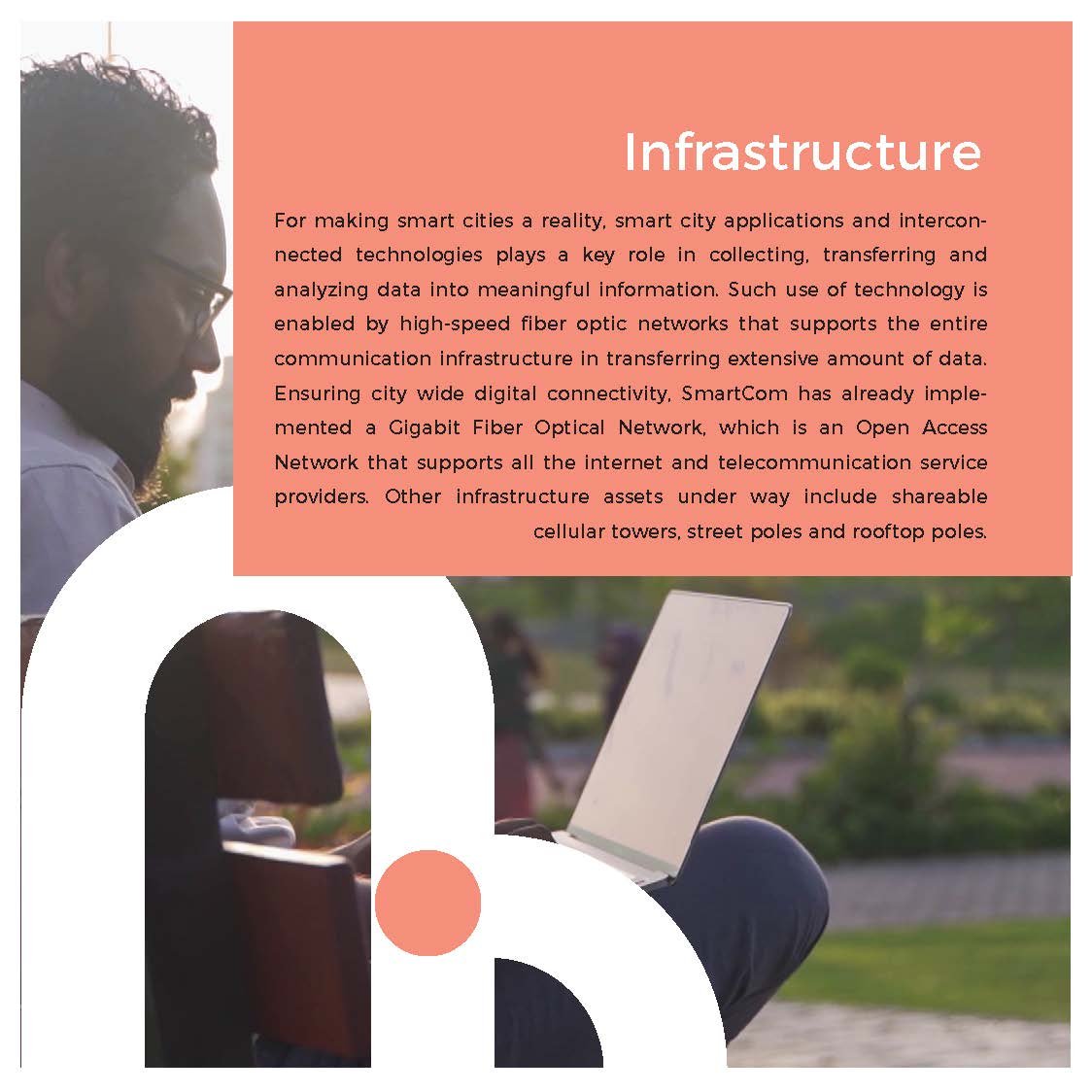
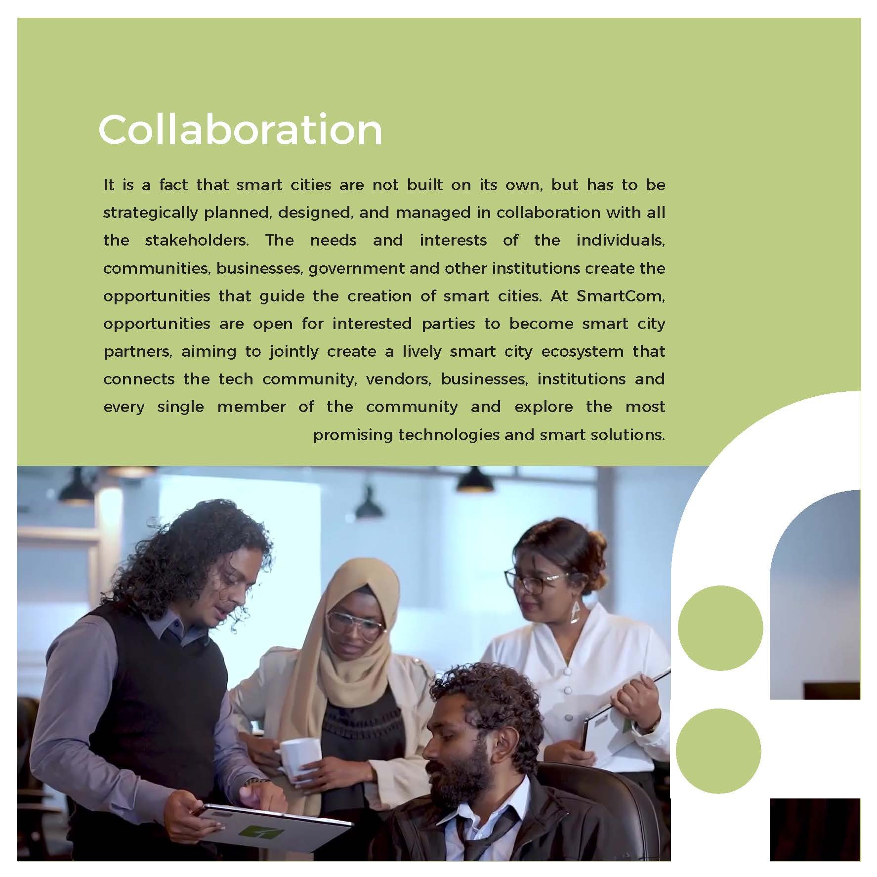
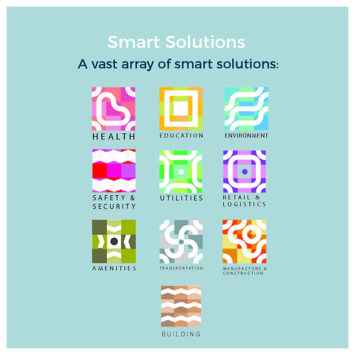
“SmartCom is an easily accessible, high-speed connected network that forms a city-wide community where youth, adults, and corporations can find sustainable solutions while also having the ability to develop and pursue innovative, scalable, and limitless solutions to challenges.”
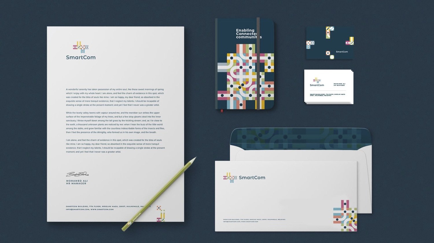
I was tasked with creating the brand development for a smart city network service provider based in the Maldives. My responsibilities included conducting research, segmenting the audience, and leading a remote team to develop the final artwork.
My Role: Branding, Strategy & Creative Directing
Key Designer: Ashward
Designer: Sithna
Motiongraphics: Imad (Dami)
Agency: Marcomms
Excerpts from the brand development document
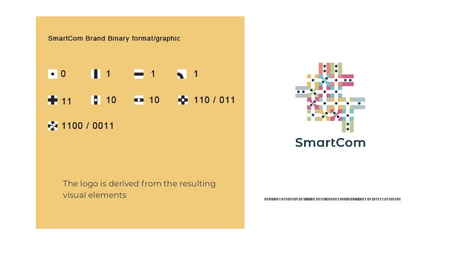
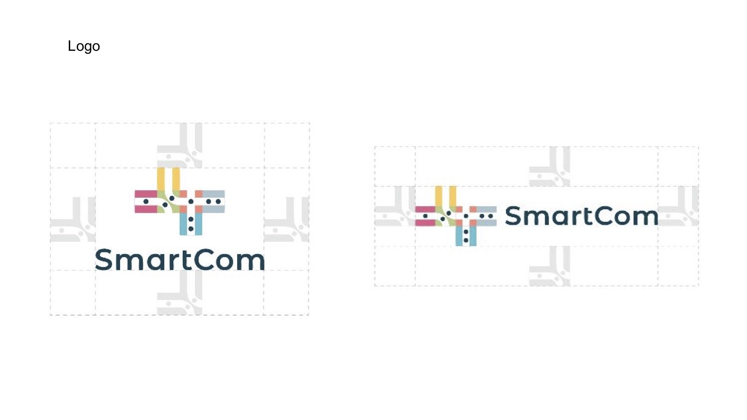
LOGO DERIVATION
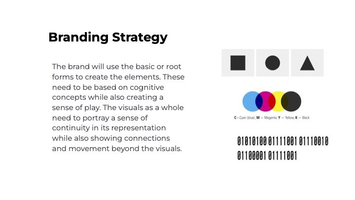
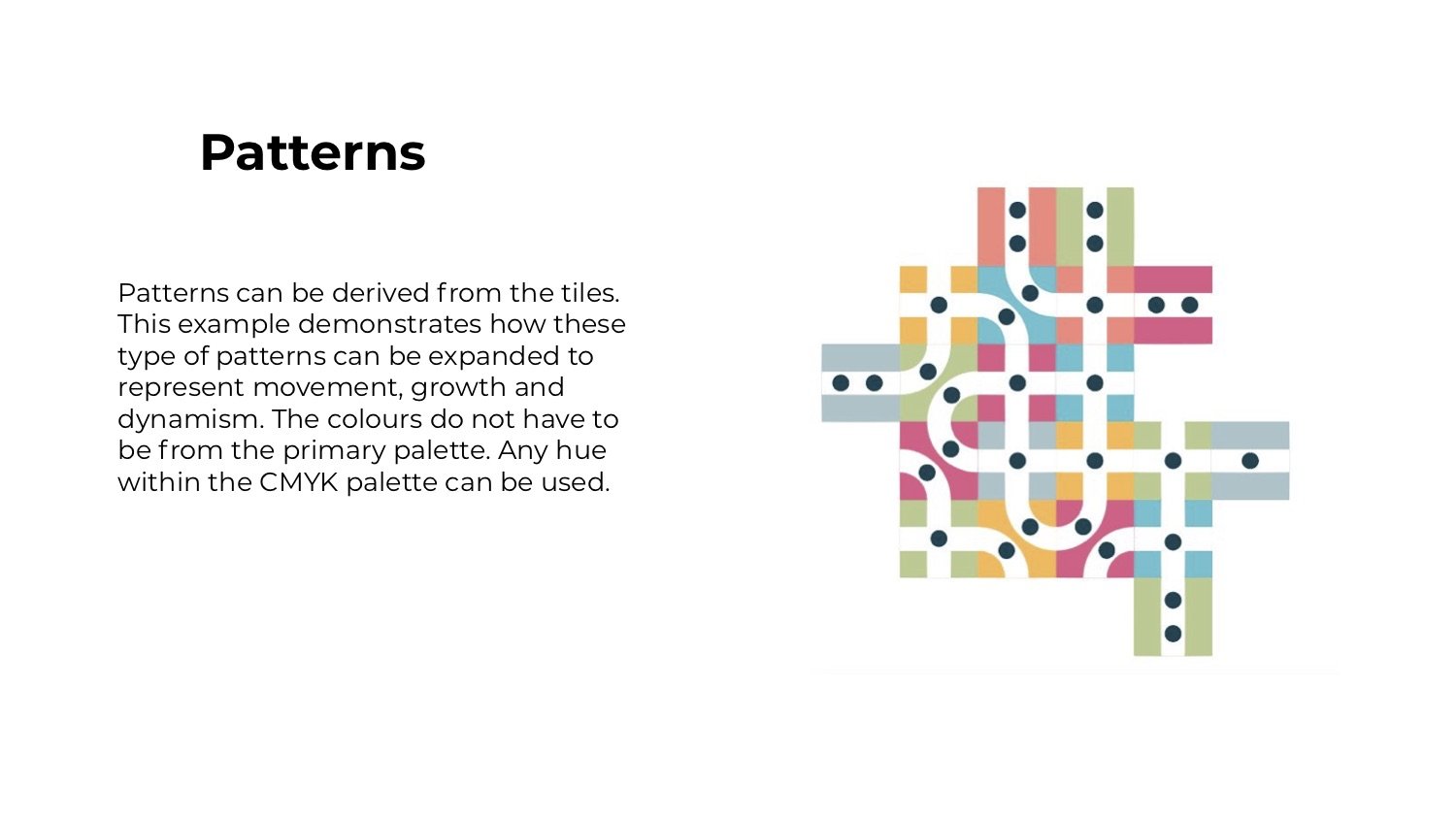
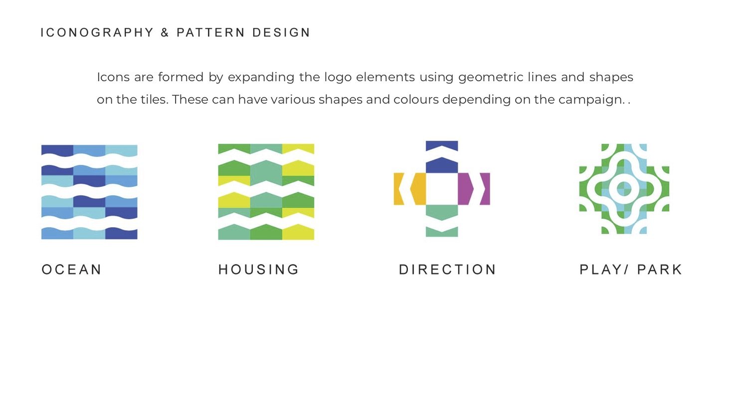
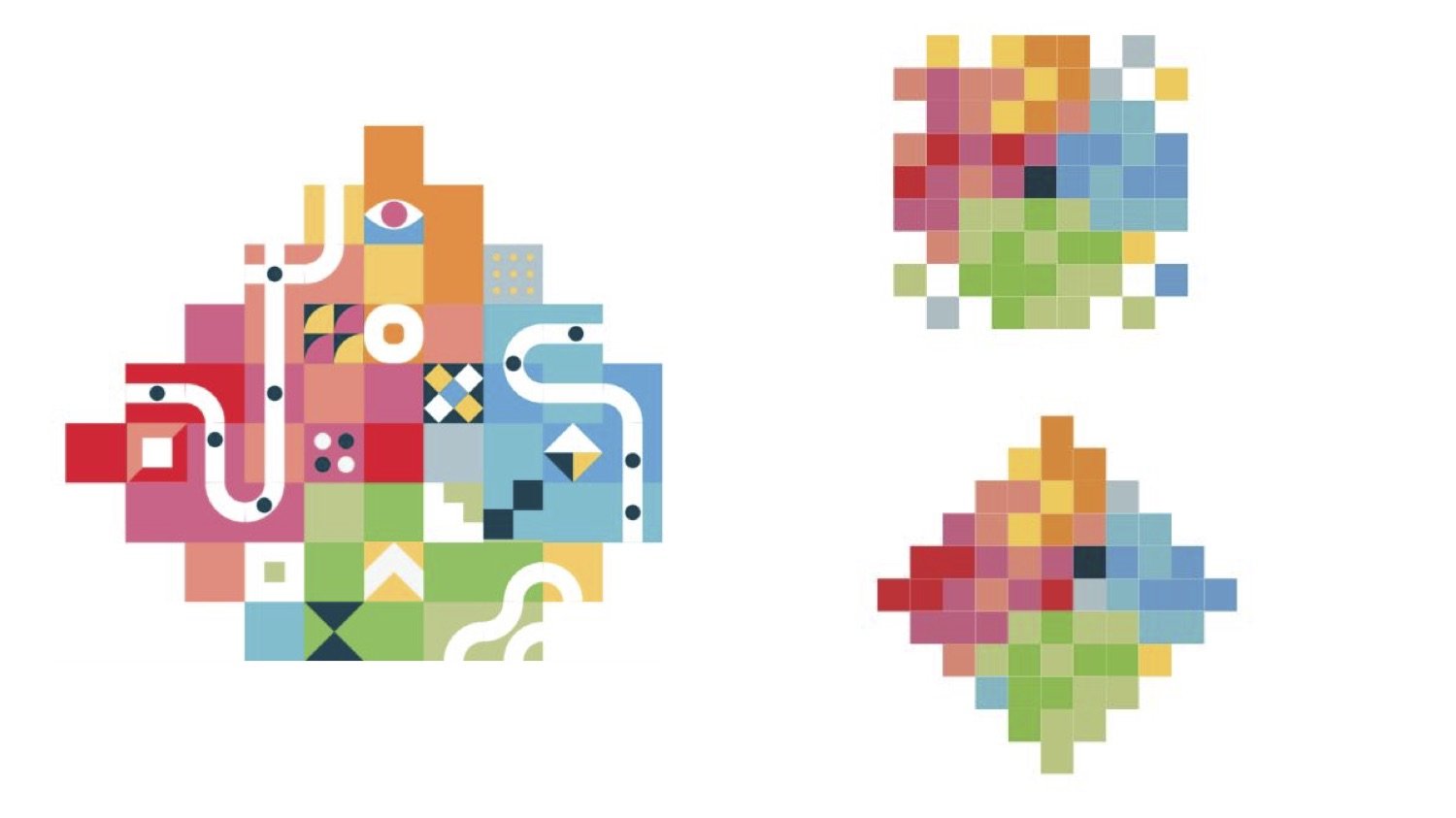
I wanted to highlight the connections; between the inhabitants of a place and their larger communities. I derived the logo by converting the name “SmartCom” to binary format and using the resulting 1’s and 0’s as a starting point. These 1’s and 0’s are represented by dots and pathways. Materials viewed from a distance are intended to give a sense of a city.
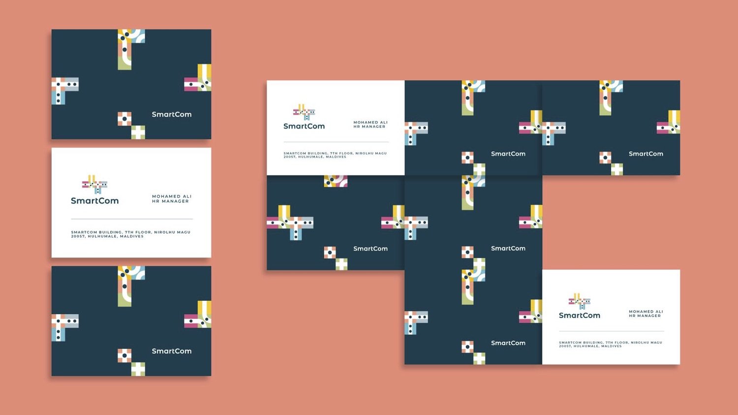
Excerpts from the brand guide.
NEWSLETTER


motion graphics: Ahmed Imad (Dami)
Color pallet for the campaign
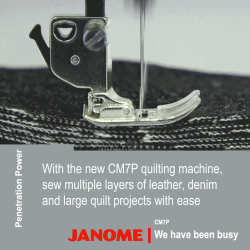
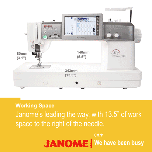
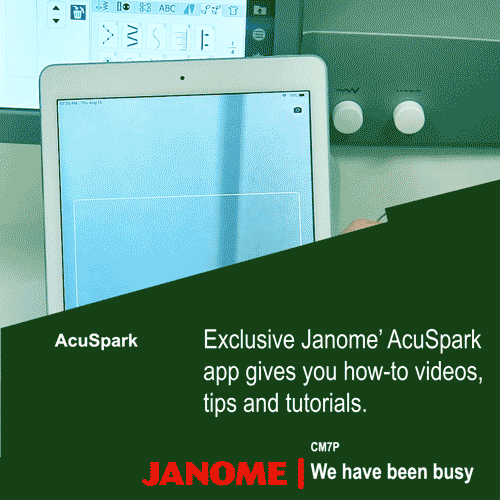
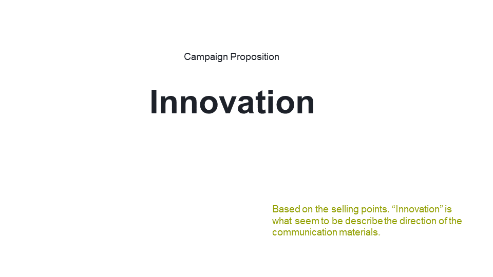
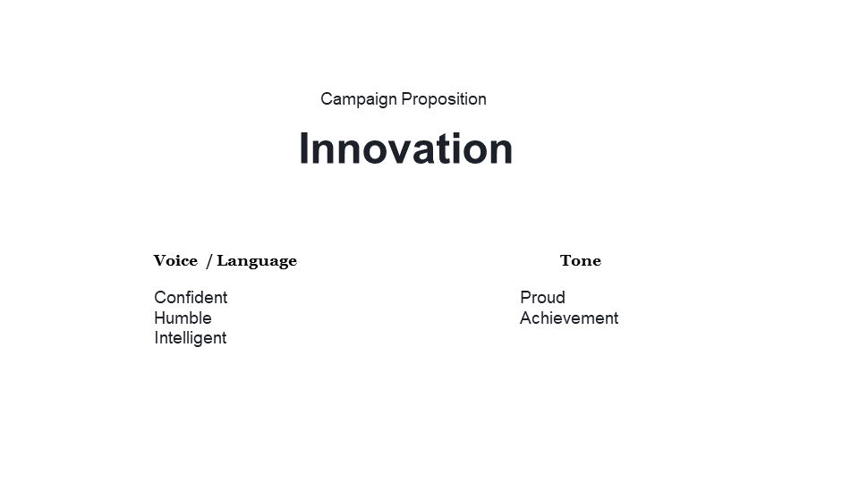
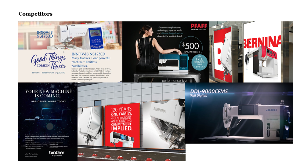
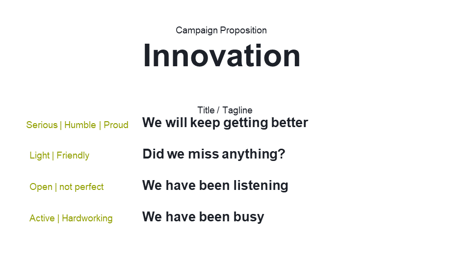
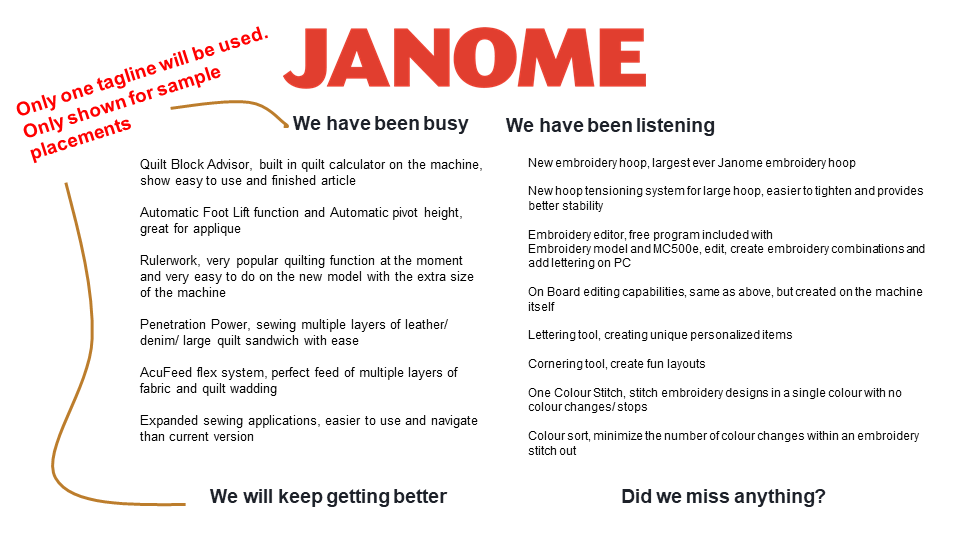
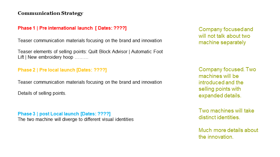
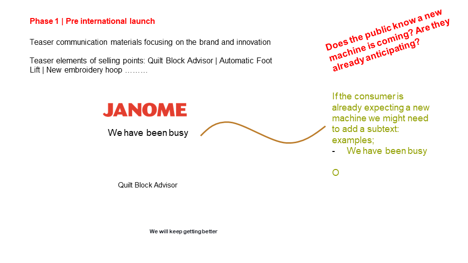
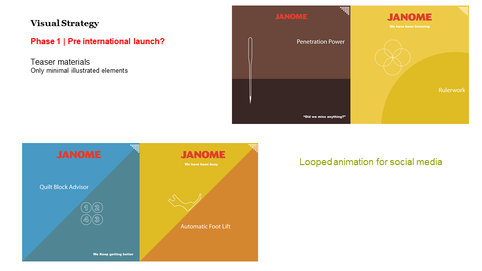
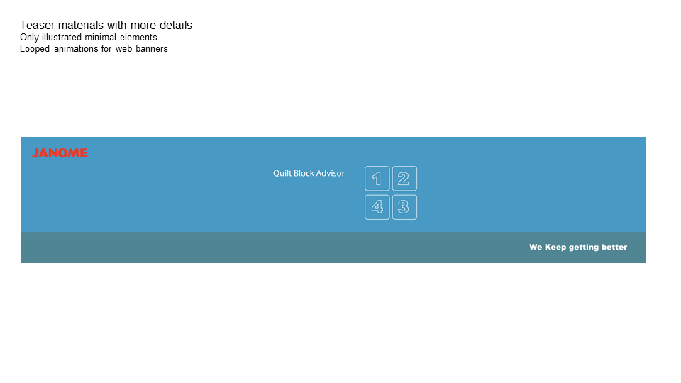
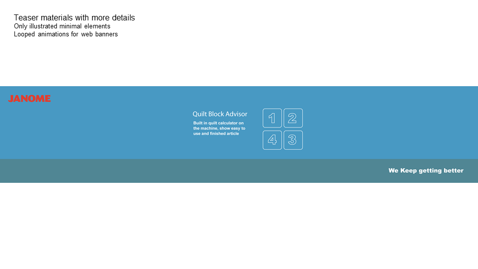
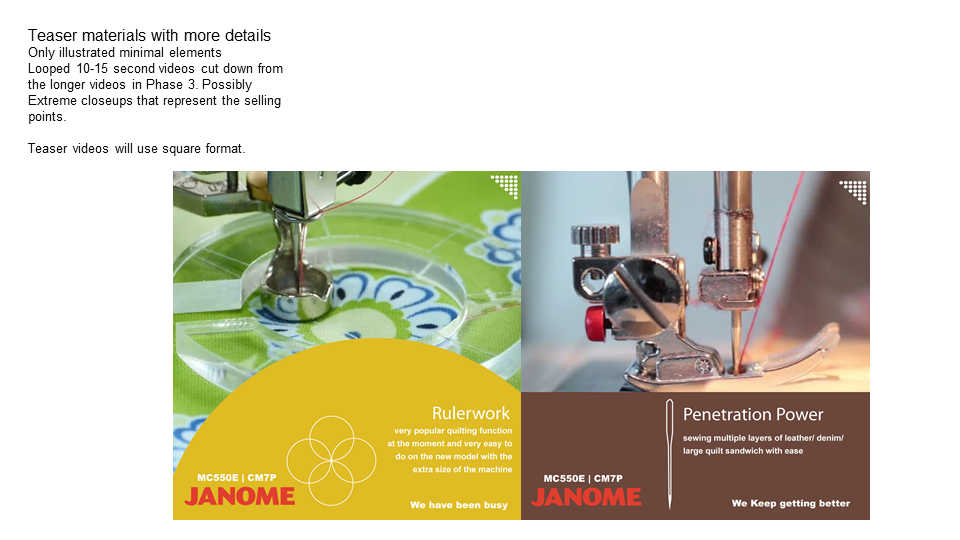
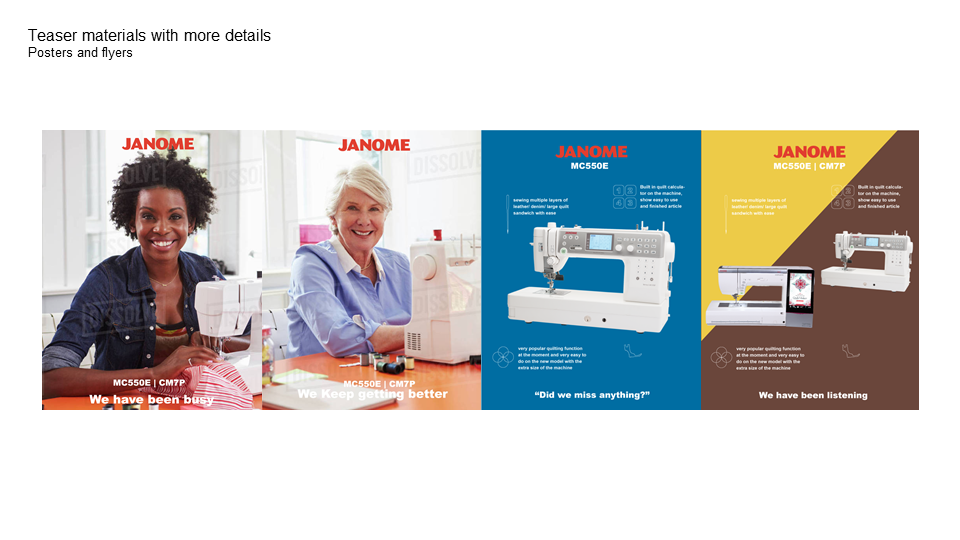
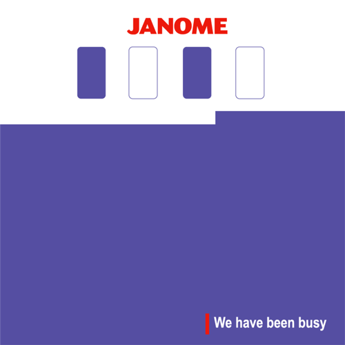
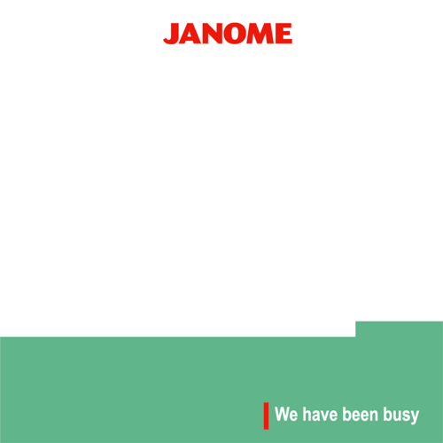
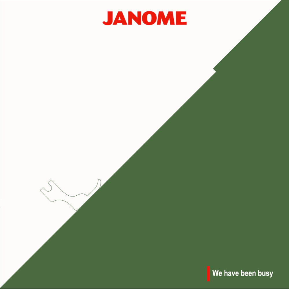
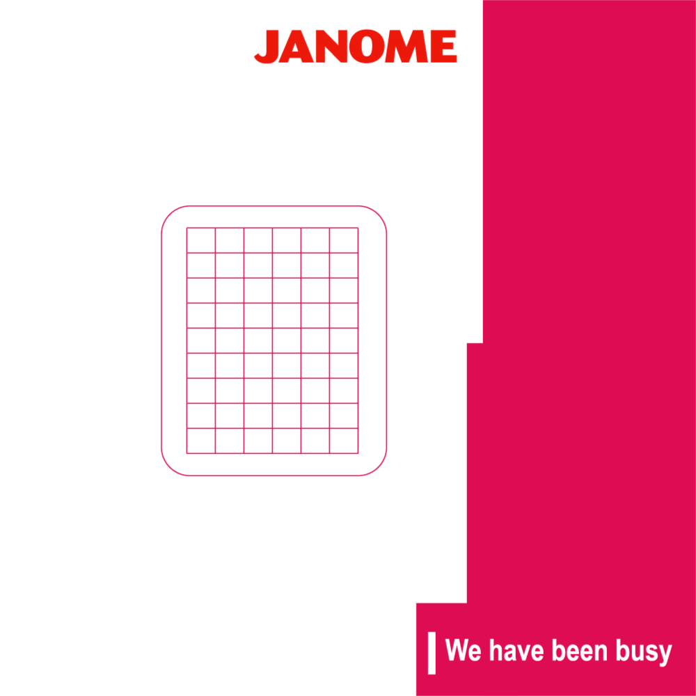
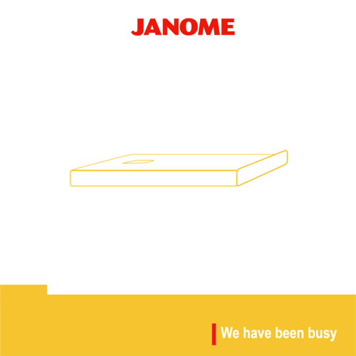
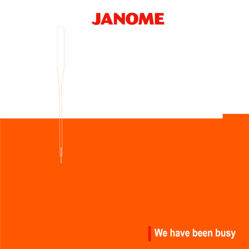
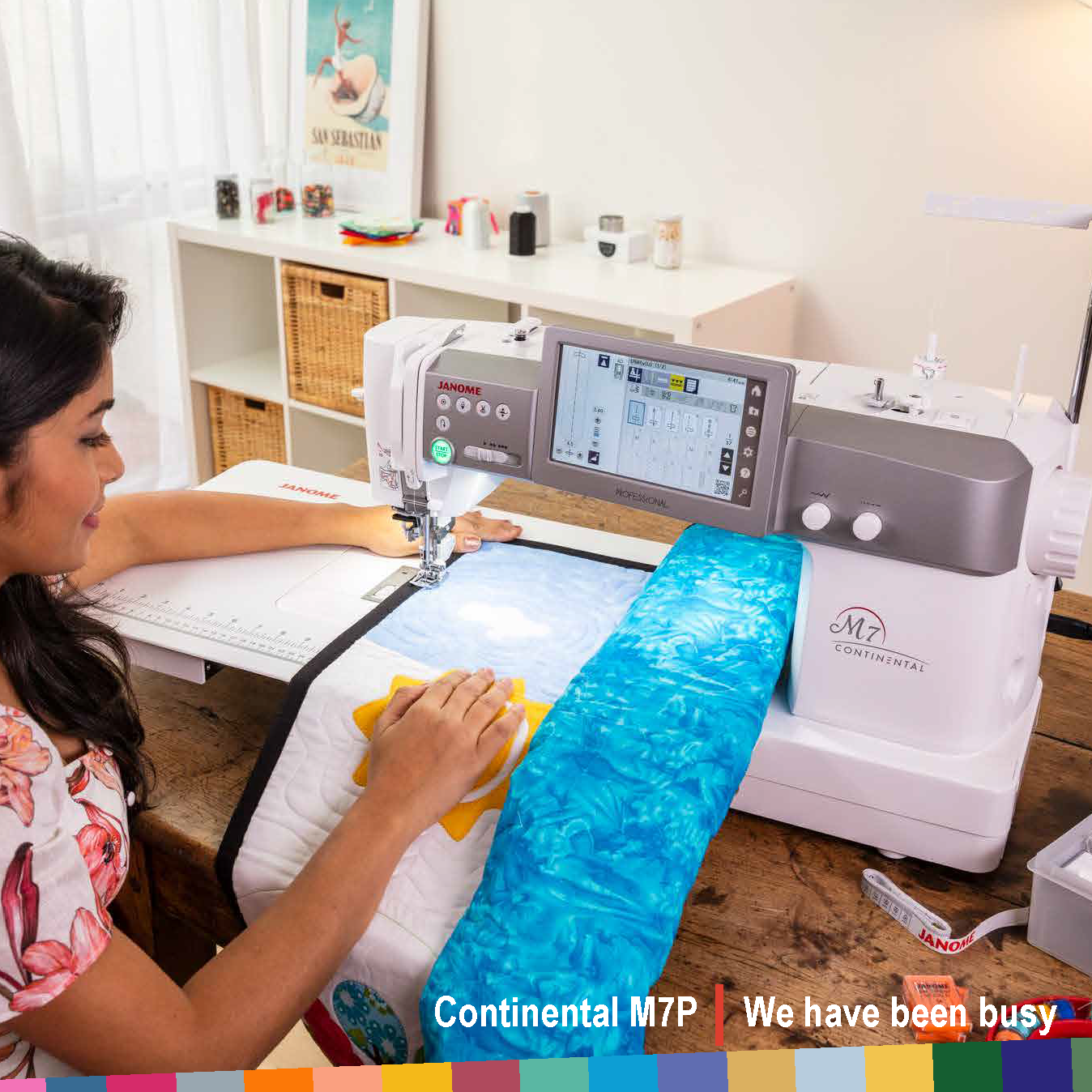
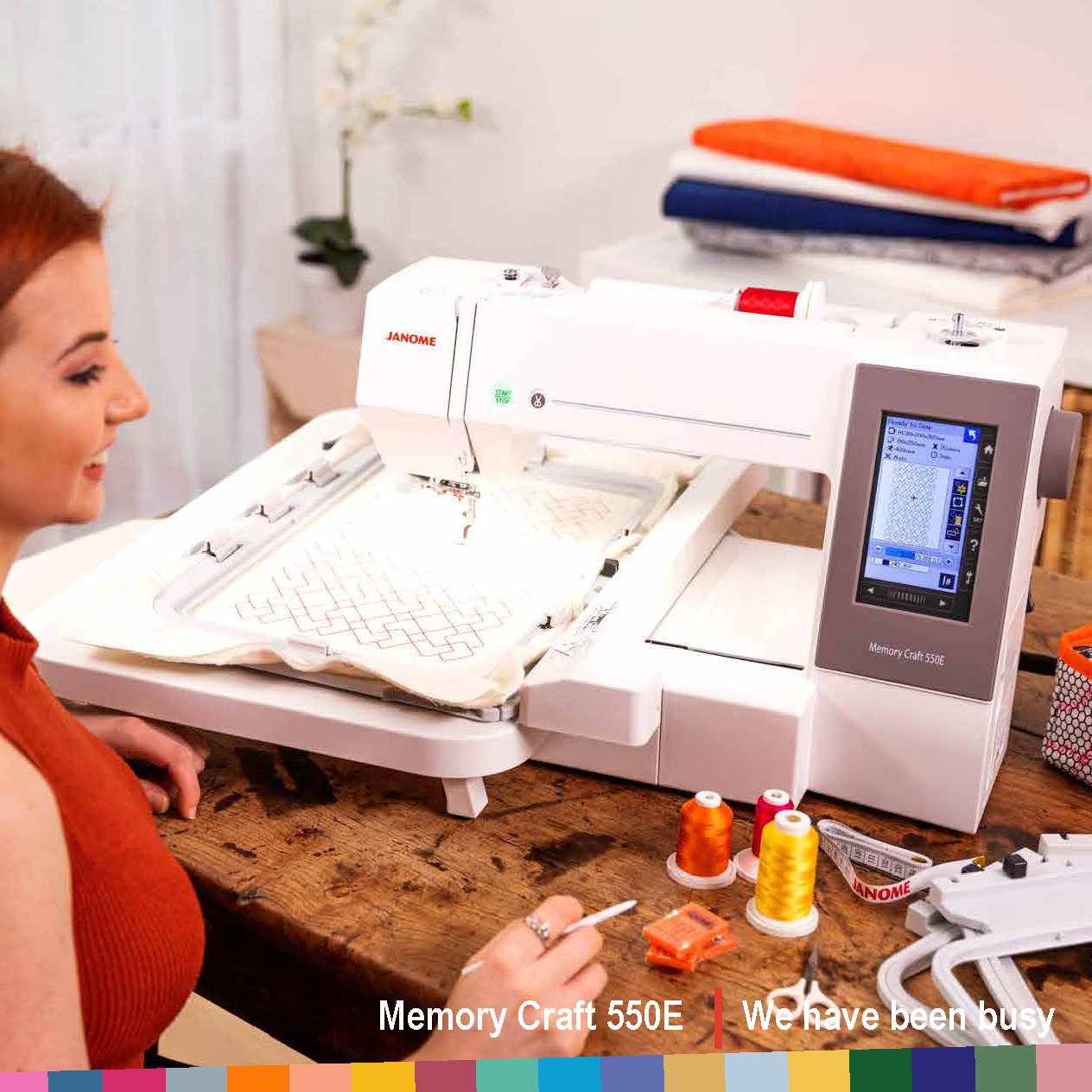
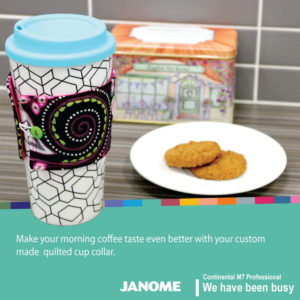
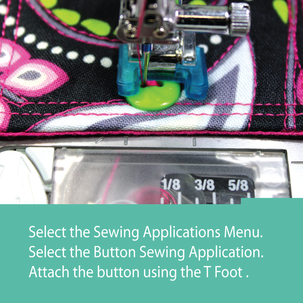
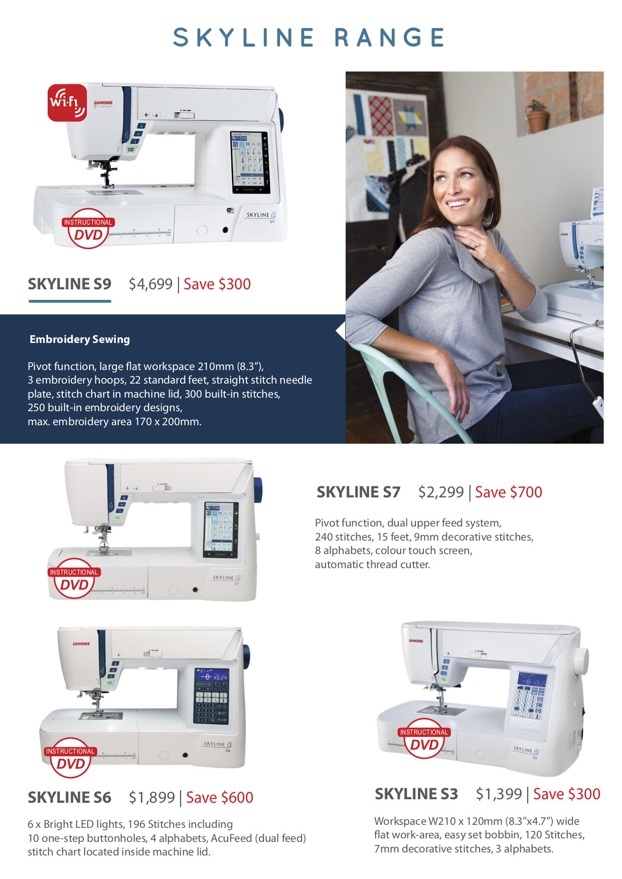
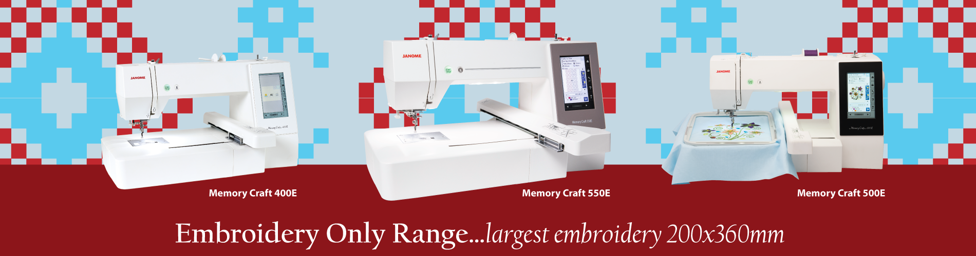
The aim of this campaign was to introduce two new machines by creating a product launch strategy that was divided into three phases: pre-launch, launch, and post-launch. The strategy involved developing relevant materials for each phase with the objective of prompting user curiosity and hinting about the upcoming features of the new machines.
My Role: Concept Development, Design and Motiongraphics
Position & Company: Graphic Designer, Janome Australia
Teaser Motiongraphics assets
Post Launch assets
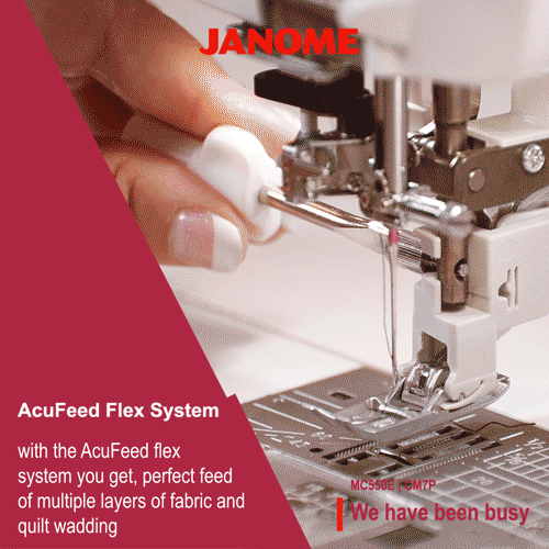
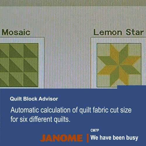
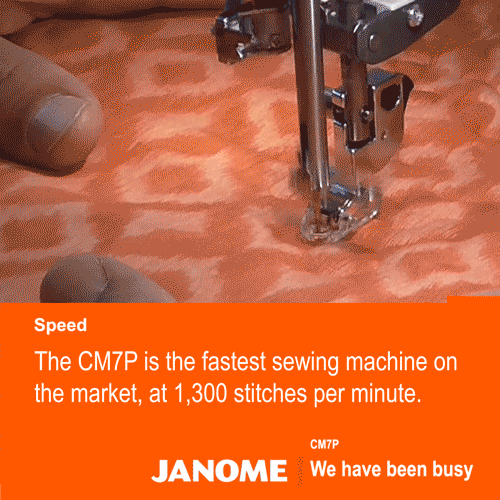
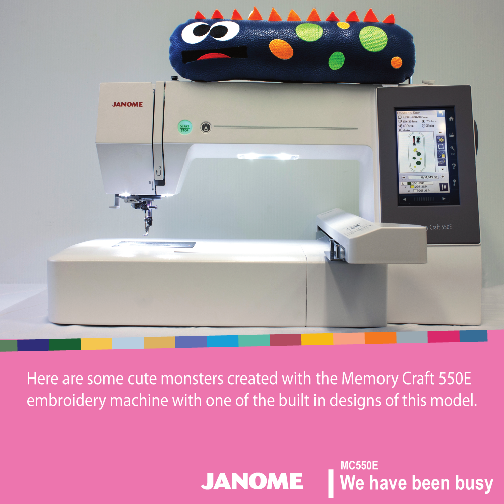
For the final phase, we developed small projects or tutorials that users can create using the new machines.


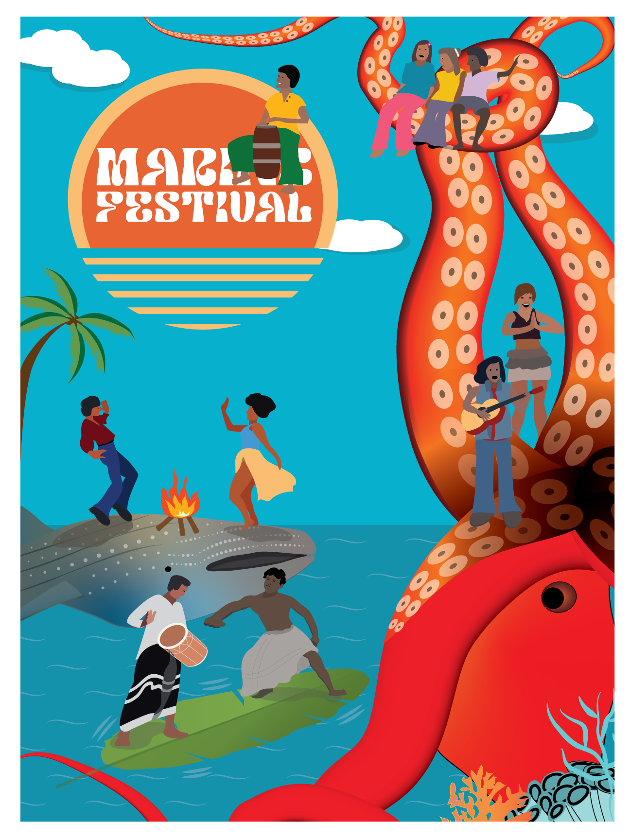
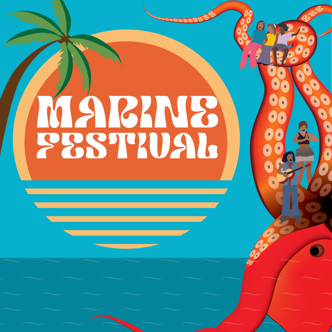
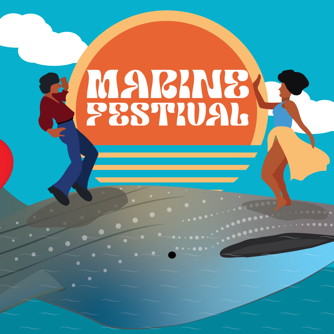
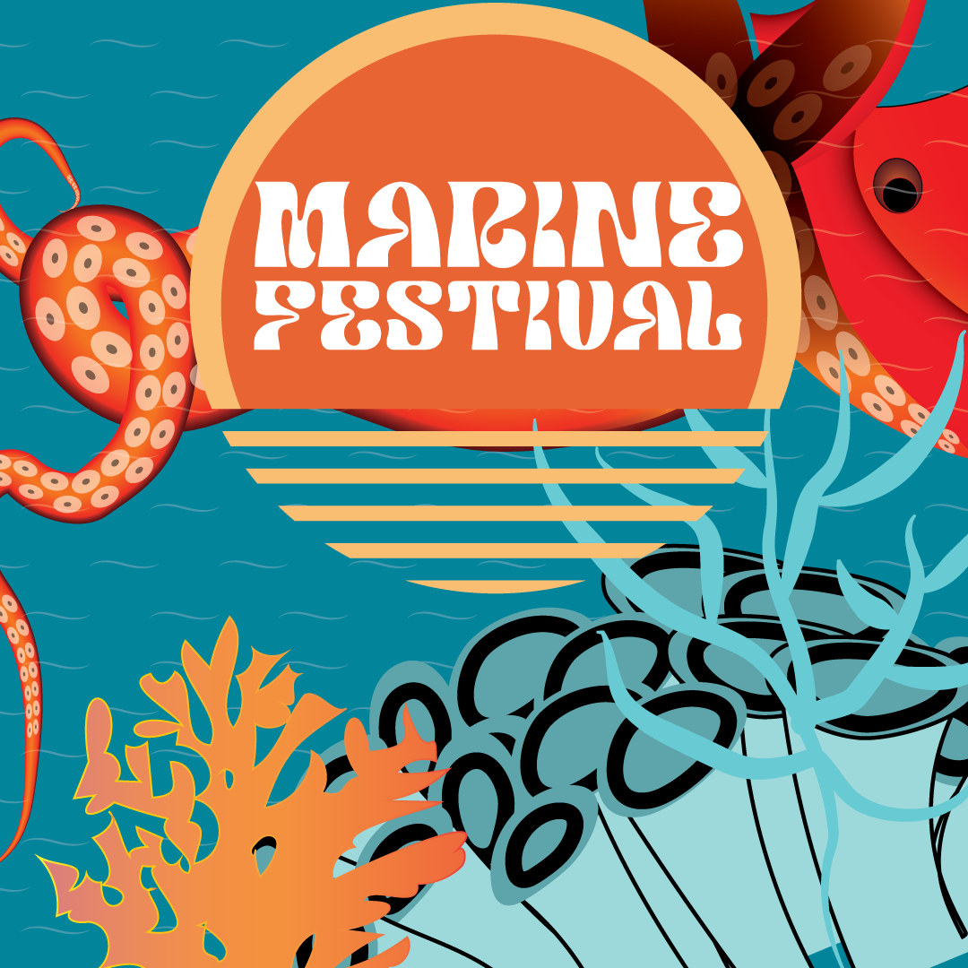
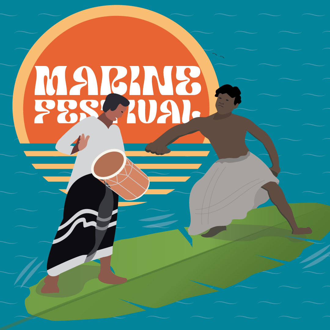
I am currently working on developing posters for the inaugural Marine festival, scheduled to take place in December 2023. As part of my role, I am responsible for determining the visual direction of the project, and I have decided to adopt a retro theme. Given that the festival's primary sponsors come from the tourism sector, who appear to have a fondness for the past, I aim to appeal to their nostalgia in the hopes of securing their partnership with the client.
ROLE: Illustrations and Design


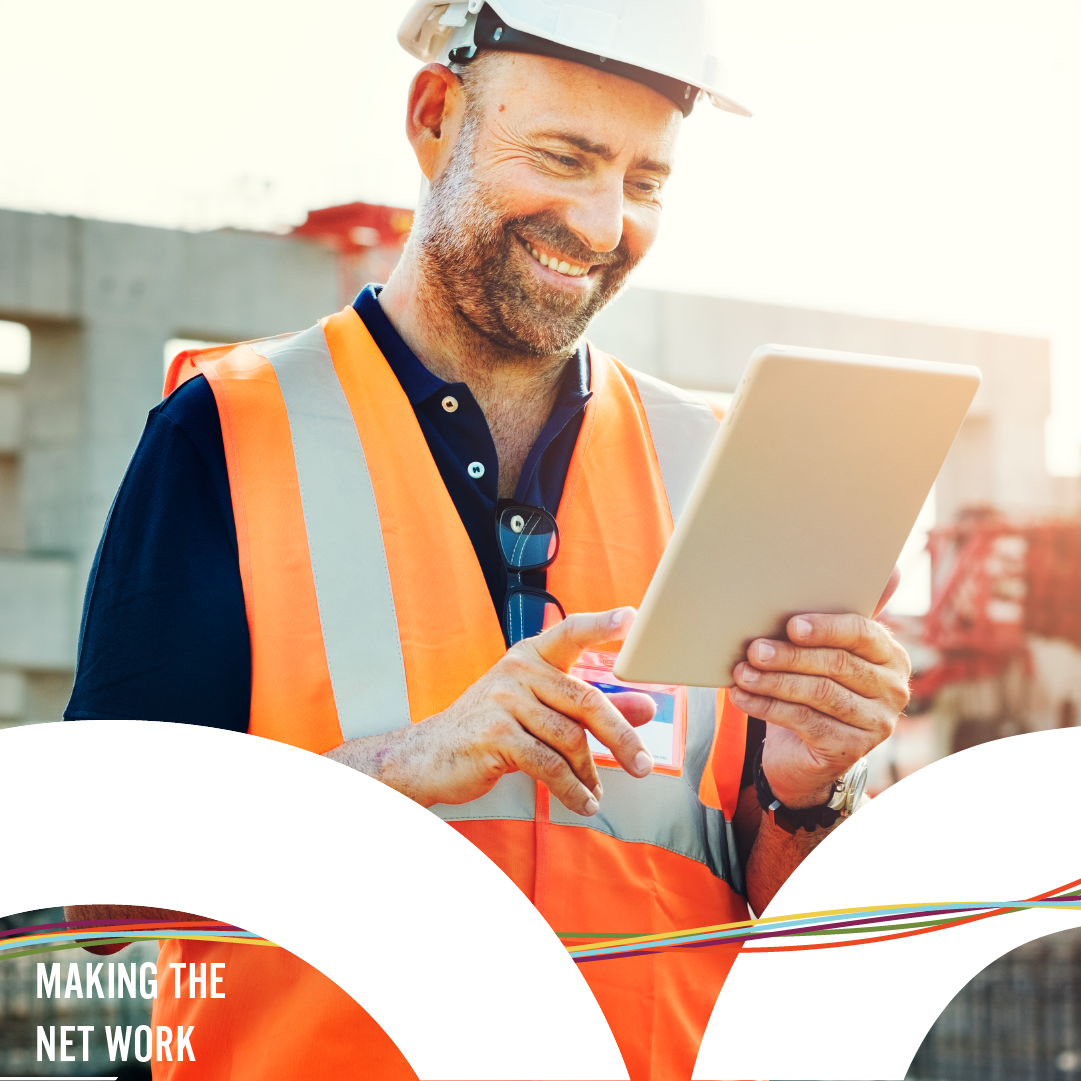
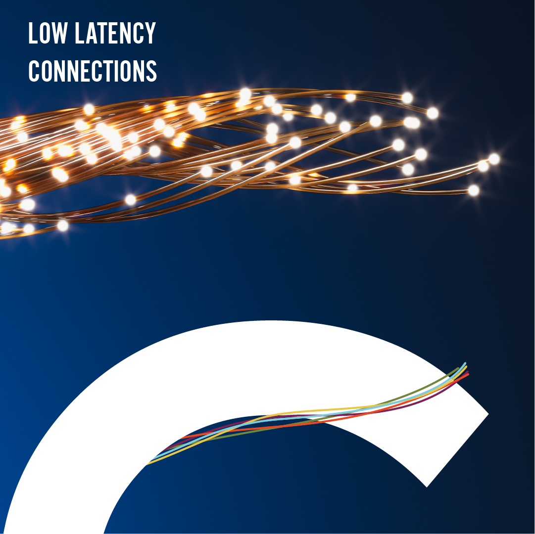
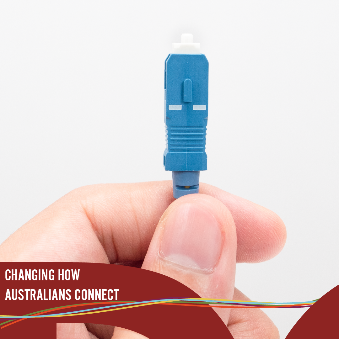
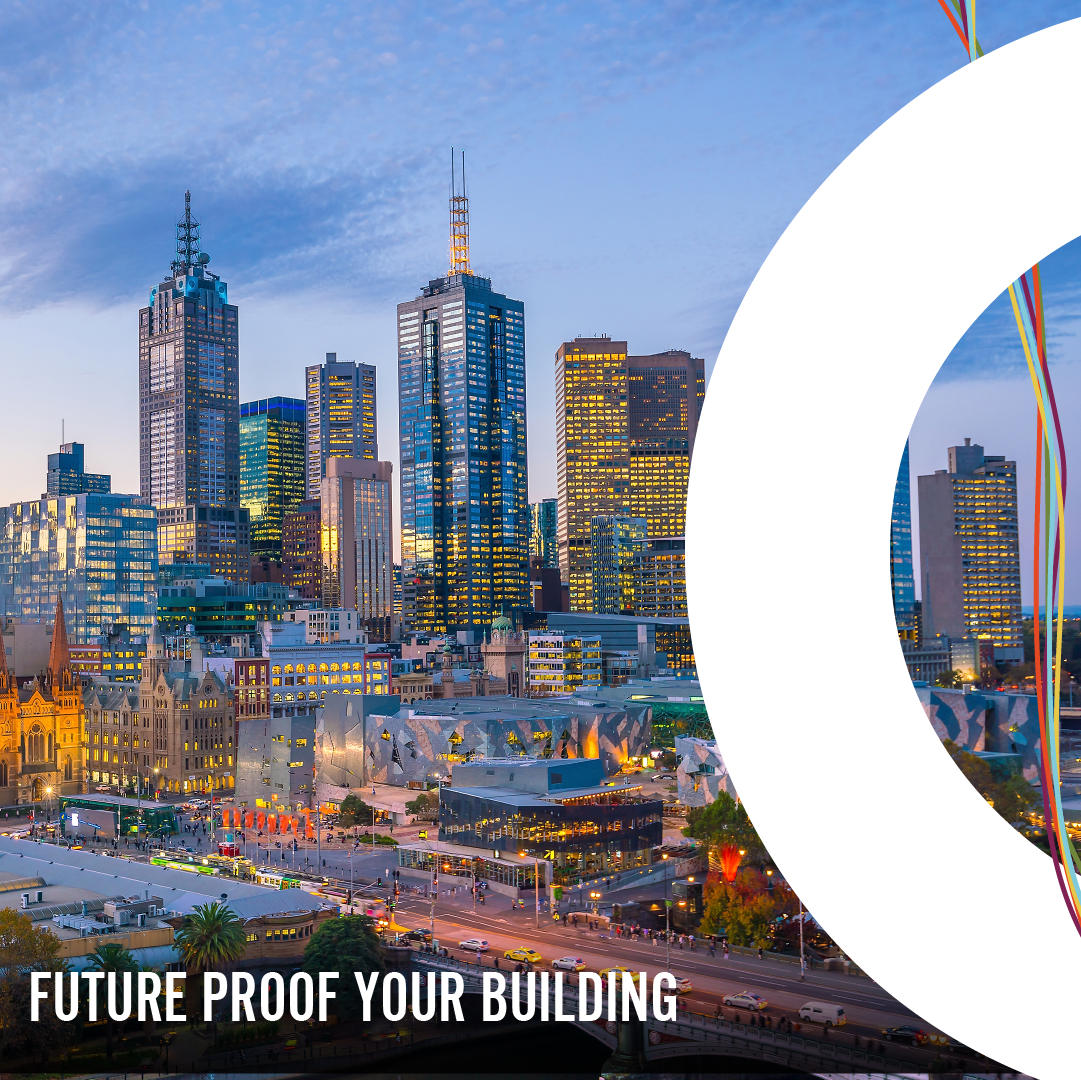
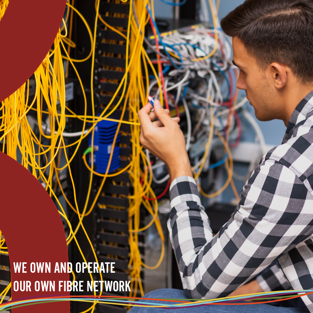
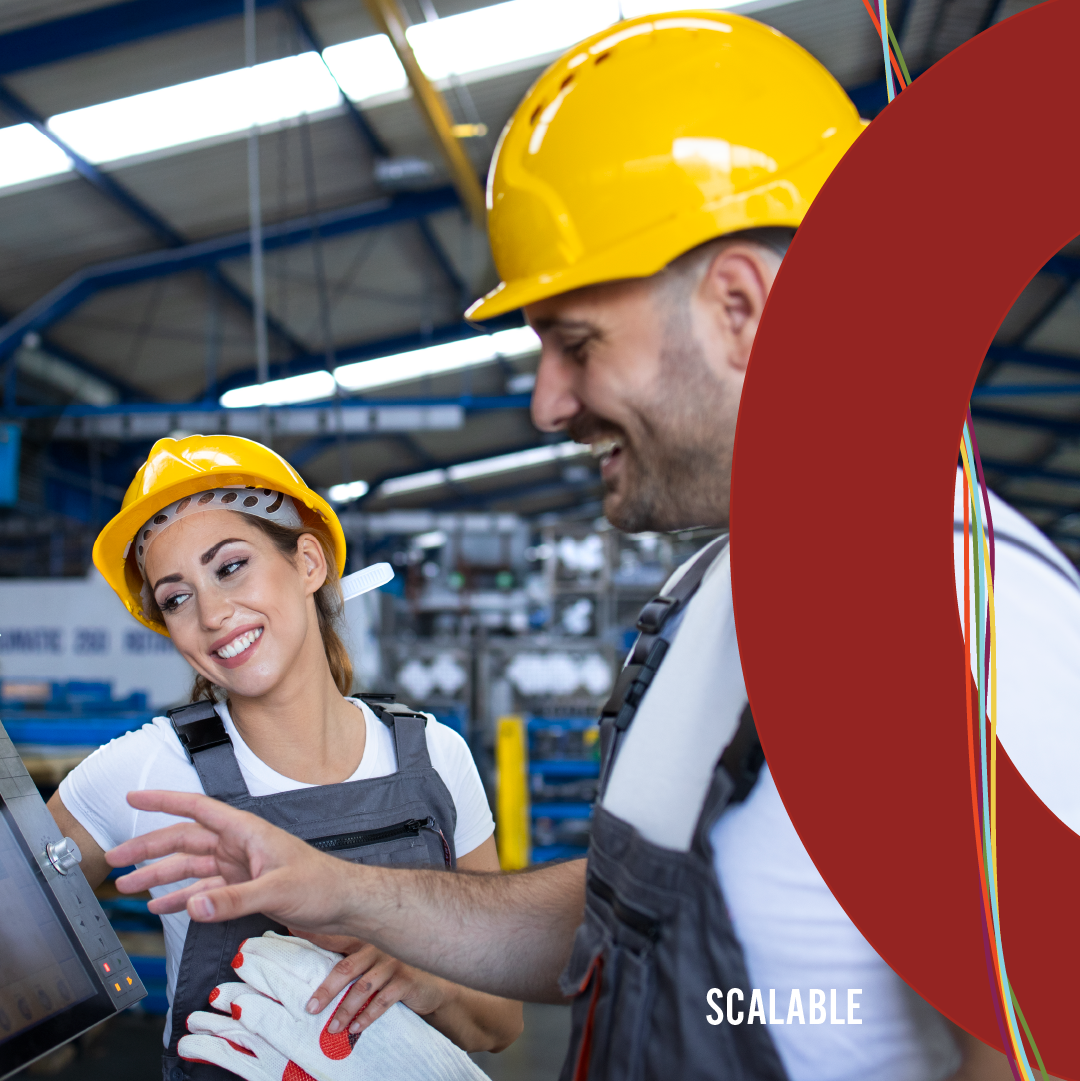
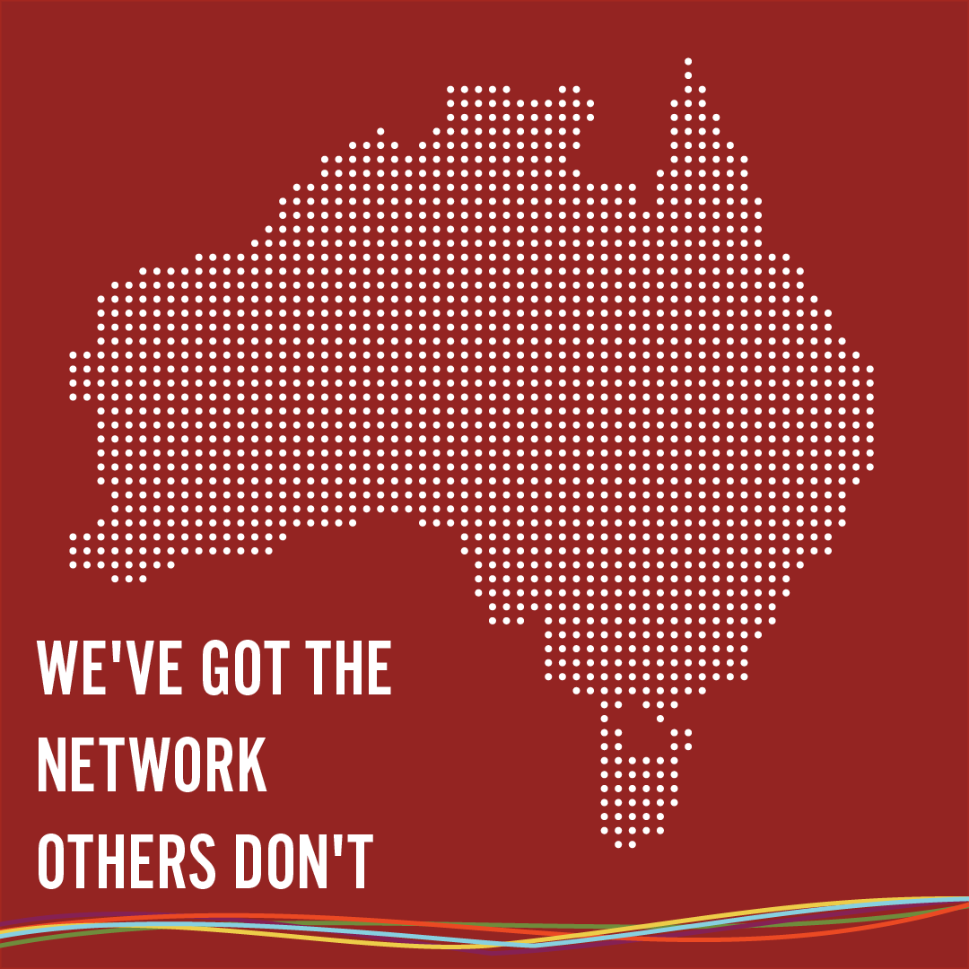
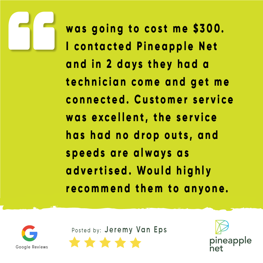
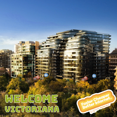
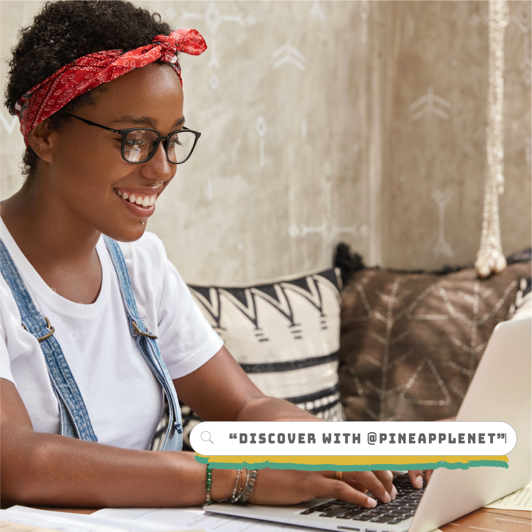
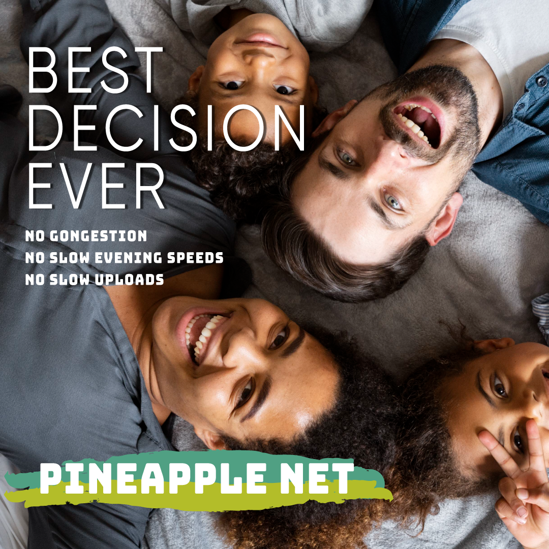
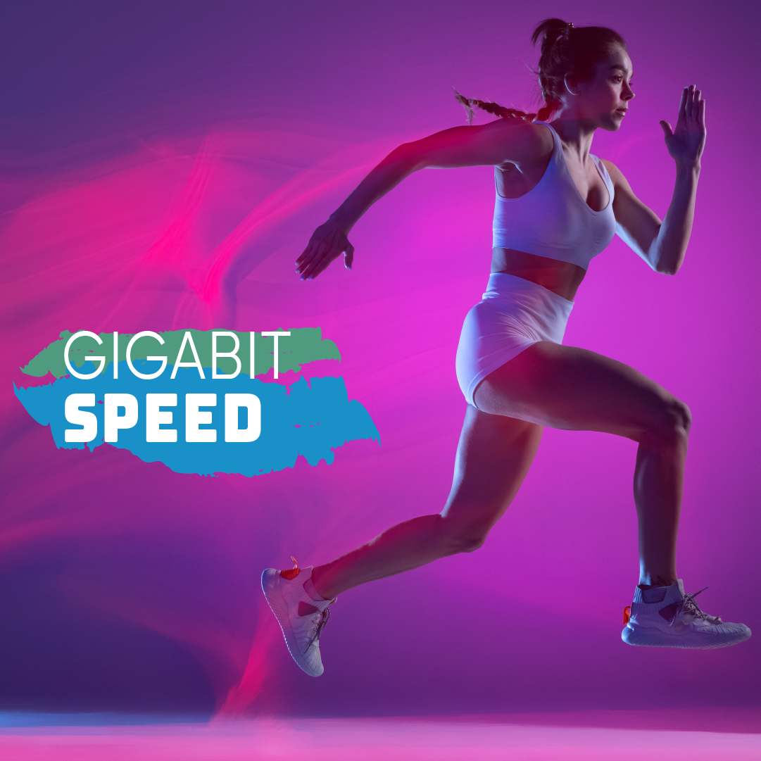
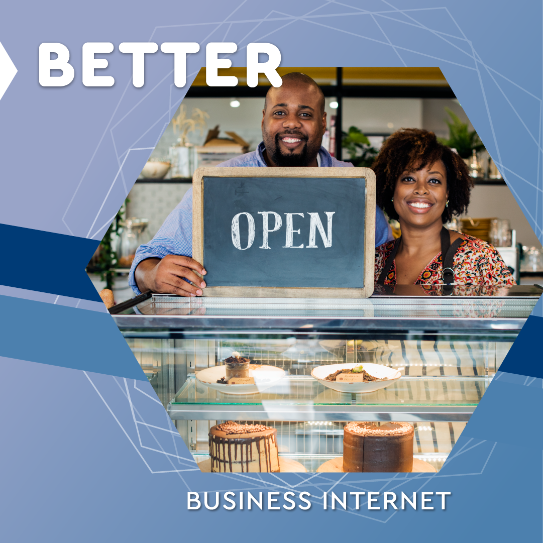
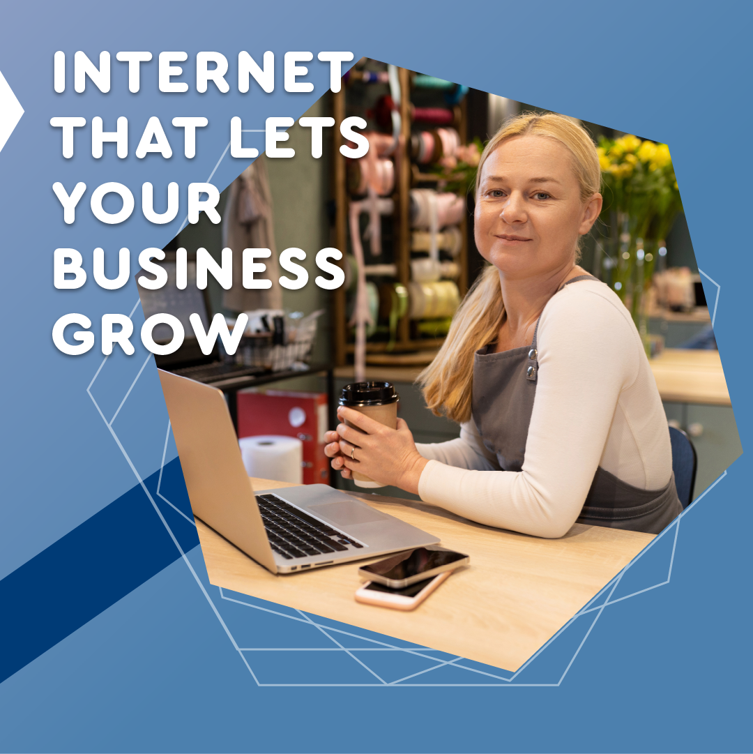
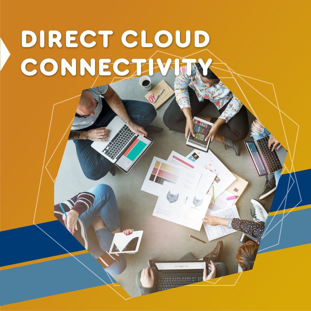
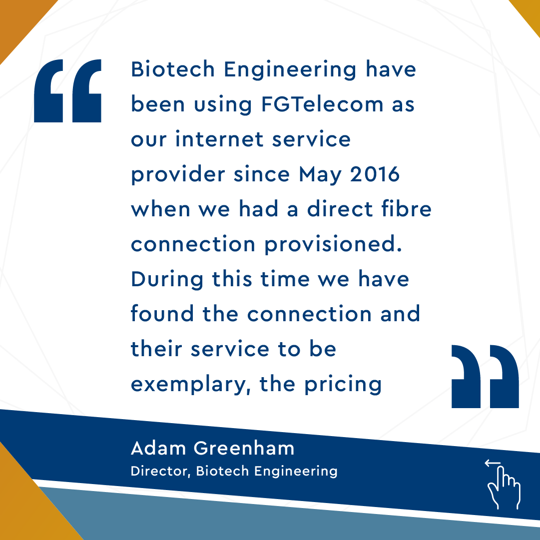
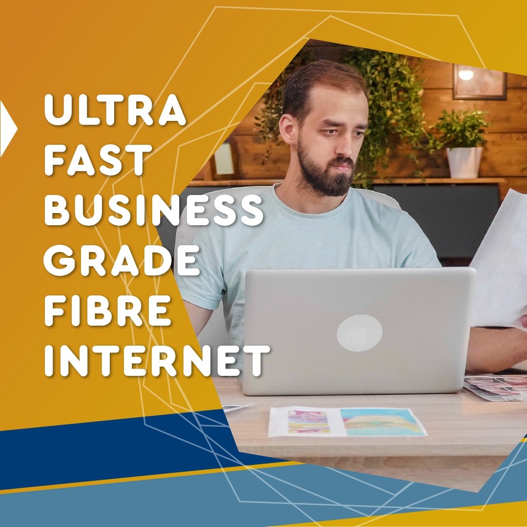
DGtek is a company based in Melbourne that provides fibre internet for businesses and the public. They have three major brands; DGtek, Pineapple Net and FG Telcom
Their goal was to establish distinct visual identities for each of the brands that set them apart from each other and effectively communicated with their respective target audiences.
Role: Visual Designs & Motiongraphics
Company: Digital Marketing Assistant, DGtek
Visual Style for DGTek
Visual Style for Pineapple net
Visual Style for FG Telecom
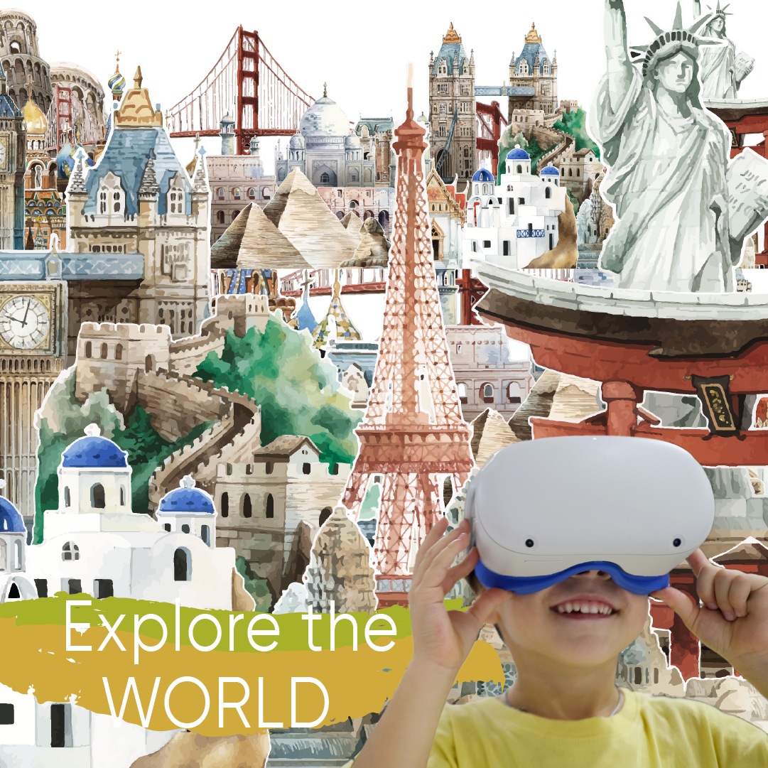
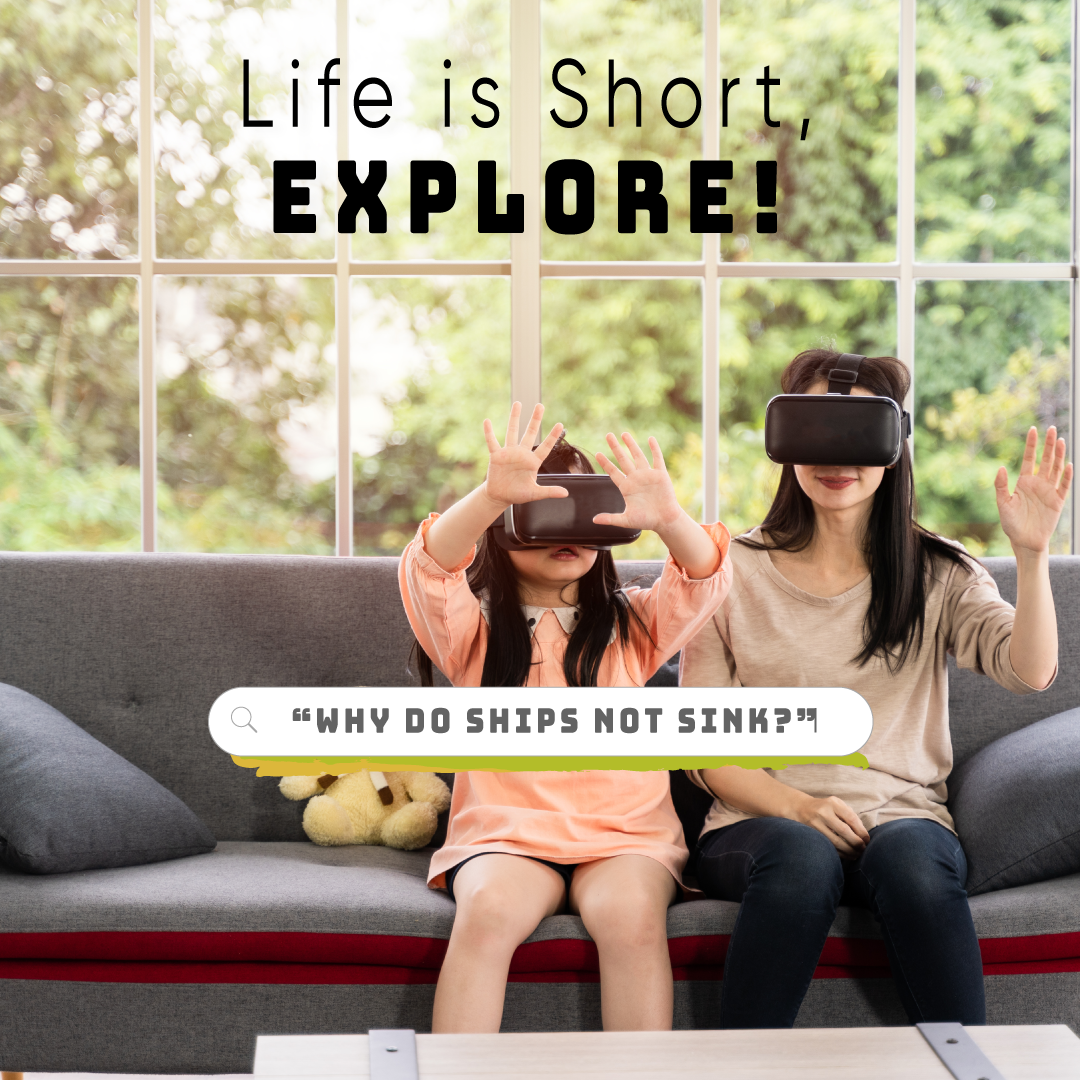
Motiongraphic Posts for Pineapple Net
As Pineapple Net was a technology firm, I believed it was important for their brand to demonstrate innovation and a futuristic digital presence. To achieve this, I opted to incorporate the parallax effect by creatively manipulating static images and merging them with motion
Video assets
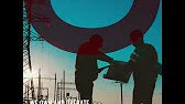
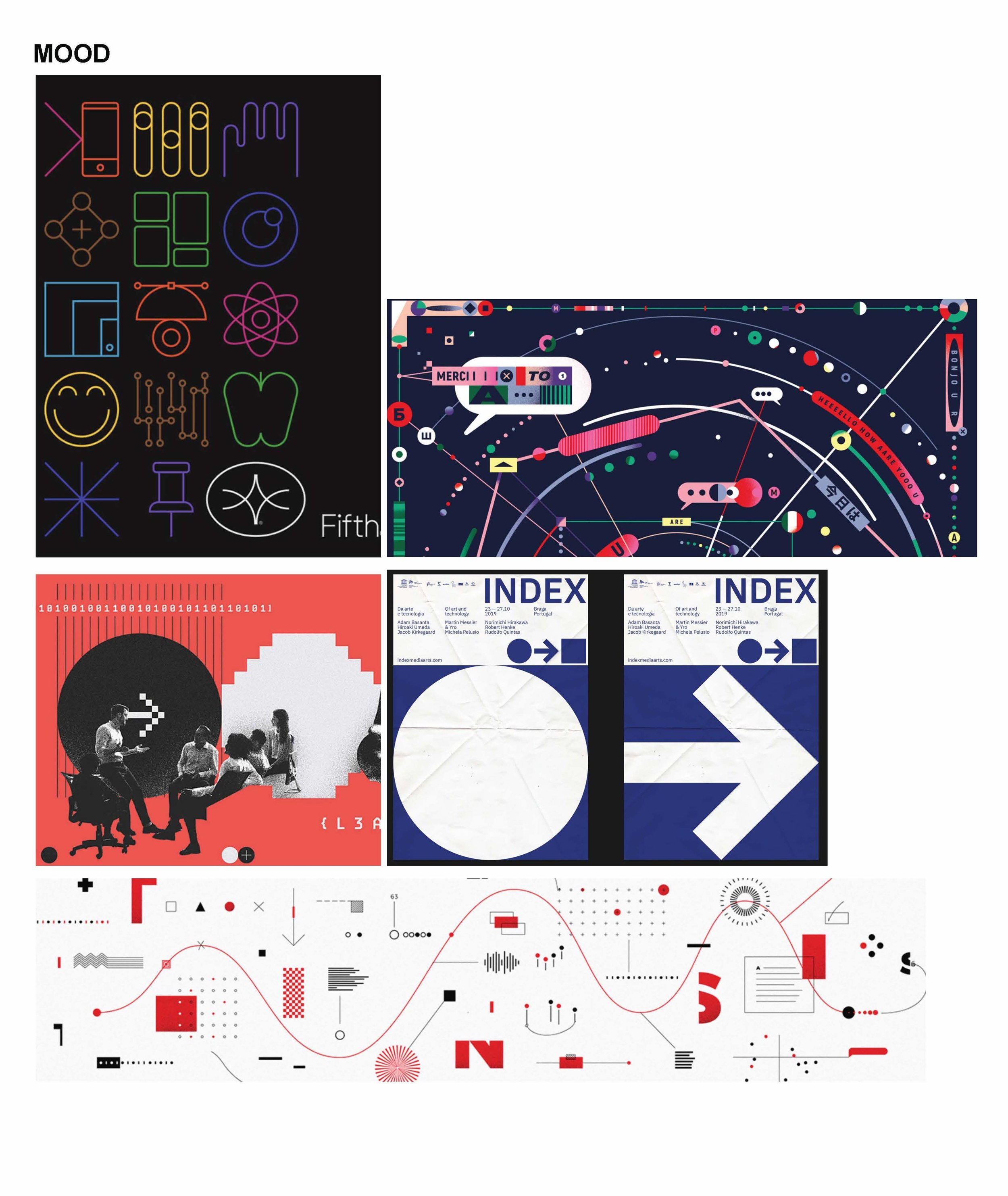
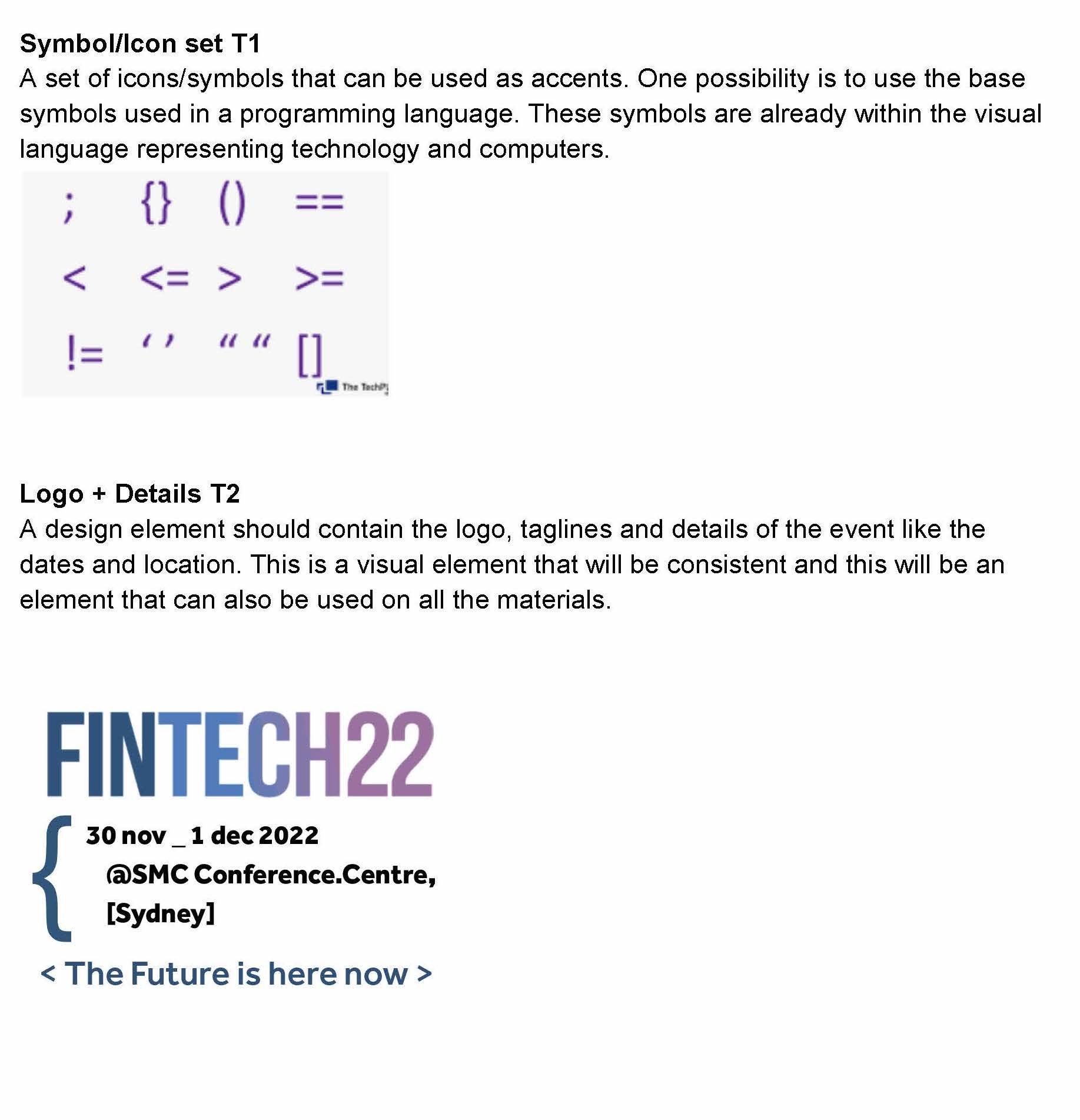
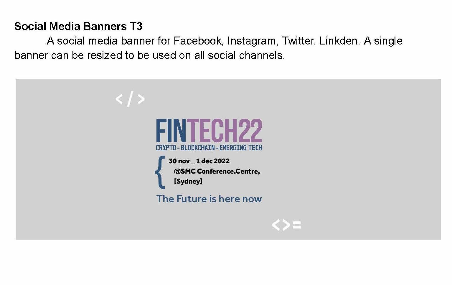
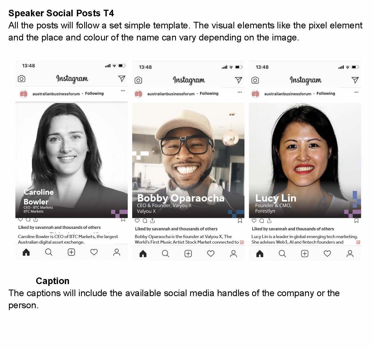
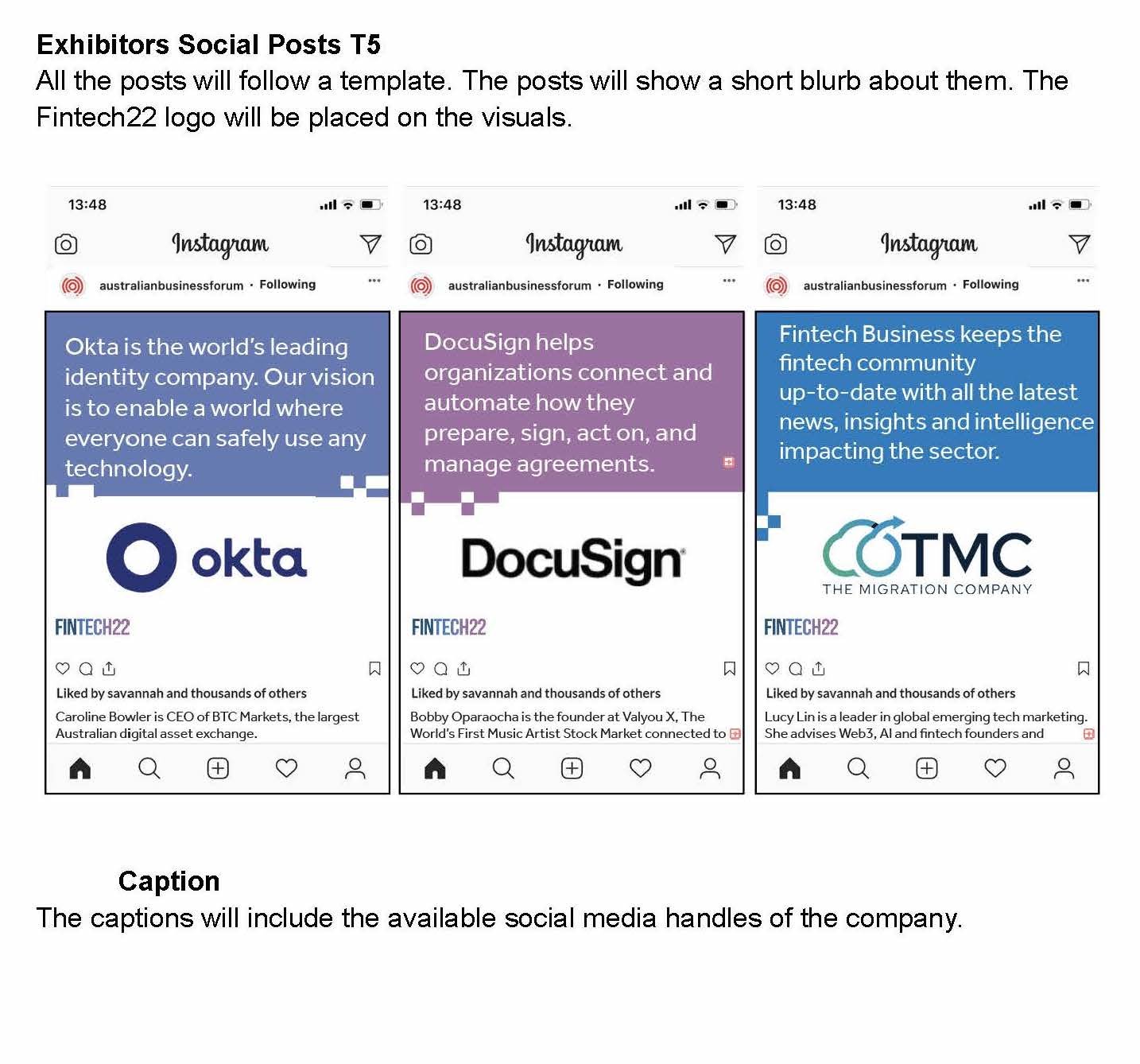
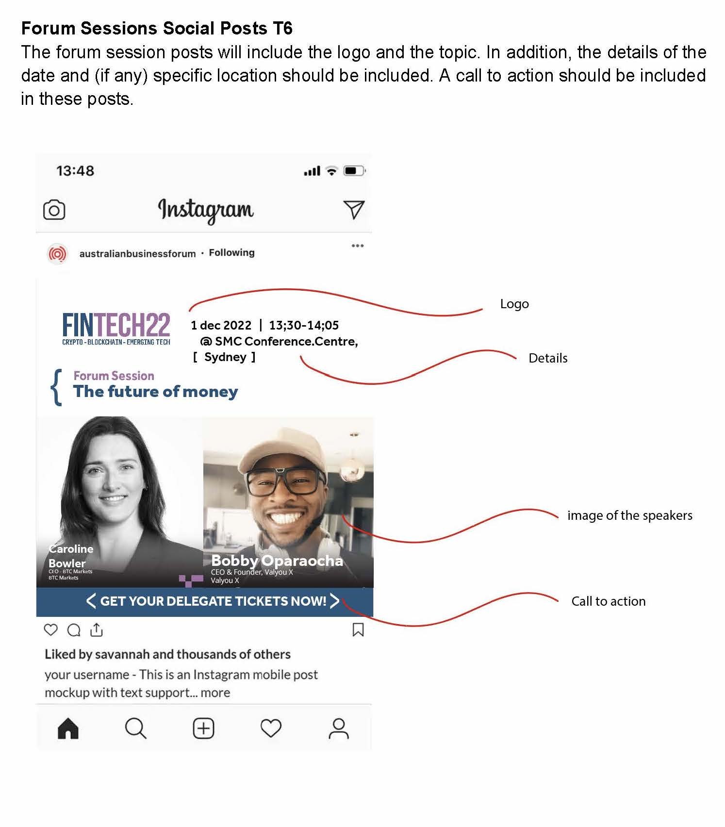
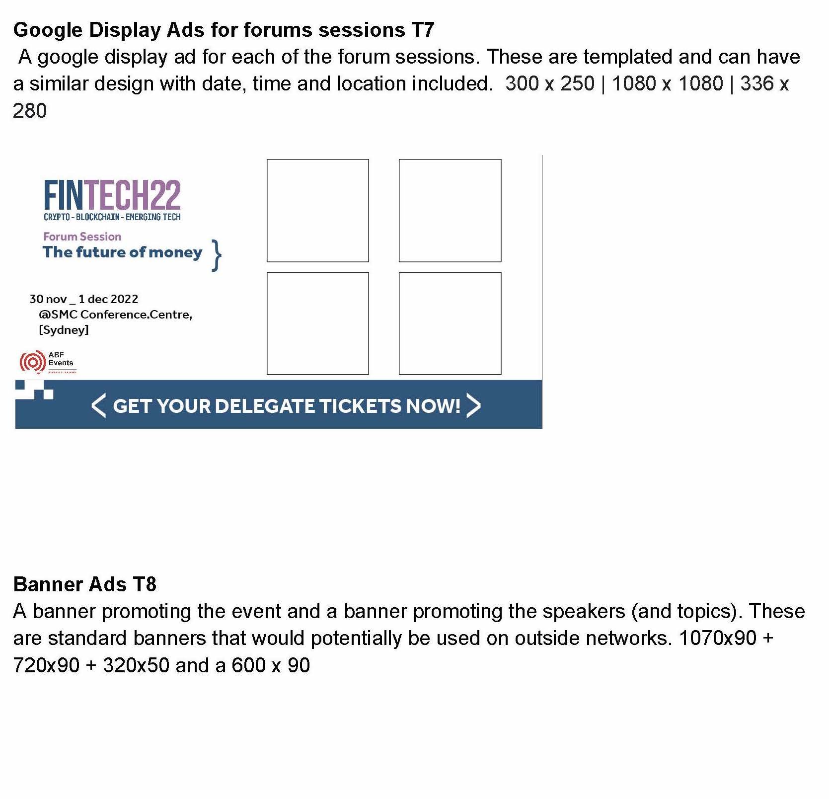
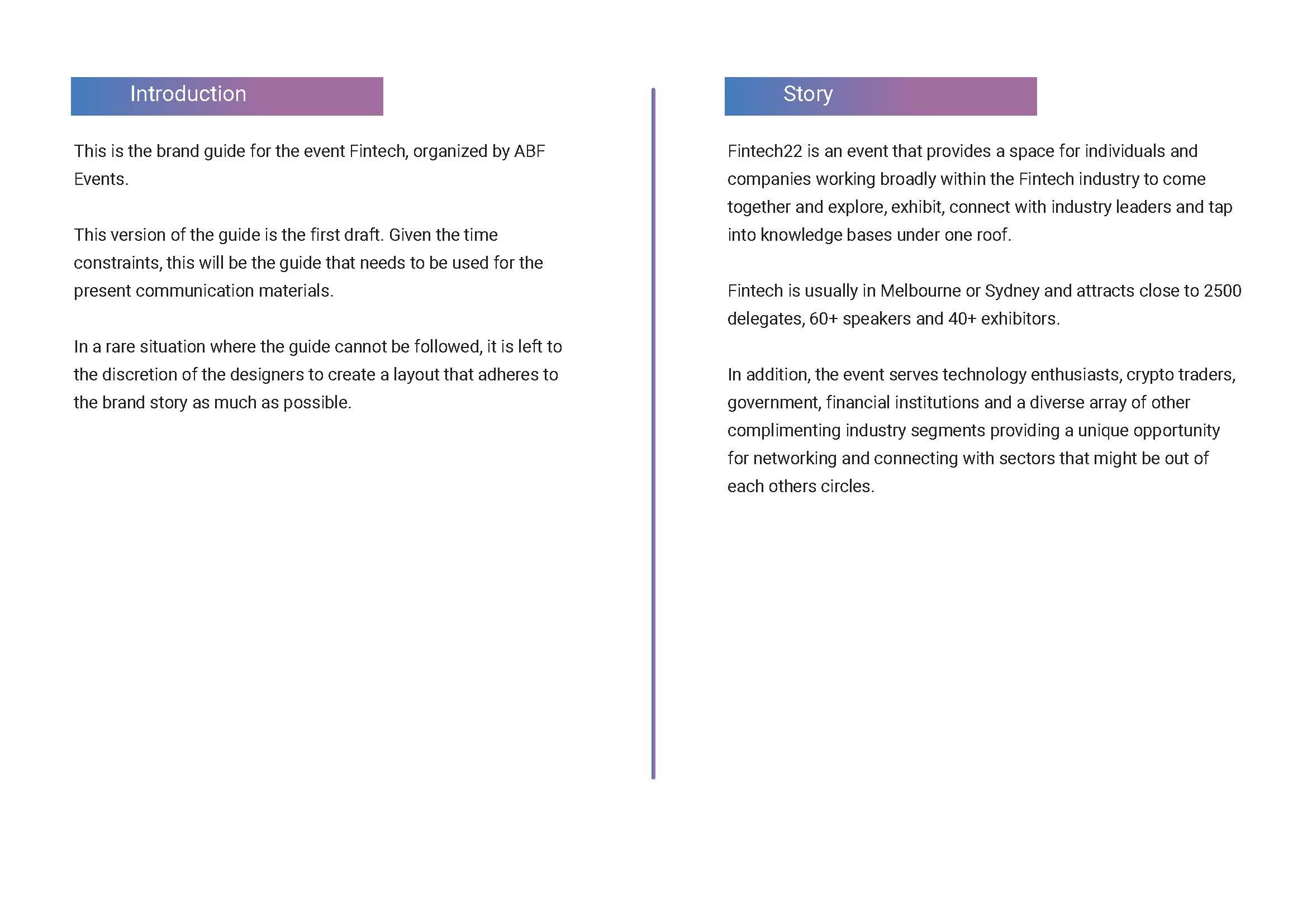
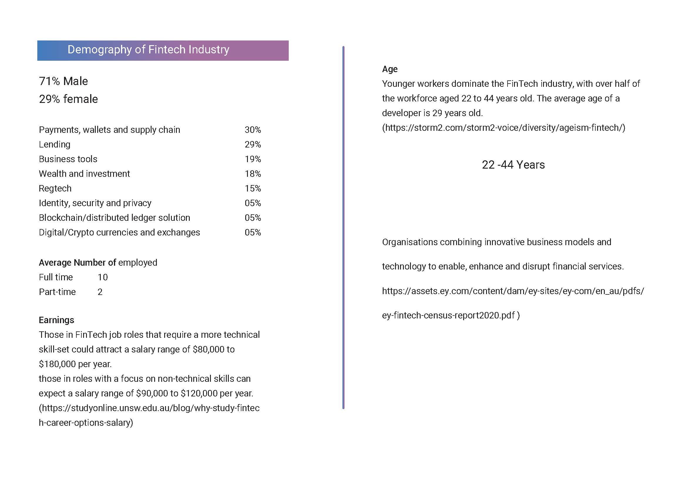
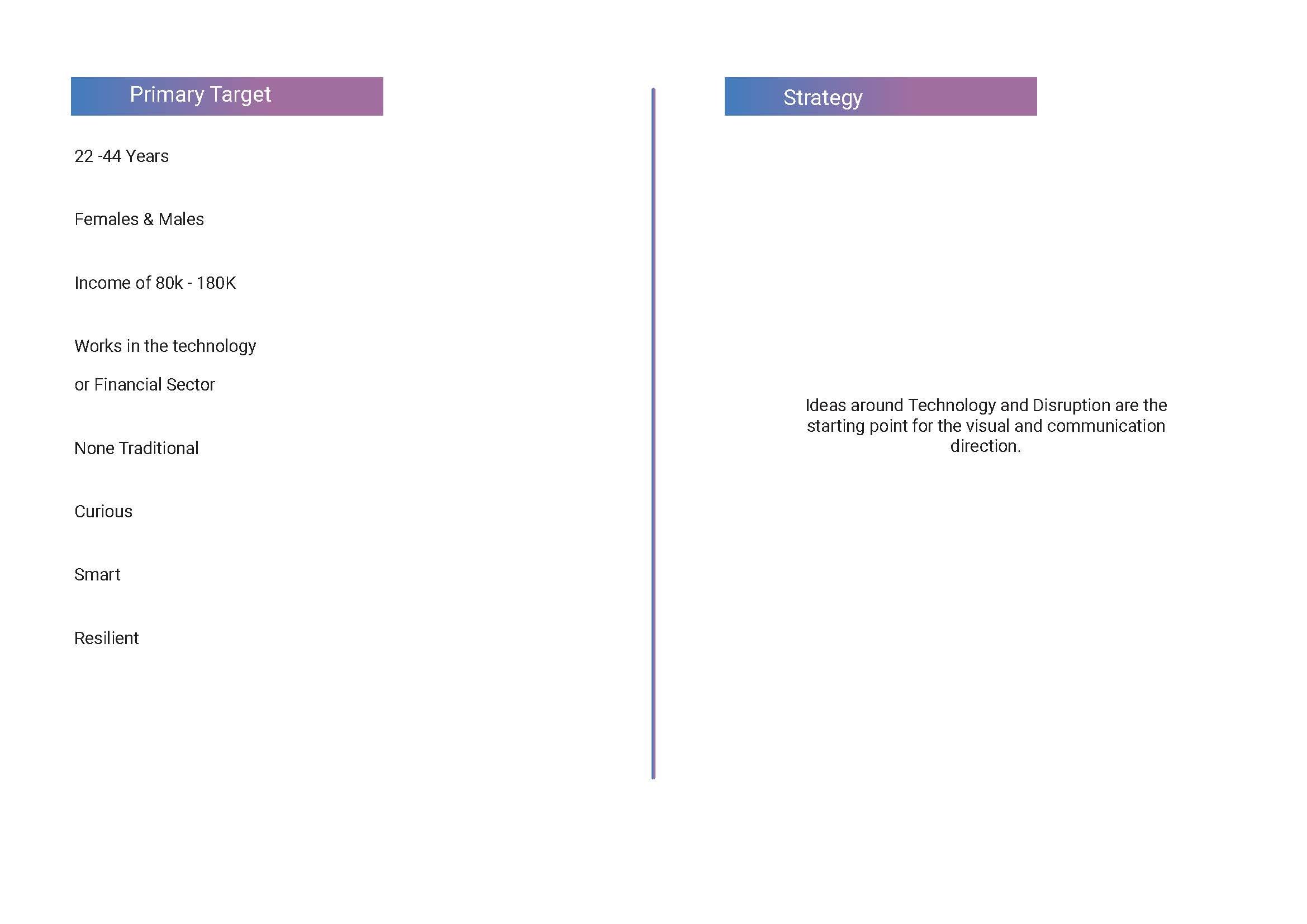
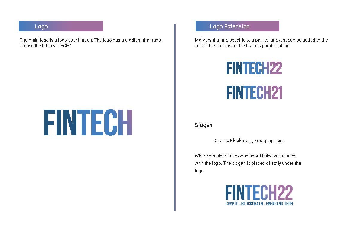
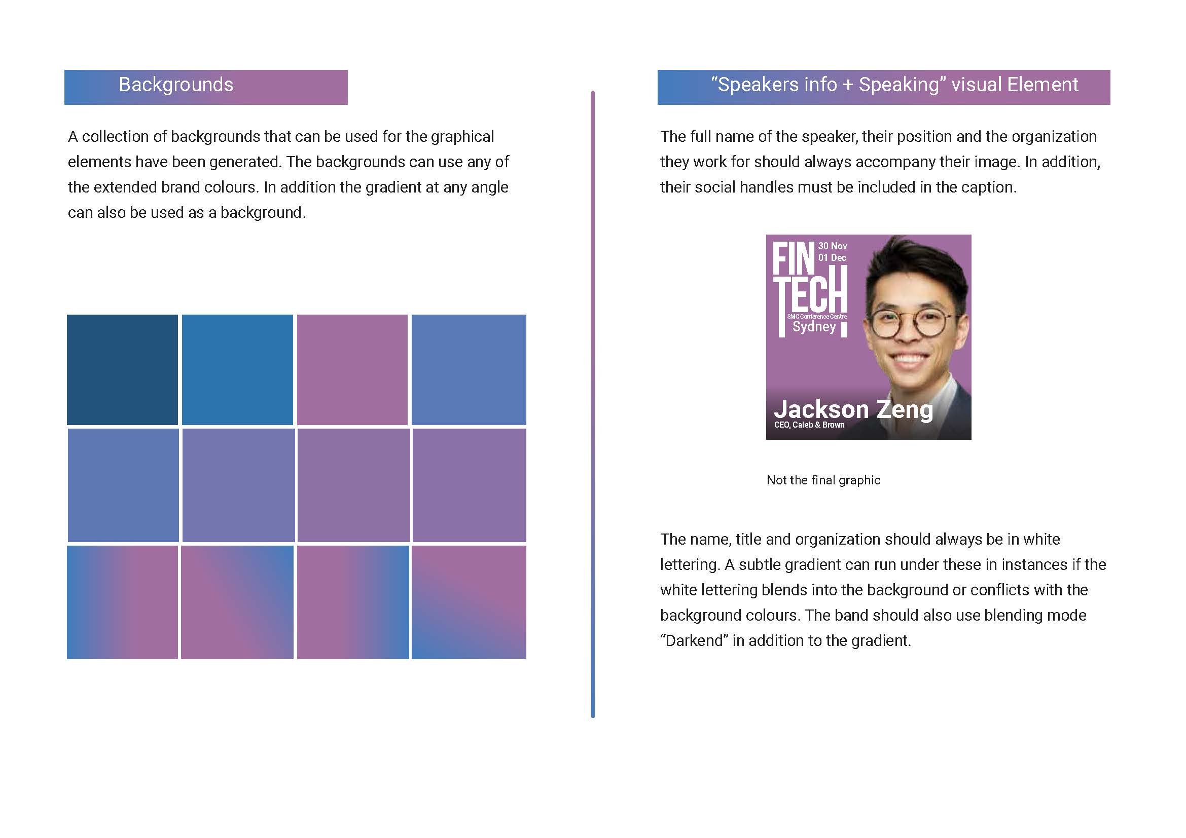
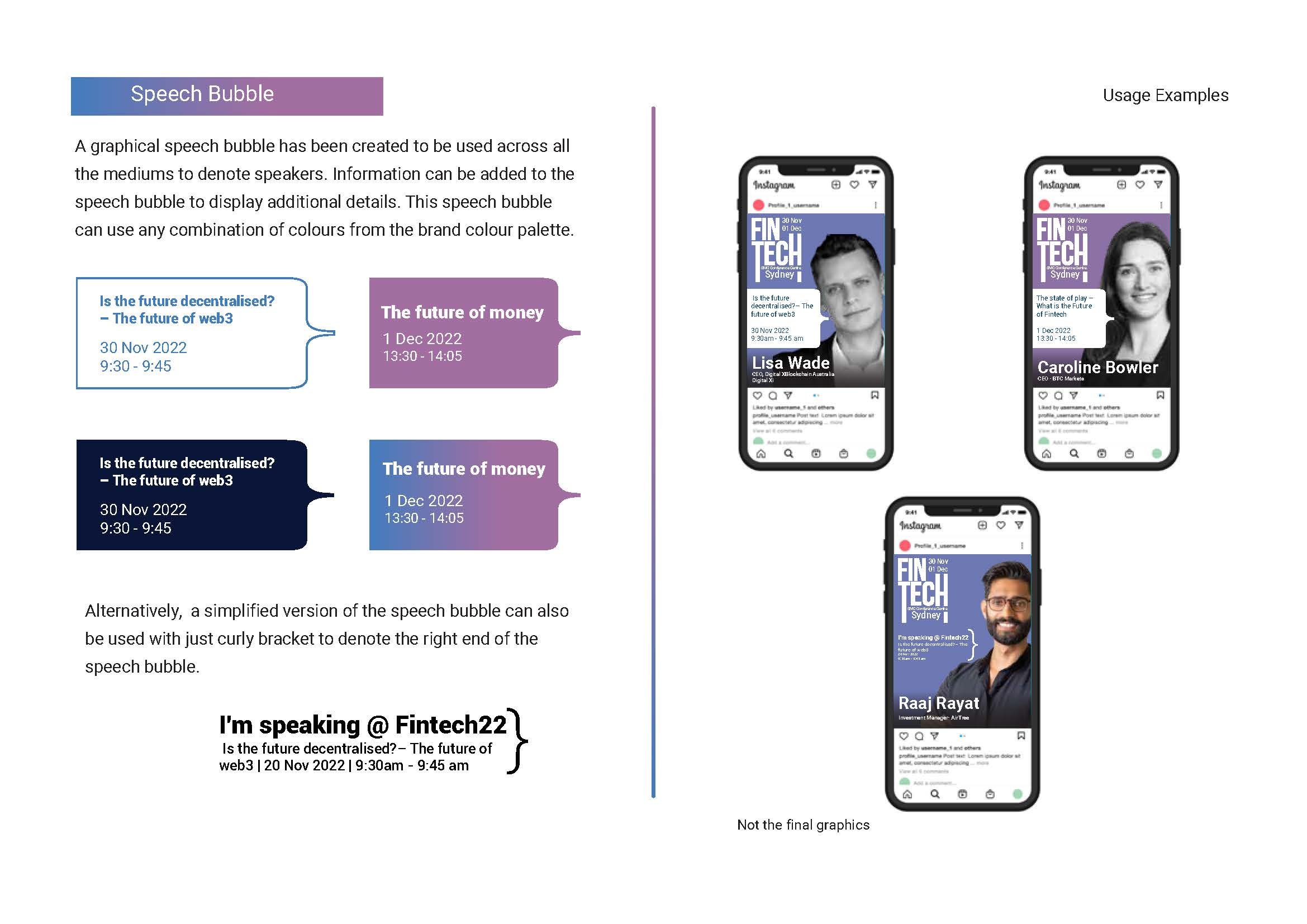
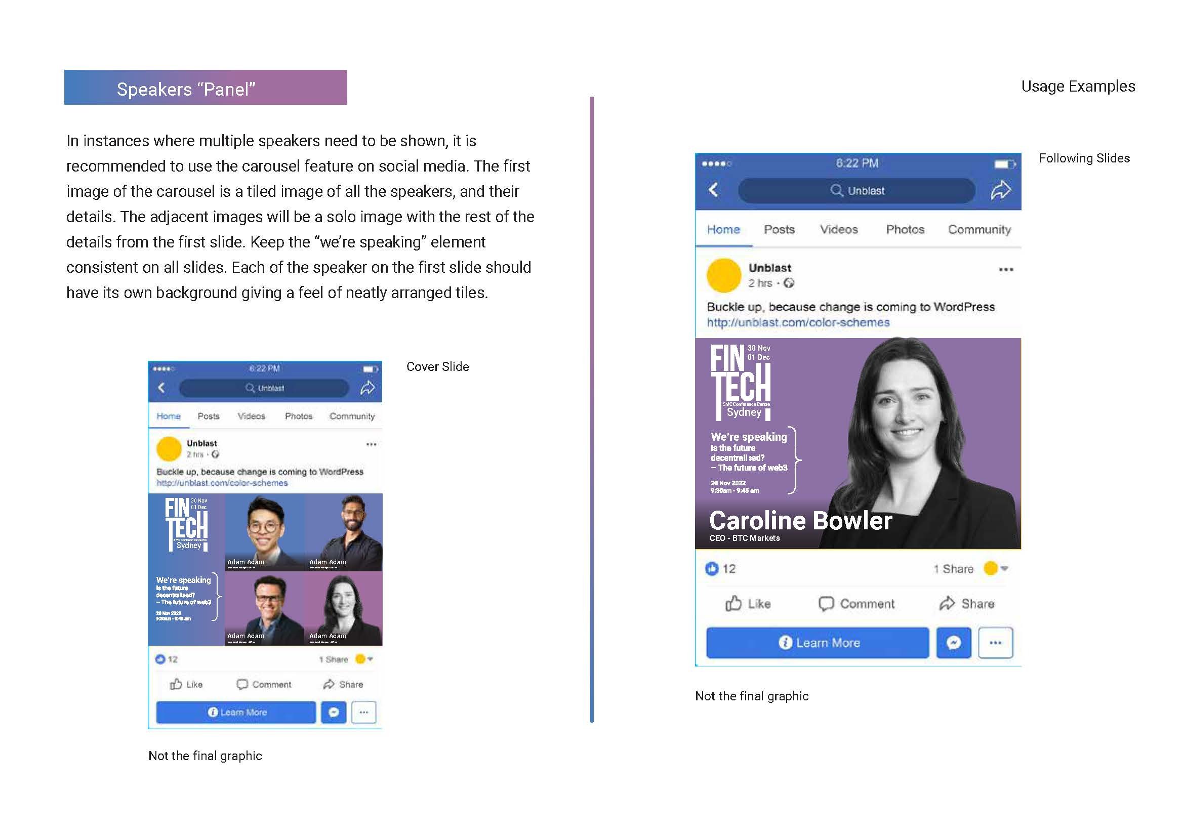
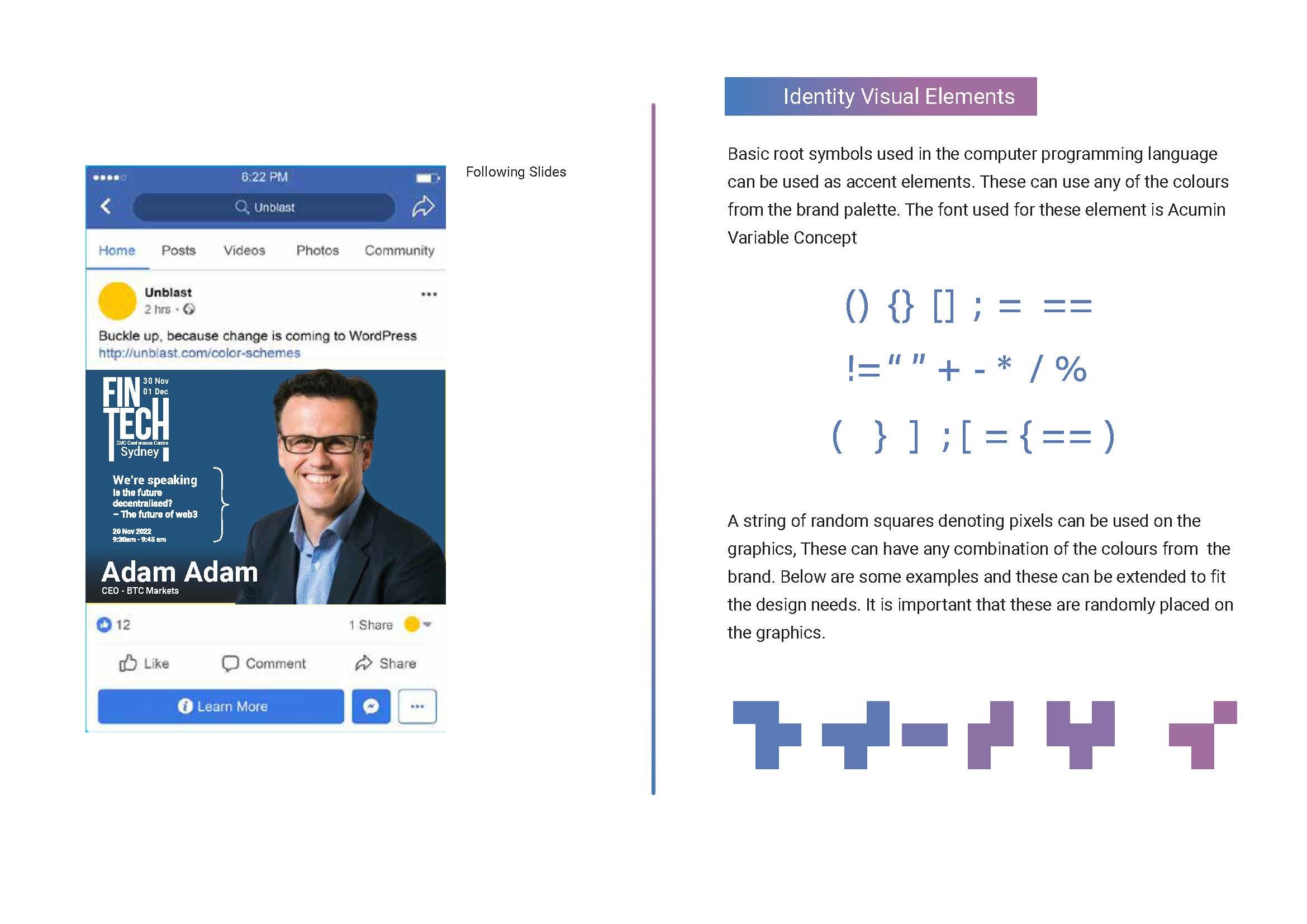
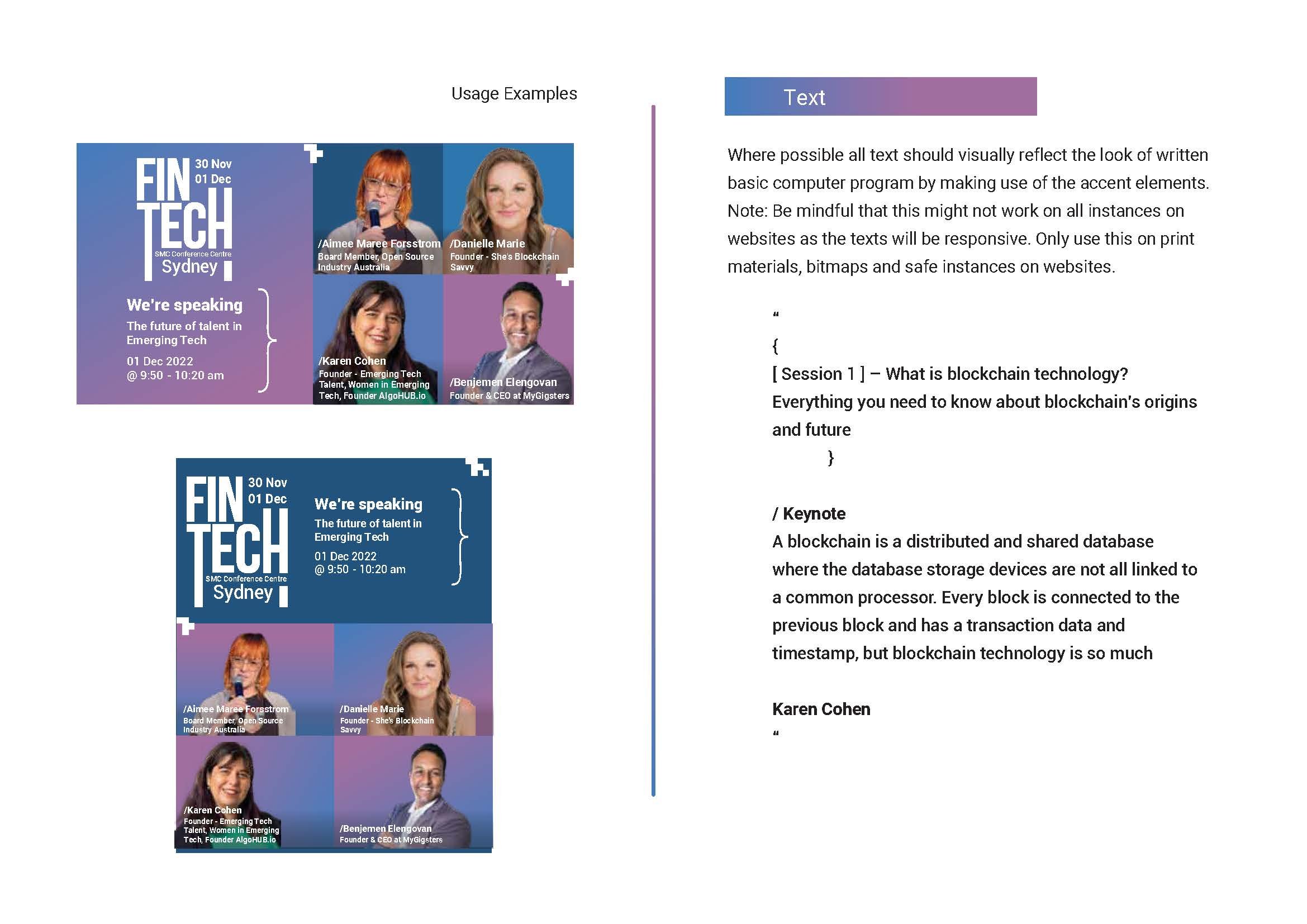
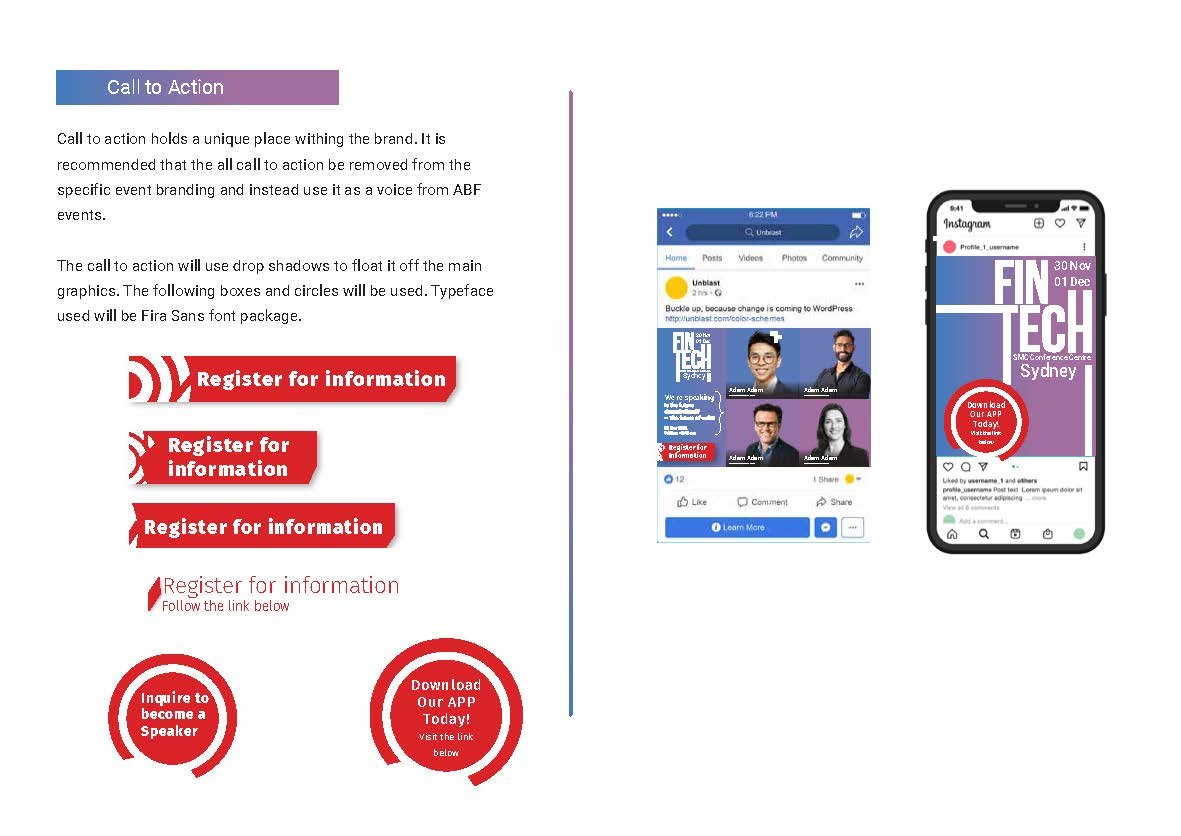
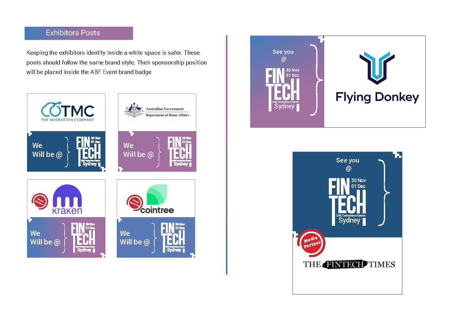
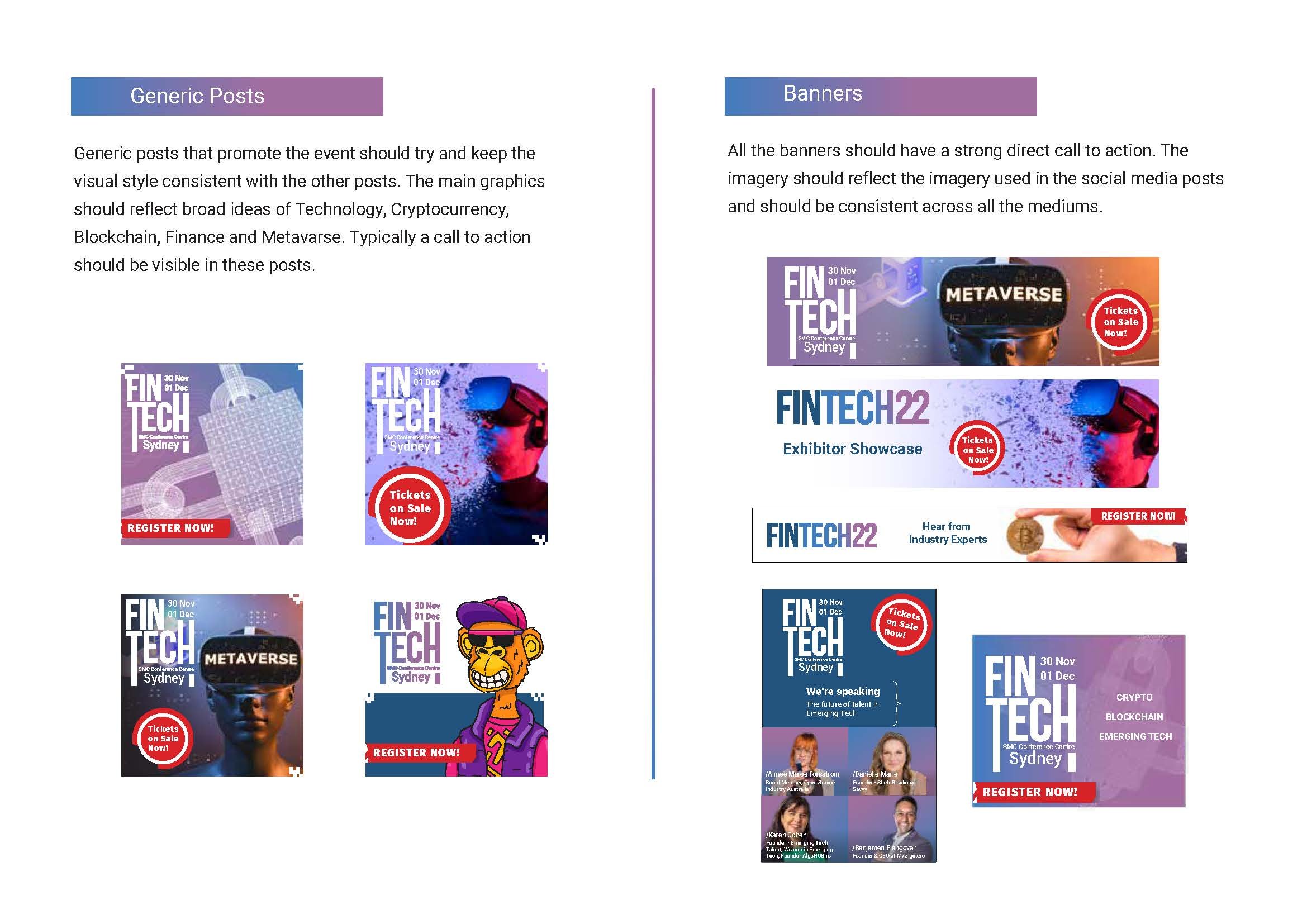
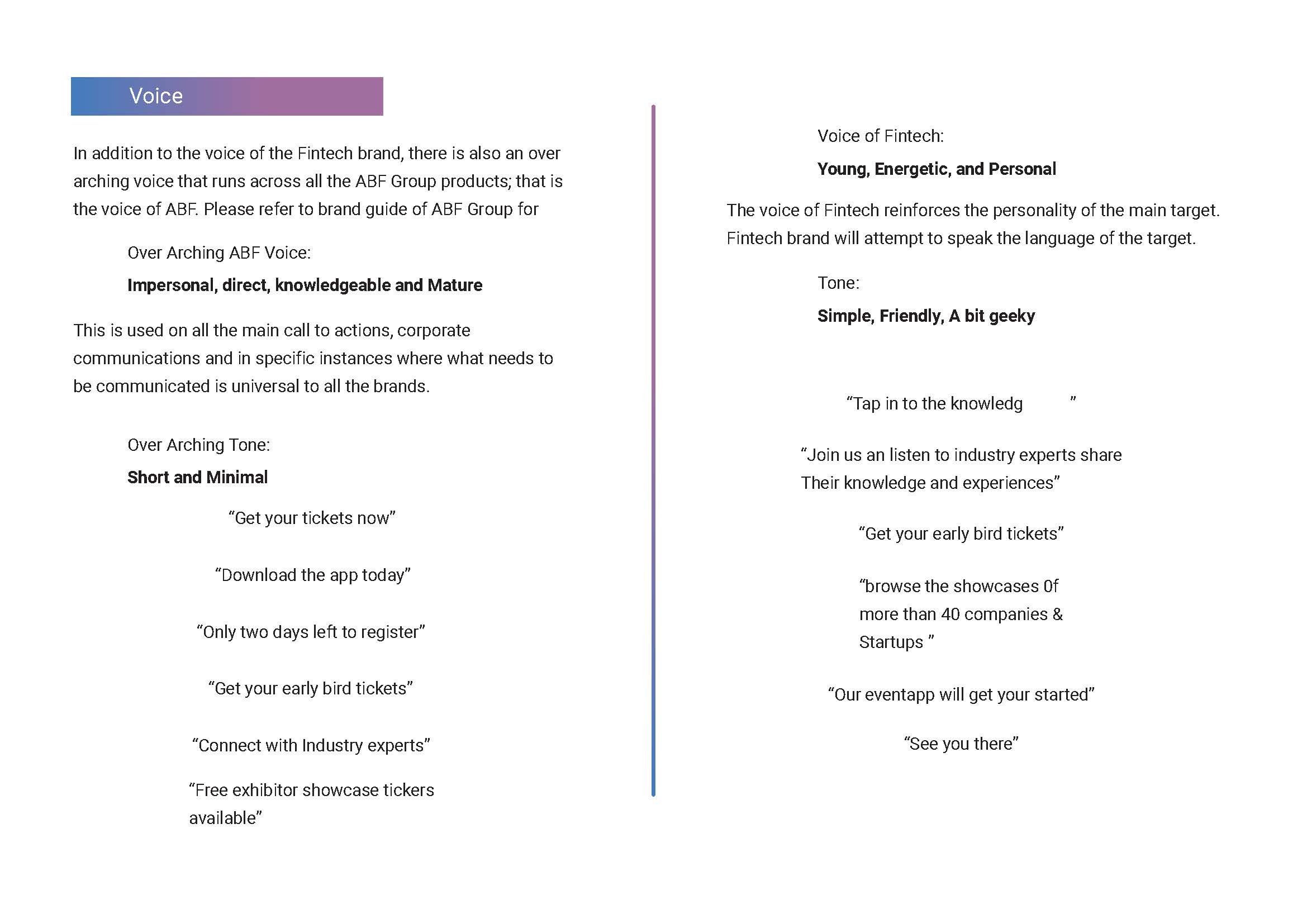
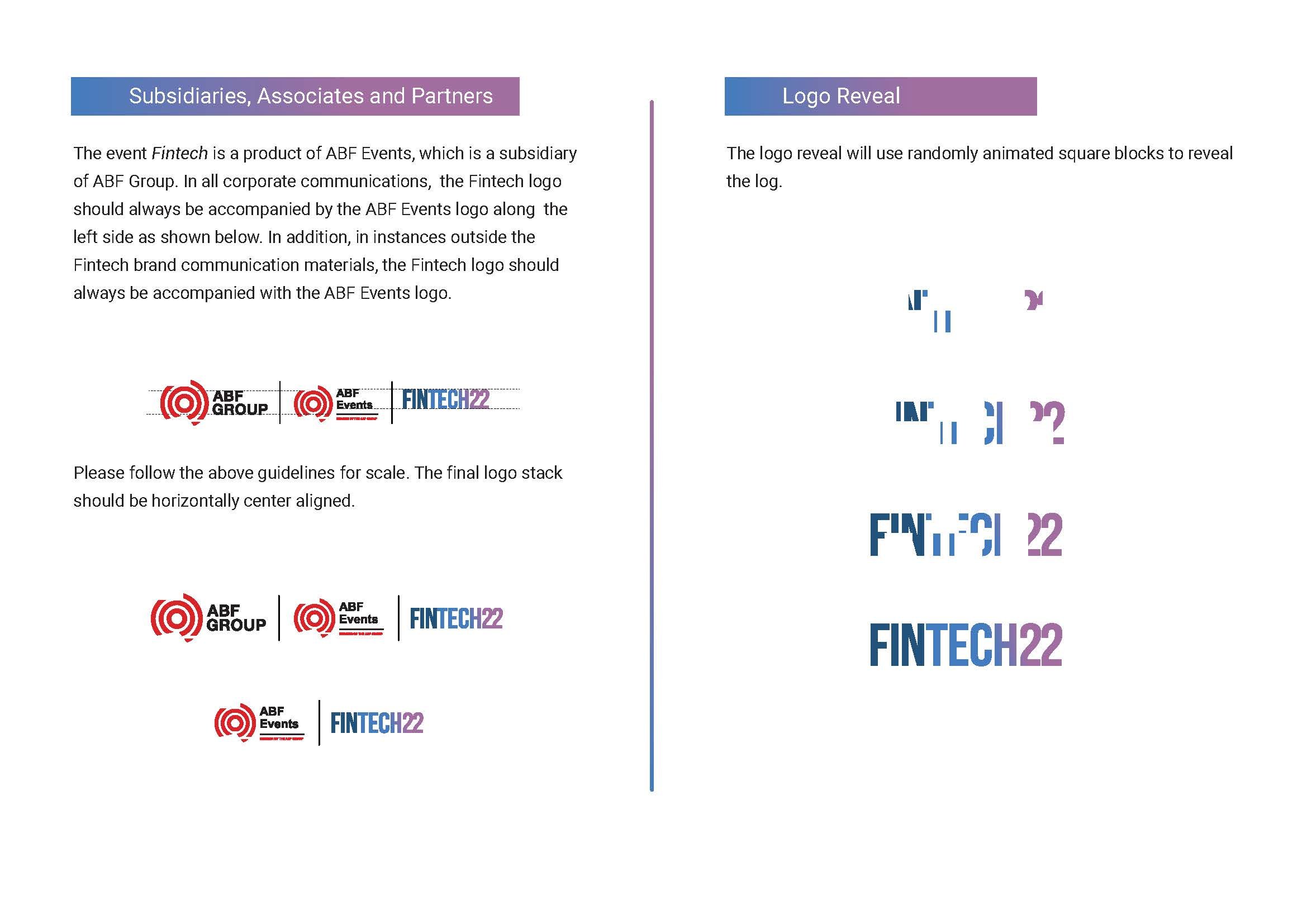
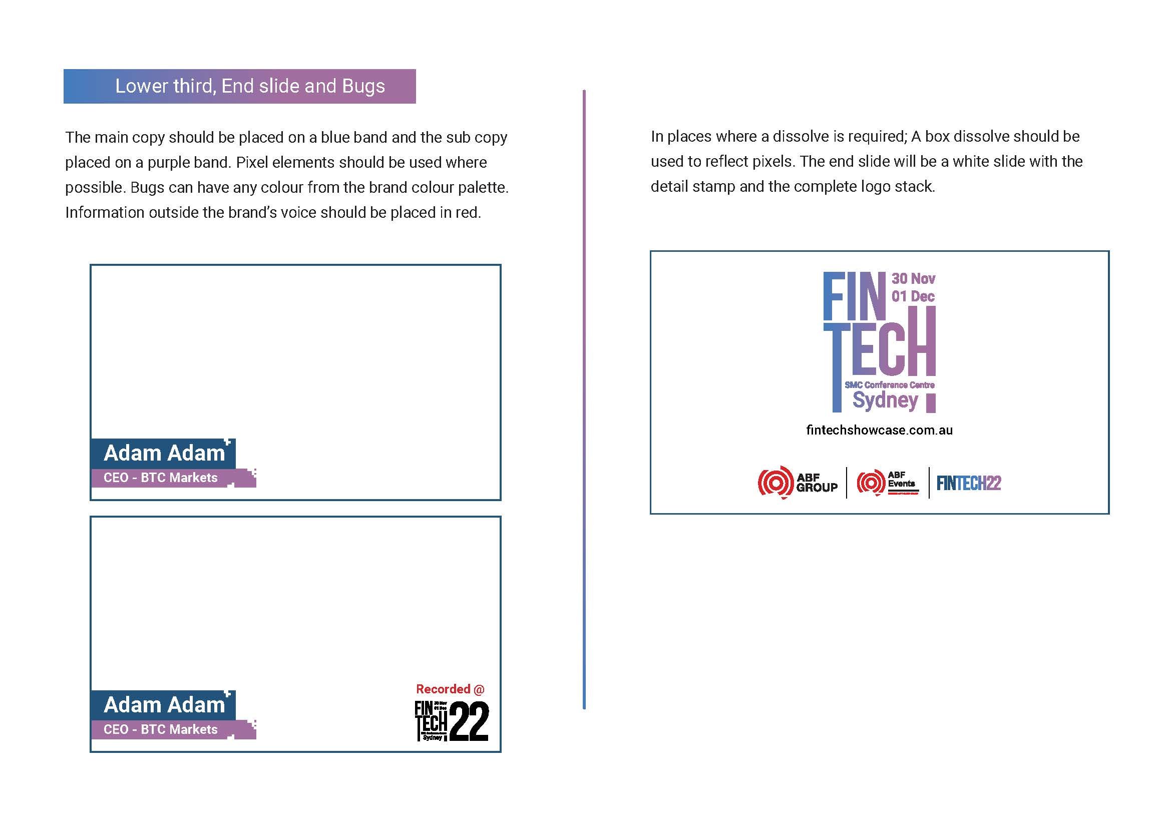
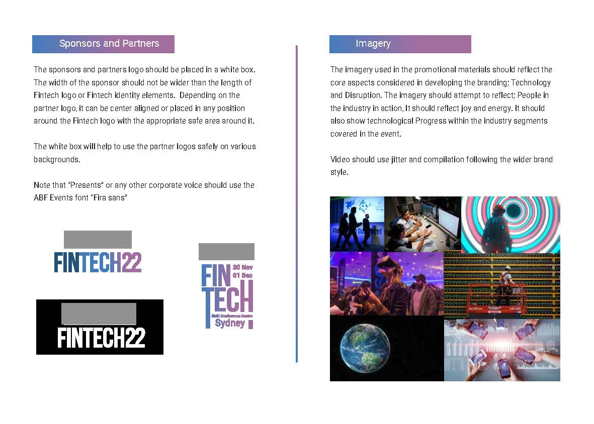
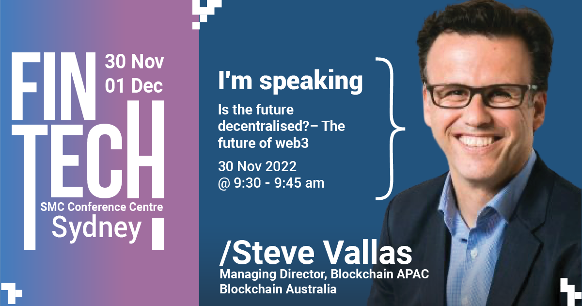
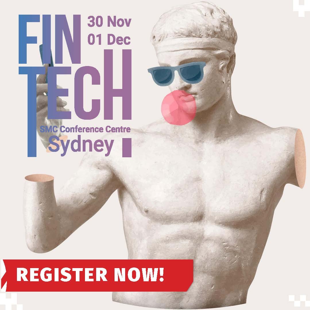
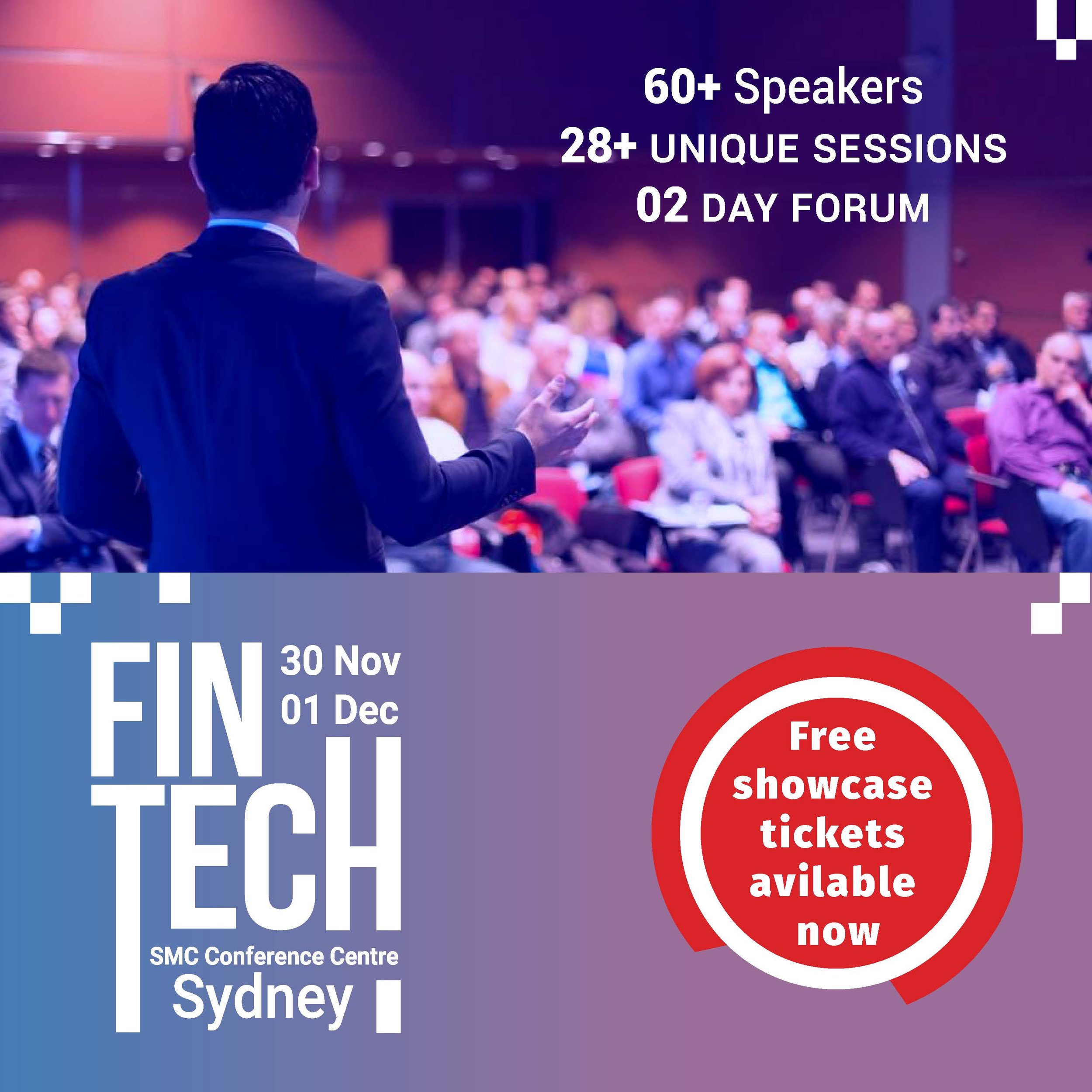
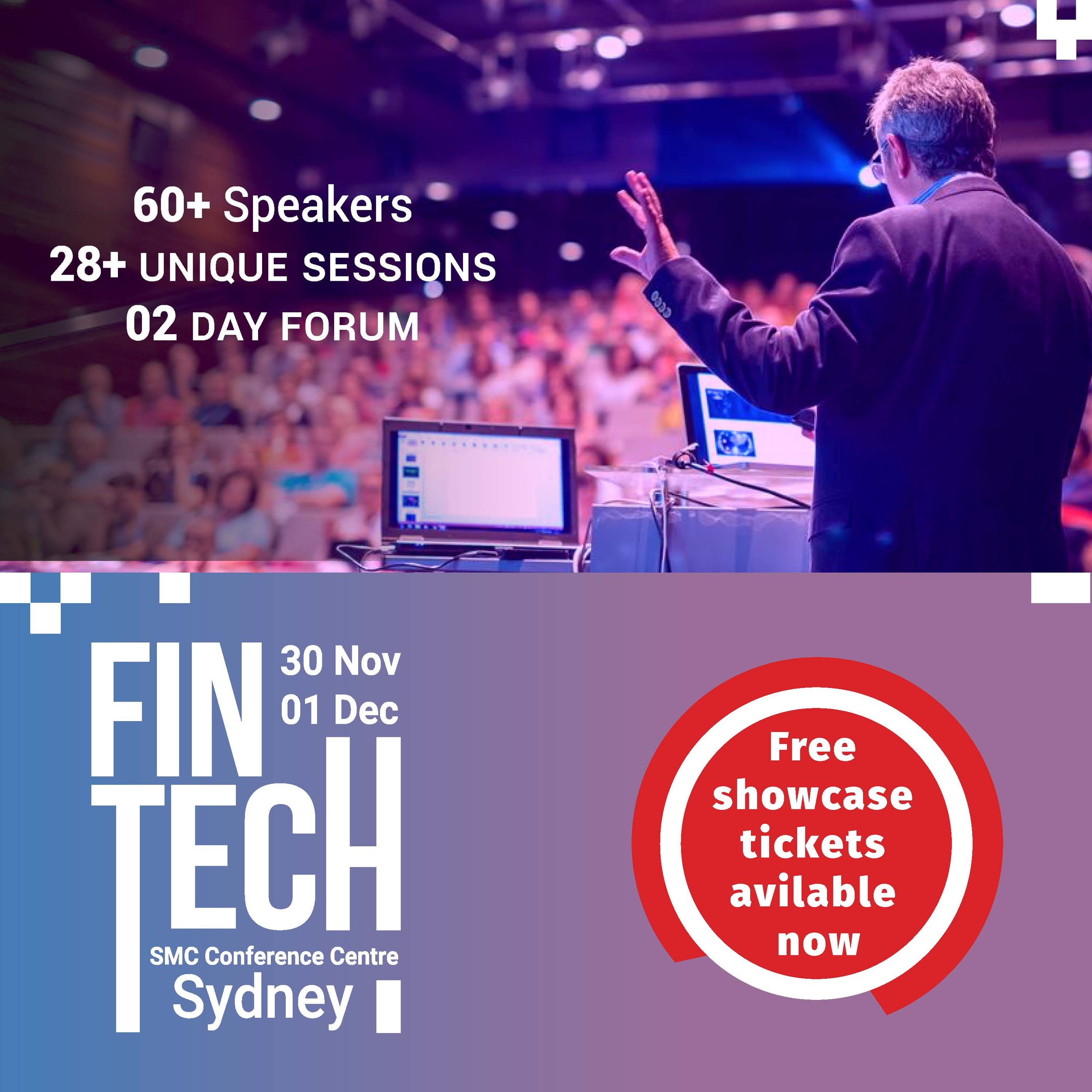
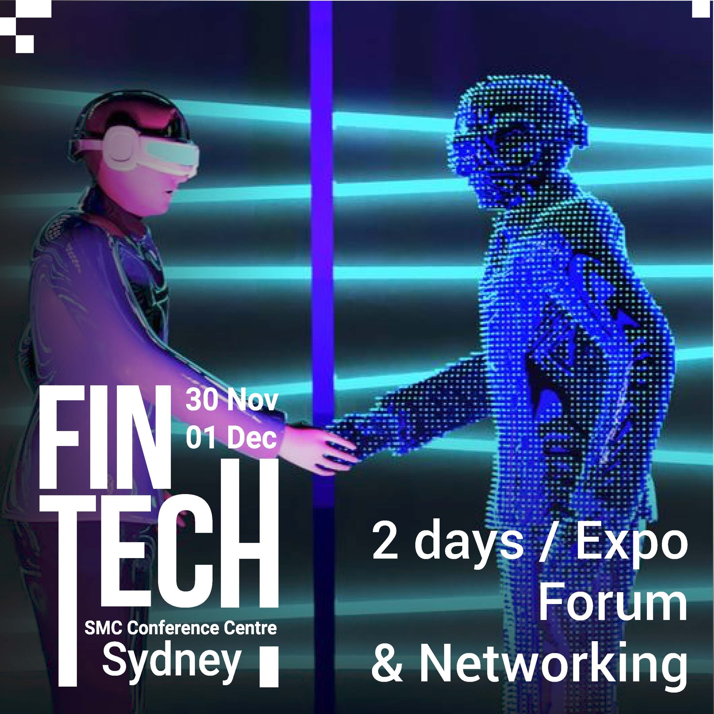
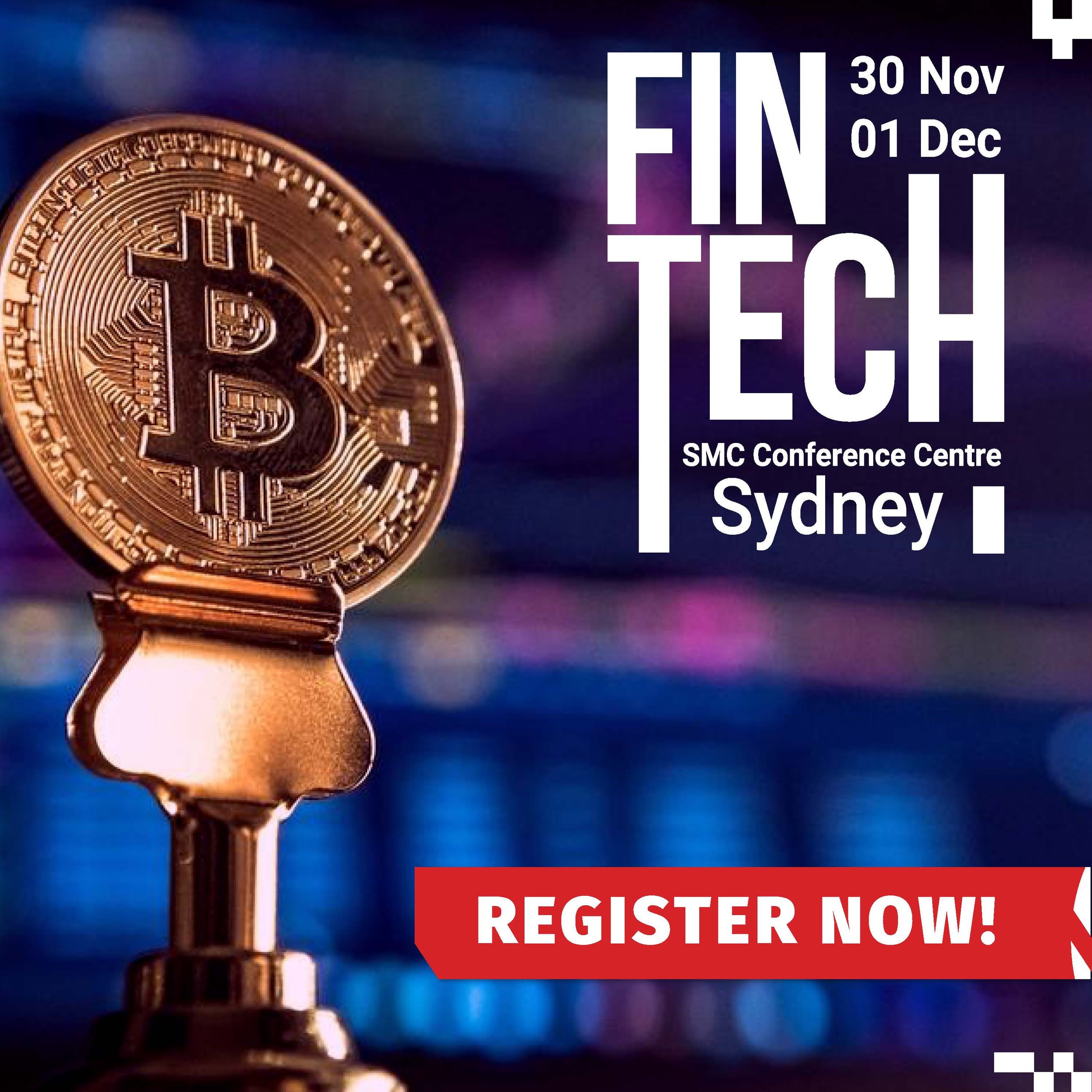
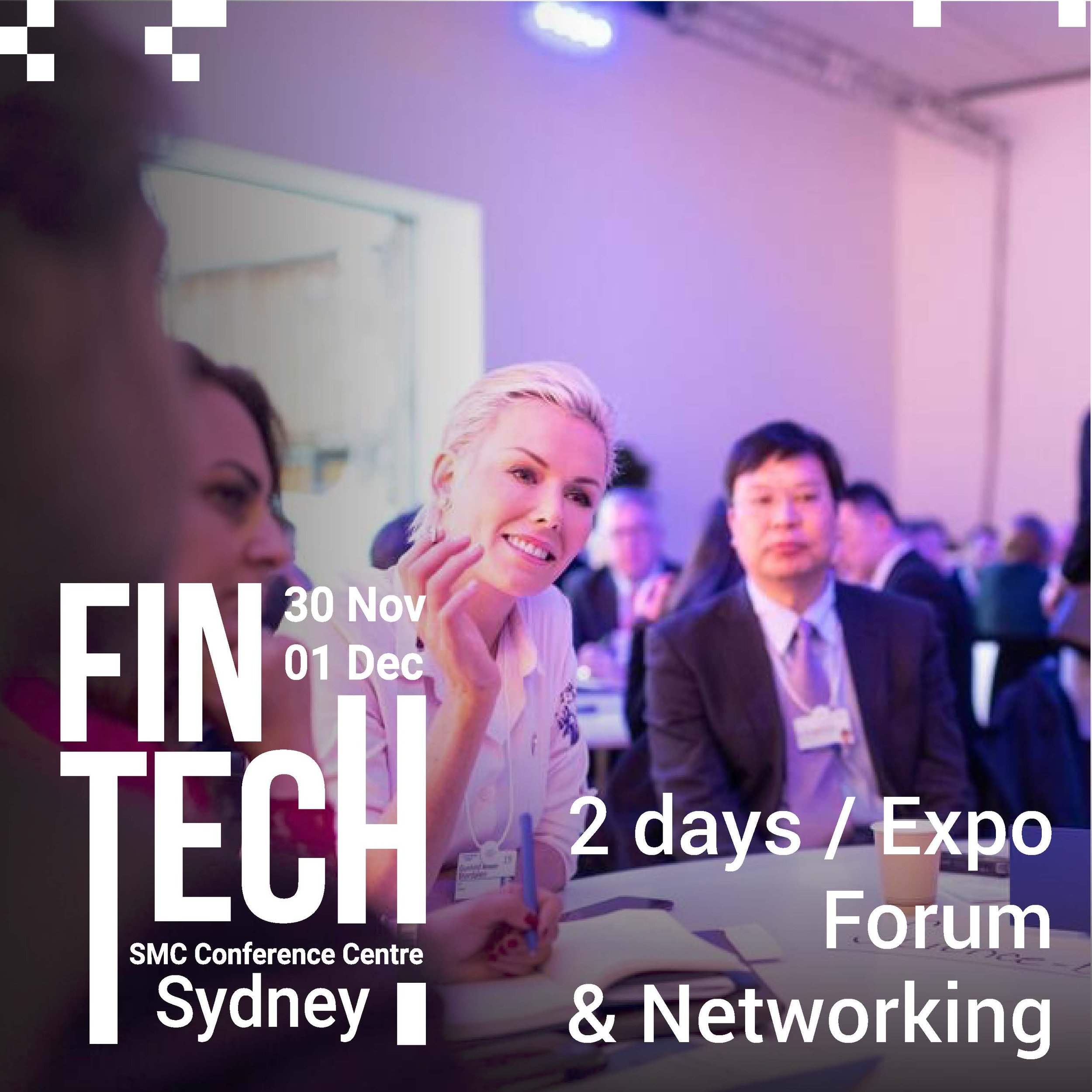
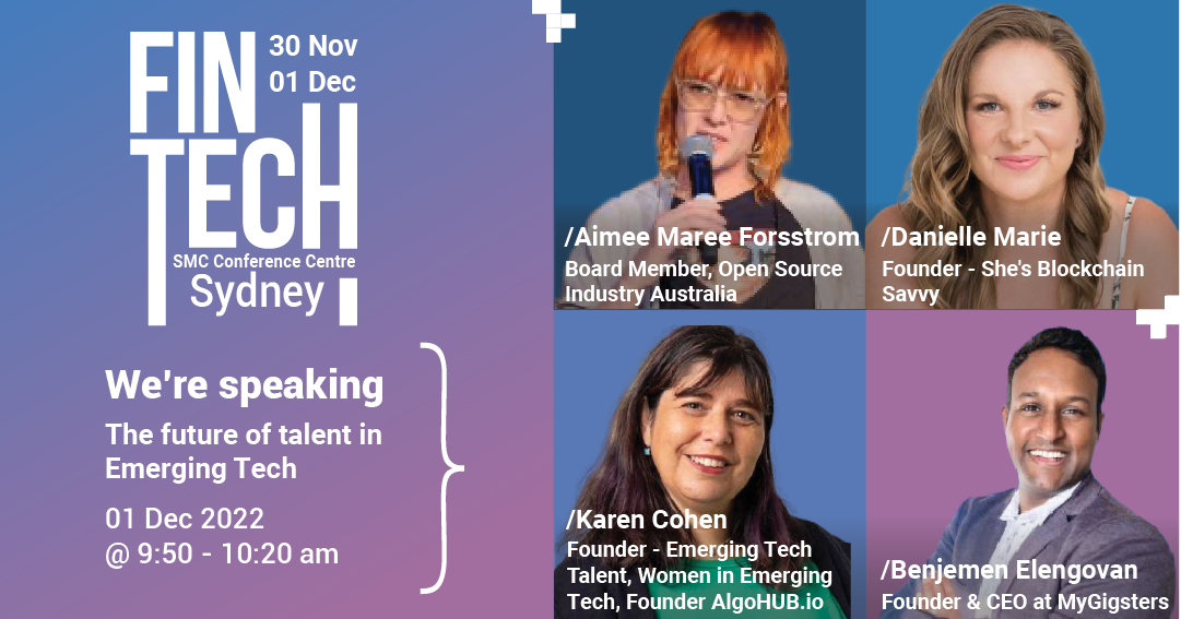
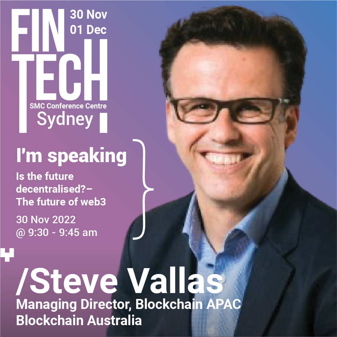
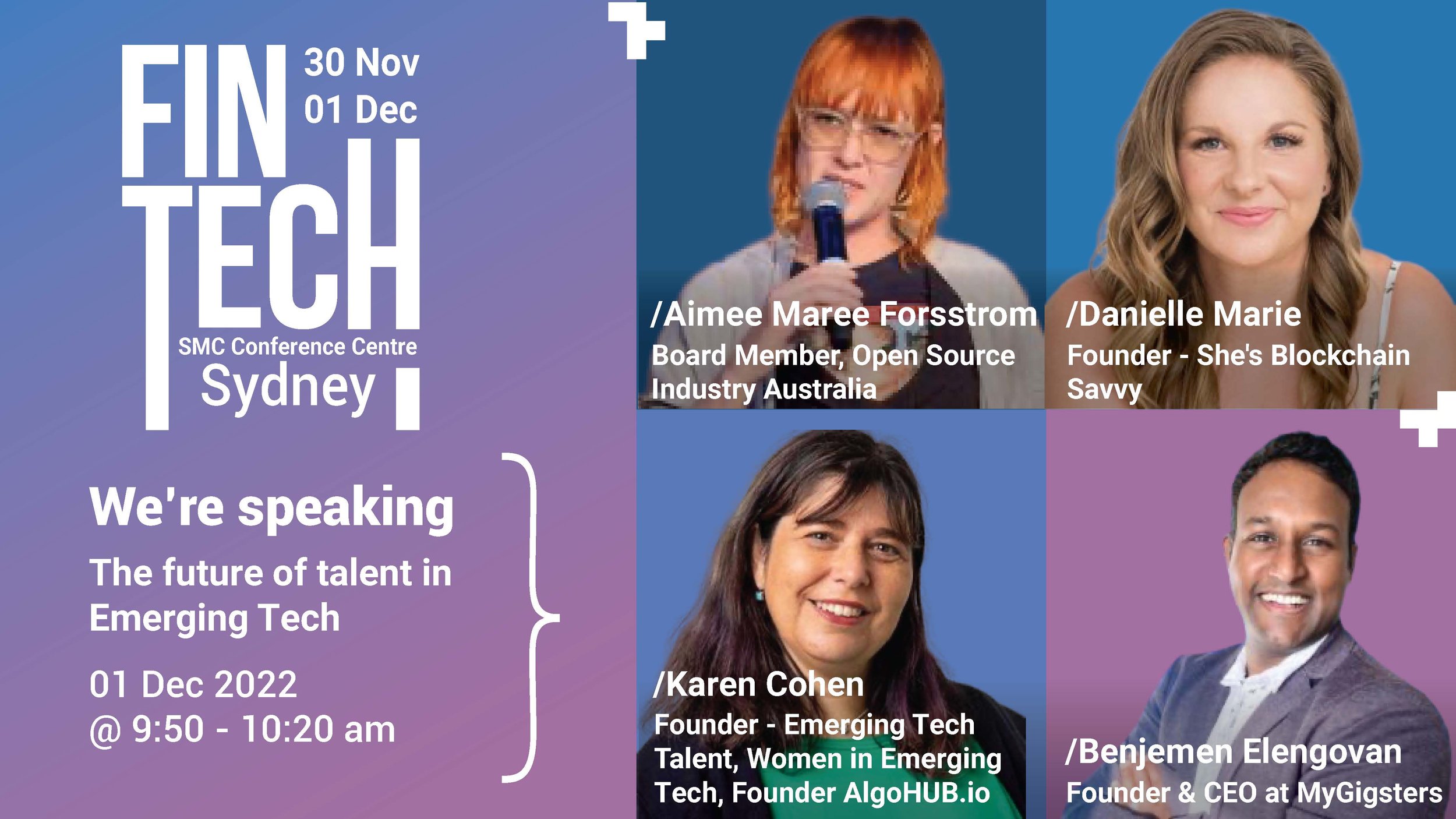
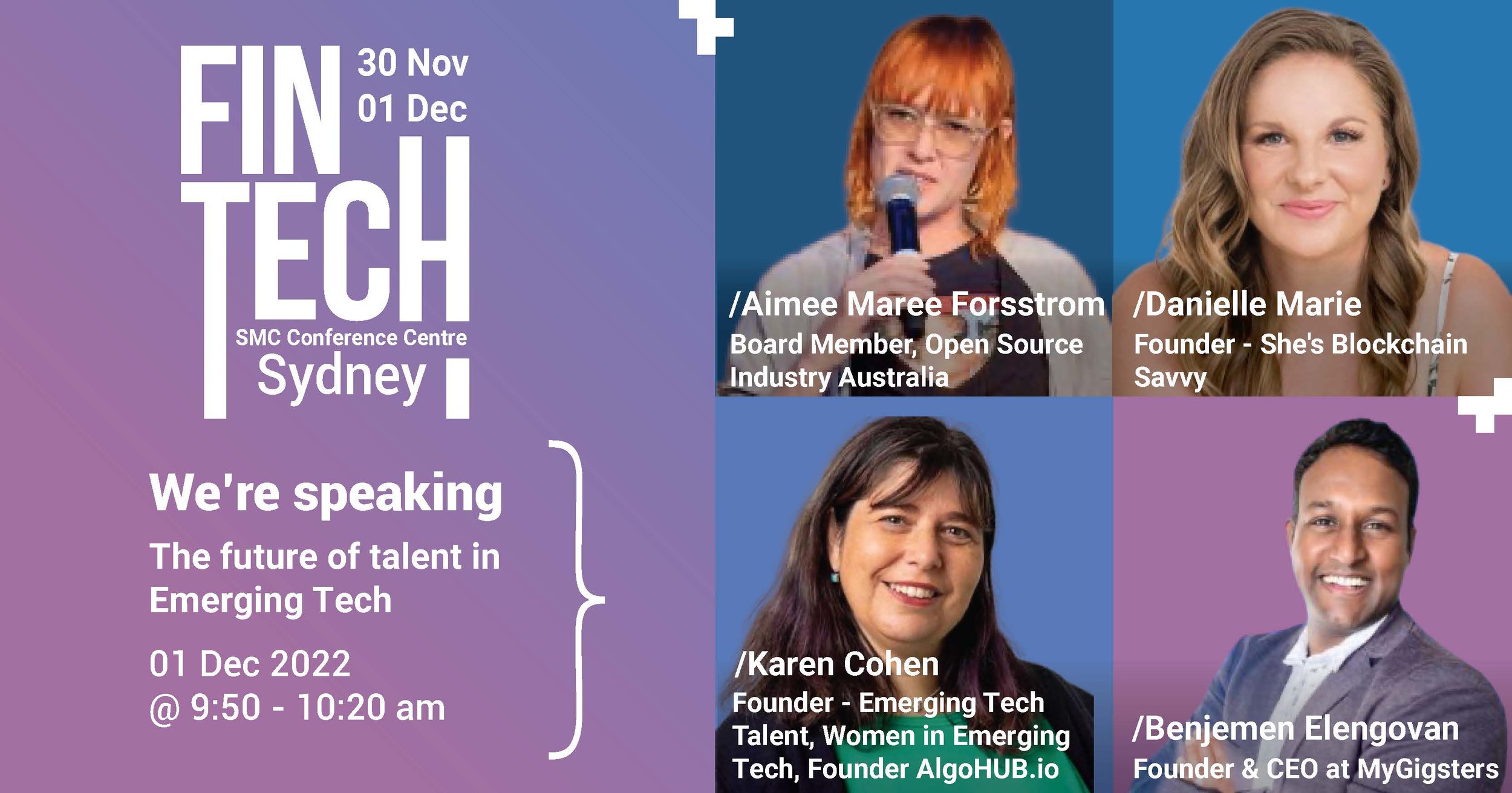
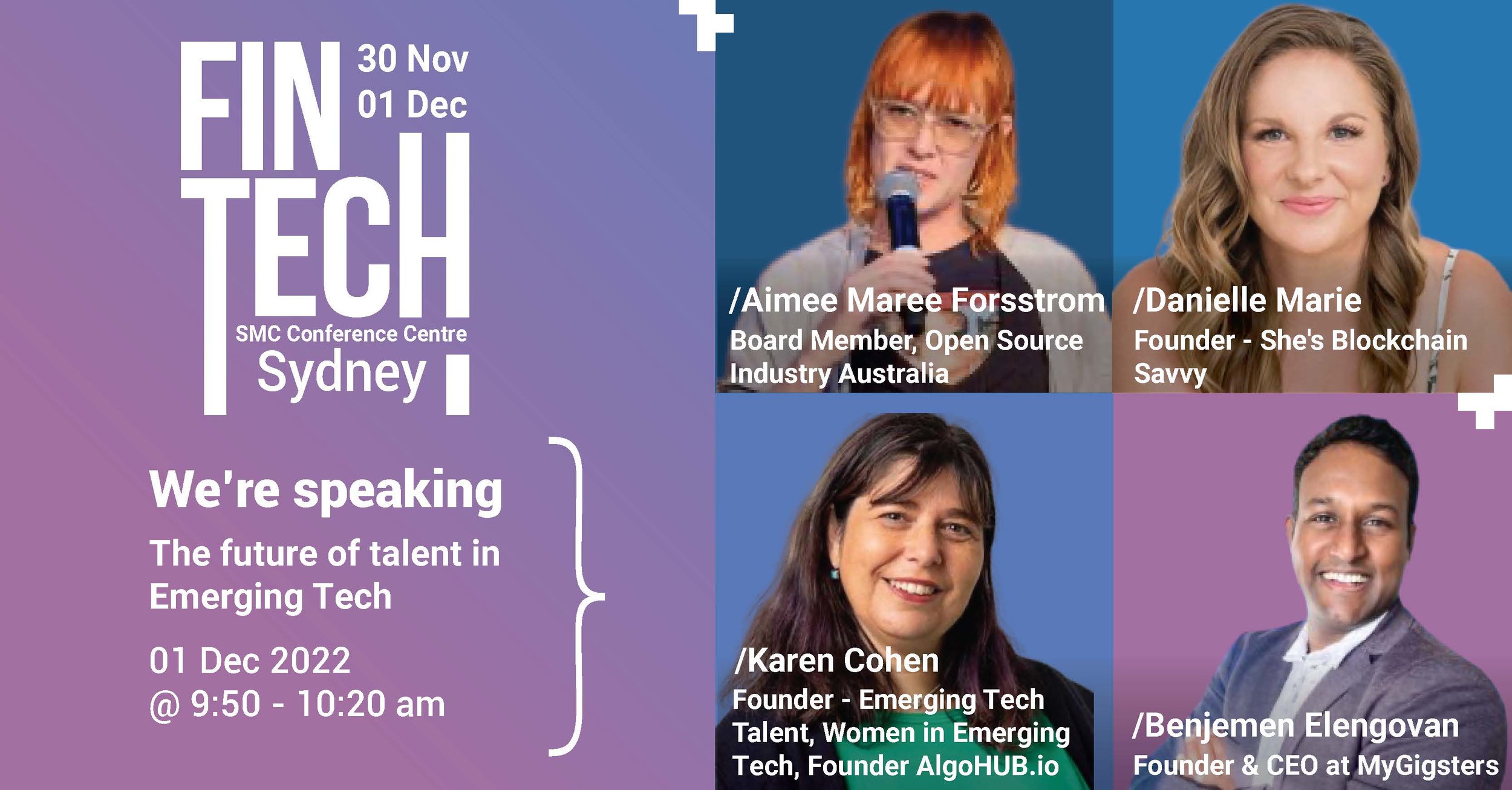
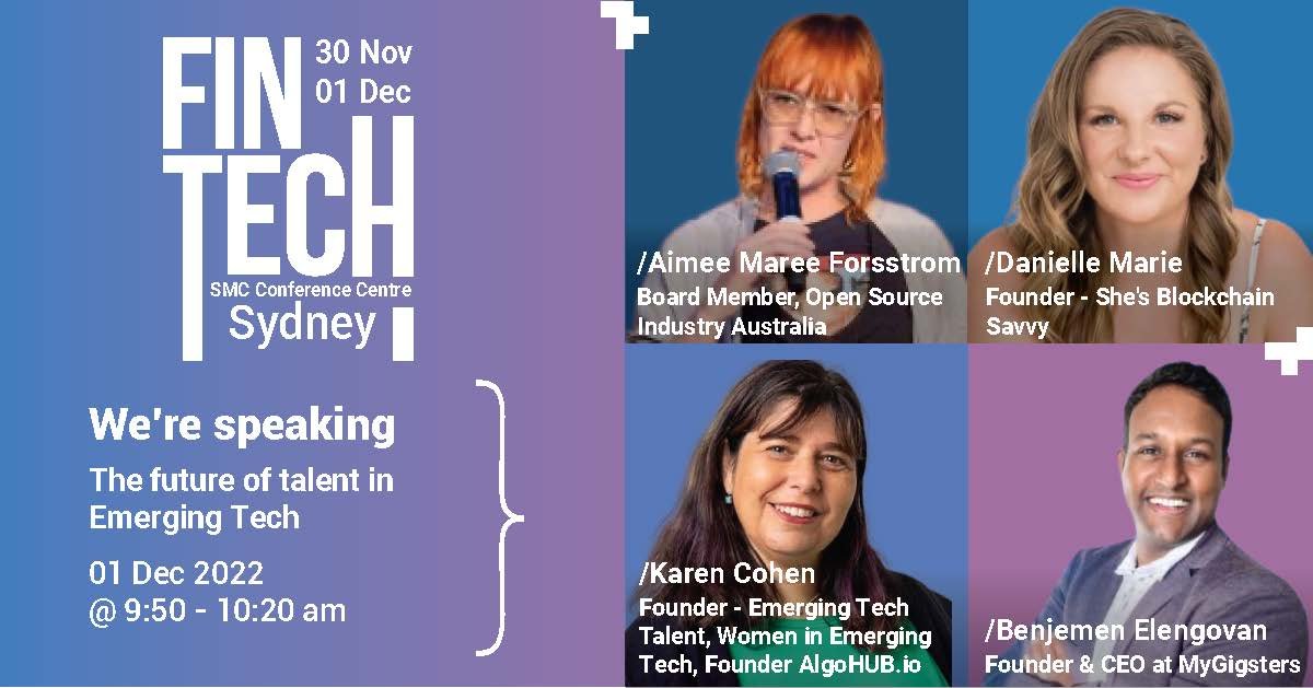
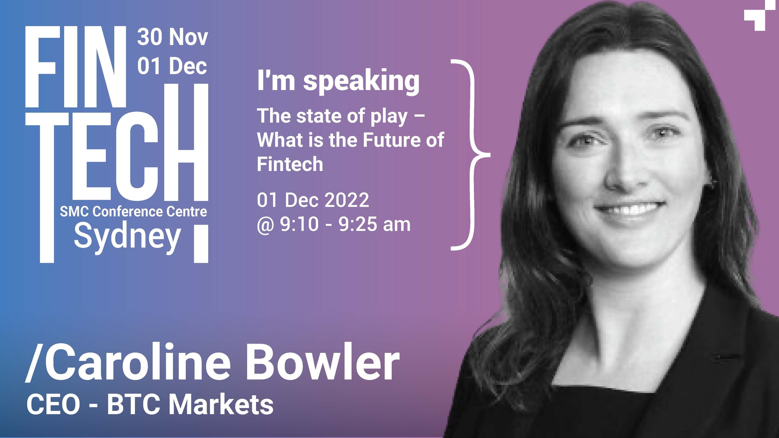
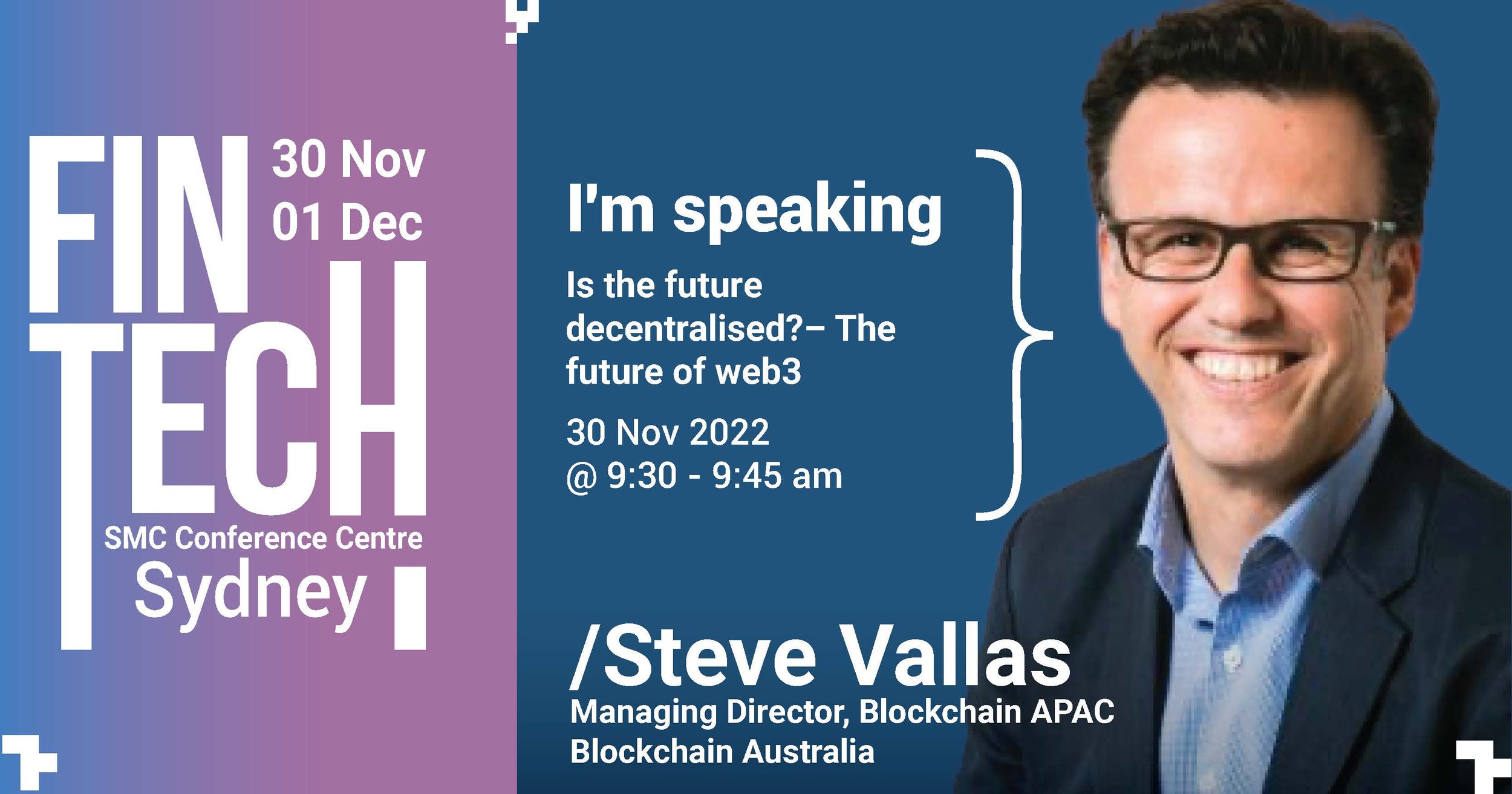
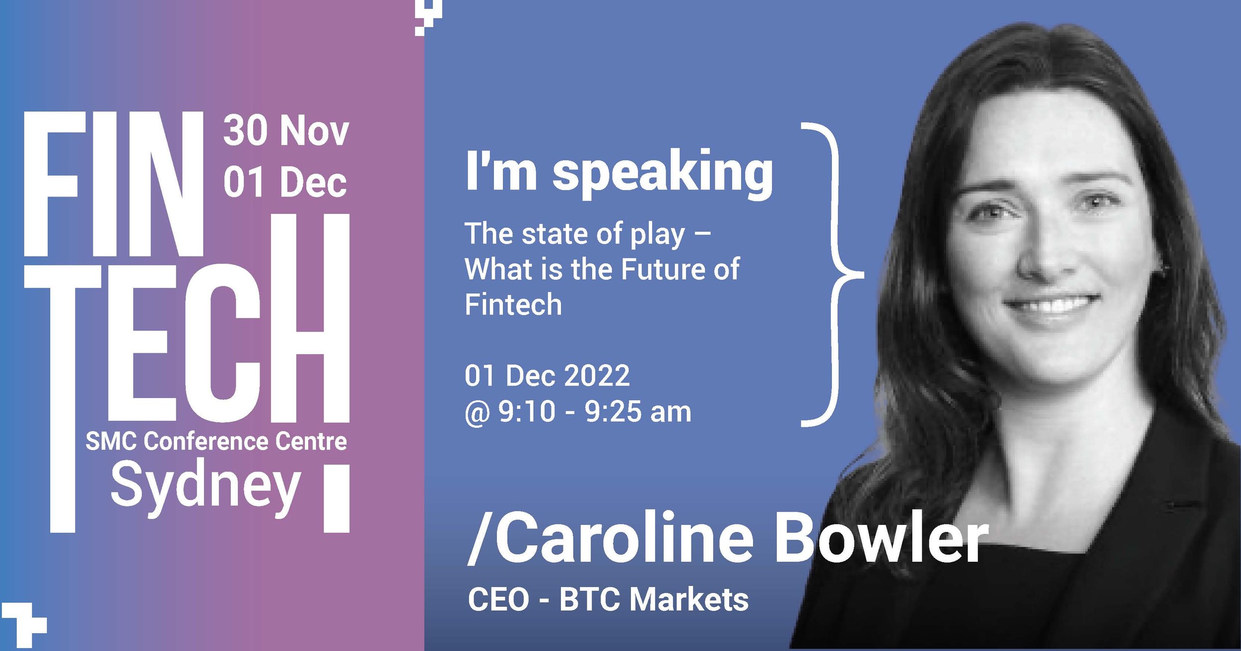
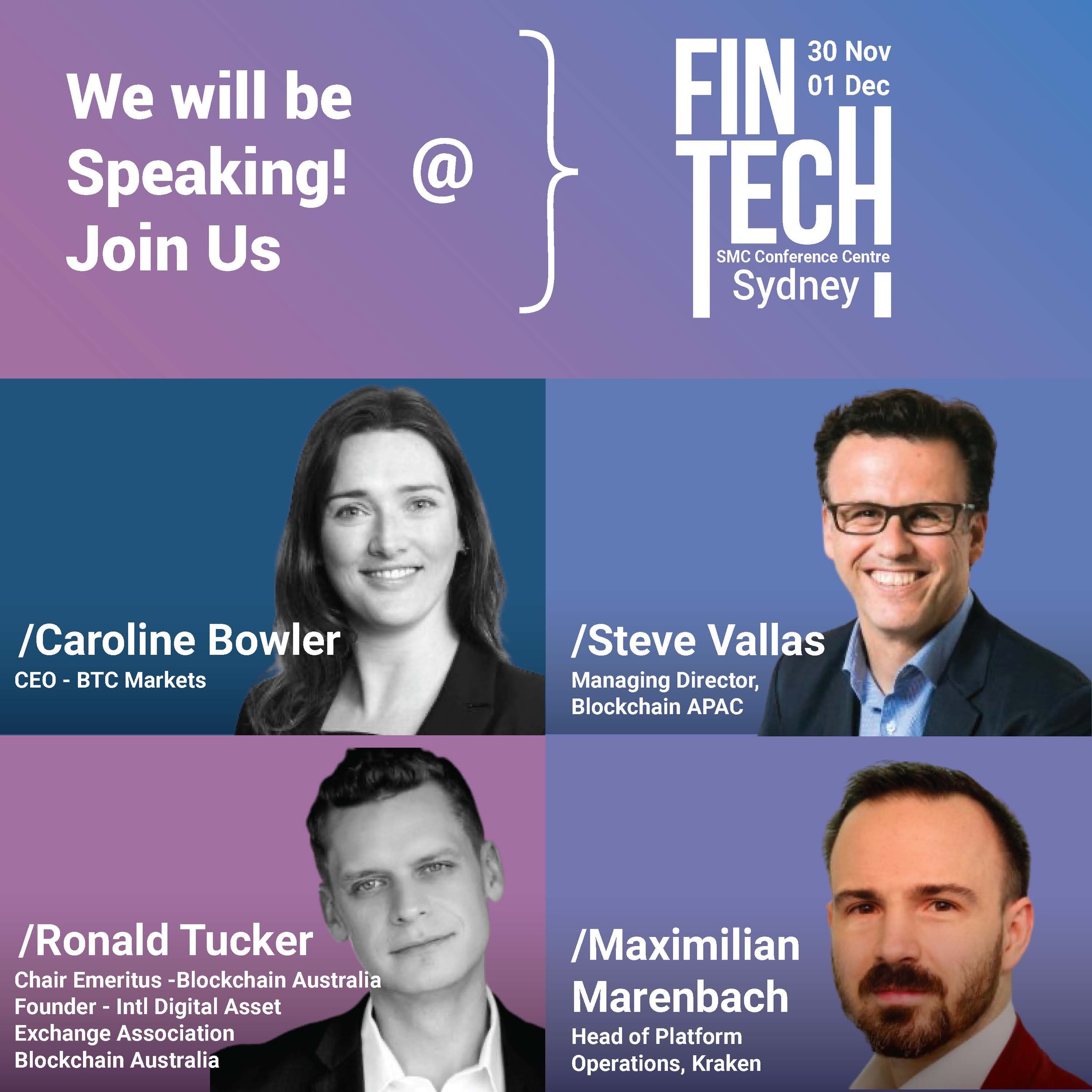
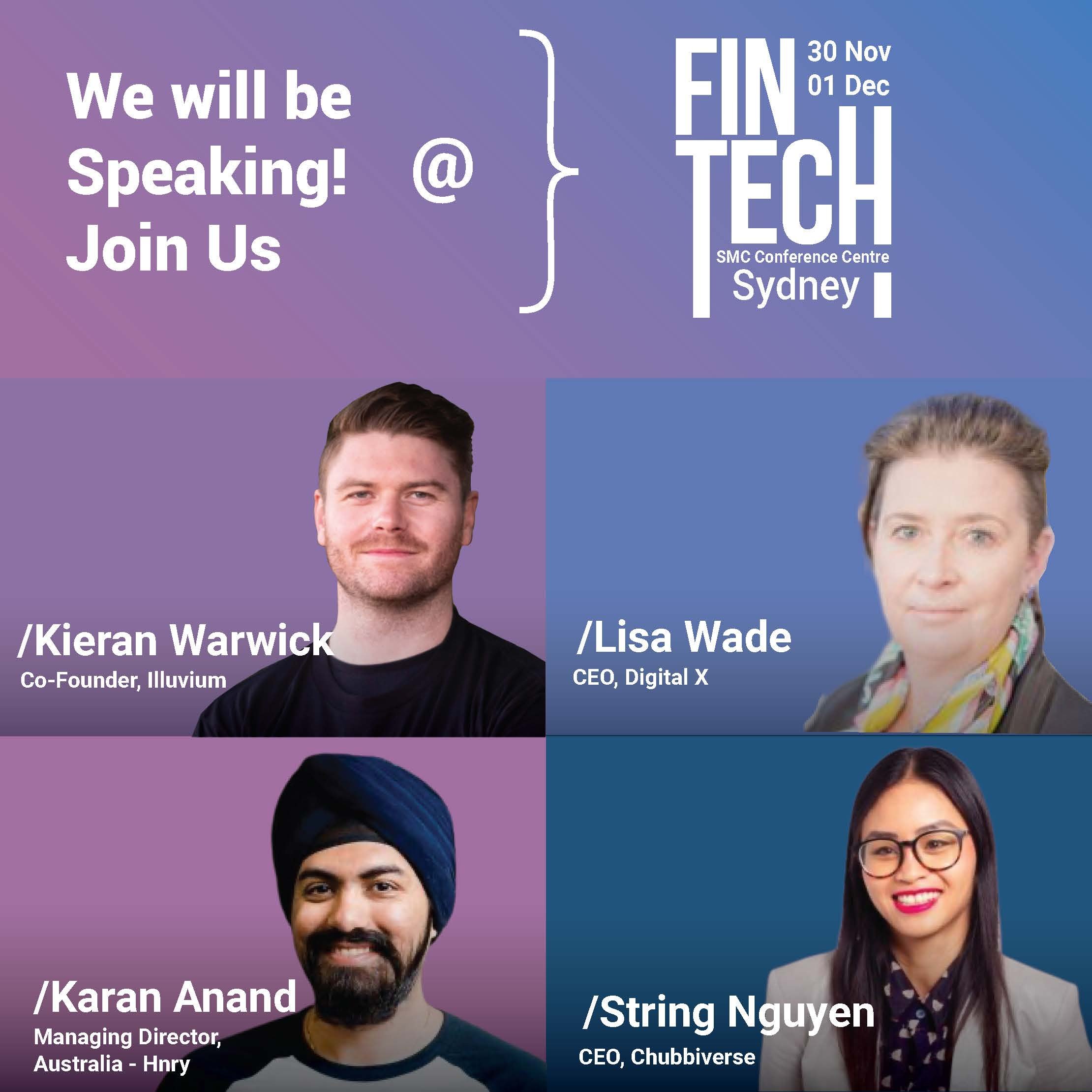
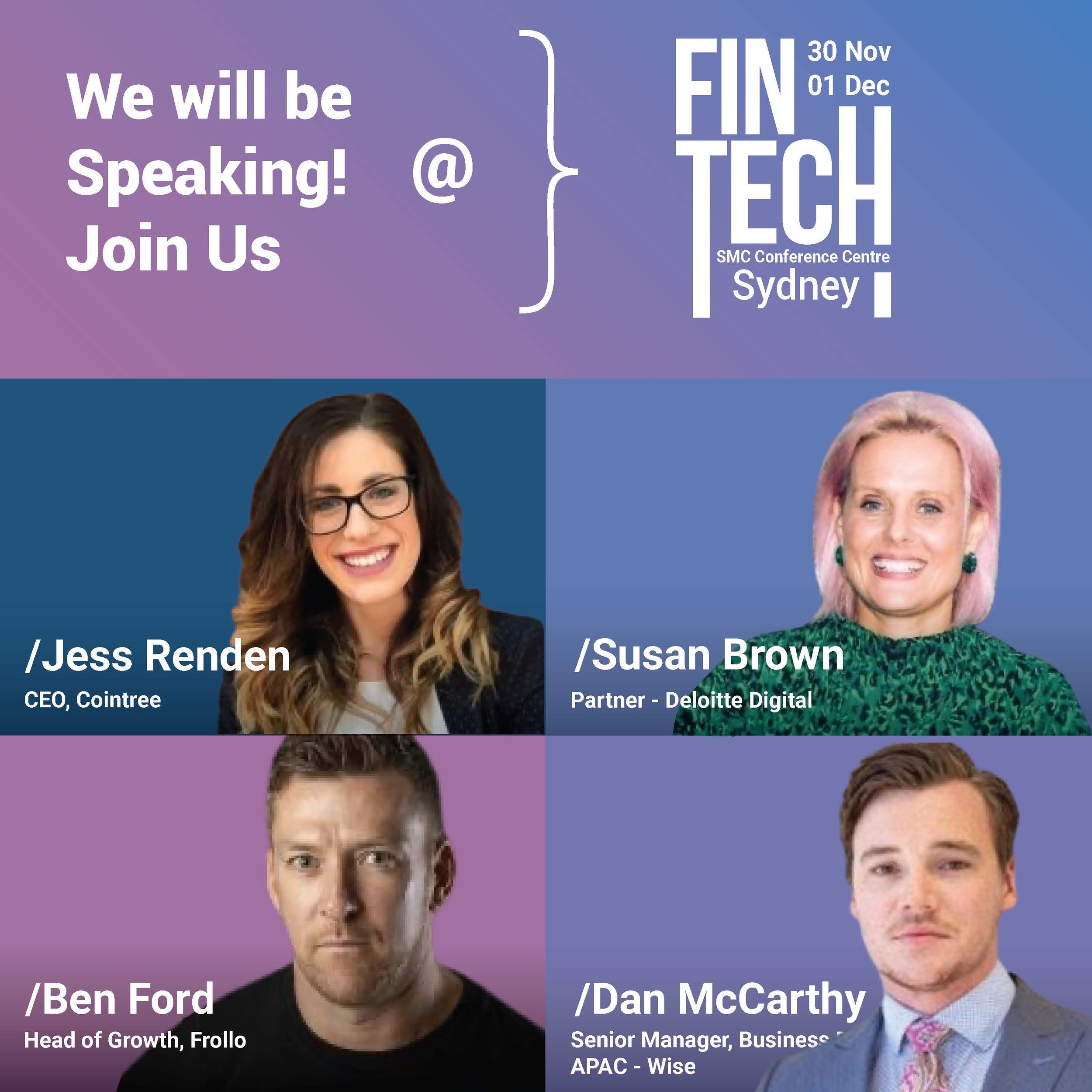
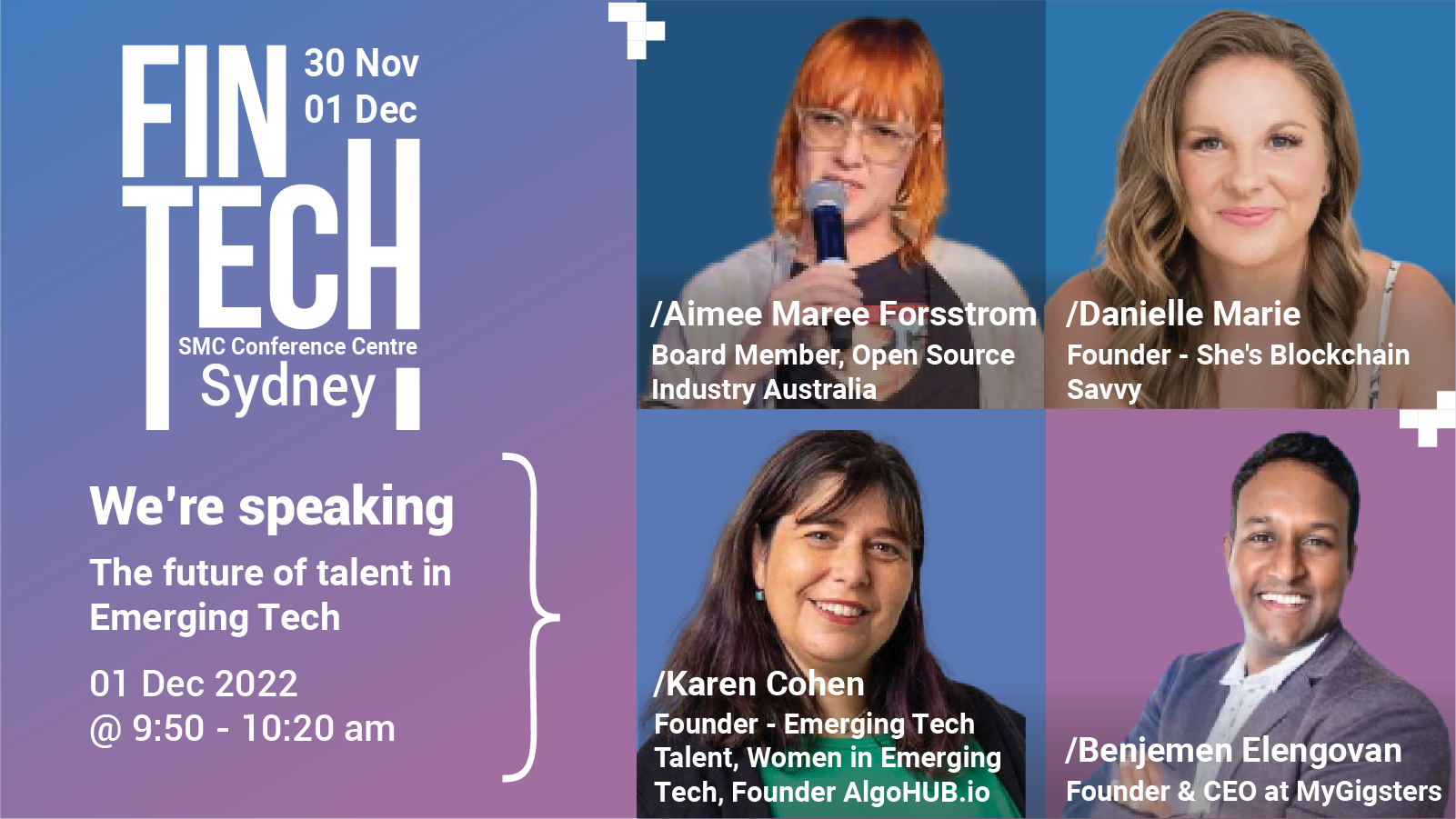
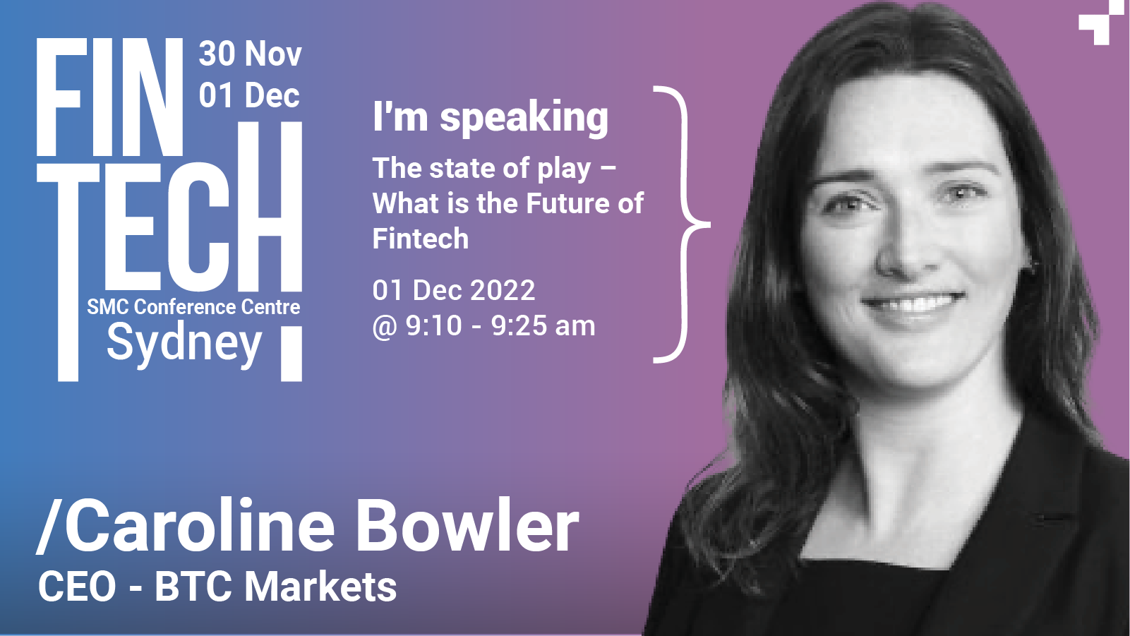
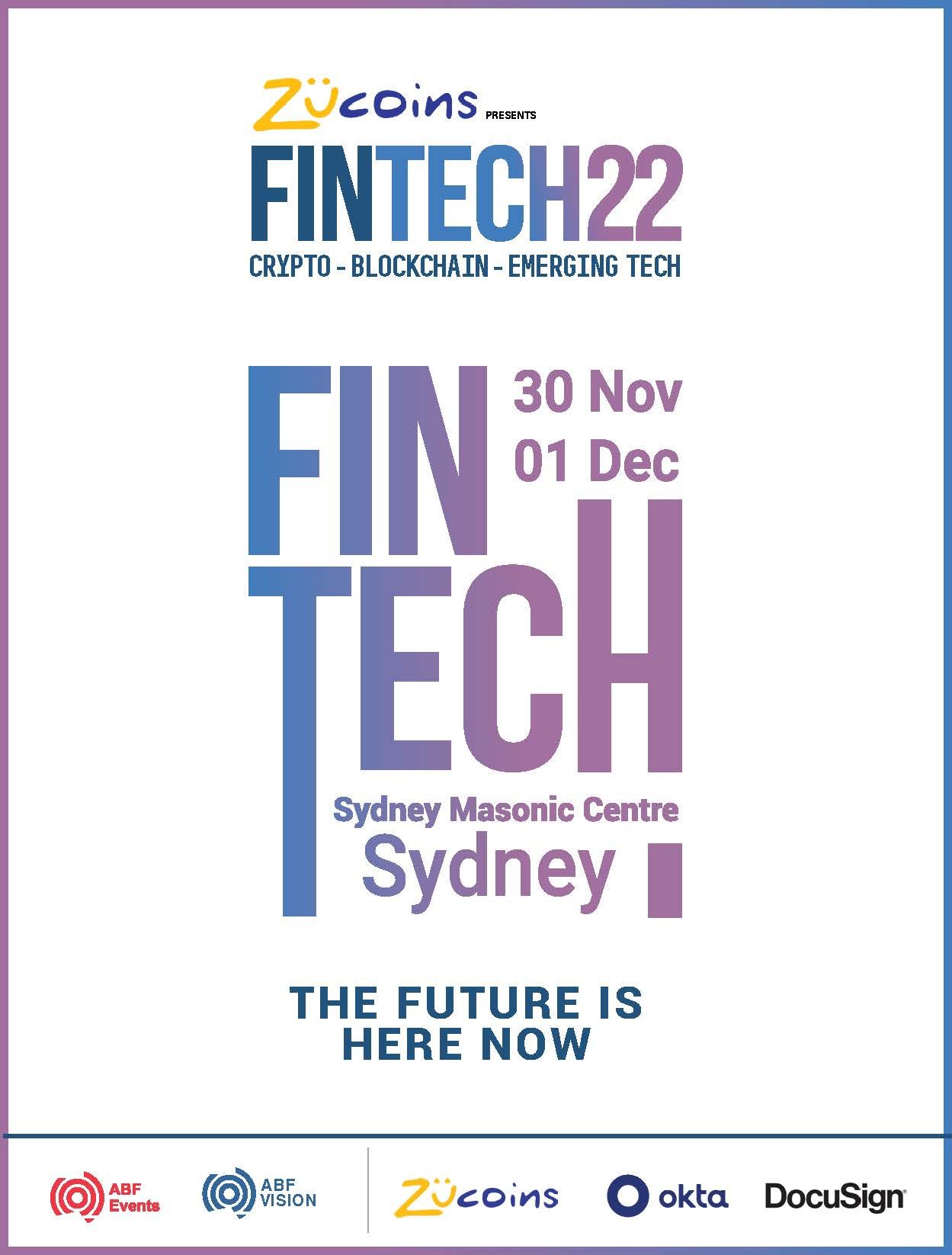
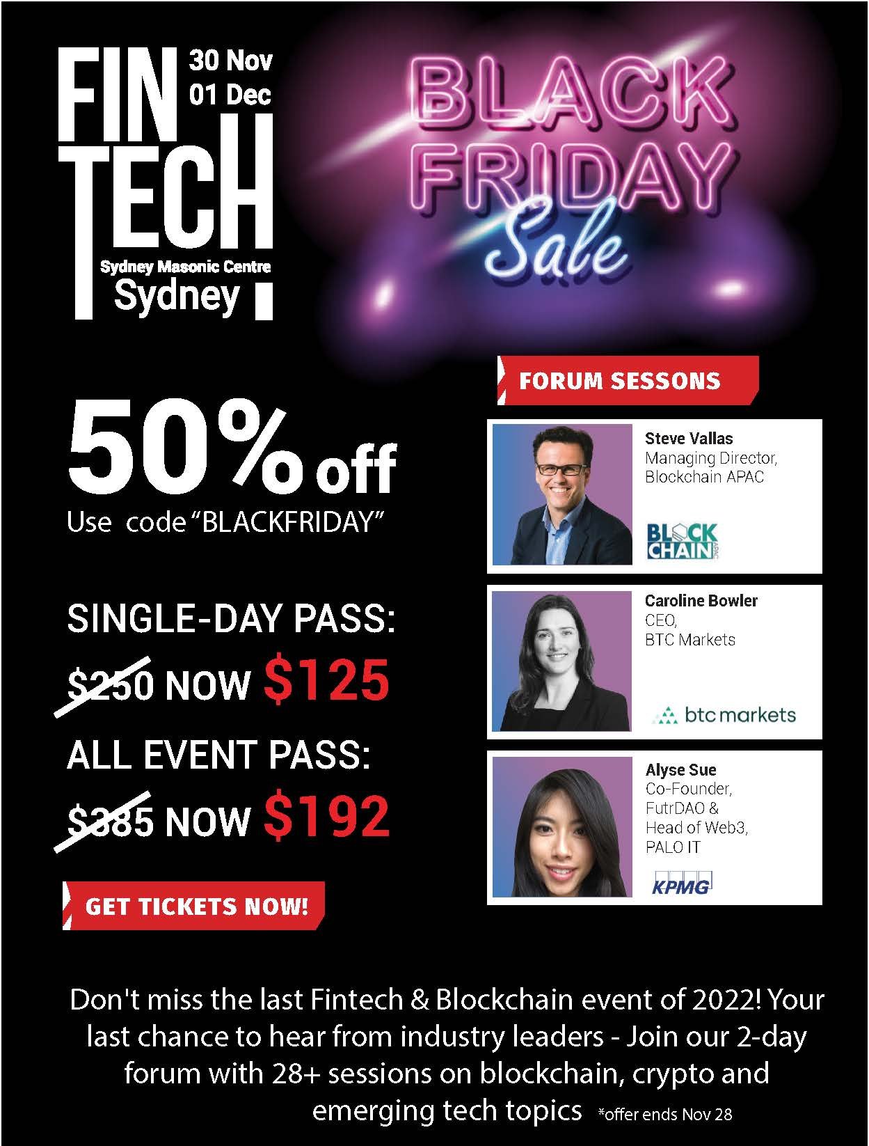
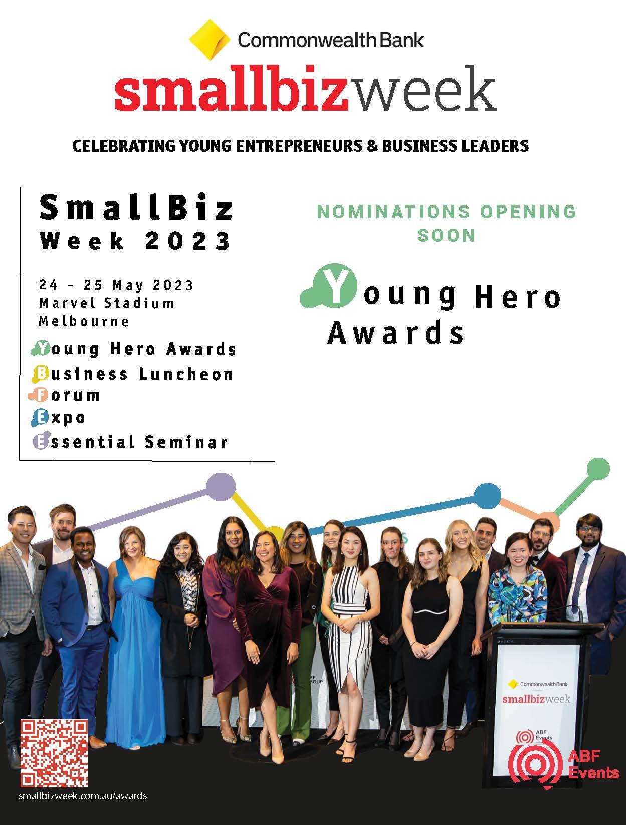
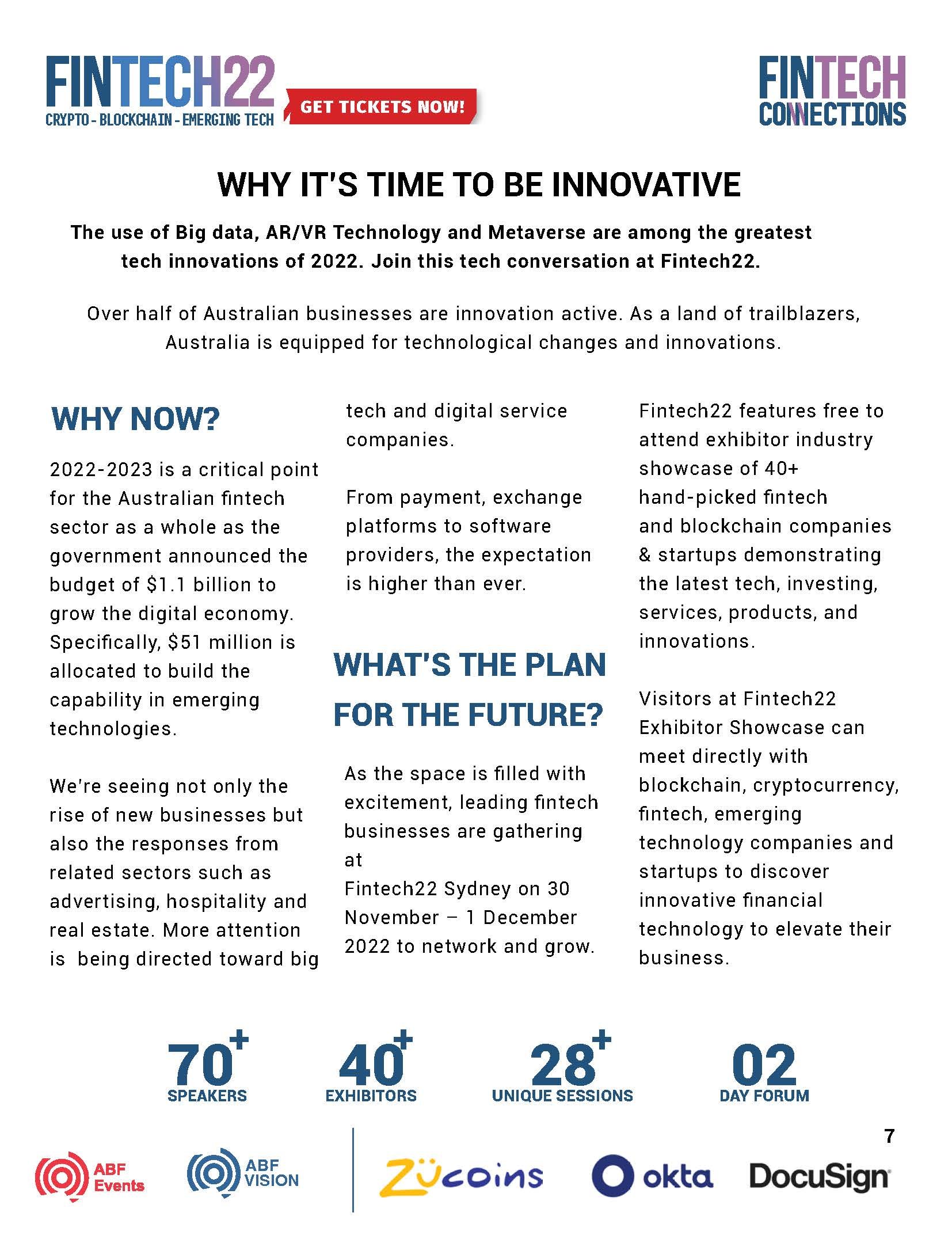
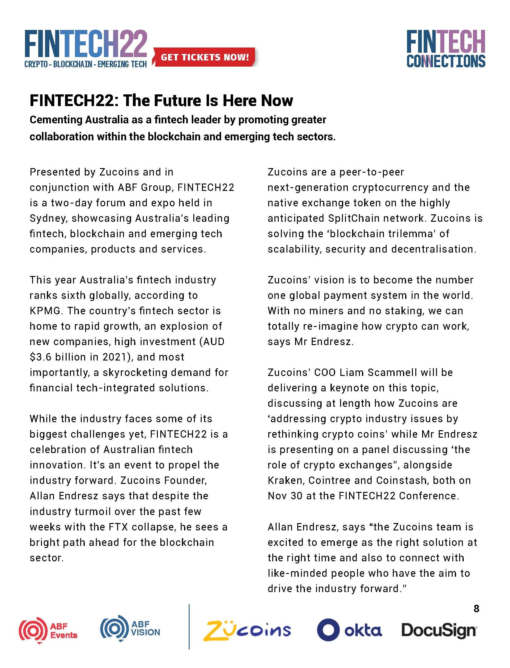
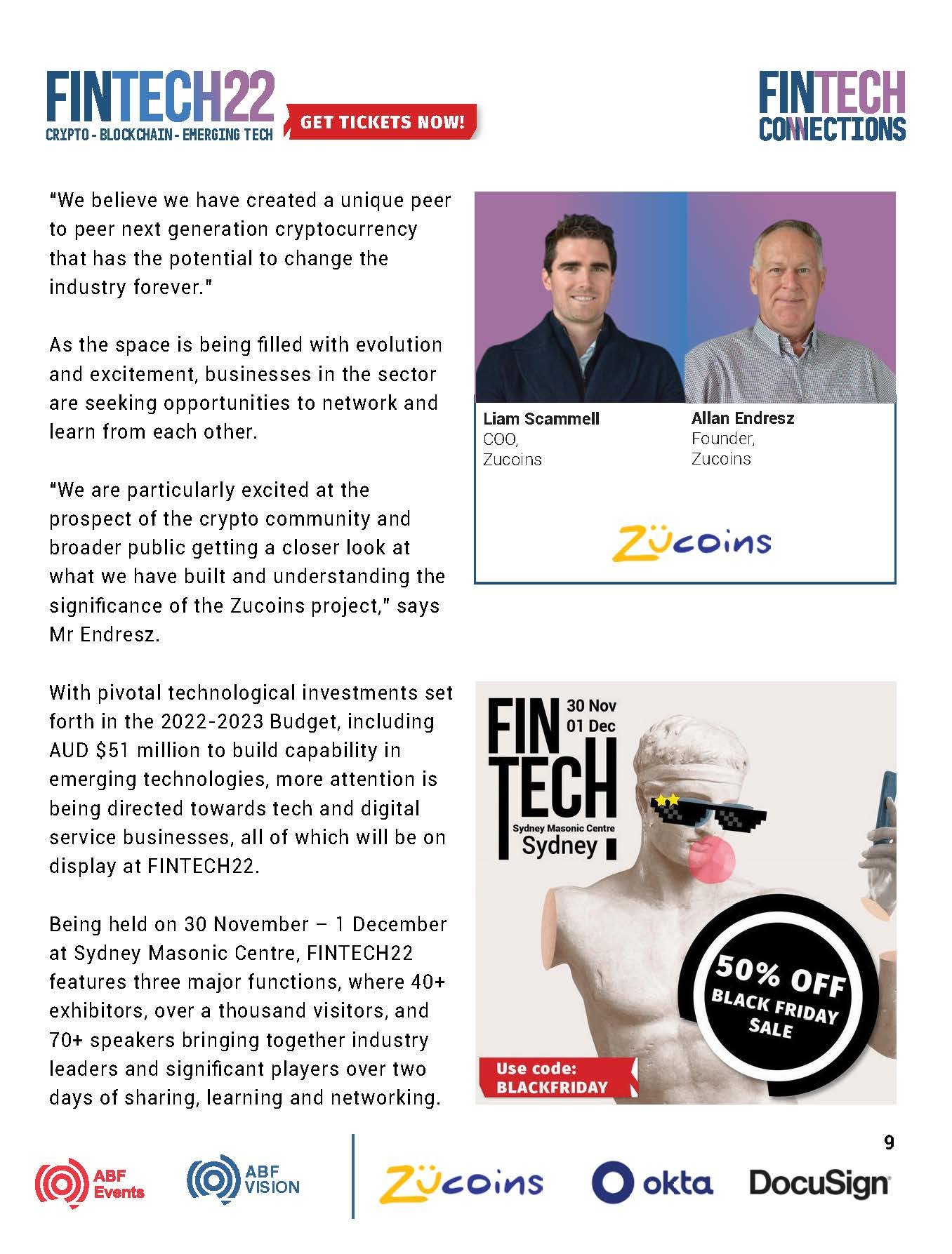
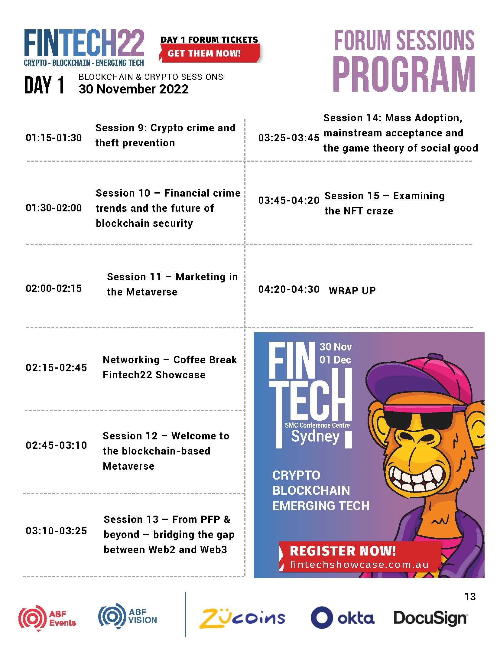
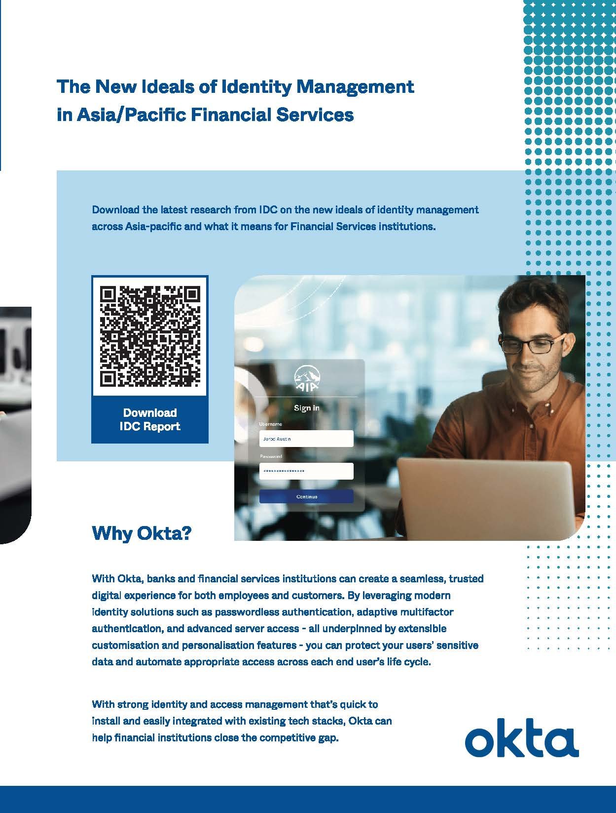
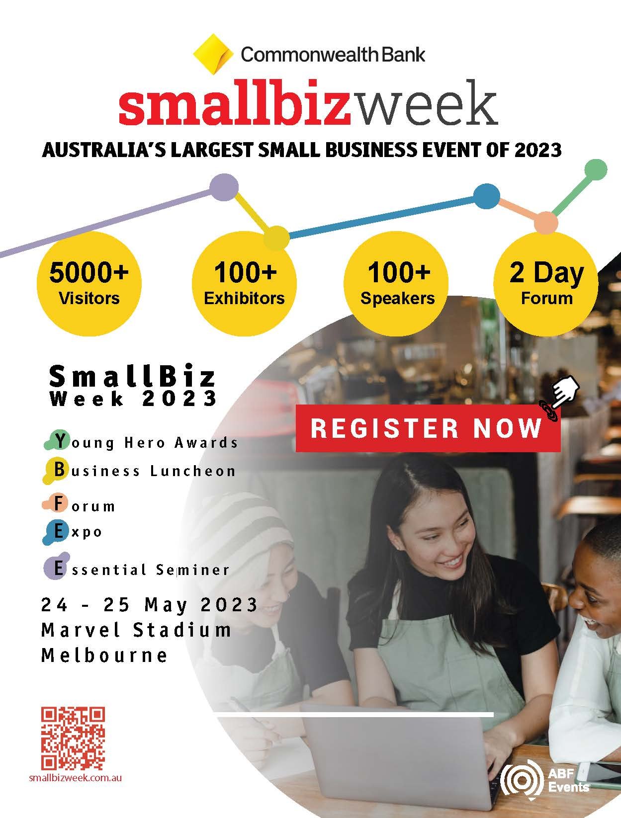
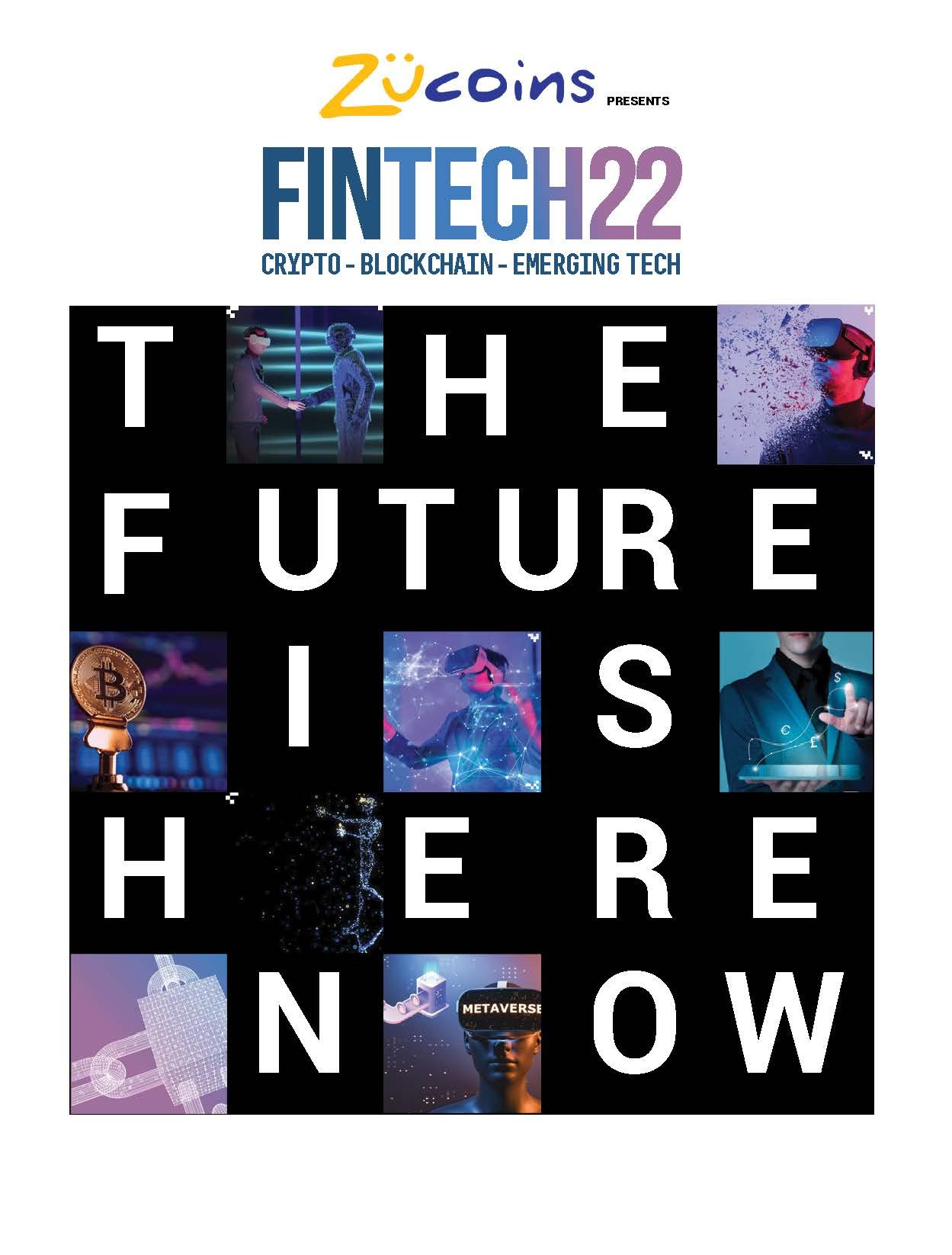
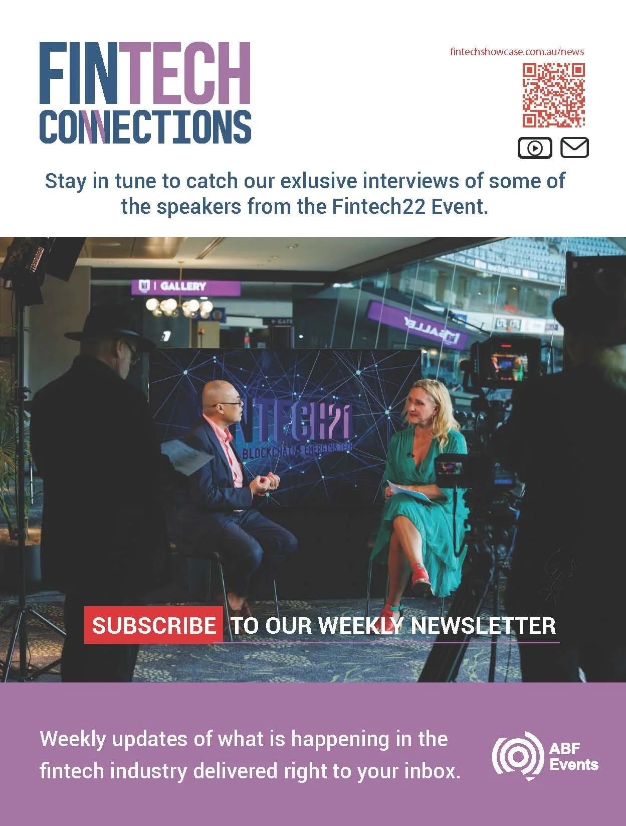
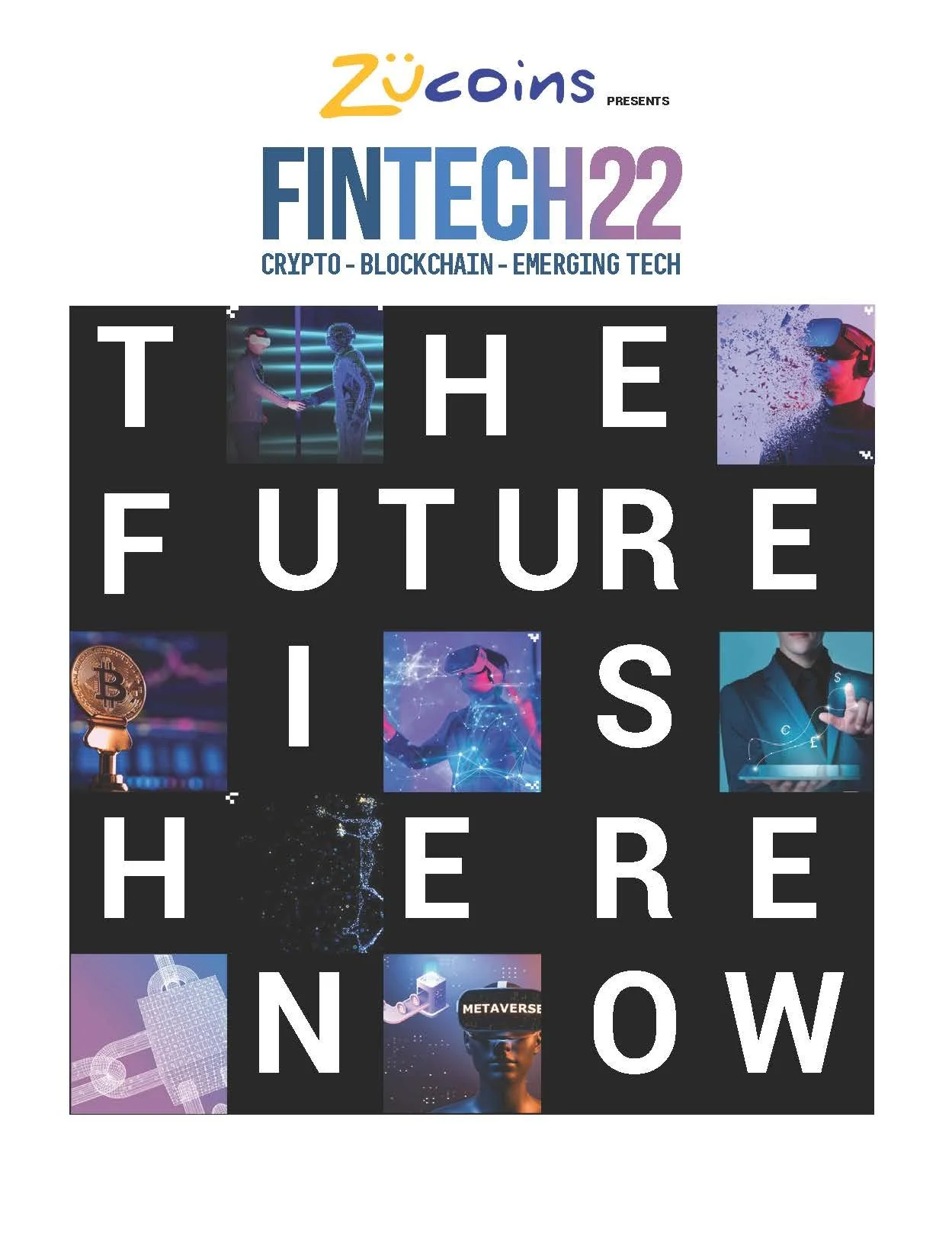
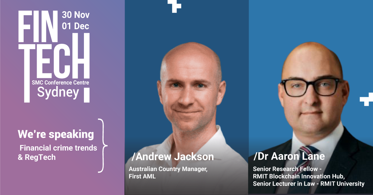
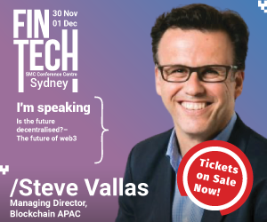
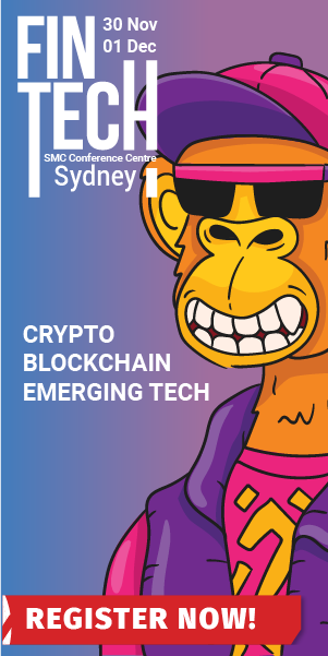
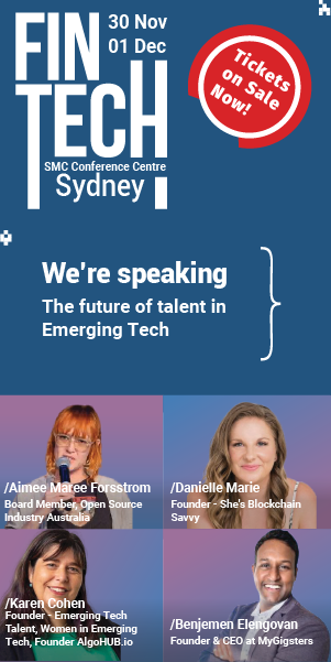
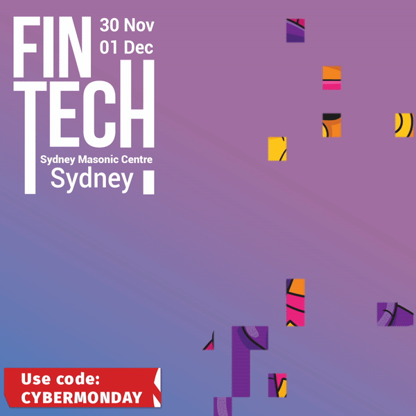
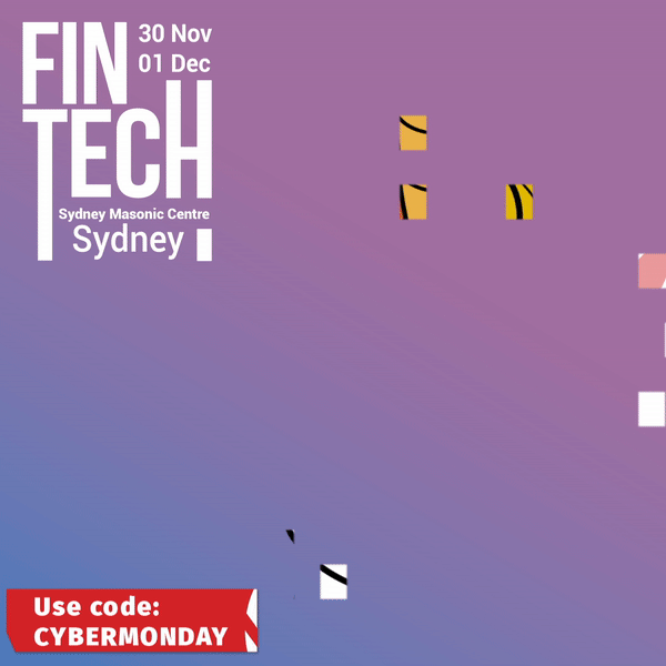
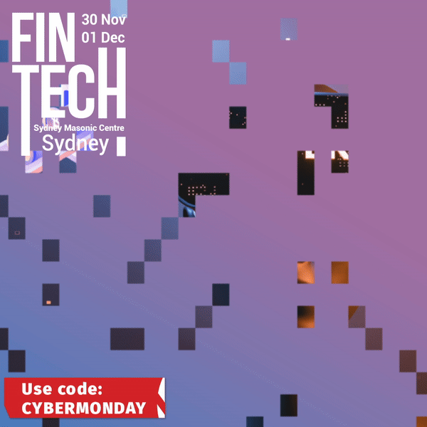
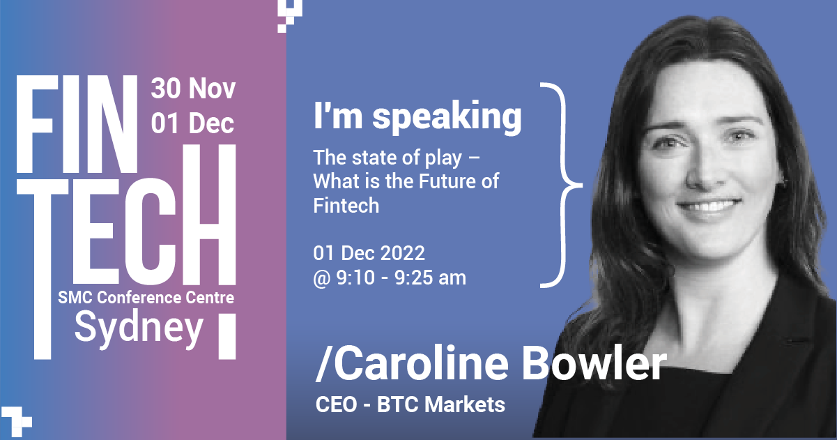
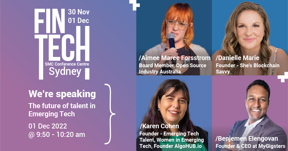
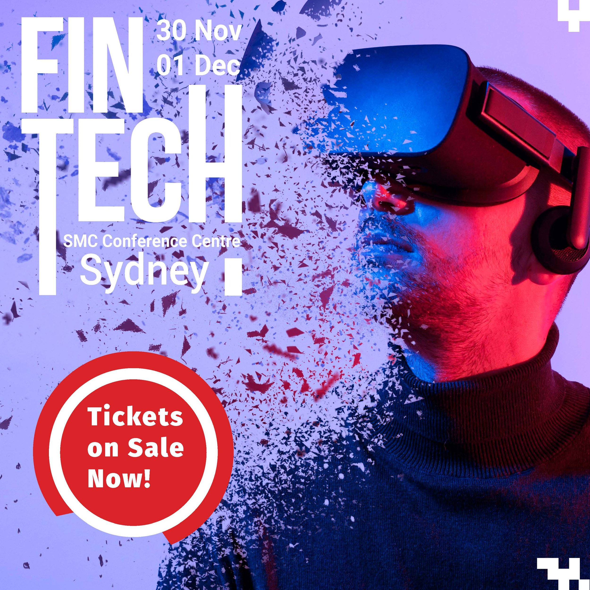
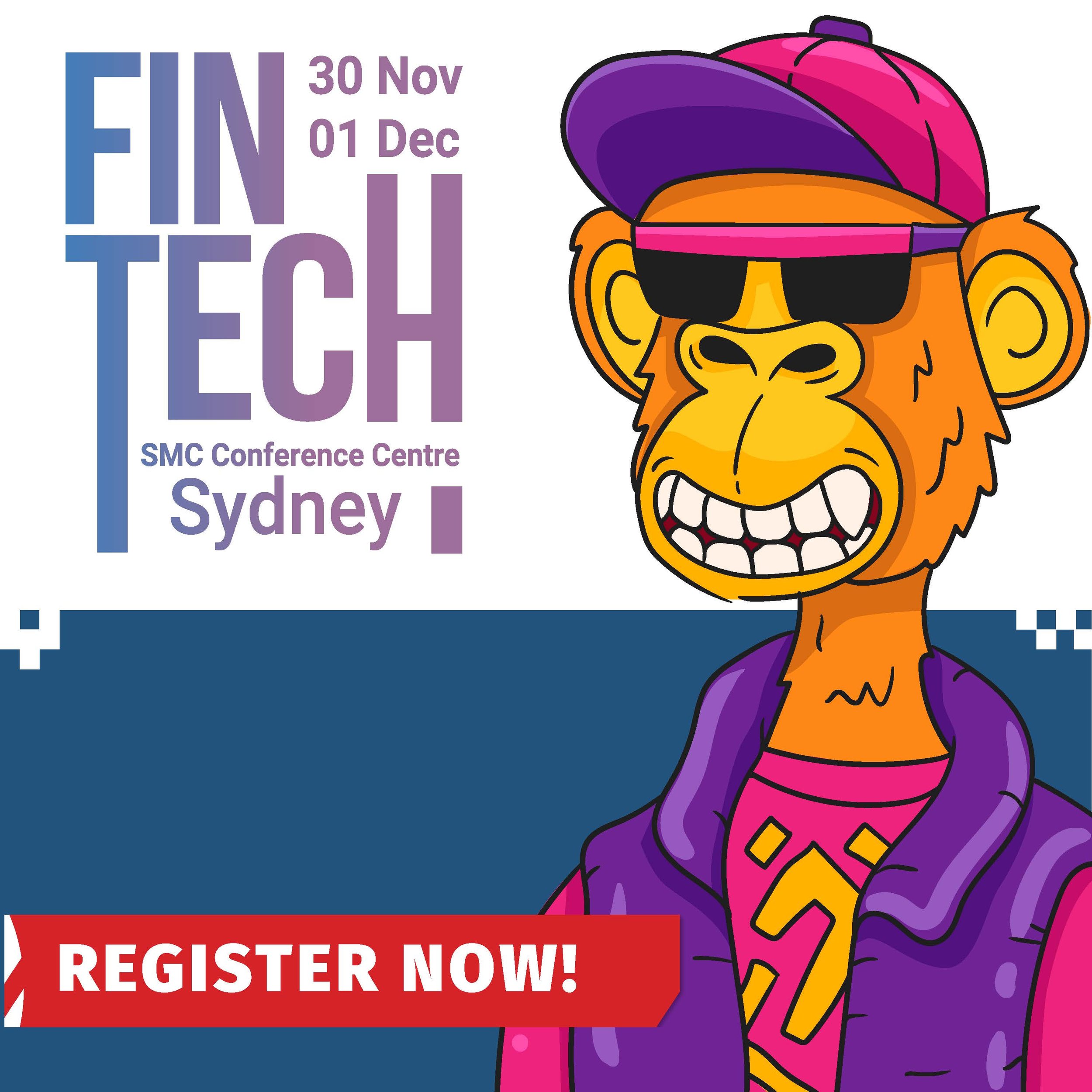
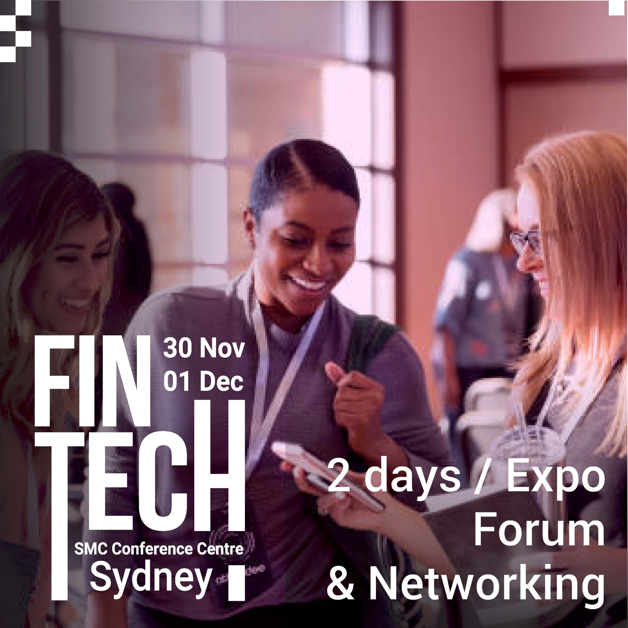
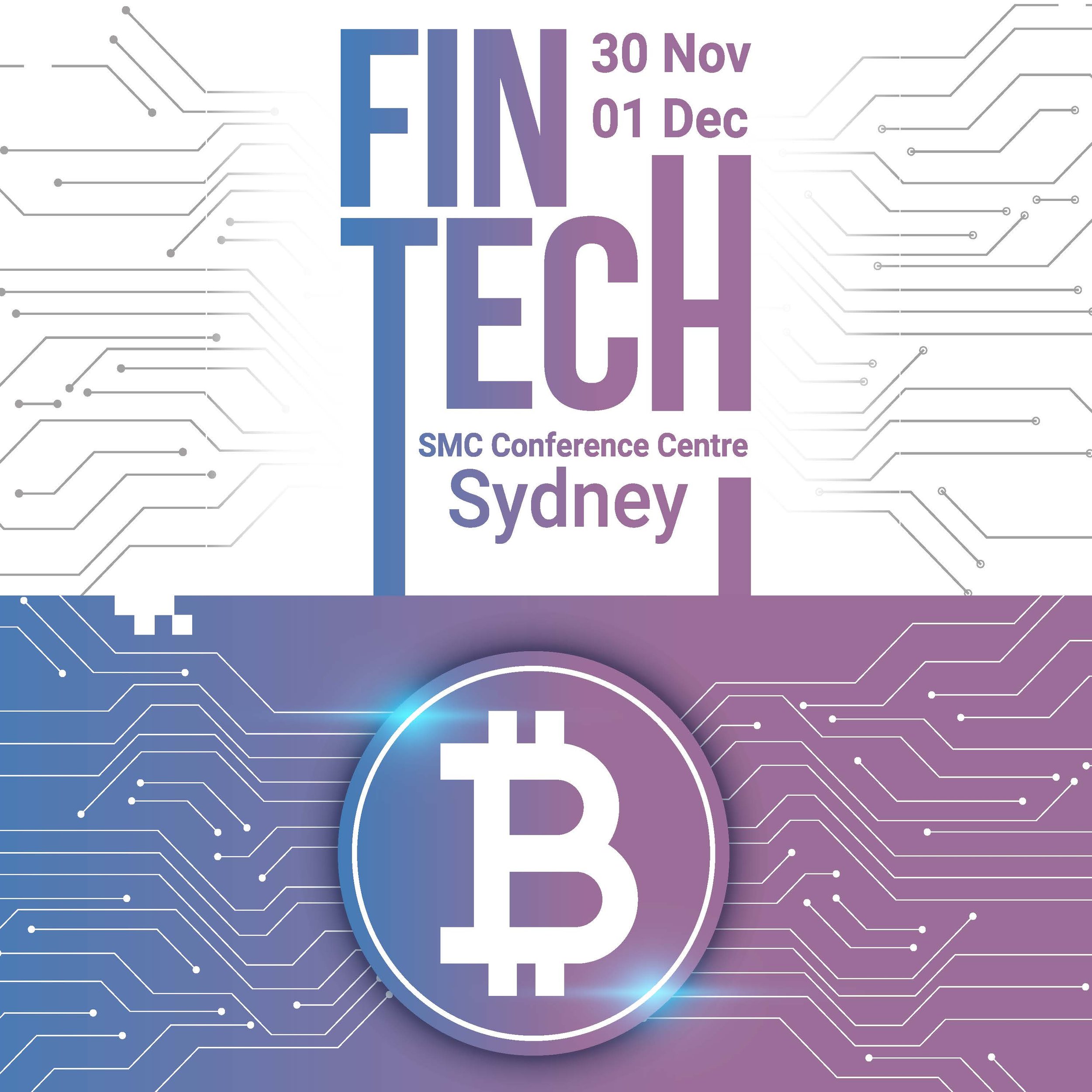
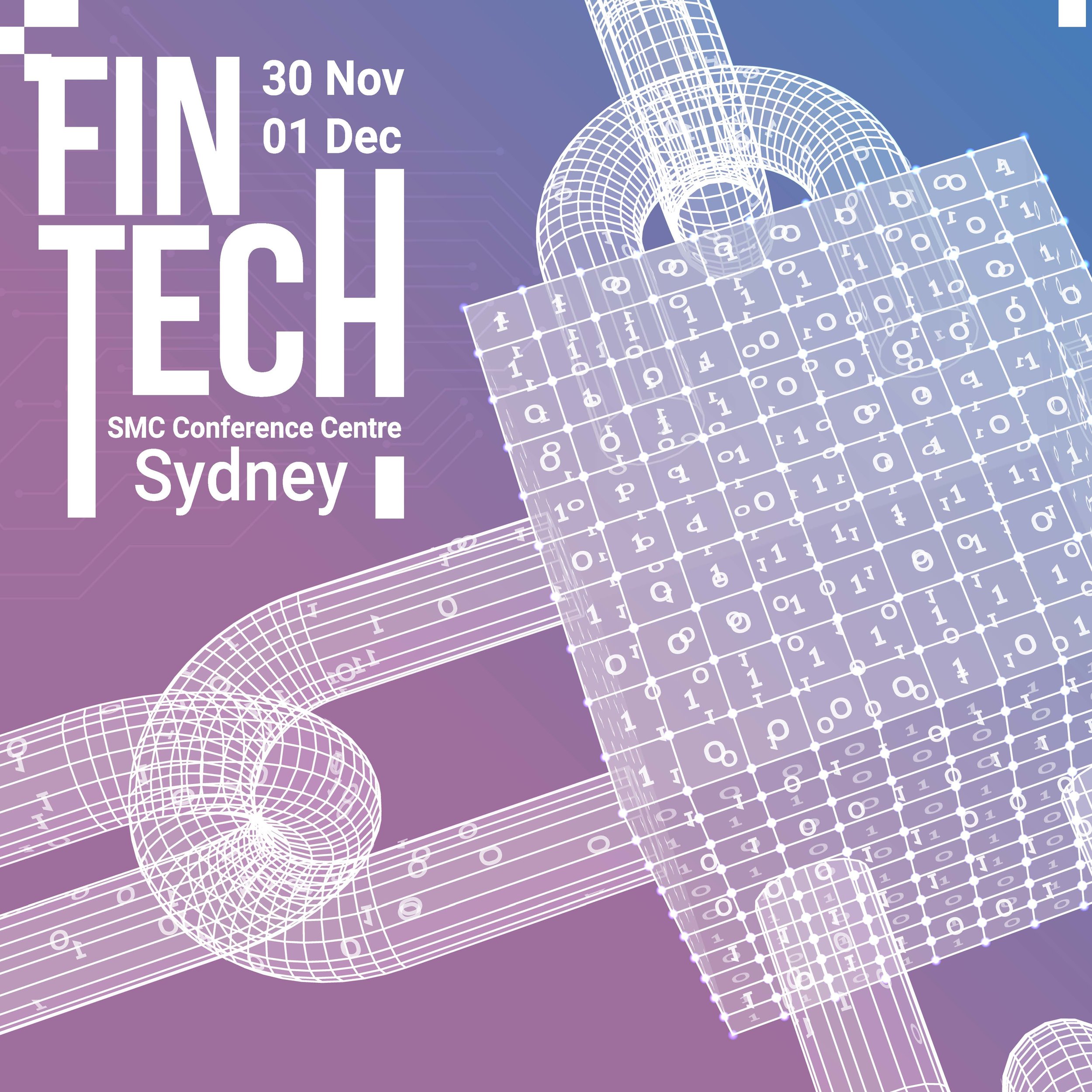
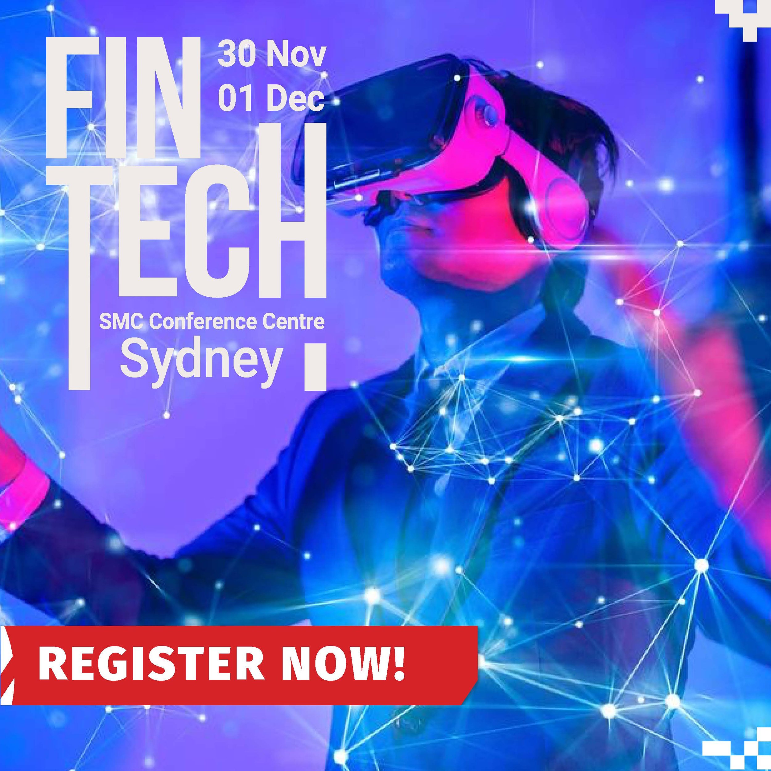
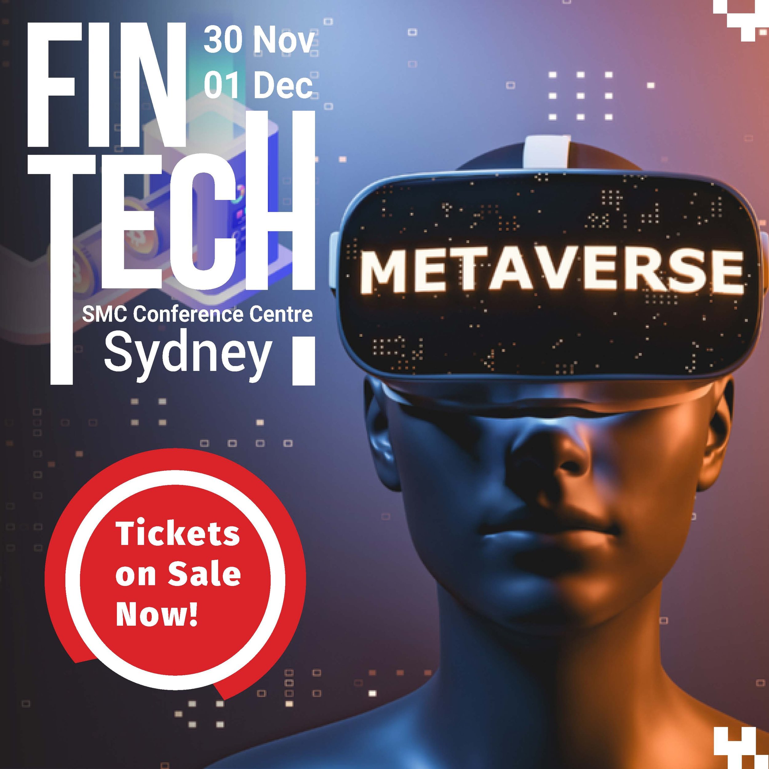
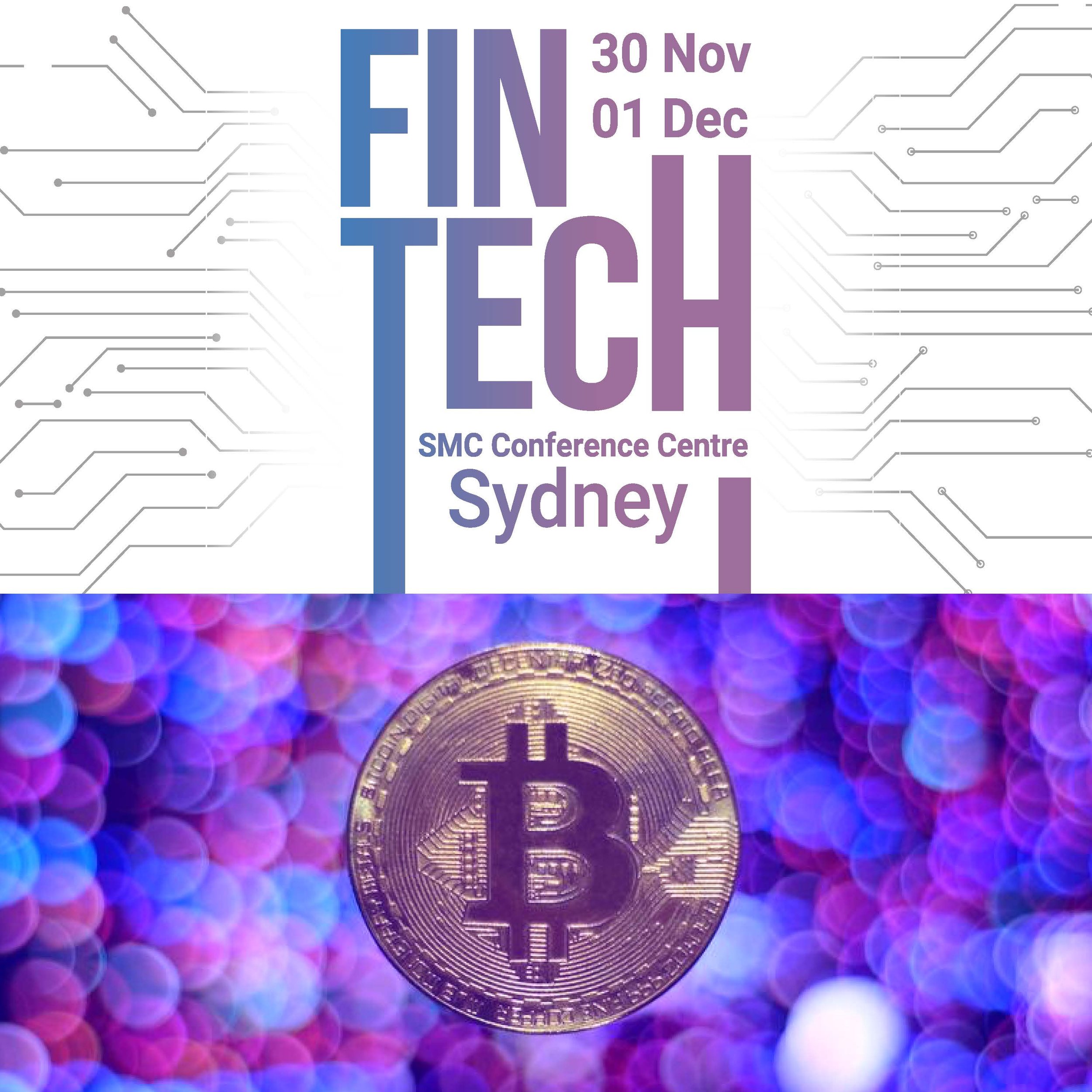
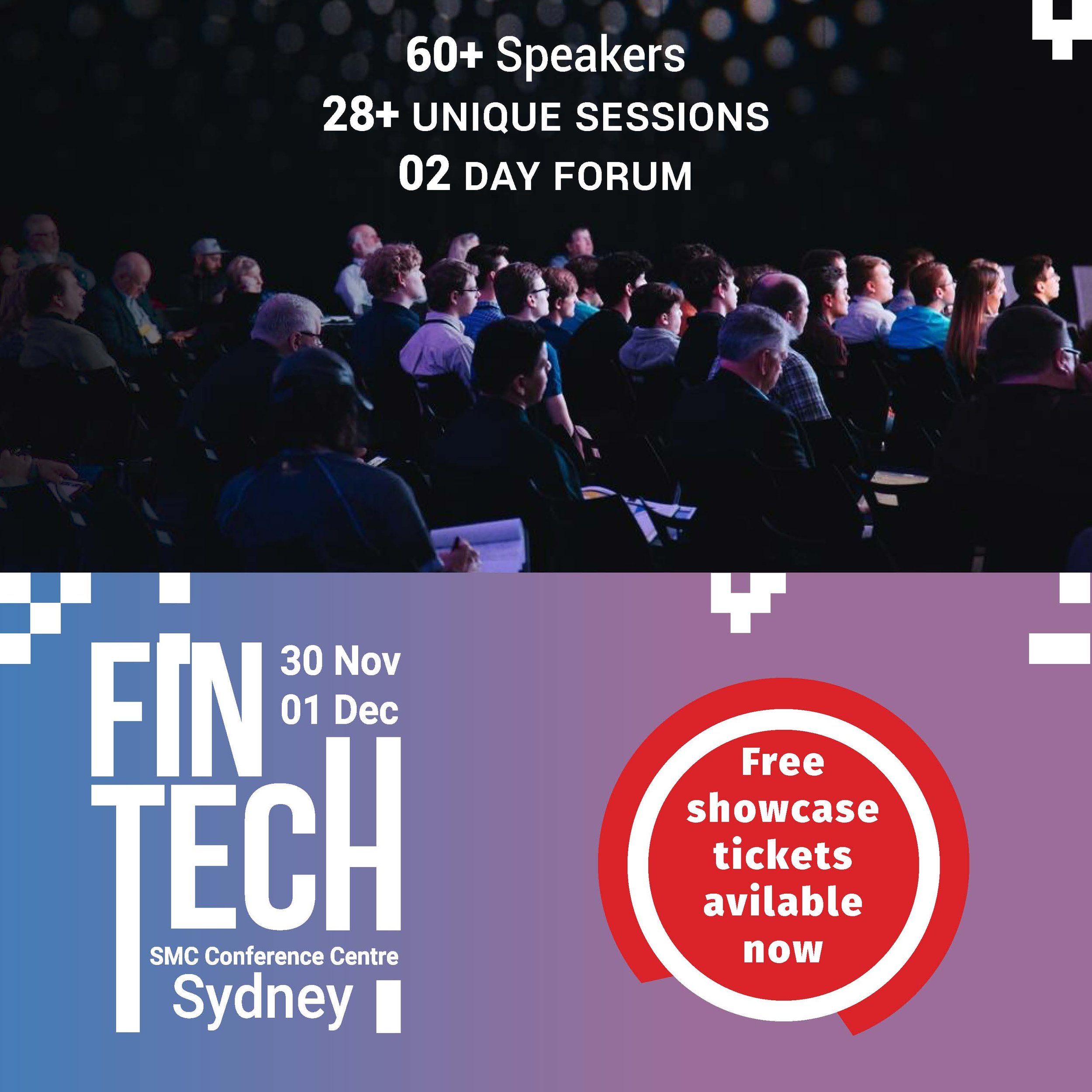
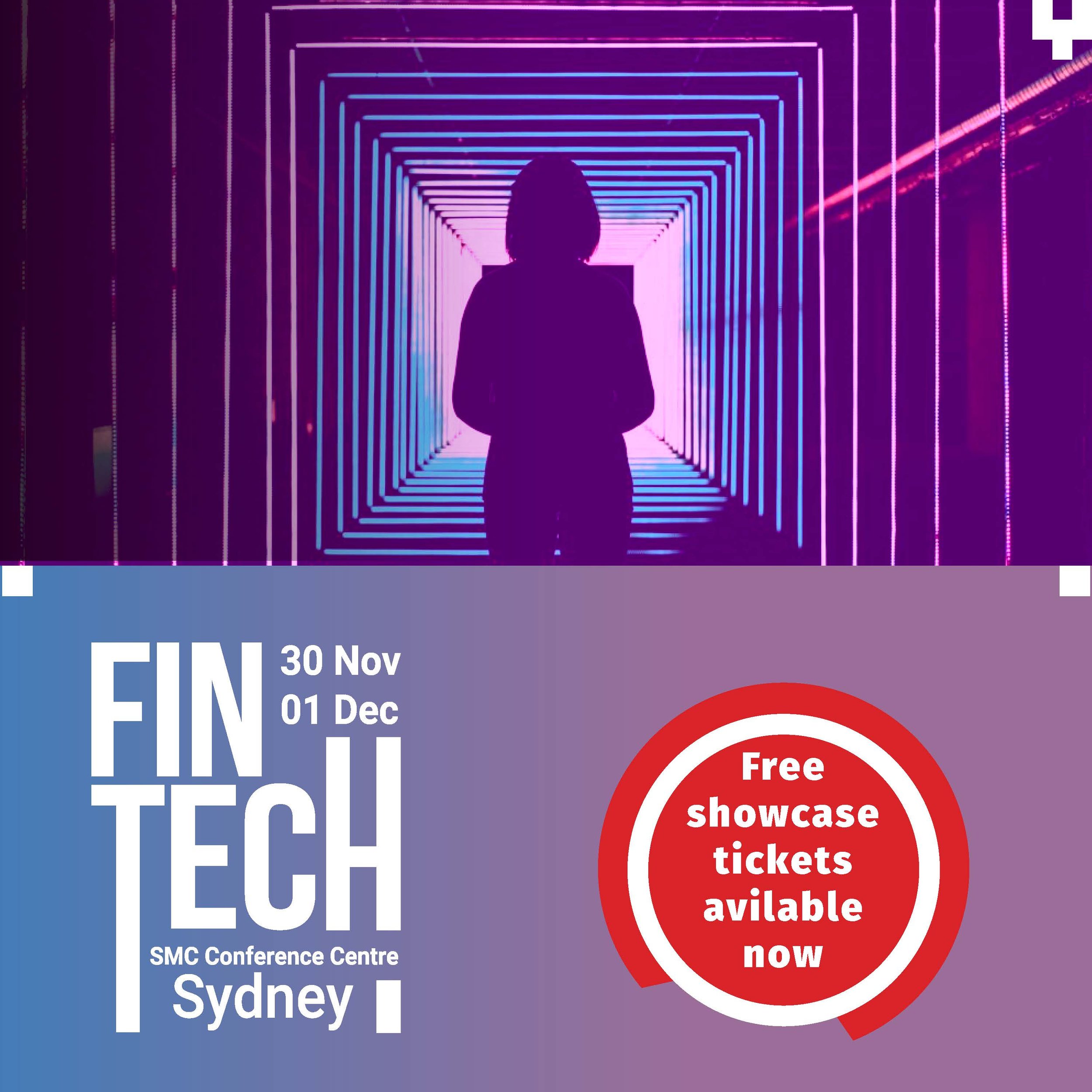
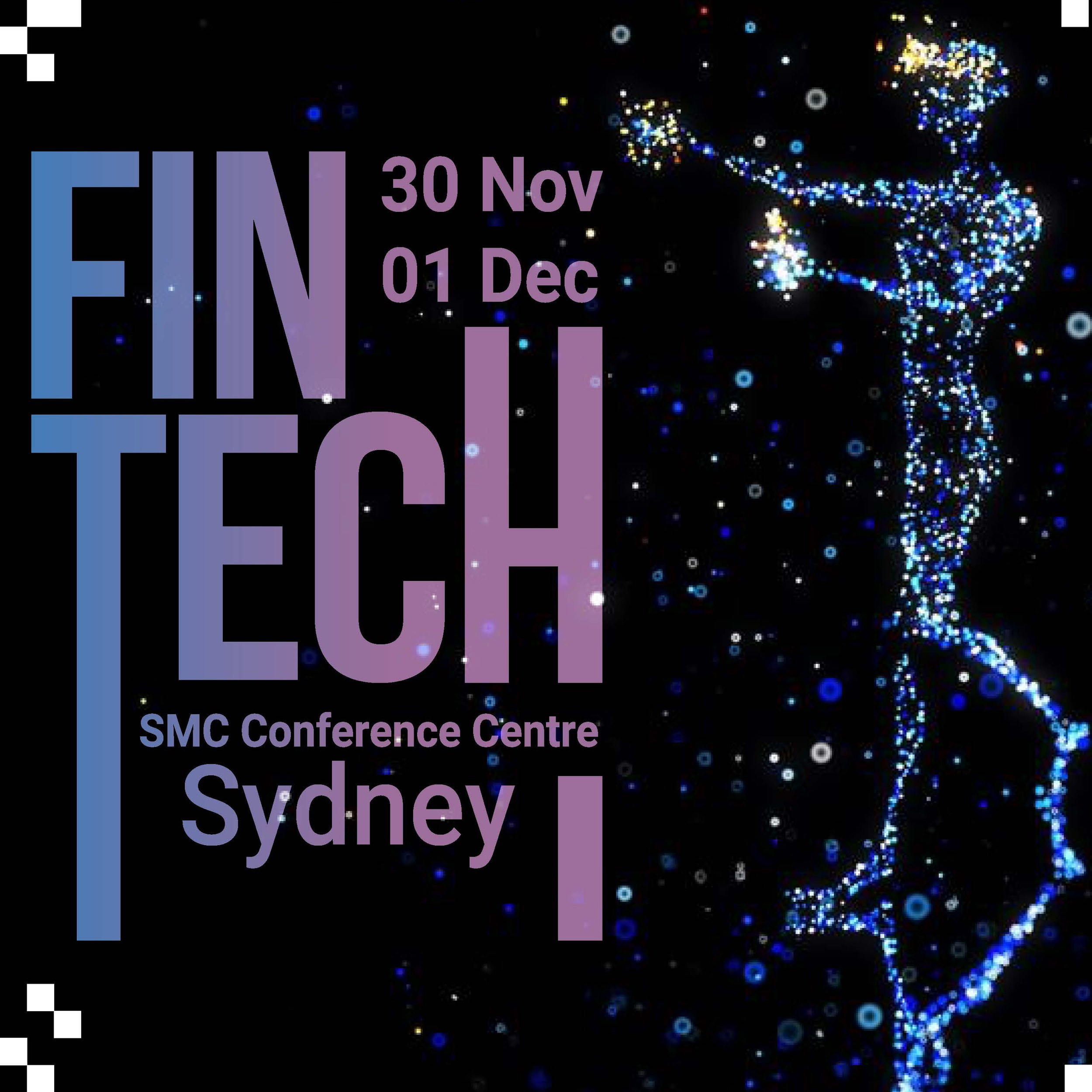
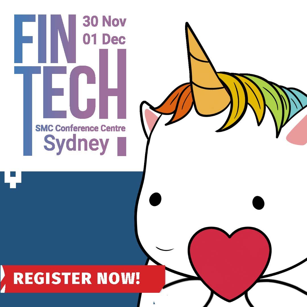
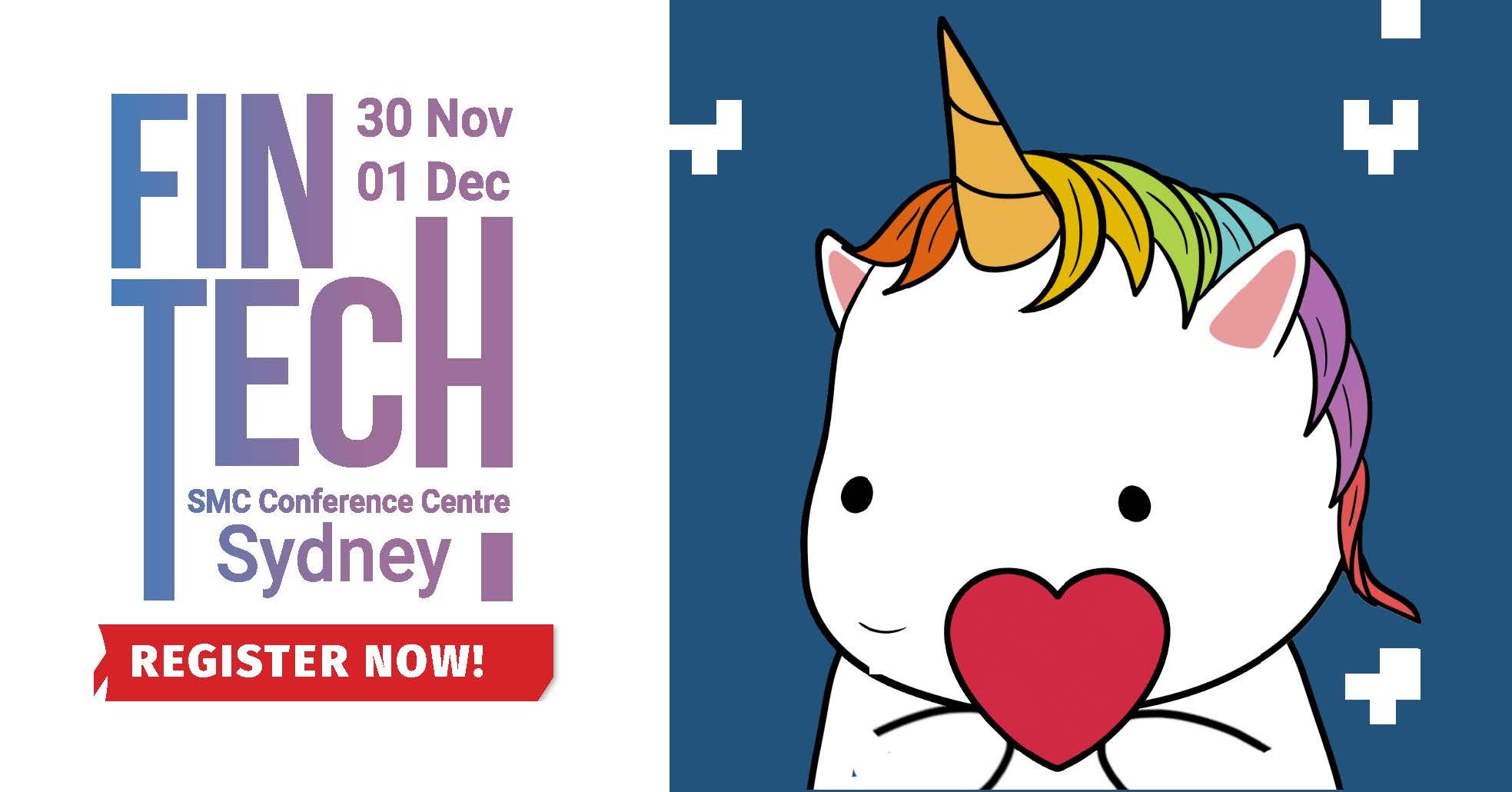
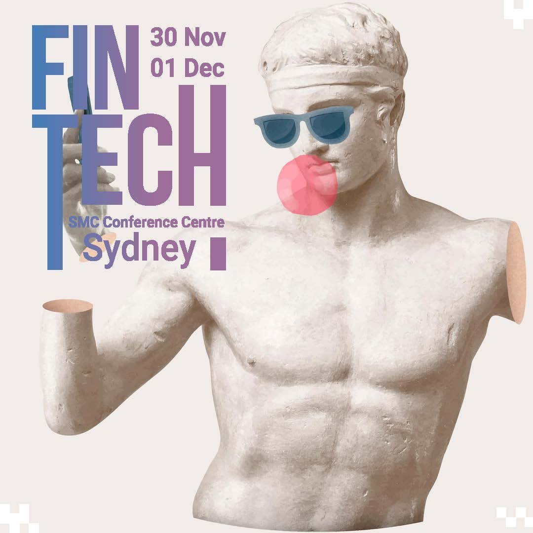
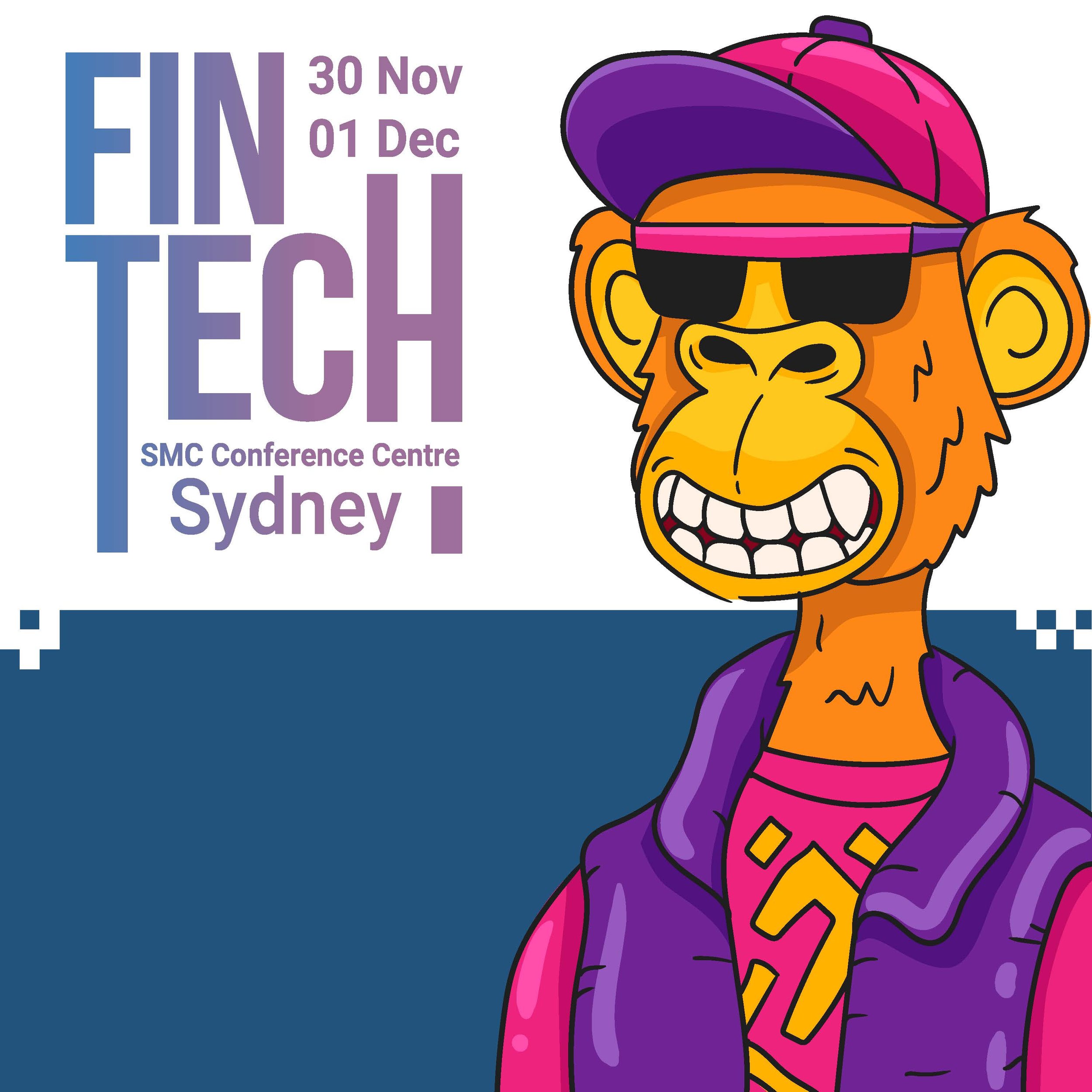
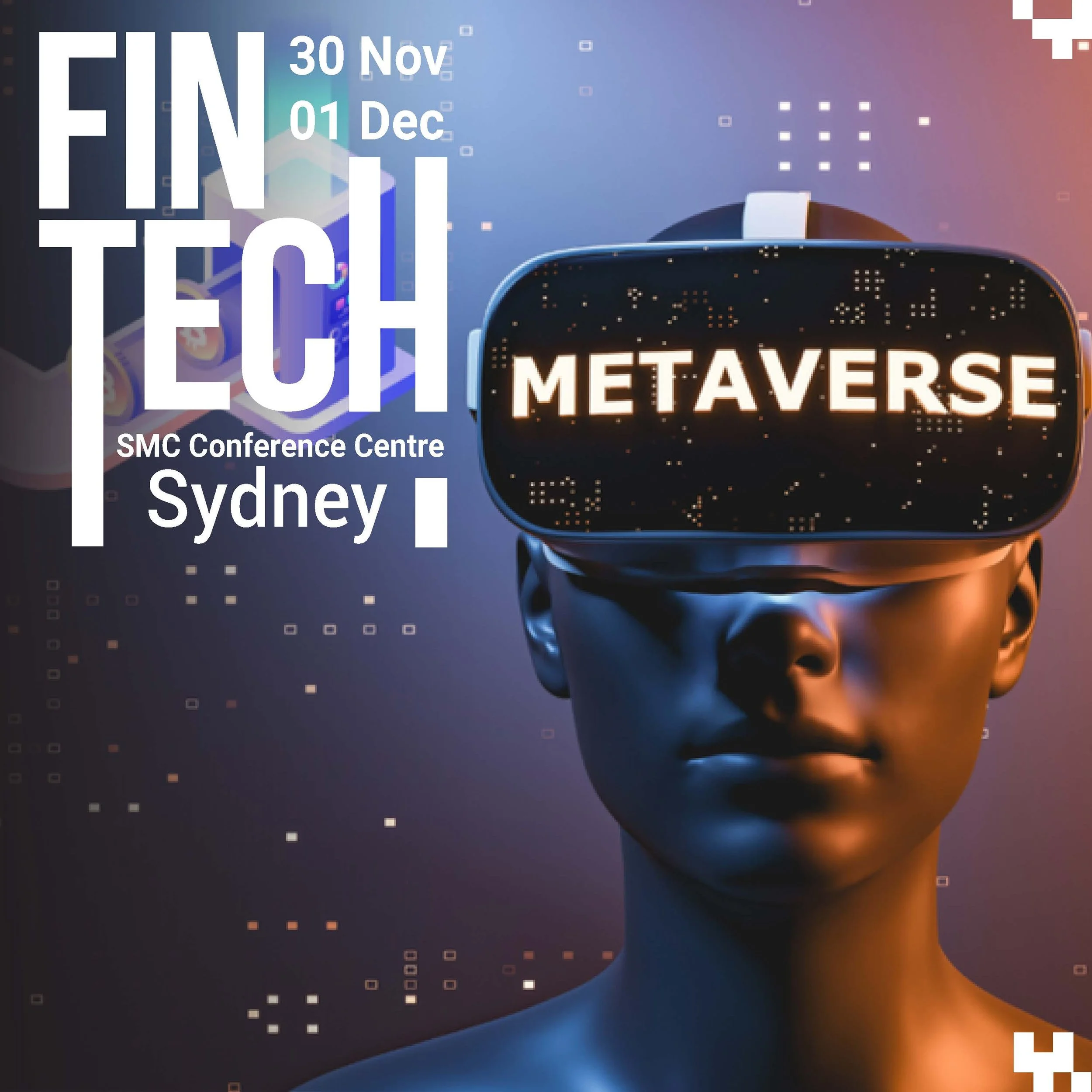
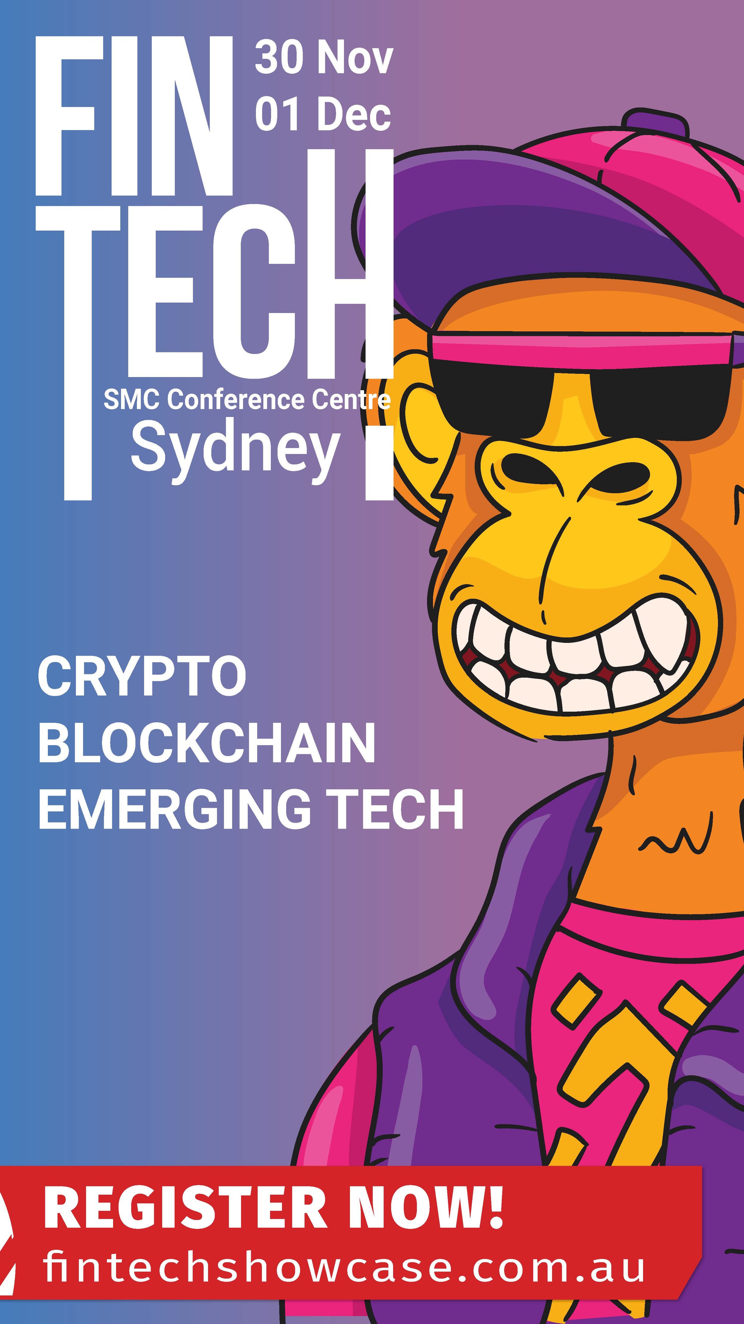
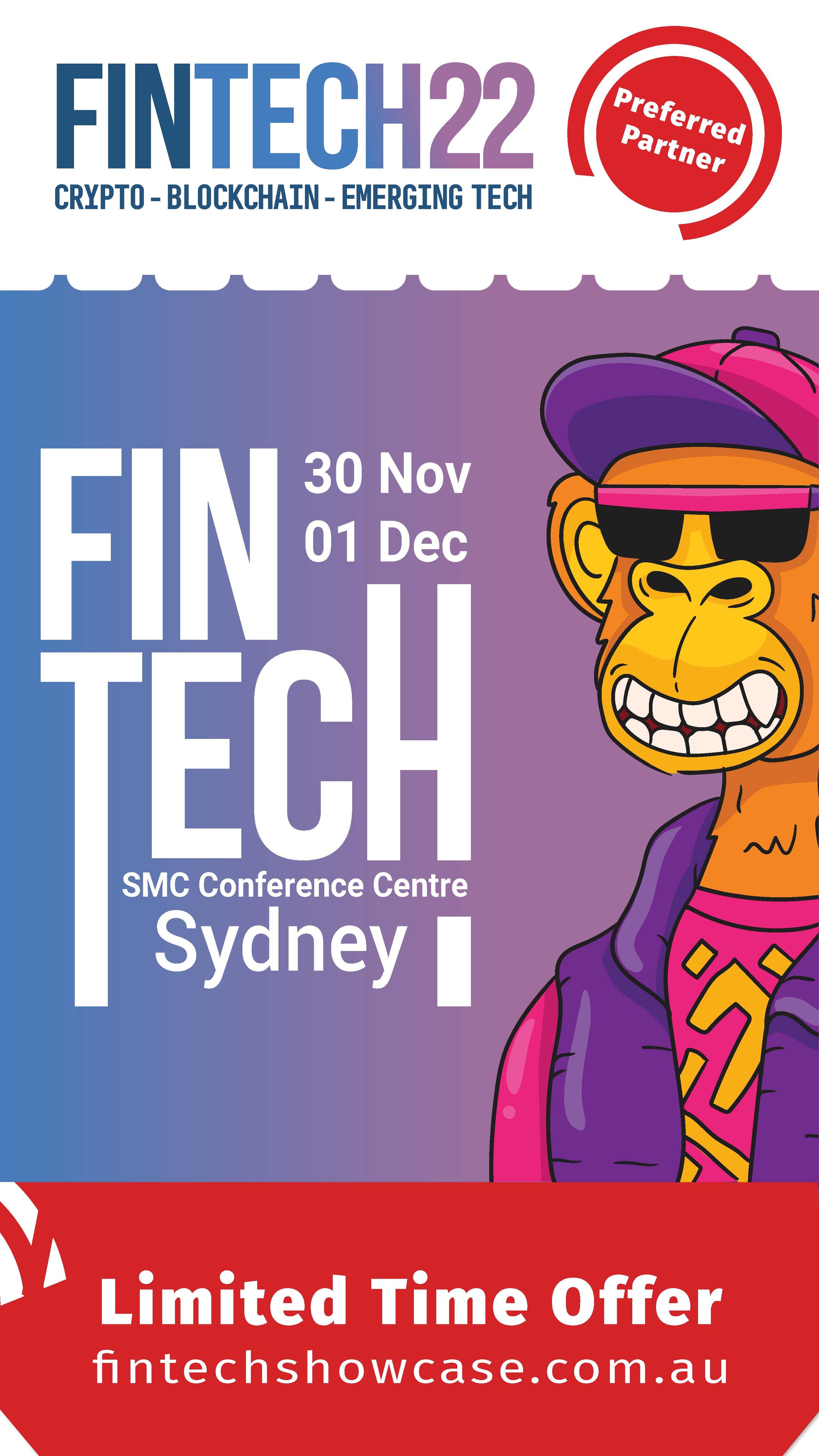
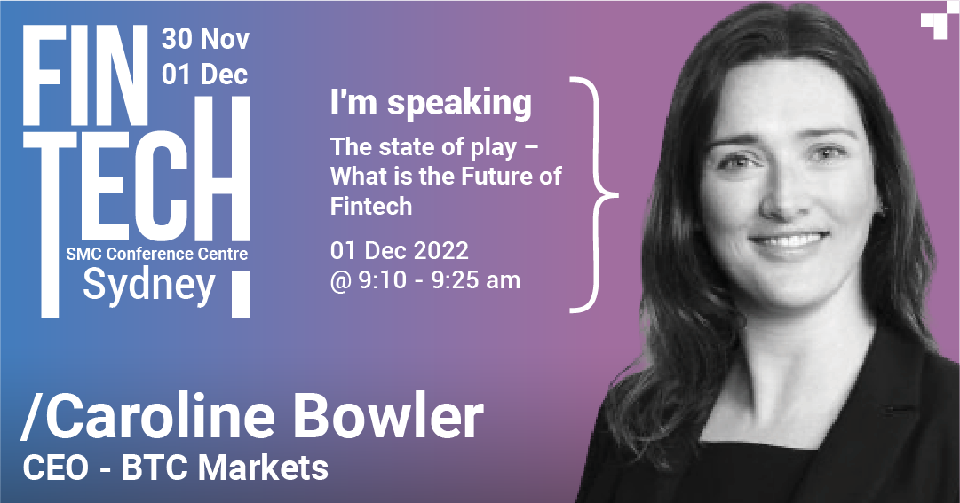
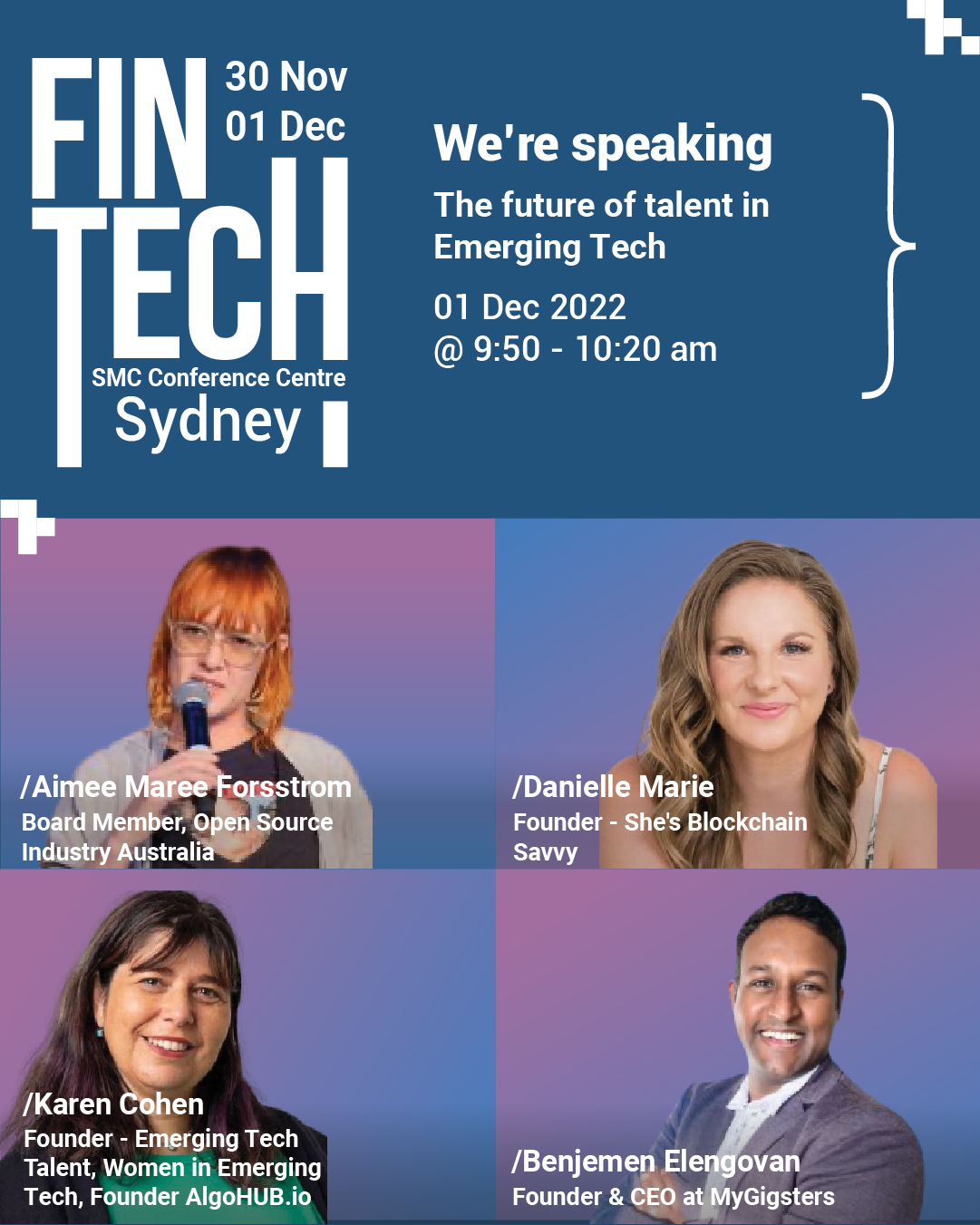
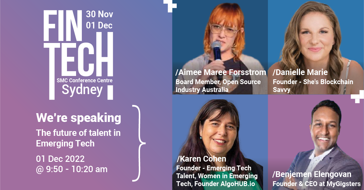
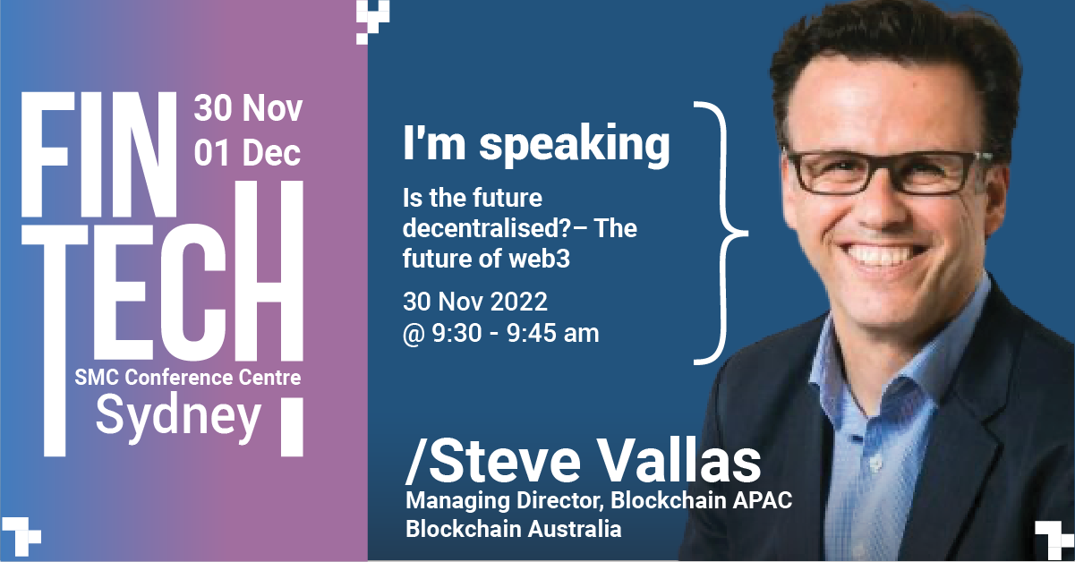
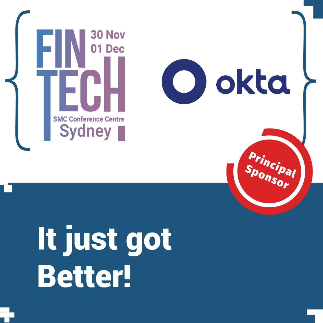
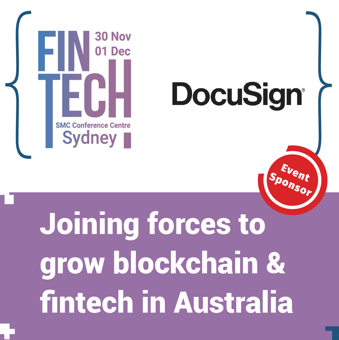
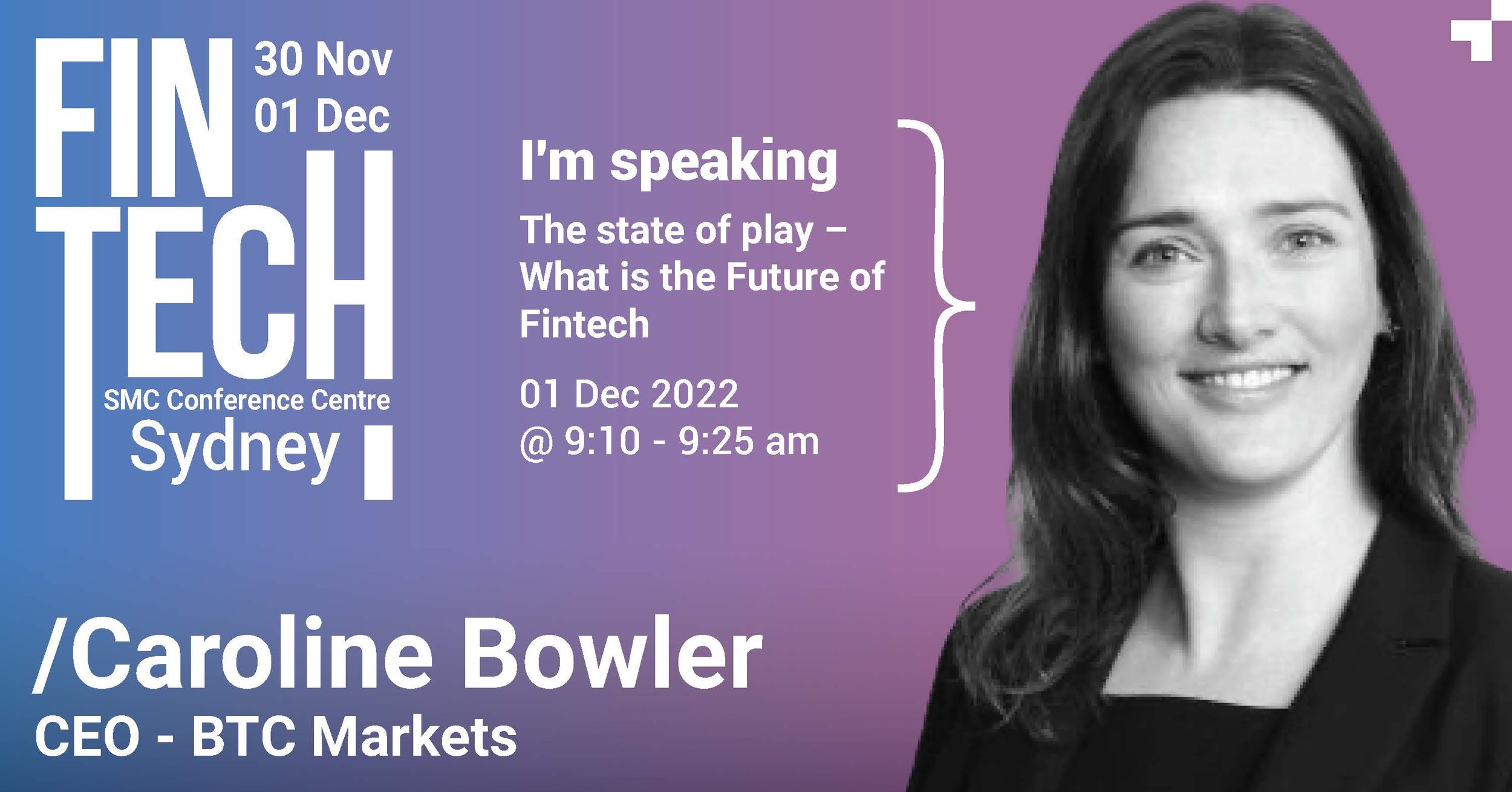
Australia Business Forum is a company that organises events for the business community. One of their flagship events is a Fintech event held in Sydney and Melbourne. My task was to create a visual direction and develop the design materials for the 2023 event. The logo was already developed and had been used in previous years.
My Role: Visual Direction, Design, Video & Motion
Position & Company: Multimedia Specialist, ABF Events
——————————
Solution
I wanted the brand and visual direction to portray ideas of technology and disruption which are key concepts celebrated within the fintech sector. As visual elements, I have used “Pixels” like graphical elements floating over the visuals. In addition, icons and symbols used in computer programming are used alongside the copy and on other visuals.
MY INITIAL SKETCHES AND BRIEFS
BRAND GUIDE
DIGITAL ASSETS
ROLE: Design and Motion
PRINT MAGAZINE
Role: Layout & Design
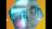
Promo Video for the Event
My Role: Editing and Motion
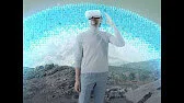
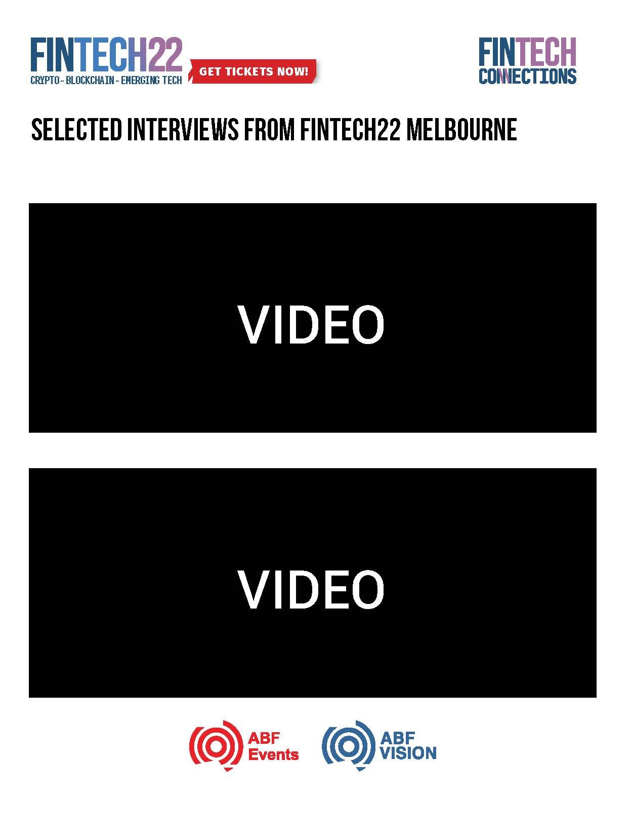
INTERVIEW VIDEO
Due to technical challenges and difficulties with setting up the space, I opted to shoot all the interviews in 4k on a static shot and digitally add various elements to the shot to dress it. Here is an excerpt from one of the interviews.
My Role: Videography, Editing and VFX
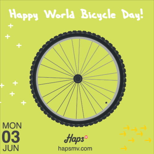
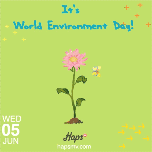
Gif animations for Hapsmv website. They wanted to create a few seconds of gif animations that reflect and highlight specific days which are globally celebrated.
ROLE: Concept development | Motiongraphics


In-store mailer designed for mother’s day.
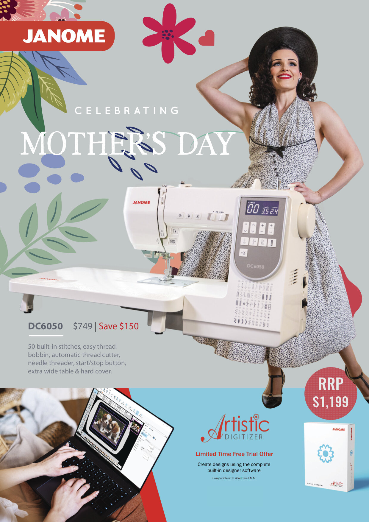
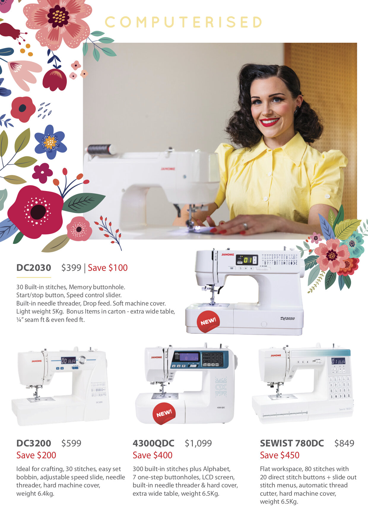
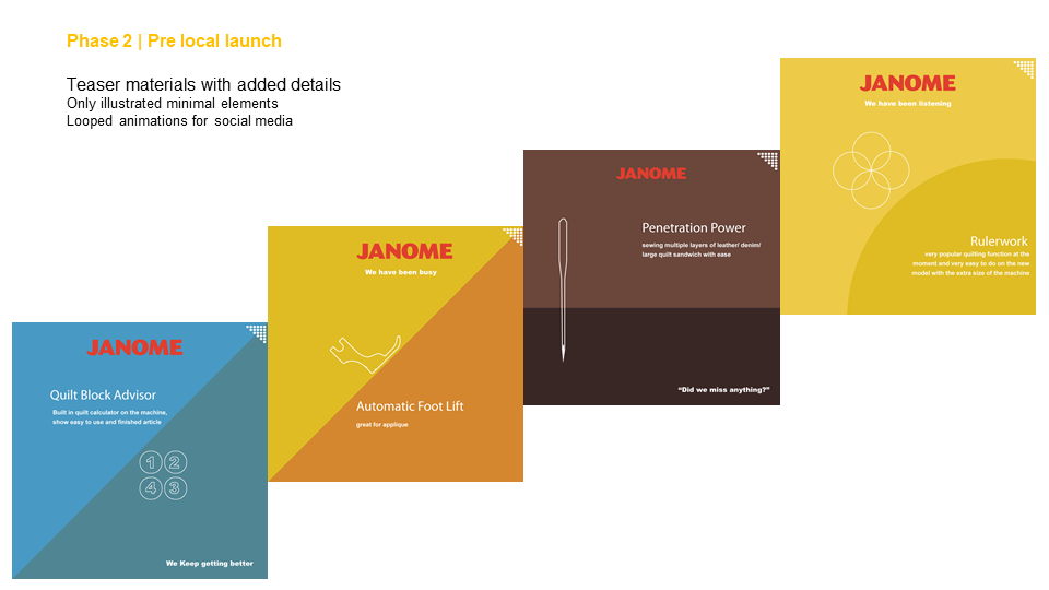
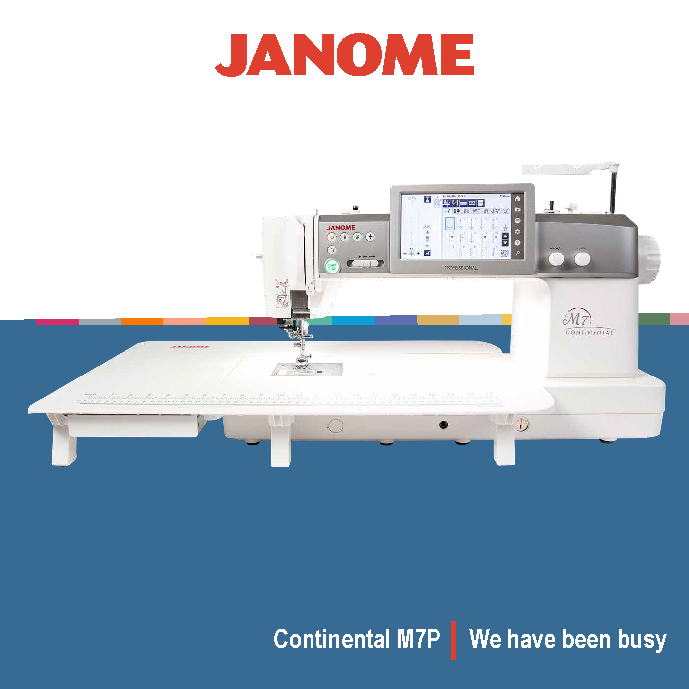
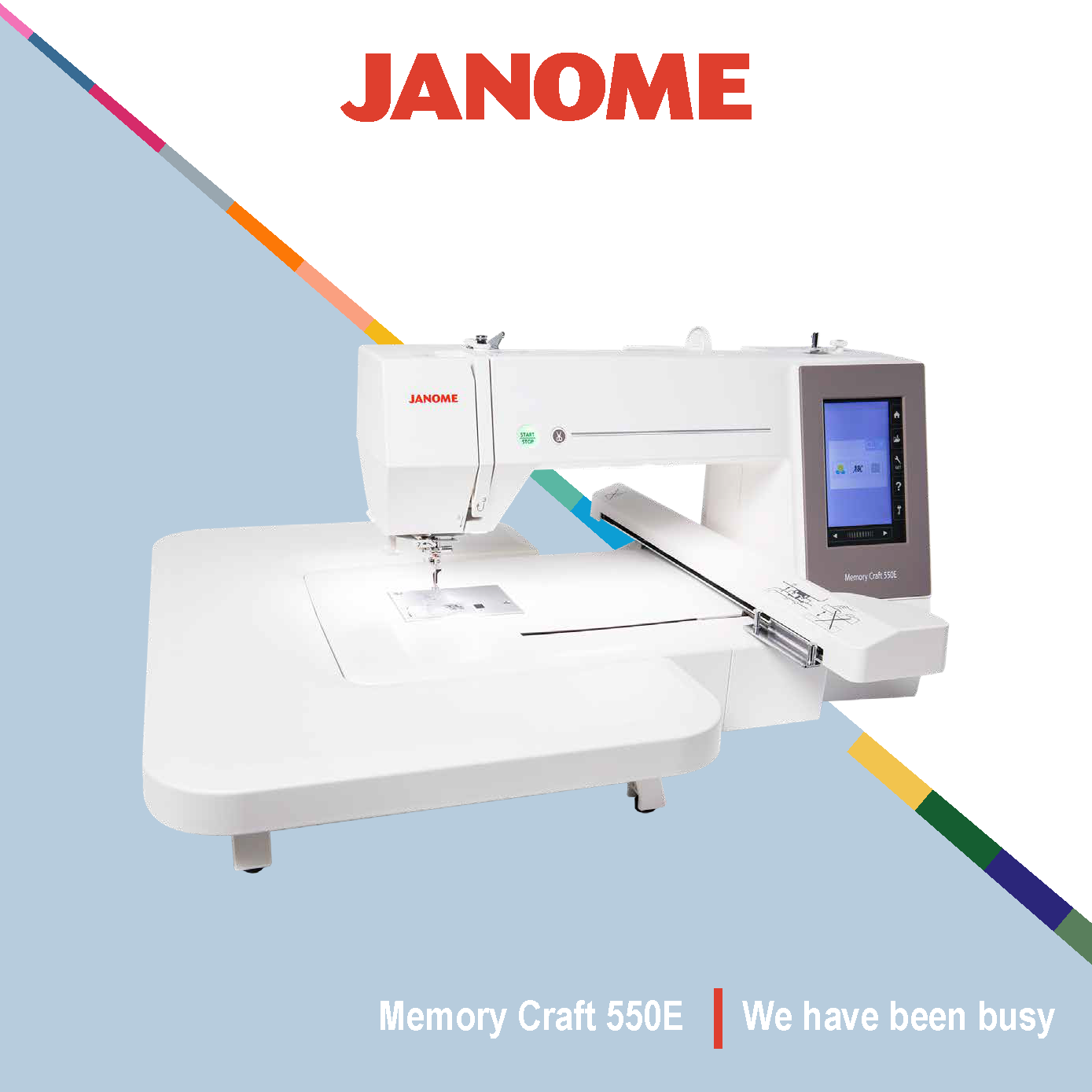
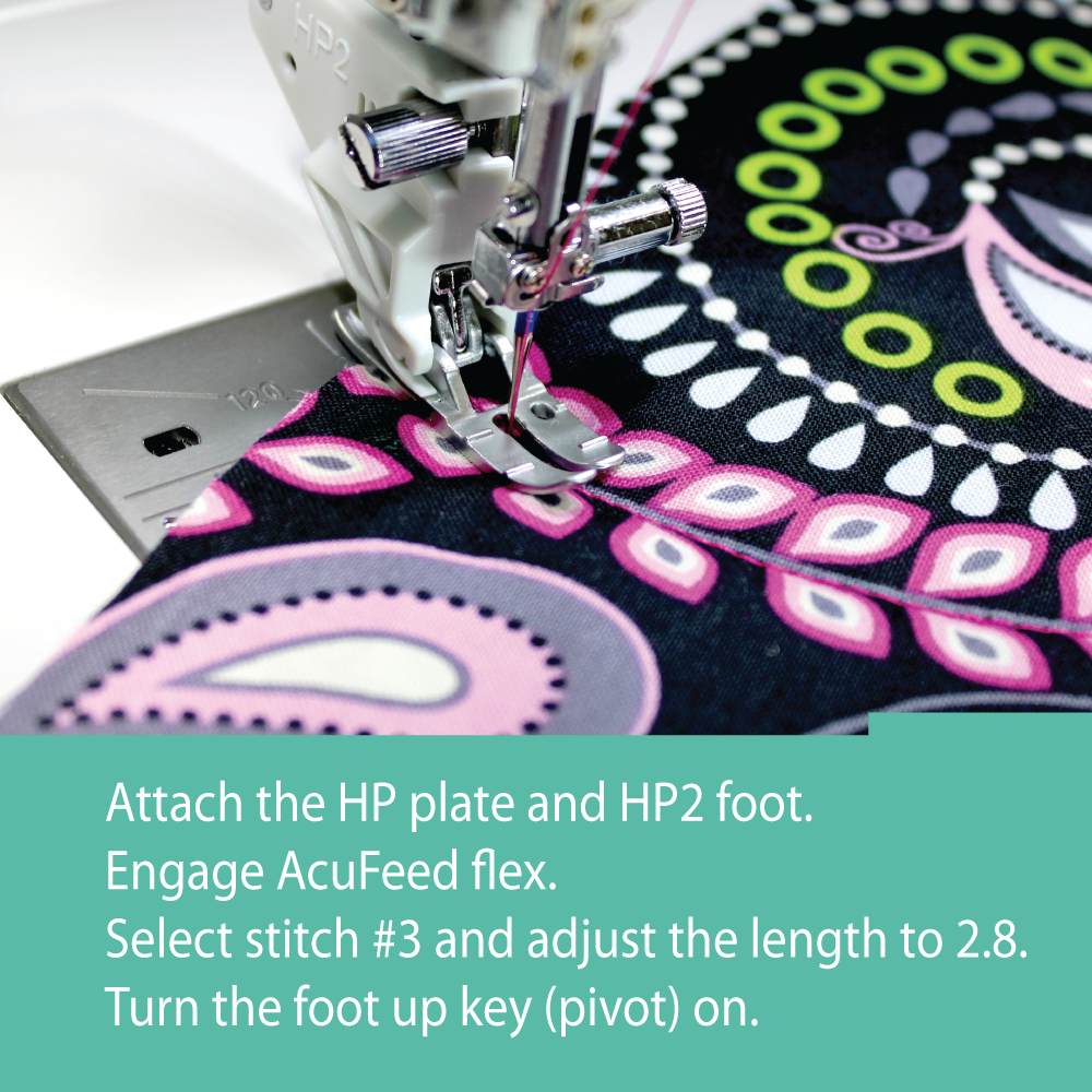
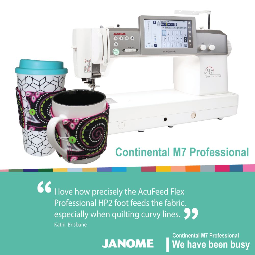
This is a product launching campaign that was created to promote two new machines. The strategy was to divide the campaign into three parts; Pre-launch, launch and post-launch and develop materials for these phases. My goal was to tease the users to anticipate new features. These same visuals are then used in the post-launch phase detailing the features.
My Role: Concept Development, Design and Motiongraphics
Position & Company: Graphic Designer, Janome Australia
Teaser Motiongraphics assets
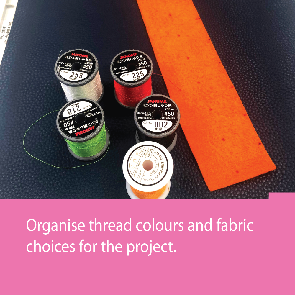
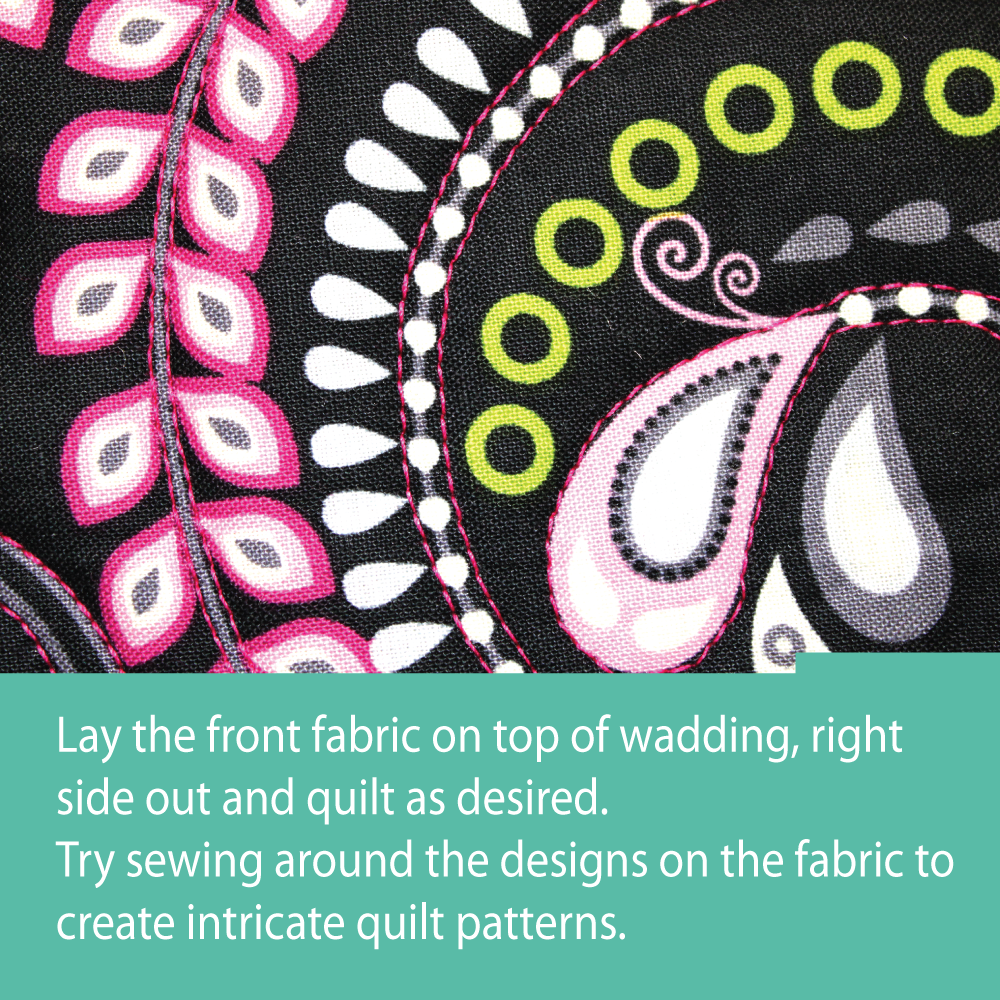
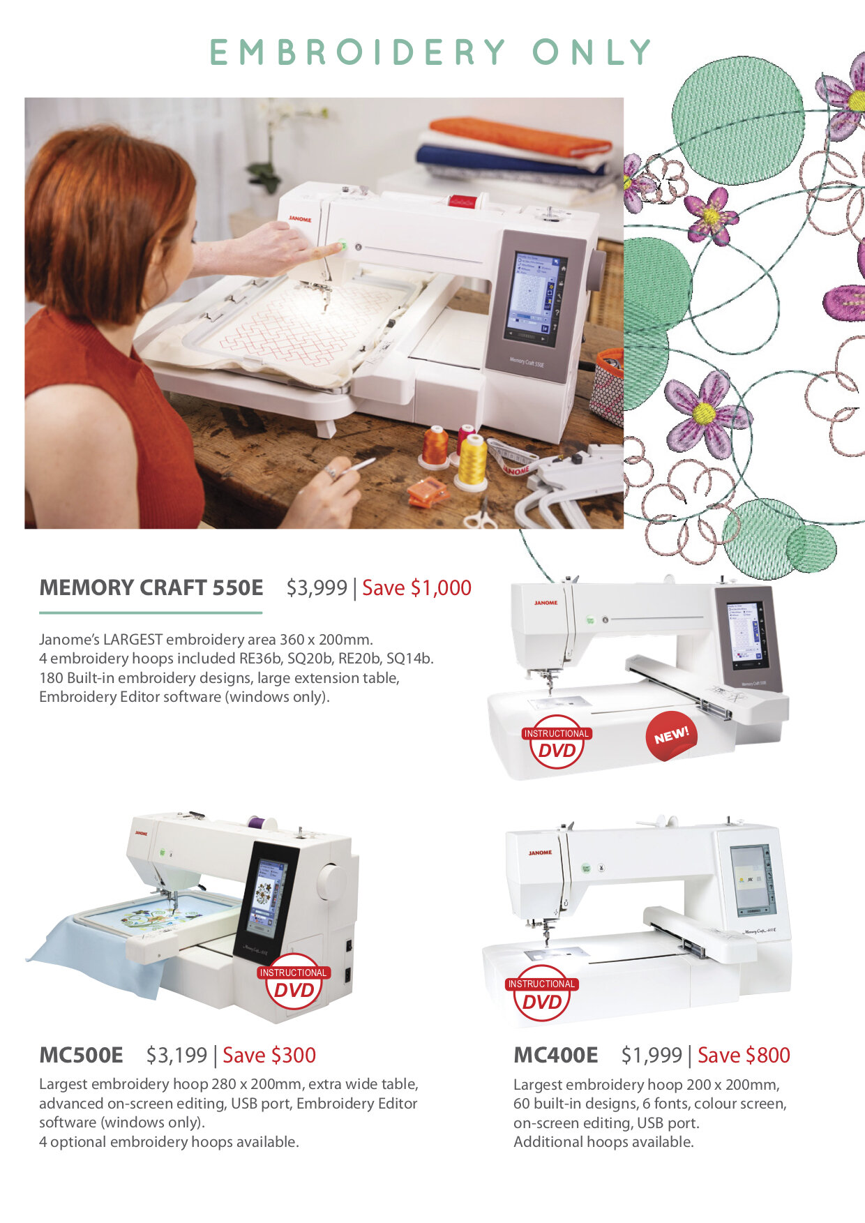
Right after the launch we created a very dynamic color palette to reflect on the diverse range of projects the consumer can work on with these machines. The colors were chosen from the most used treads that quilters and embroidery artists use. This pallet also became a visual identity element for these two machines.

Color pallet for the campaign
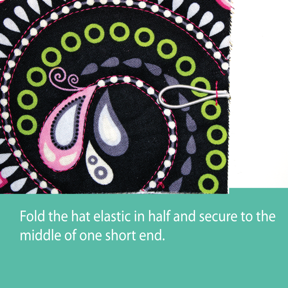
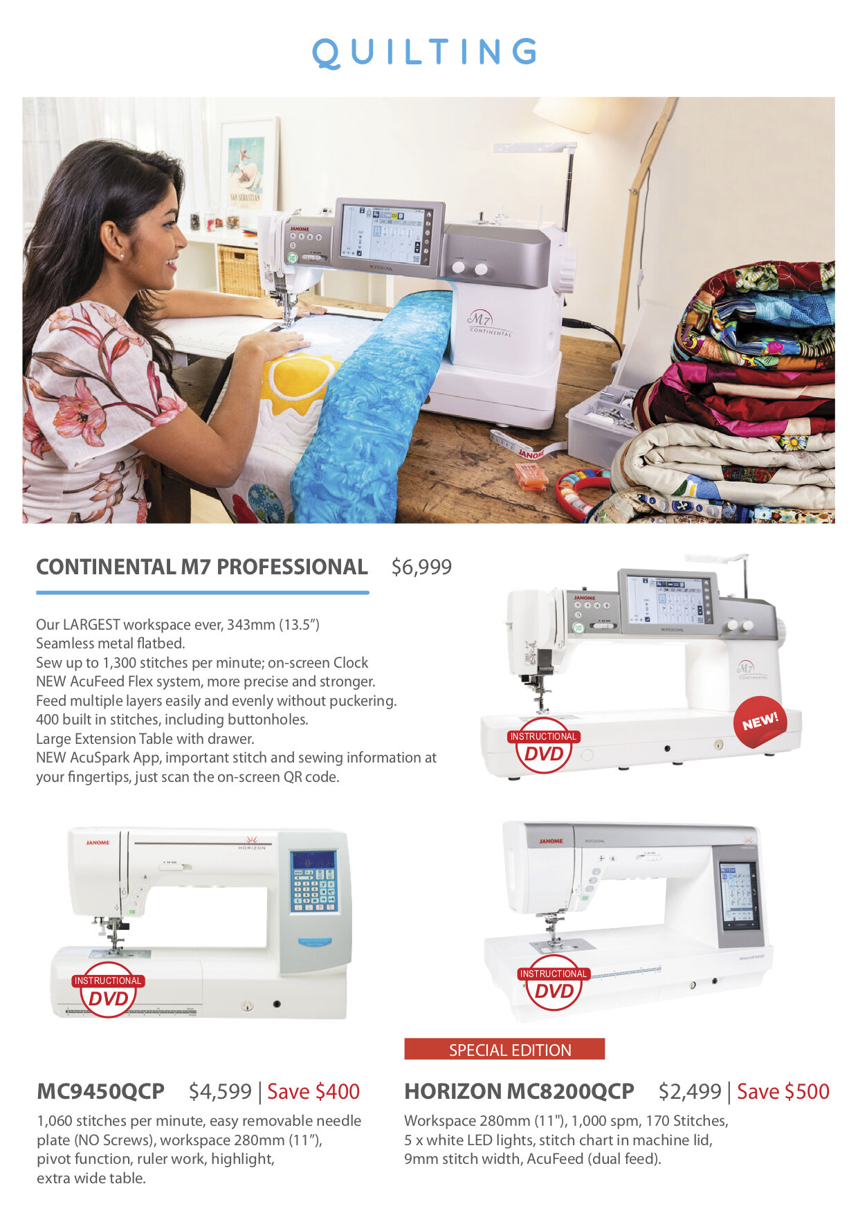
Post Launch assets
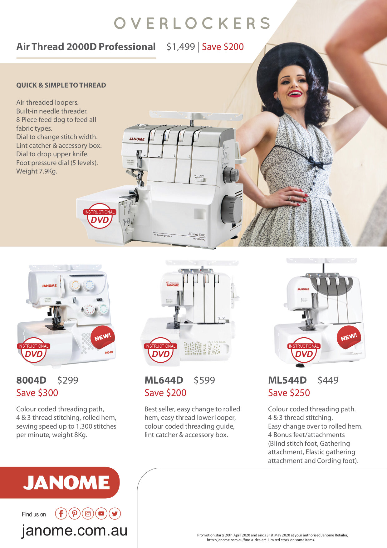
Specific information was revealed after the launch. These were also extensions of the selected teaser elements.
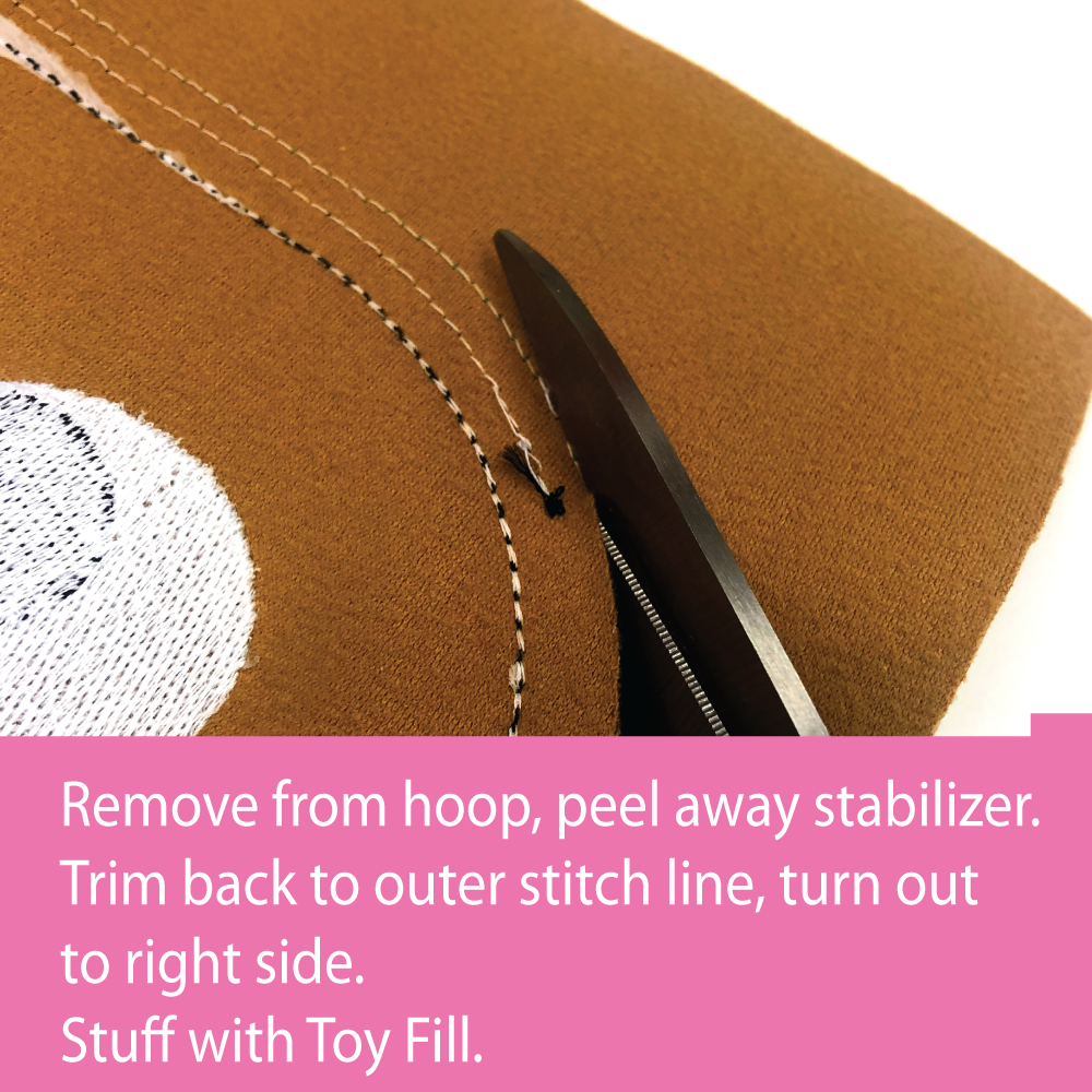
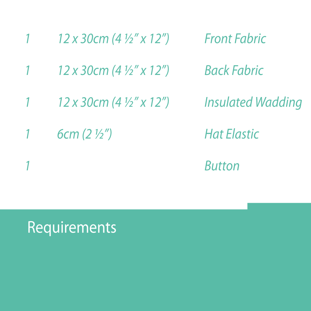
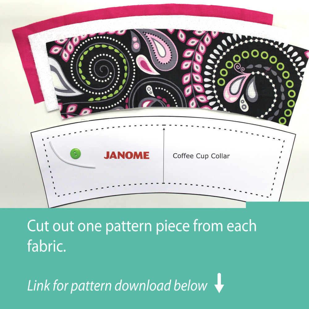
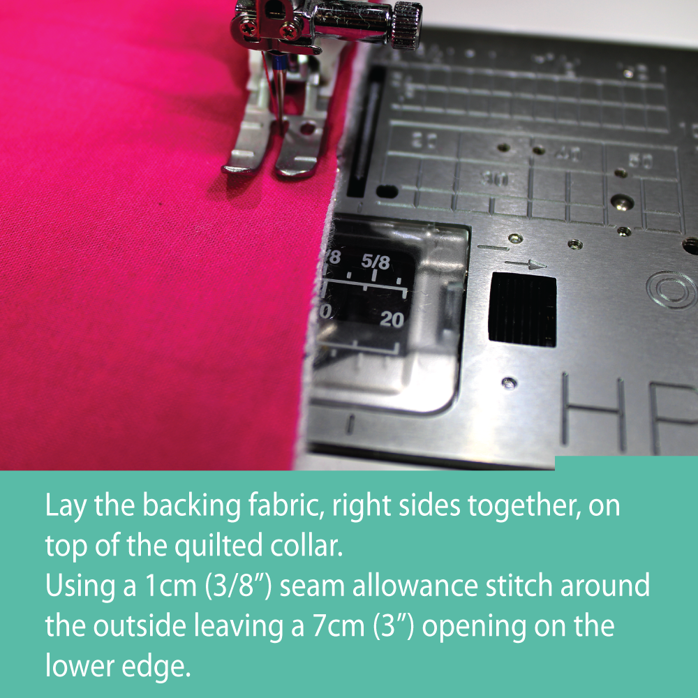
For the final phase, we developed small projects that users can create using the new machines.
Rather than use the website we opted to use Facebook and Instagram carousel posts to show the projects.
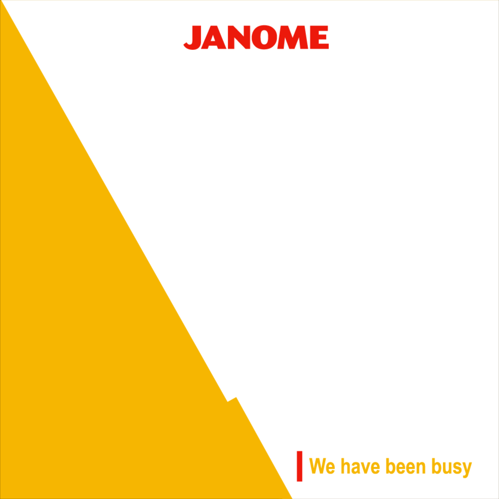
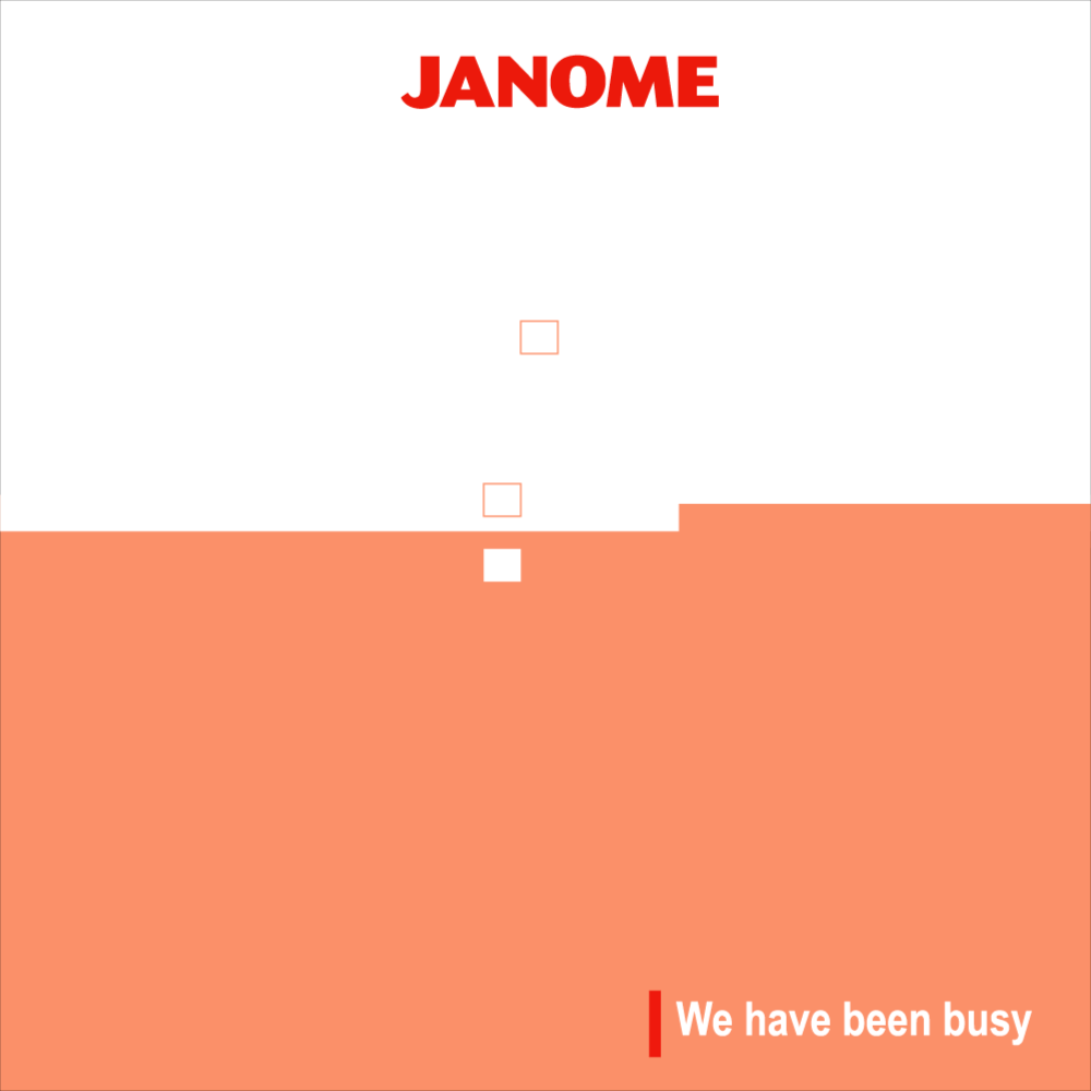
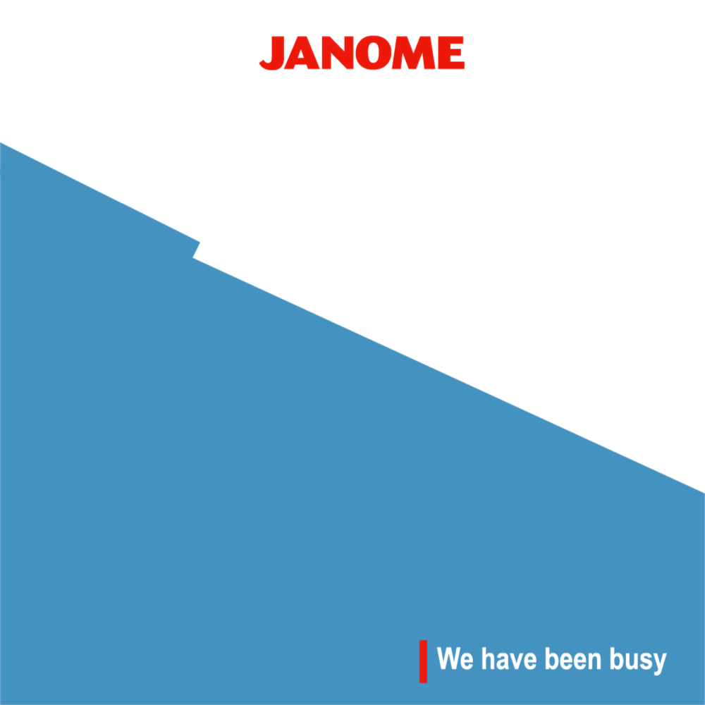
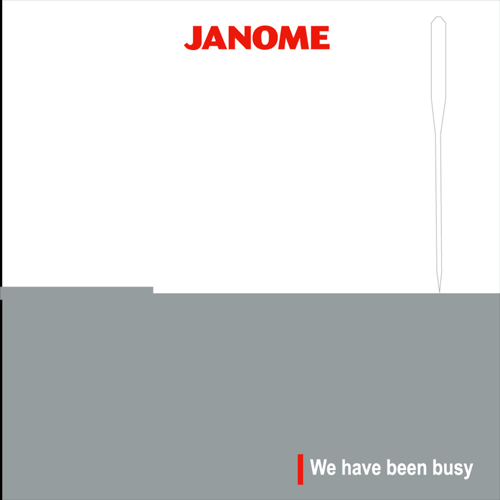
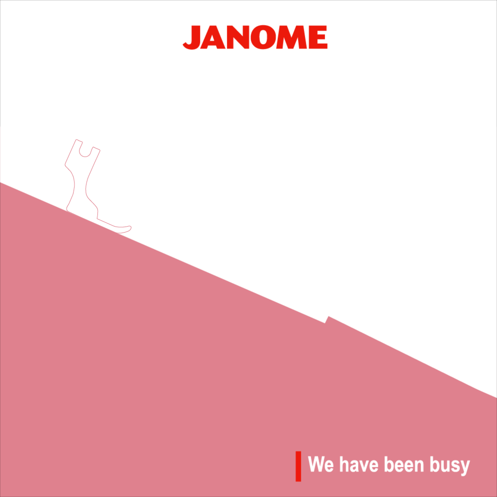
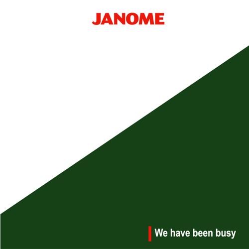
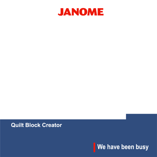
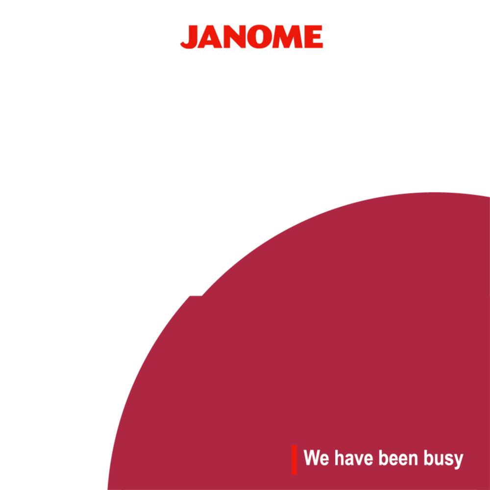
Motiongraphic elements for the We have been Busy campaign. We wanted to represent complex features in the most simplistic form. These posts were released before the launch of the new product and these visuals acted as teasers for what will be revealed later.


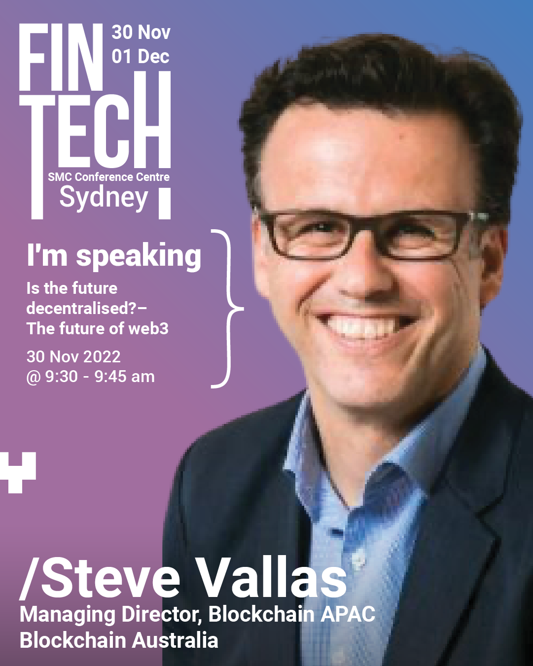
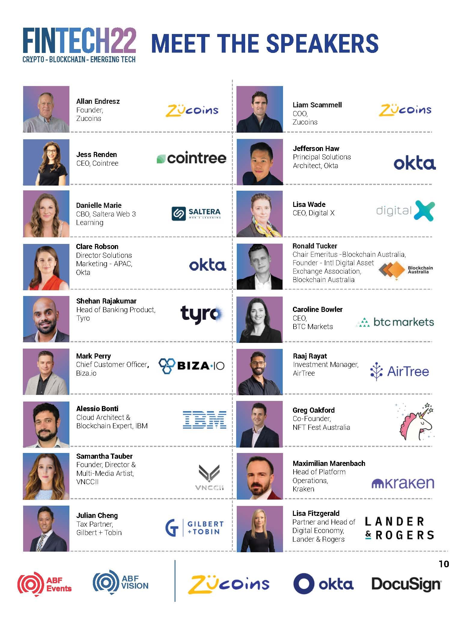
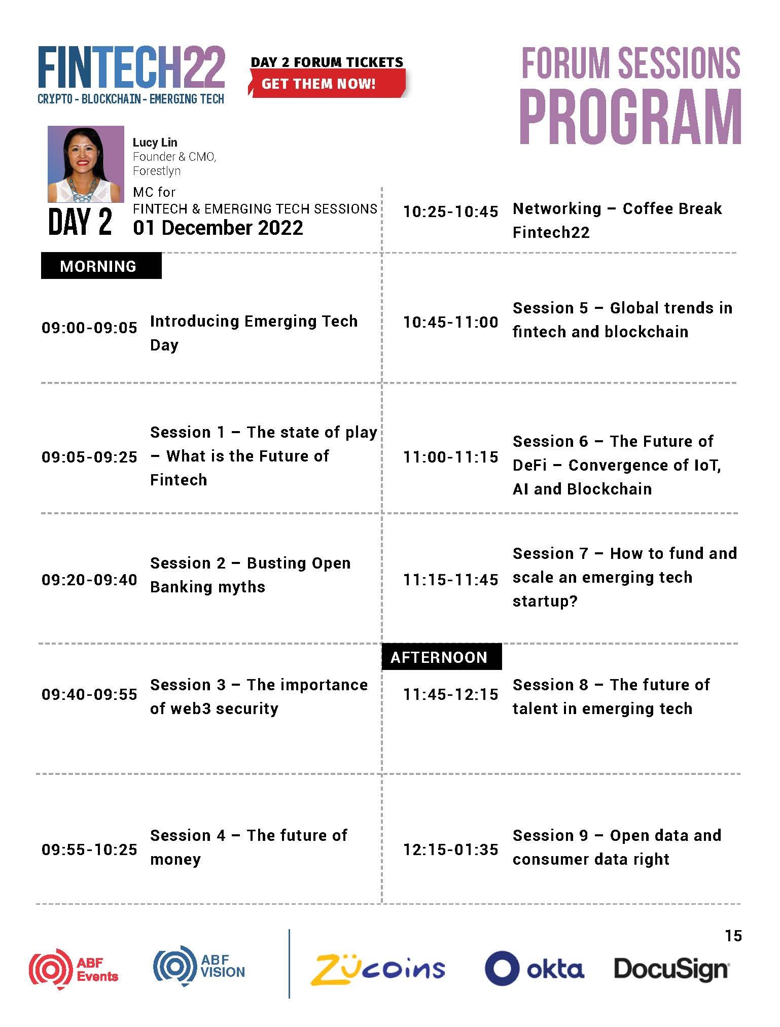
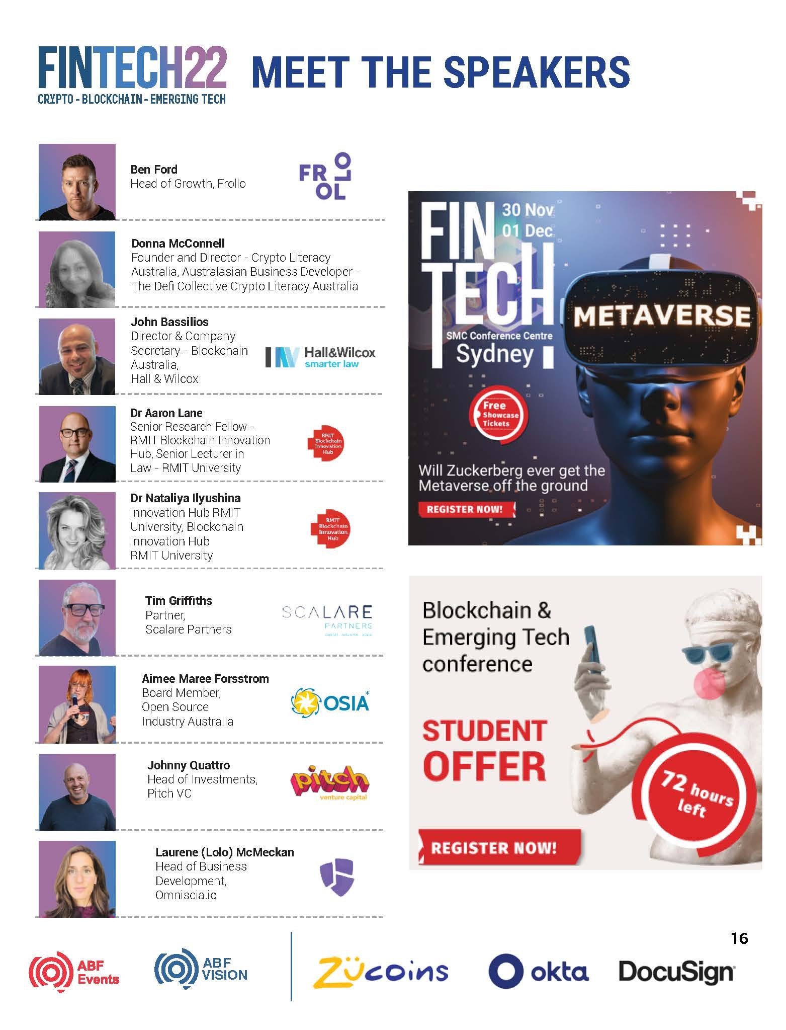
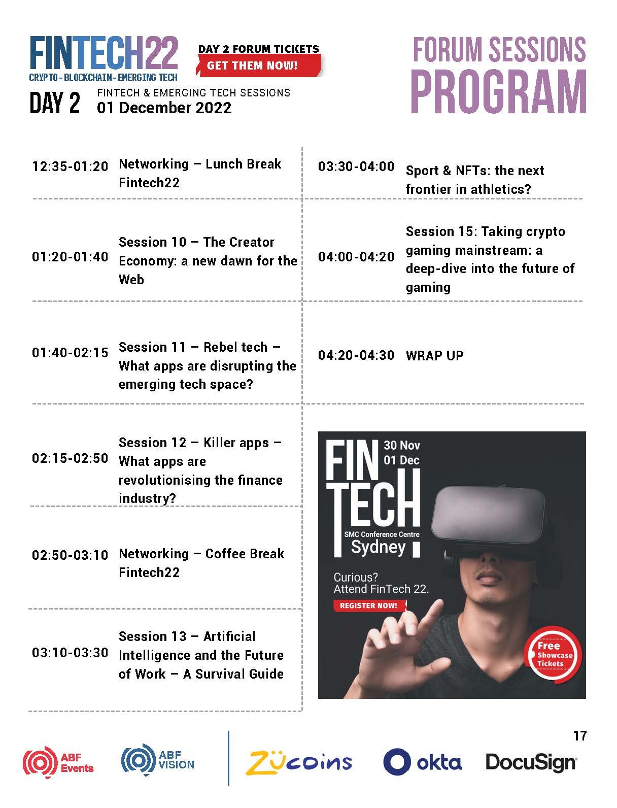
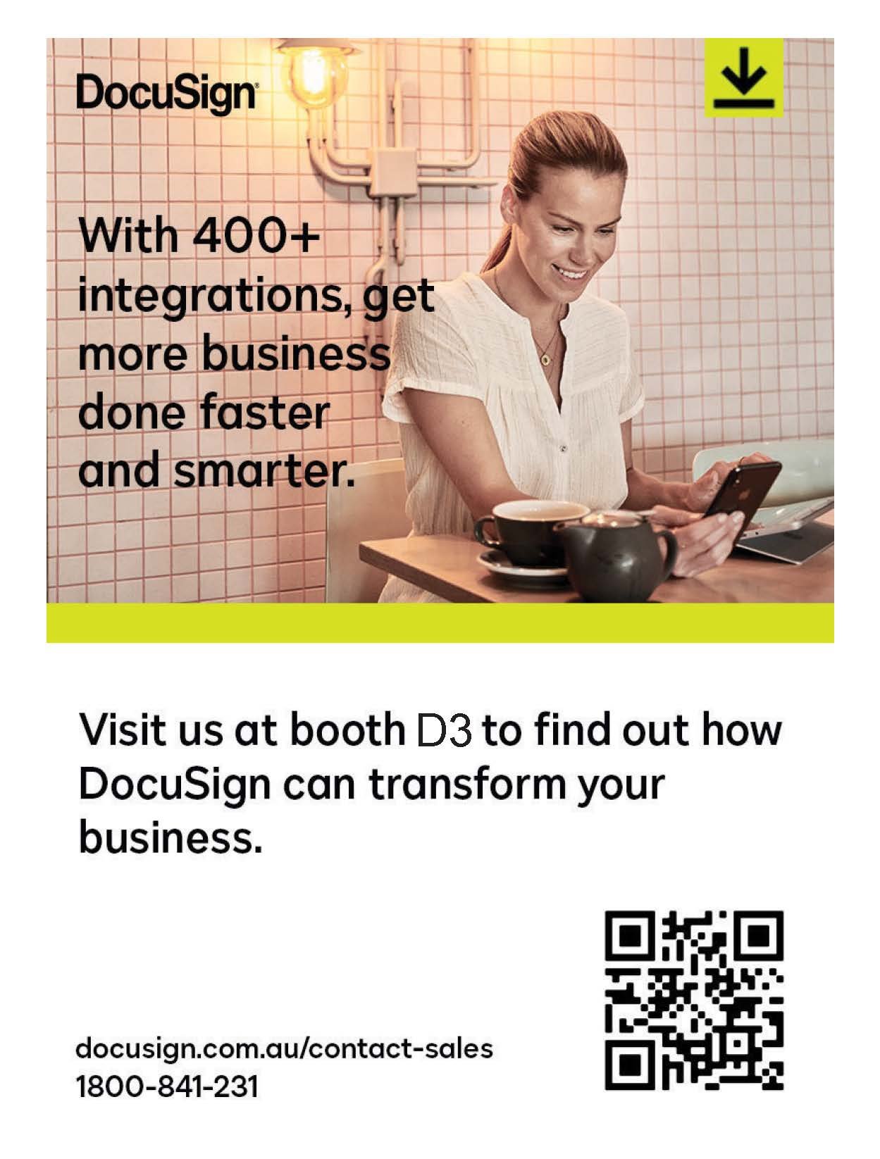
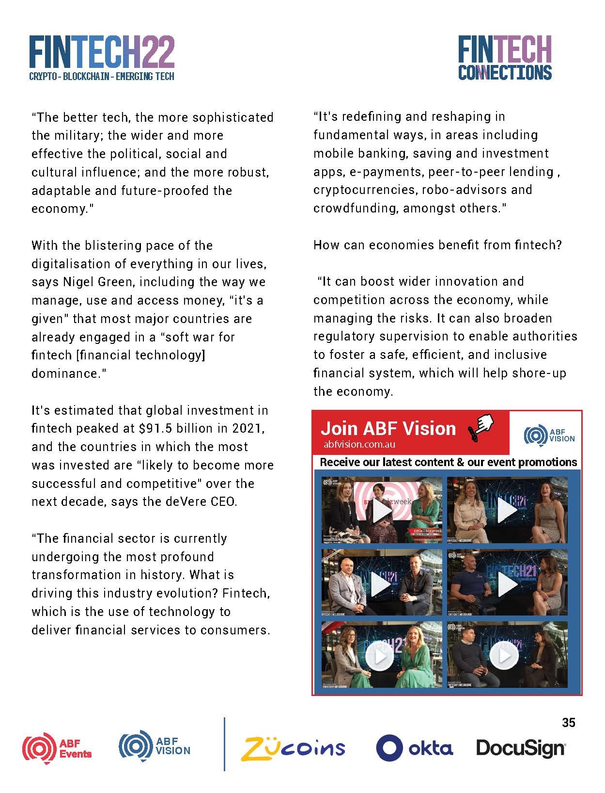
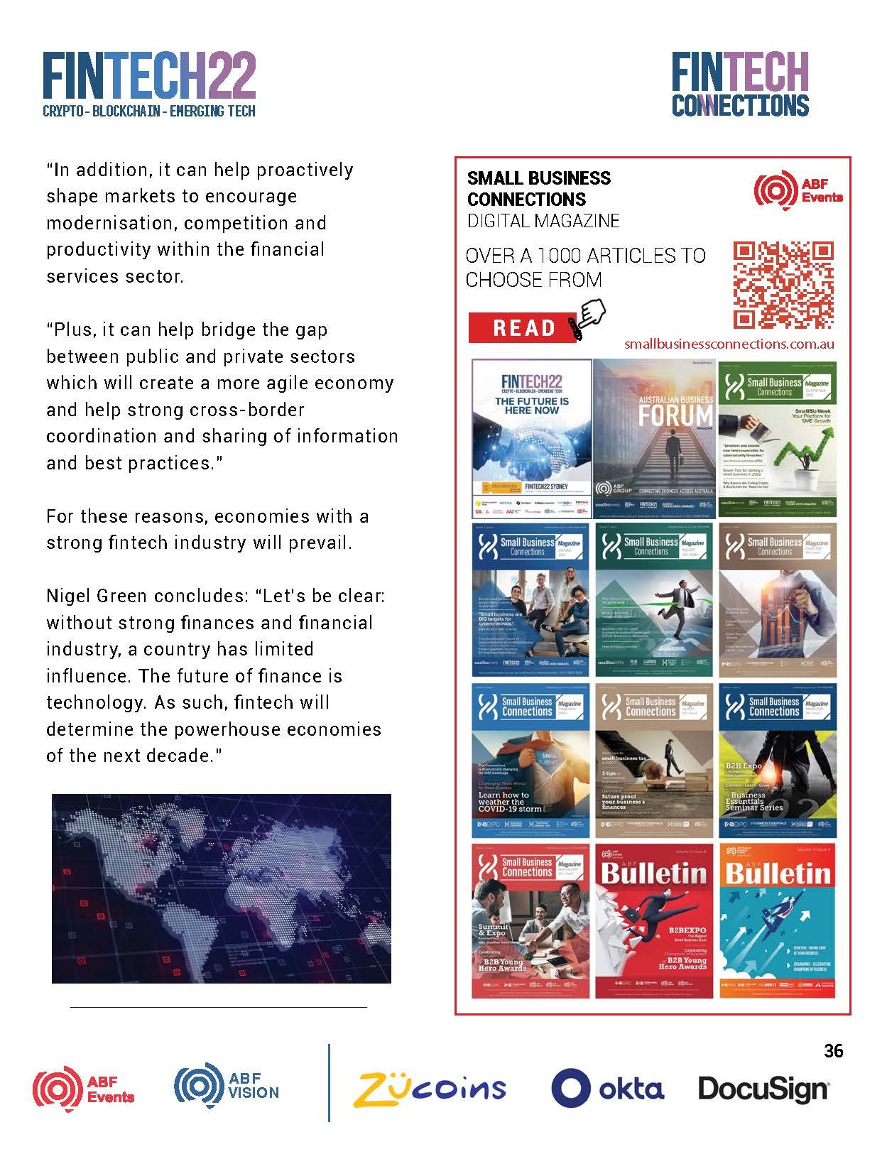
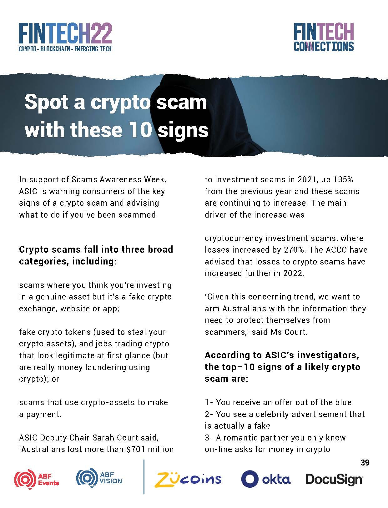
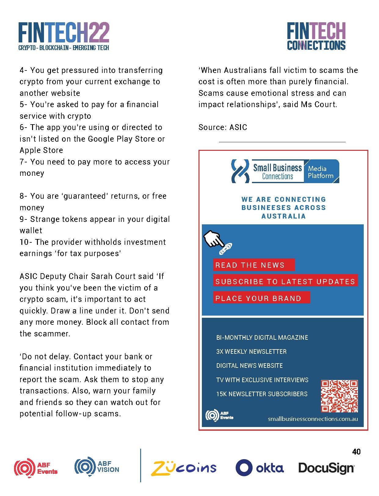
Australia Business Forum is a company that organises events for the business community. One of their flagship events is a Fintech event held in Sydney and Melbourne. My task was to create a visual direction and develop the design materials for the 2023 event. The logo was already developed and had been used in previous years.
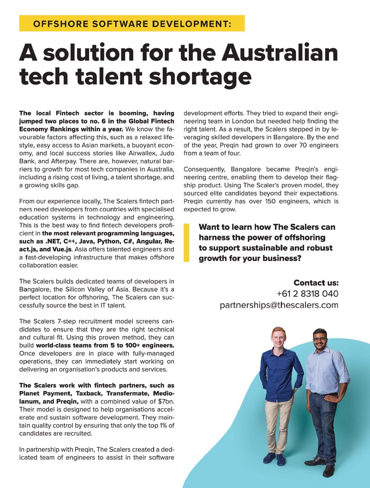
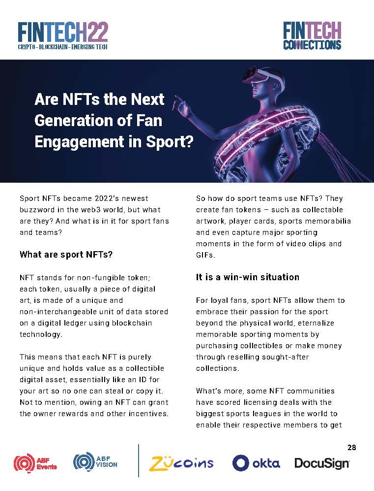
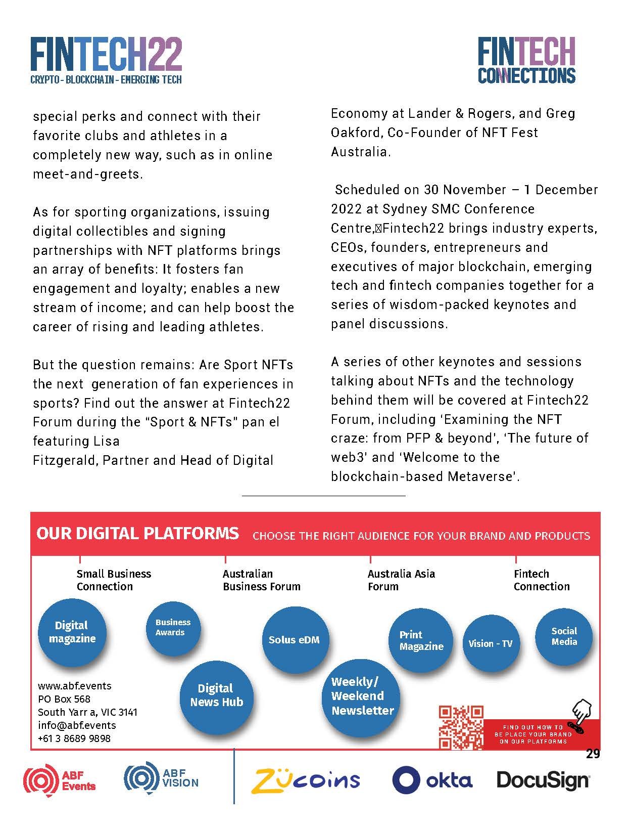
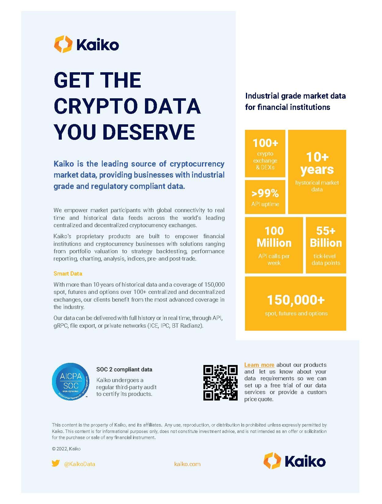
This is both a print and digital publication
My Role: Layout & Design
Position & Company: Multimedia Specialist, ABF Events
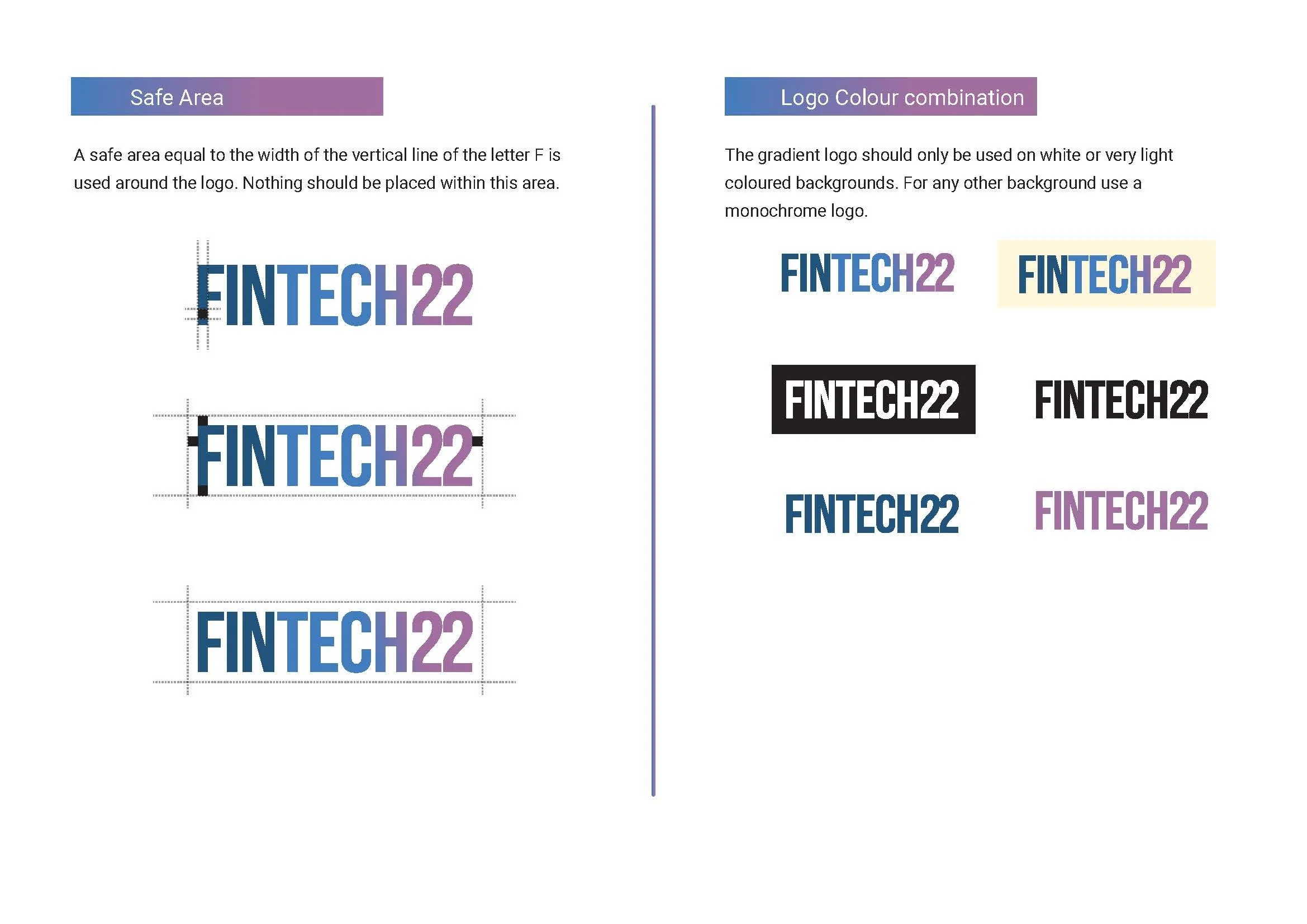
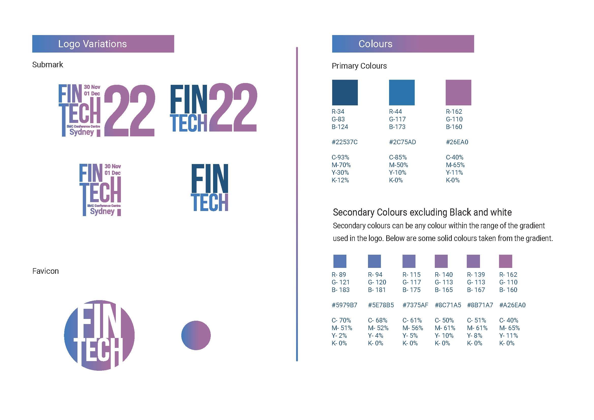
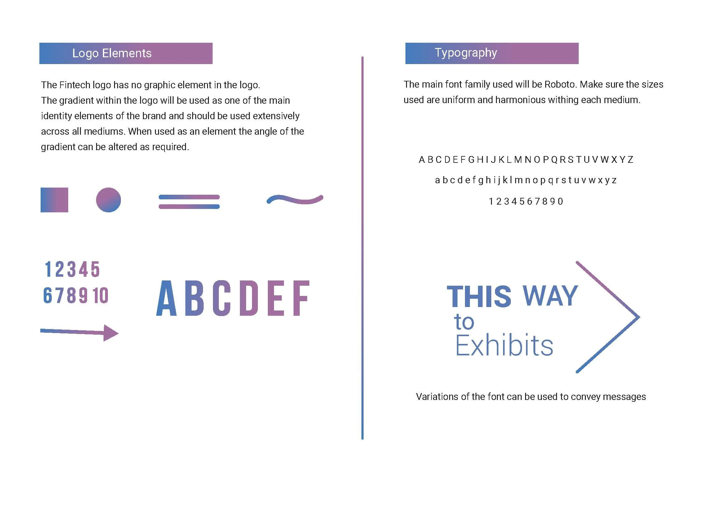
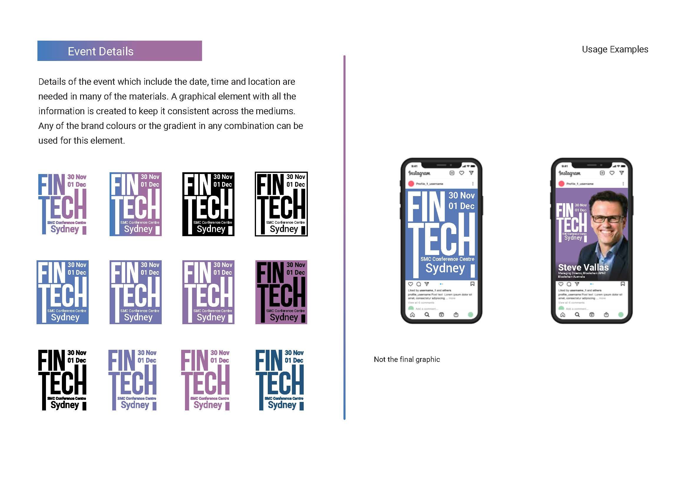
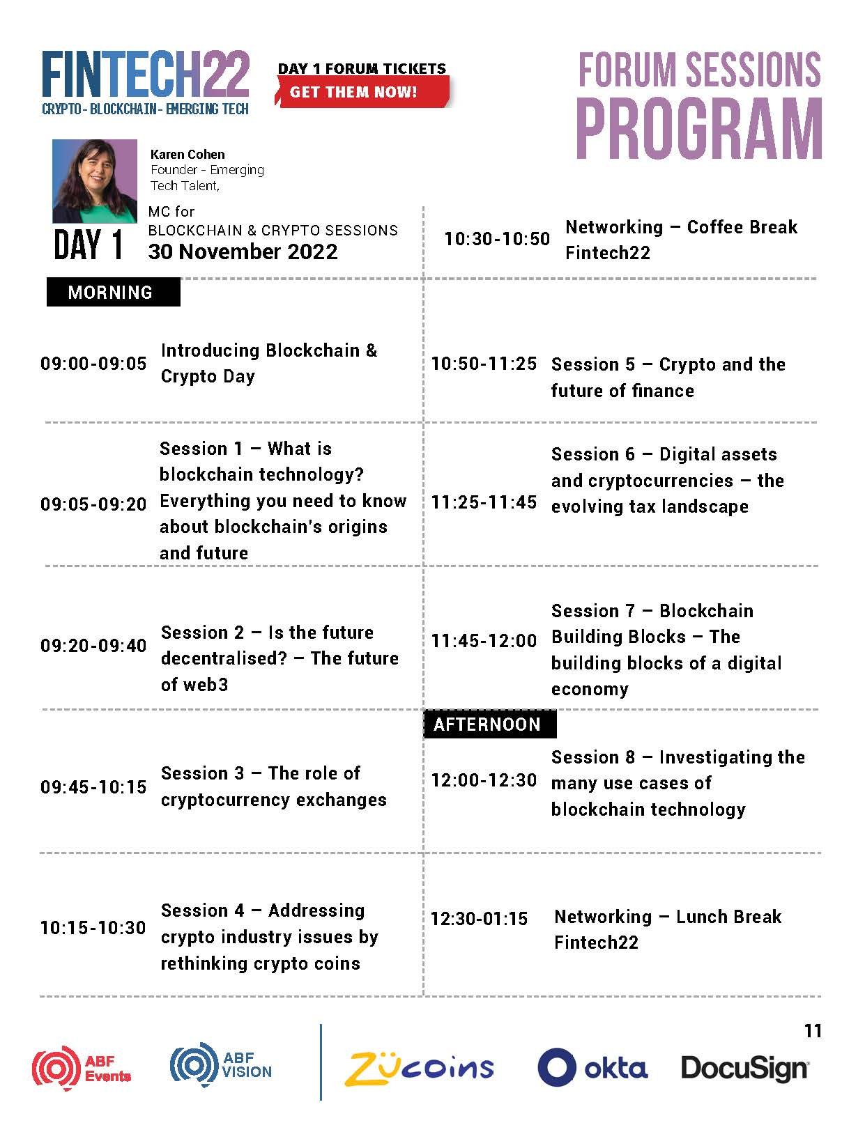
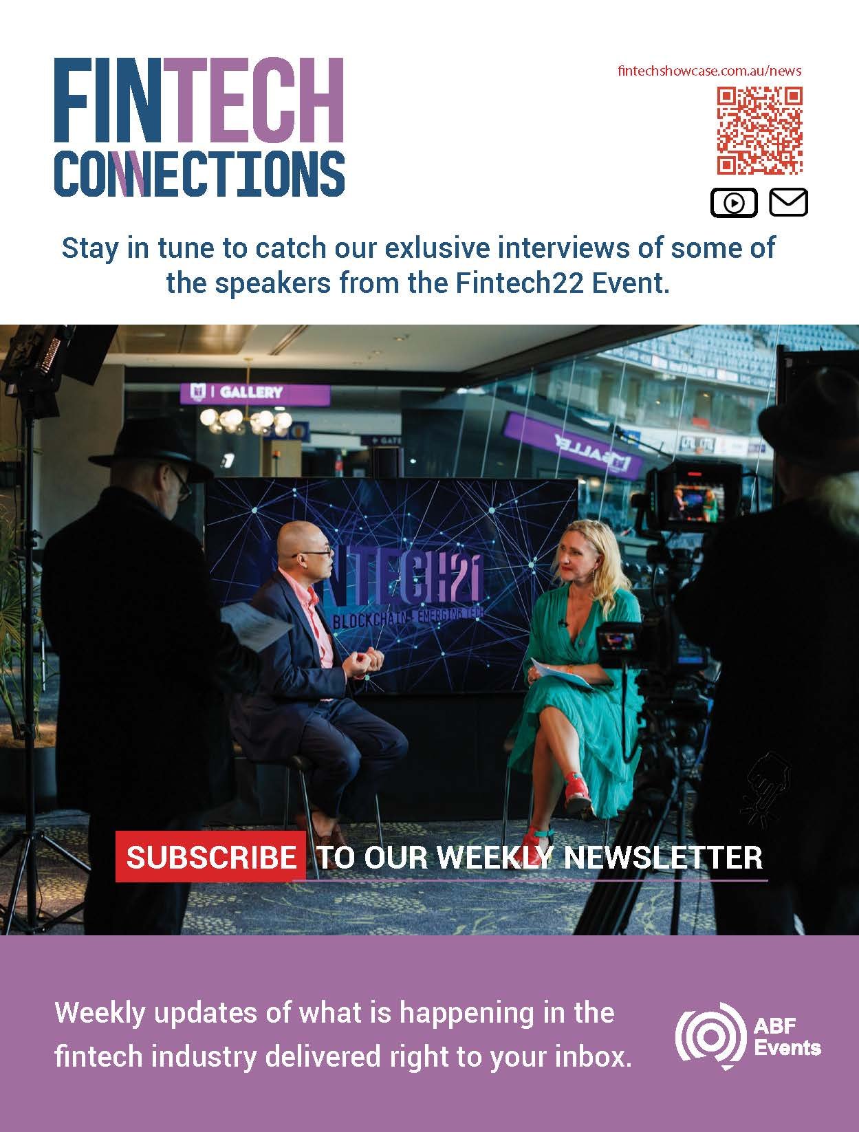
Australia Business Forum is a company that organises events for the business community. One of their flagship events is a Fintech event held in Sydney and Melbourne. My task was to create a visual direction and develop the design materials for the 2023 event. The logo was already developed and had been used in previous years.
My Role: Visual Direction, Design, Video & Motion
Position & Company: Multimedia Specialist, ABF Events
Website Banners
ROLE: Design | Motiongraphics


Broadcast visual motiongraphics for a book launch. The images were done in photoshop and animated in aftereffects.
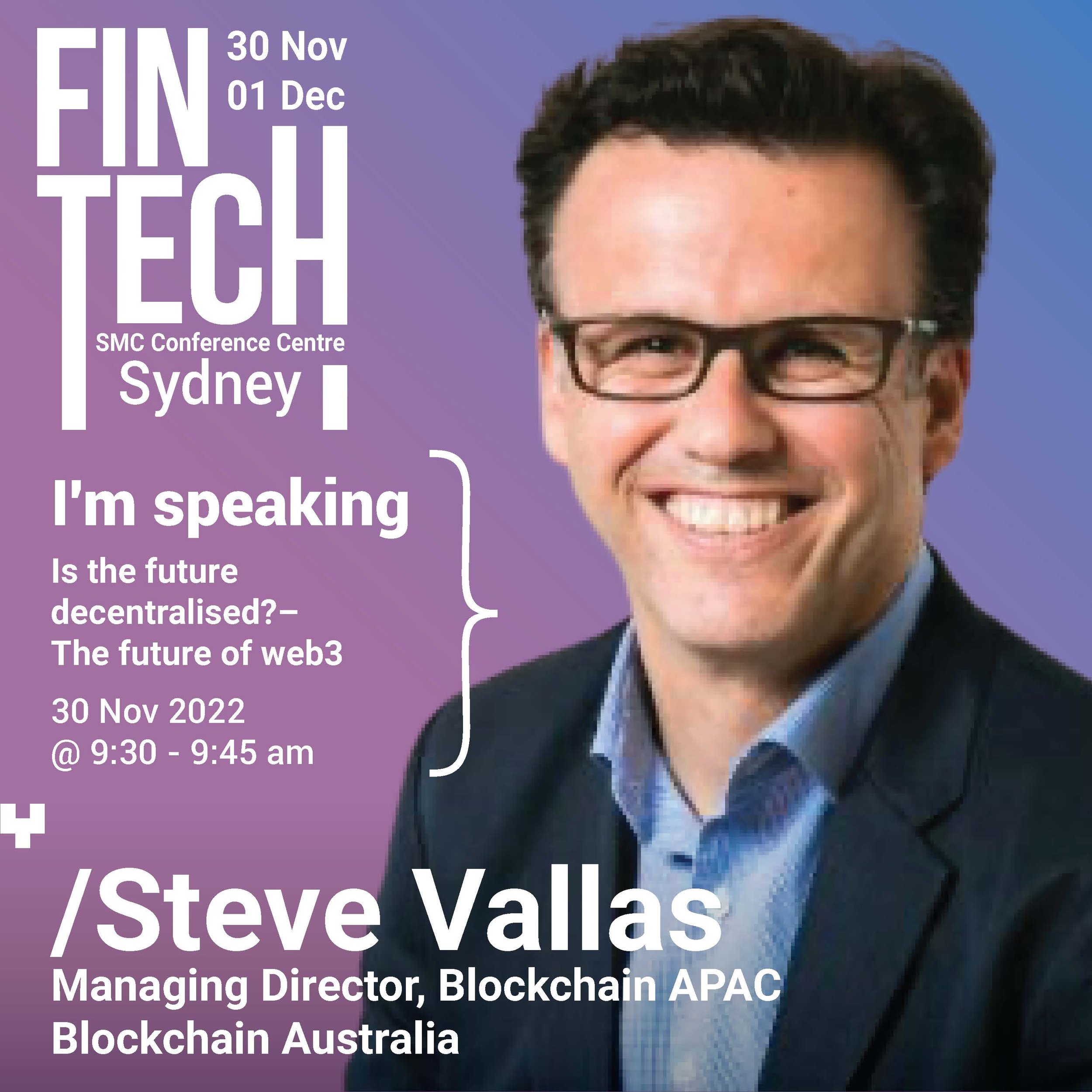
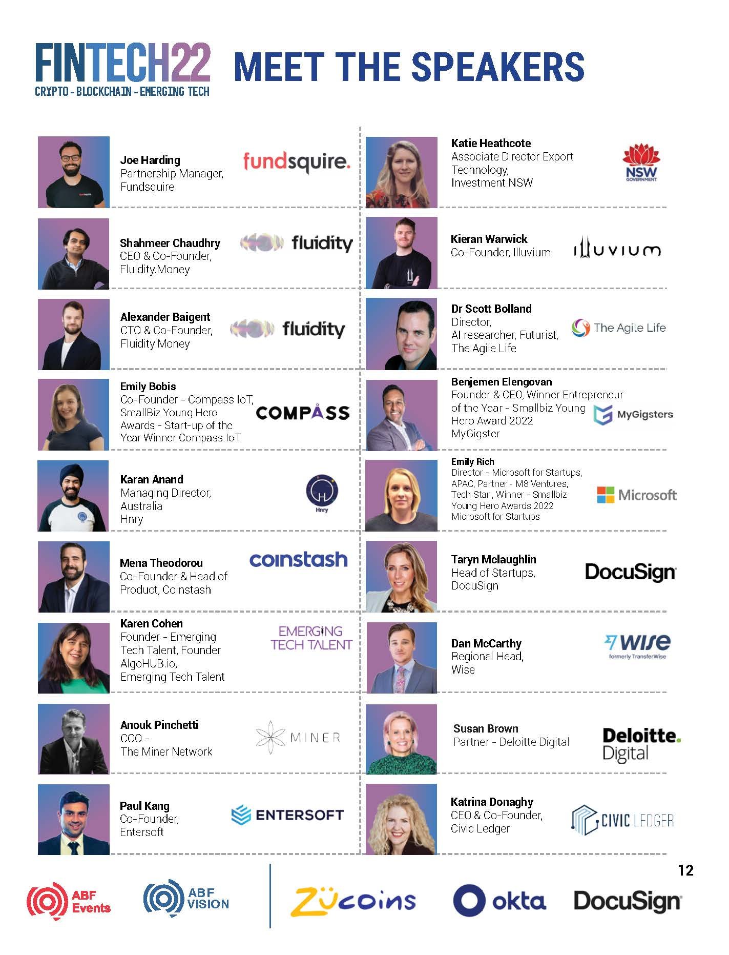
Australia Business Forum is a company that organises events for the business community. One of their flagship events is a Fintech event held in Sydney and Melbourne. My task was to create a visual direction and develop the design materials for the 2023 event. The logo was already developed and had been used in previous years.
My Role: Visual Direction, Design, Video & Motion
Position & Company: Multimedia Specialist, ABF Events
Large format hanging banners were designed and used for the National conference. The large hanging banners measure about six meters in length.
ROLE: Design and Layout
Large format hanging banners
Large format pull up banners